Overview
To ensure the fidelity of estimated parameters and mathematical functions in PEARL, we compared individual fits between projected outcomes (such as age distribution, CD4 count, prevalence of risk factors and comorbidities) from simulation data and corresponding data from NAACCORD (“in-sample” approach) among ART-users in 2009 and among the ART-initiators from 2010–2022.
Furthermore, to ensure the fidelity of model projections, we compared the projected age distribution and prevalence of comorbidities of ART-users in PEARL to the observed data from NA-ACCORD from 2010-2022 that they’re not directly used to inform the model (“out-of-sample” approach).
To account for outliers, we present the median value across 200 simulations. Agents and NAACCORD members that initate ART or reengage are included in calculations for that given year. Likewise, agents and members that disengage or die are also counted in that given year.
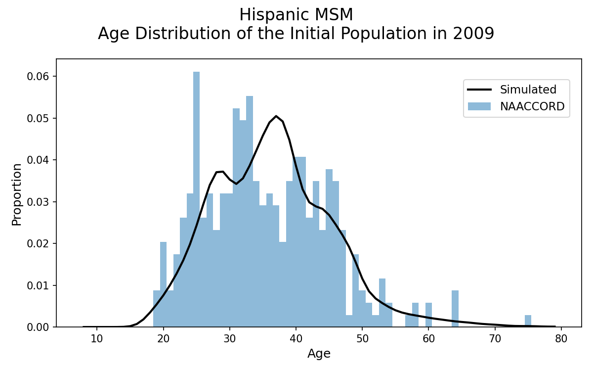
Initial Population in Year 2009
Age Distribution of Initial Population in Year 2009
The age distribution of the simulated population on ART in year 2009 is shown, modeled via a two-component mixed normal distribution (black line) based on data from NA-ACCORD (blue bars).
Figure 1a: HET Black Female
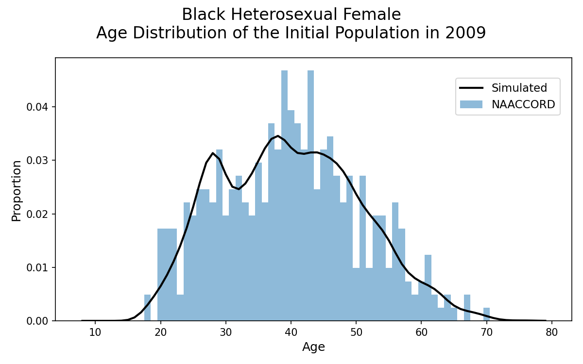
Figure 1b: HET White Female
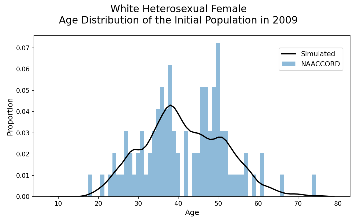
Figure 1c: HET Hispanic Female
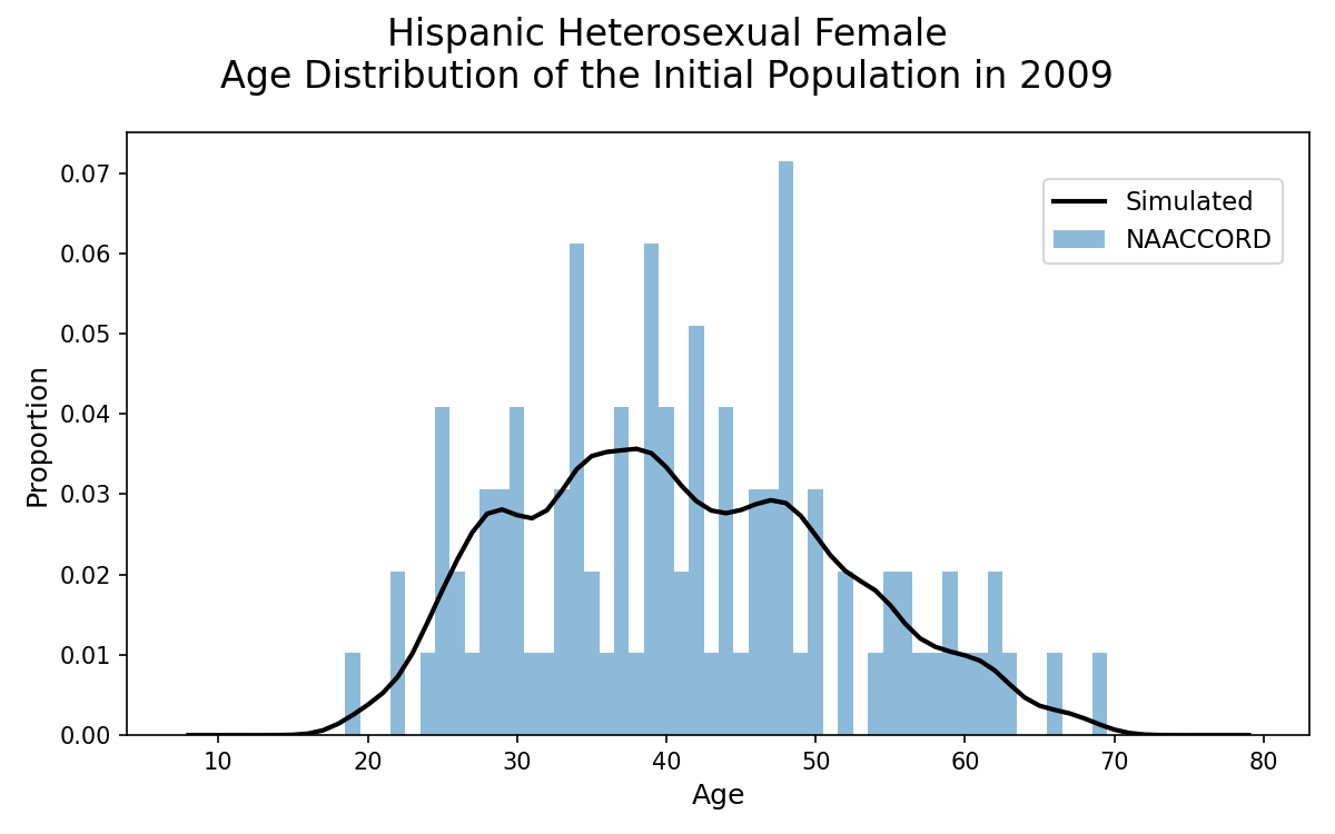
Figure 1d: HET Black Male
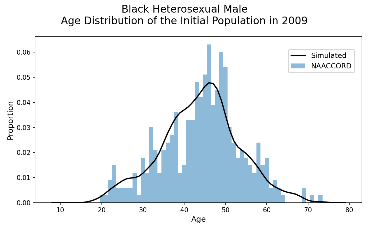
Figure 1e: HET White Male
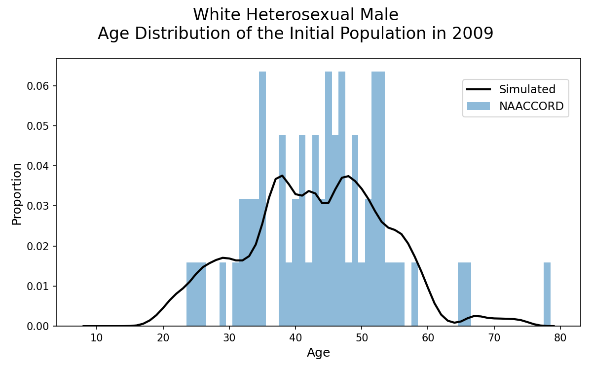
Figure 1f: HET Hispanic Male
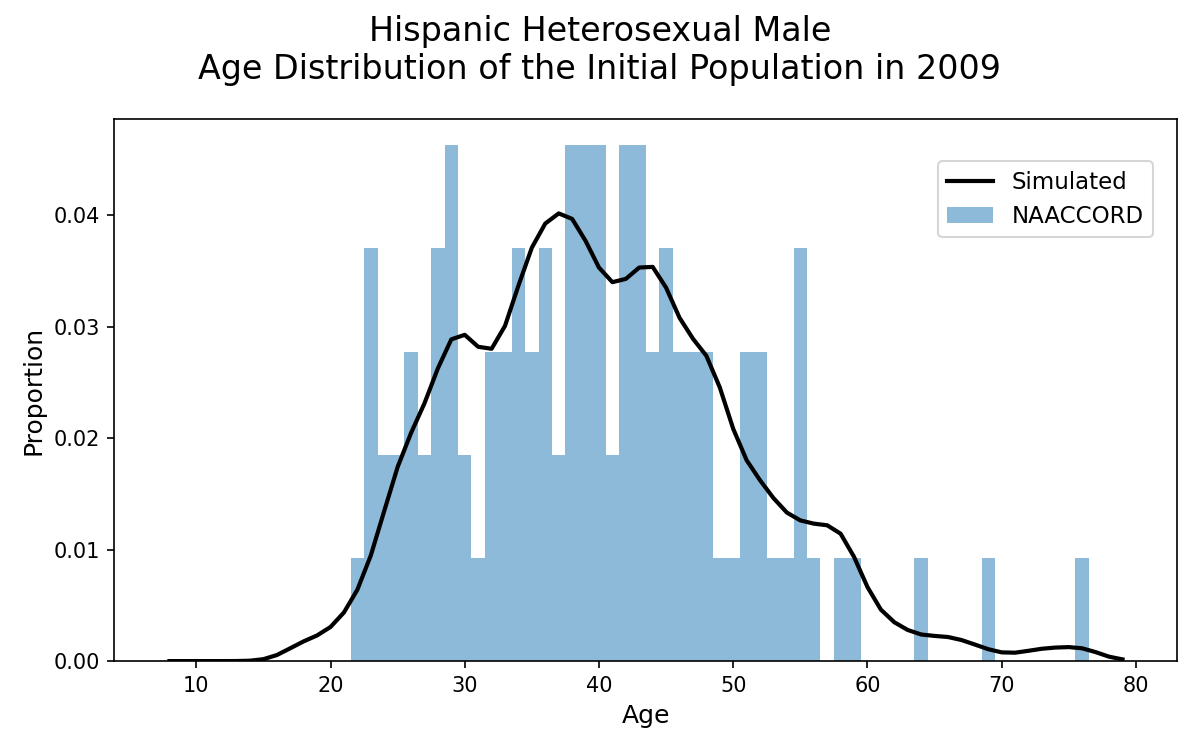
Figure 1g: IDU Black Female
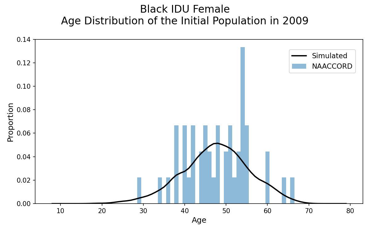
Figure 1h: IDU White Female
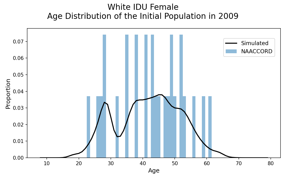
Figure 1i: IDU Hispanic Female
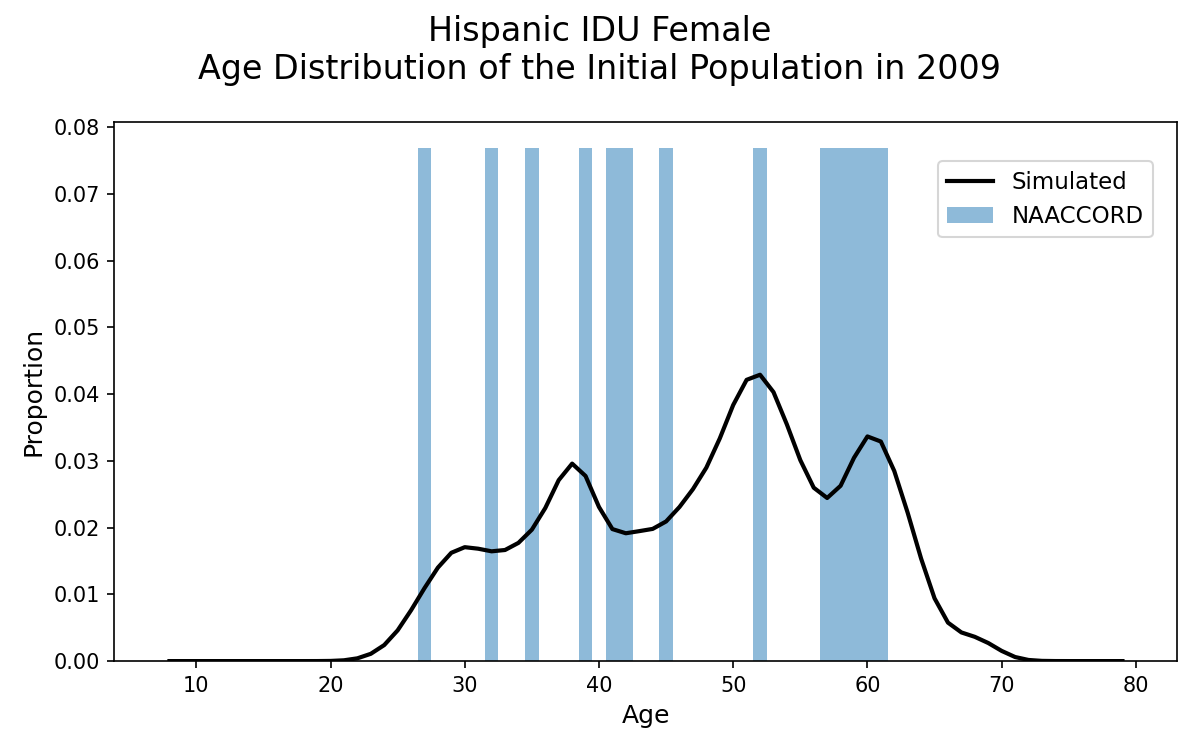
Figure 1j: IDU Black Male
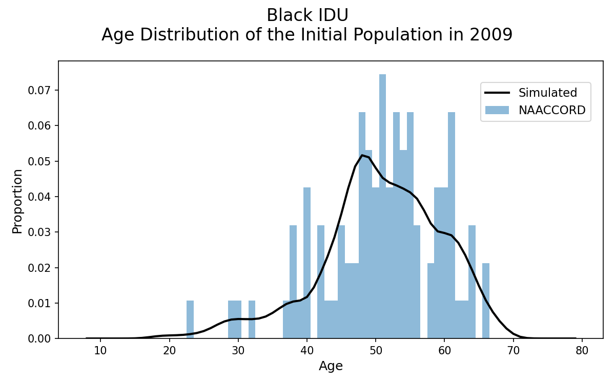
Figure 1k: IDU White Male
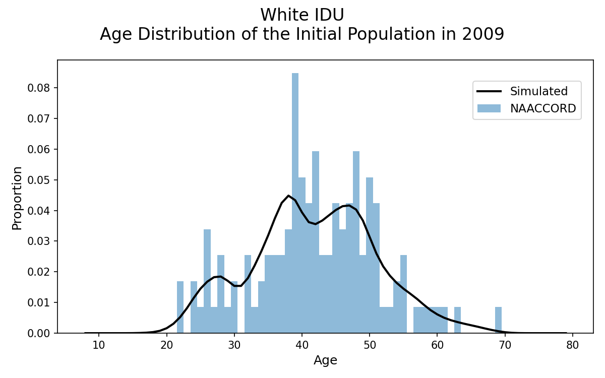
Figure 1l: IDU Hispanic Male
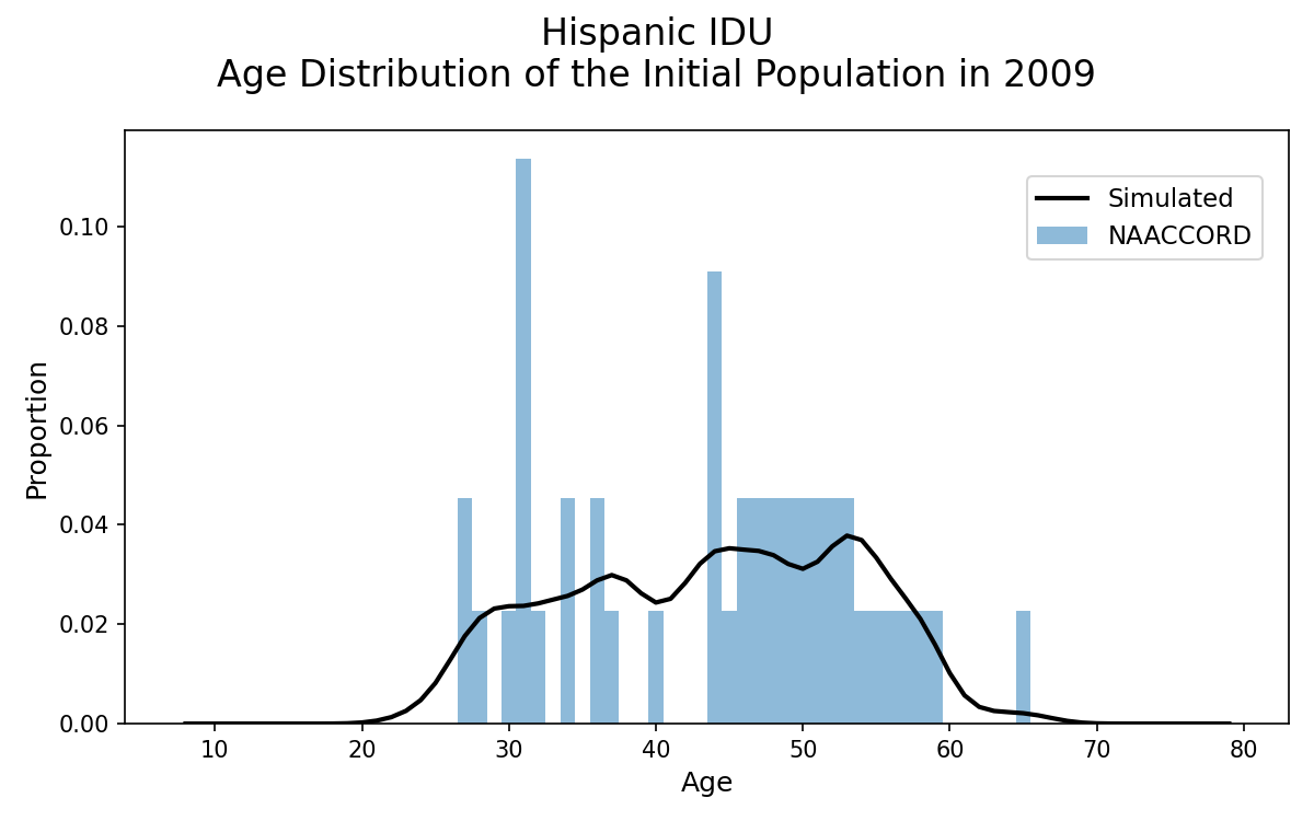
Figure 1m: Black MSM
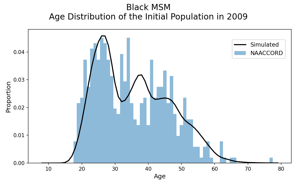
Figure 1n: White MSM
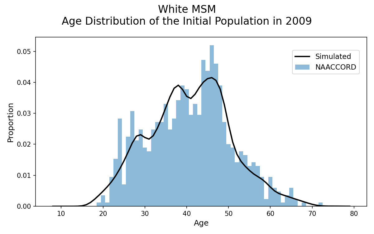
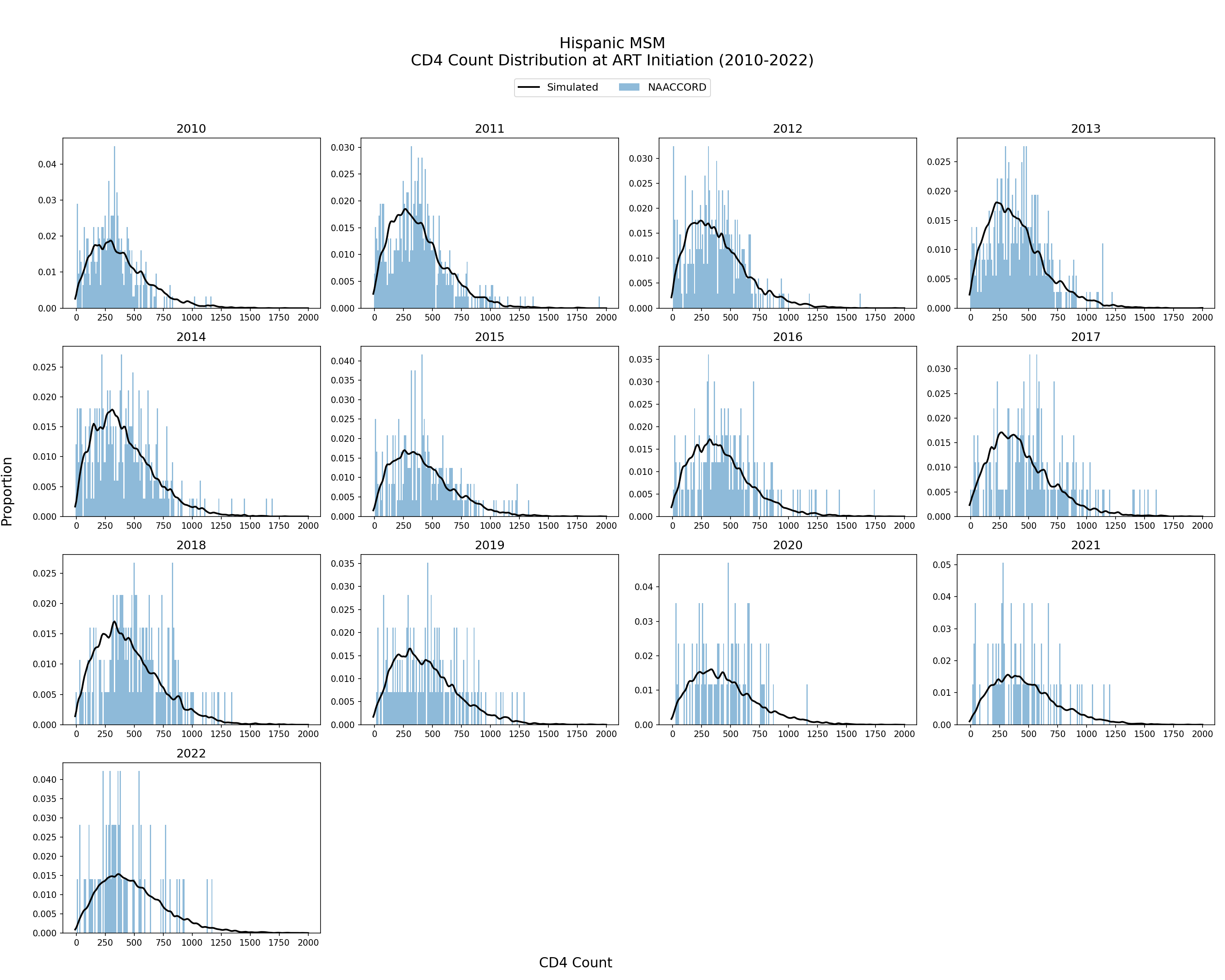
Figure 1o: Hispanic MSM
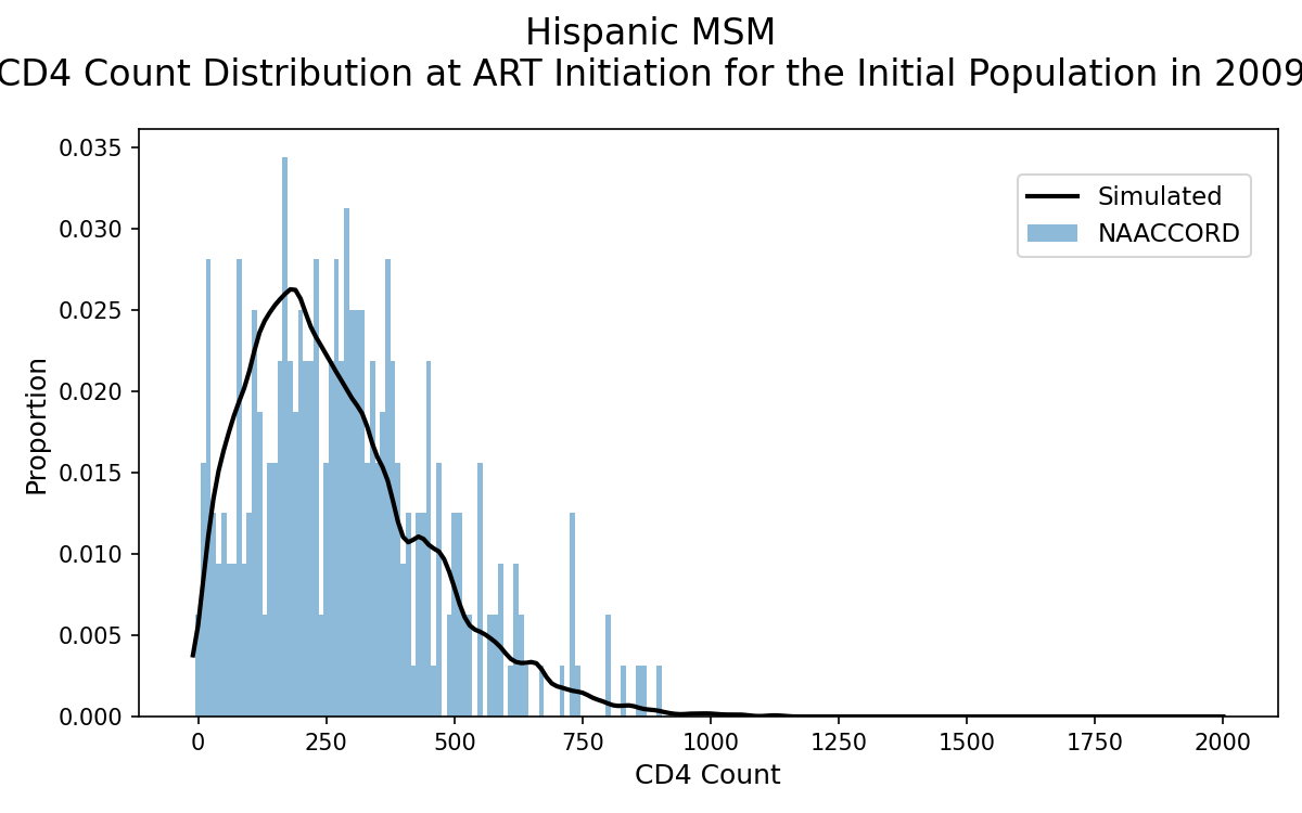
CD4 Count Distribution at ART Initiation of Initial Population in Year 2009
The CD4 count distribution of the simulated population on ART in year 2009 is shown. The black line represents the simulated CD4 count values against NA-ACCORD data (blue bars). CD4 count is drawn from a normal distribution with parameters fit to a linear function of ART initiation year.
Figure 2a: HET Black Female
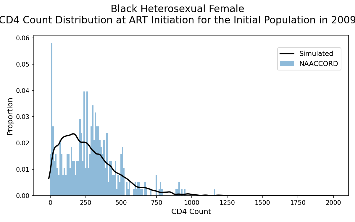
Figure 2b: HET White Female
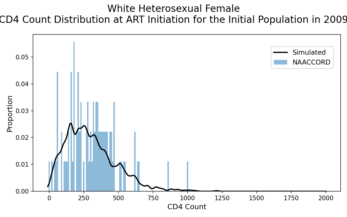
Figure 2c: HET Hispanic Female
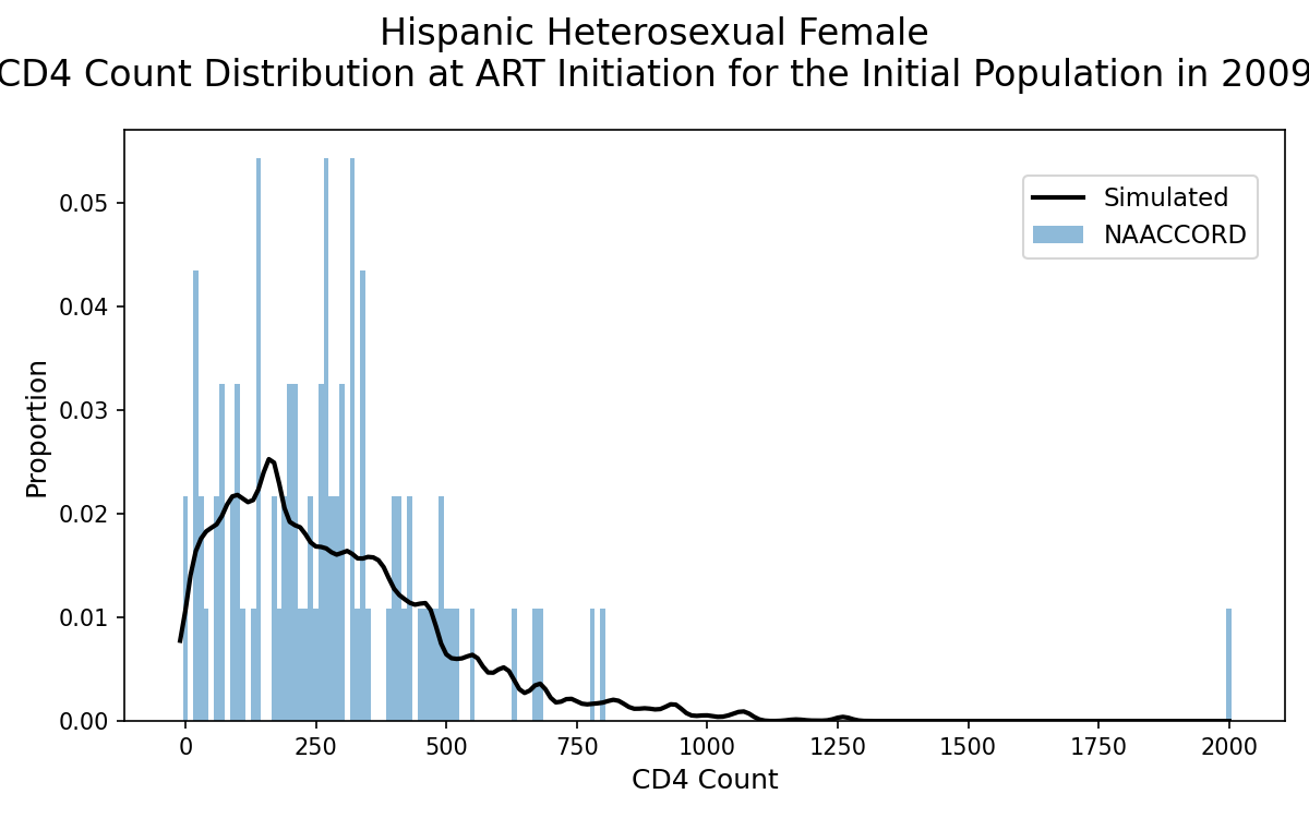
Figure 2d: HET Black Male
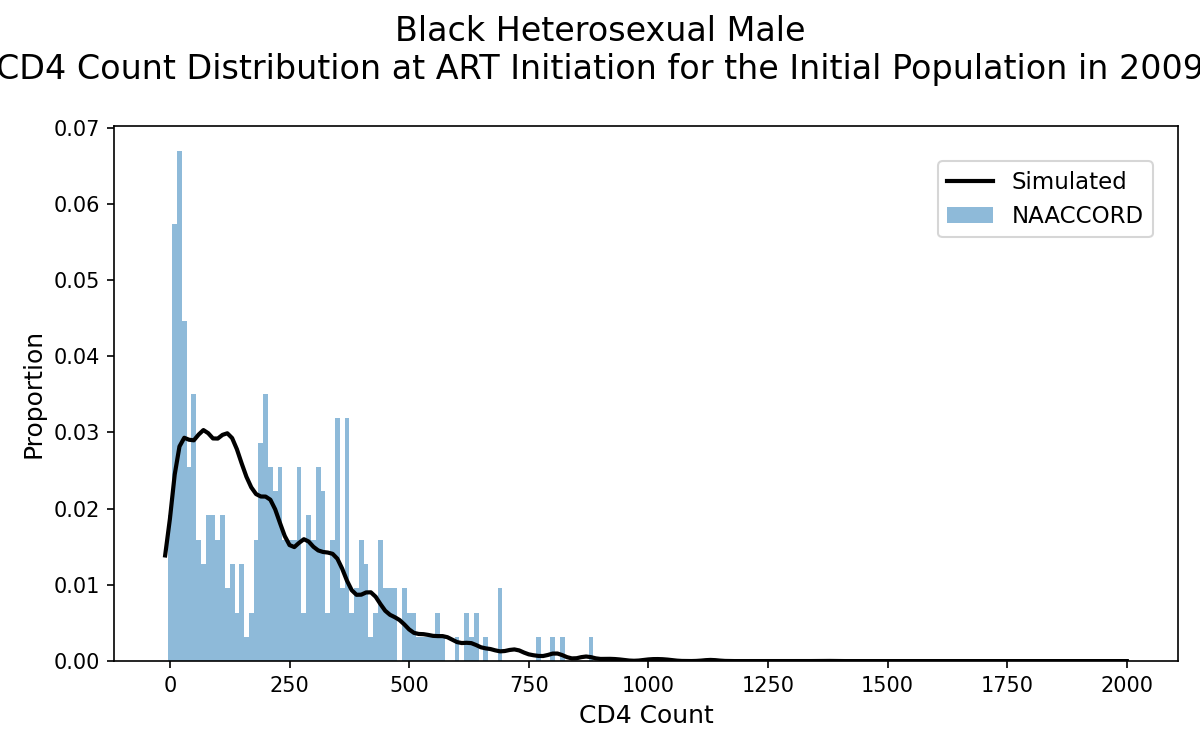
Figure 2e: HET White Male
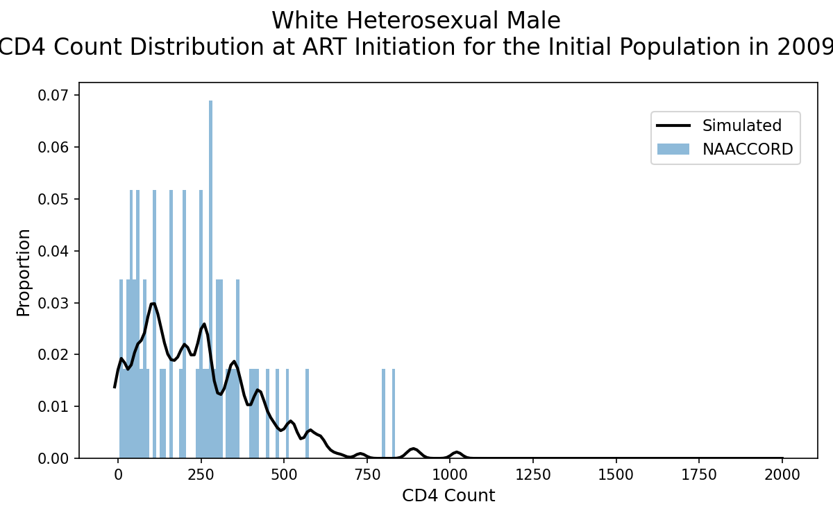
Figure 2f: HET Hispanic Male
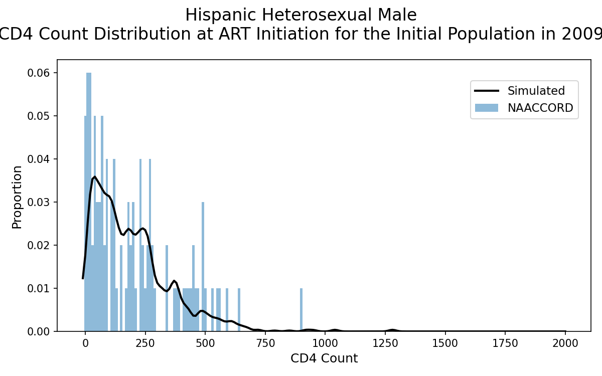
Figure 2g: IDU Black Female
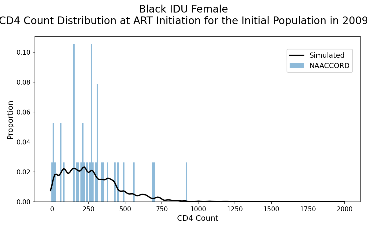
Figure 2h: IDU White Female
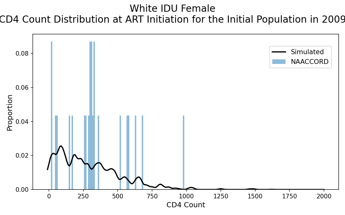
Figure 2i: IDU Hispanic Female
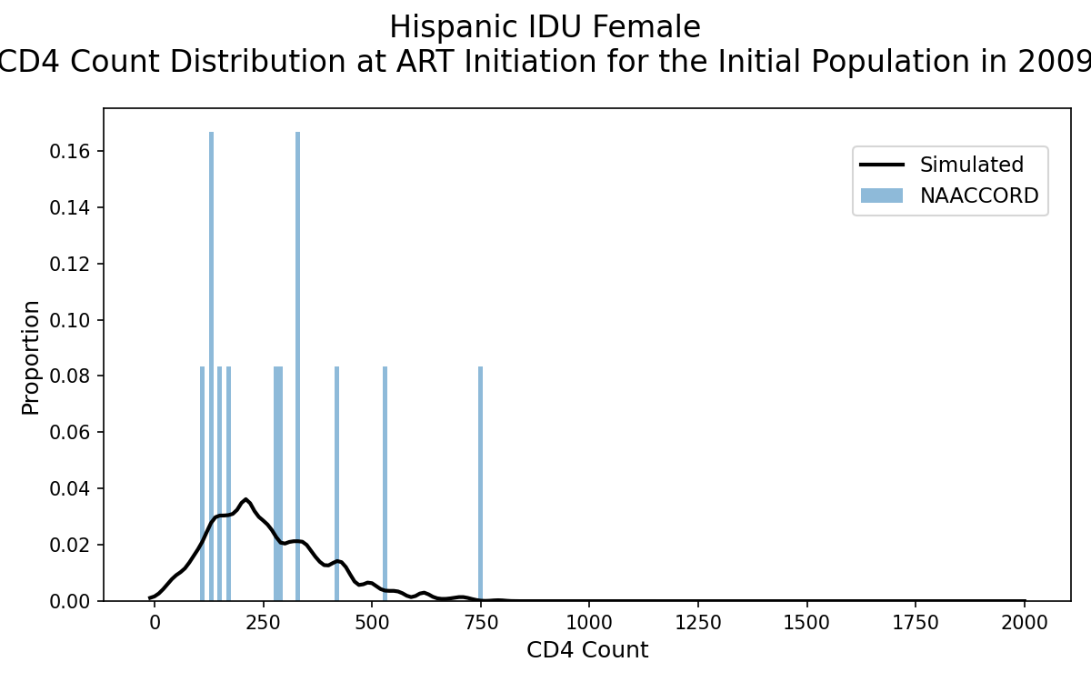
Figure 2j: IDU Black Male
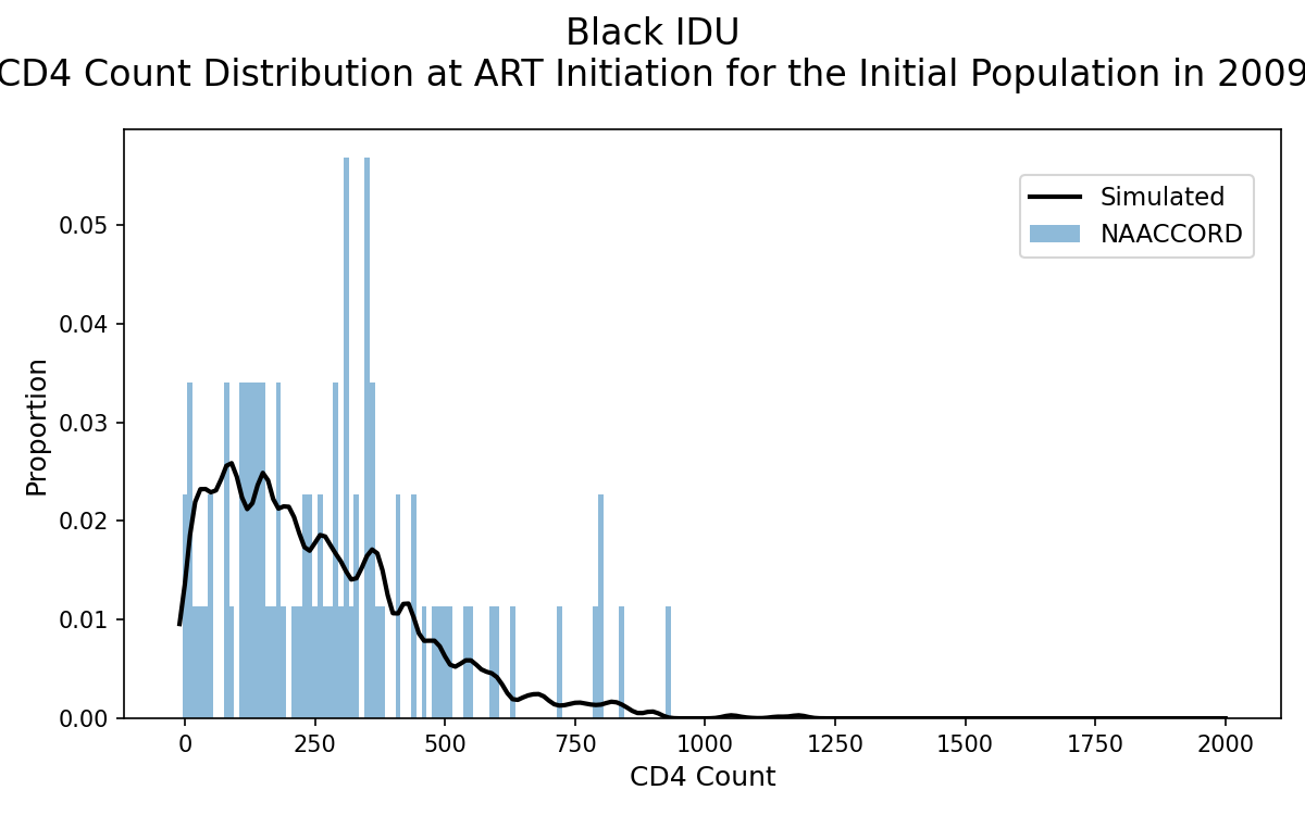
Figure 2k: IDU White Male
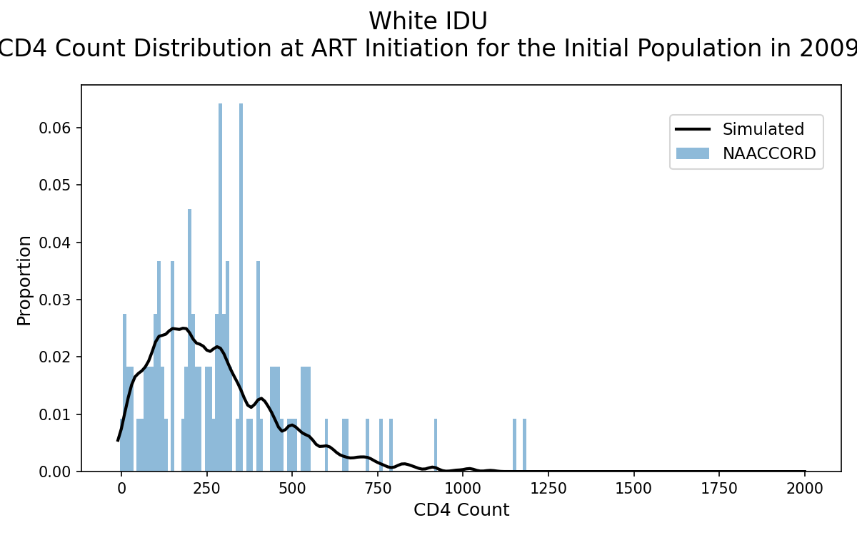
Figure 2l: IDU Hispanic Male
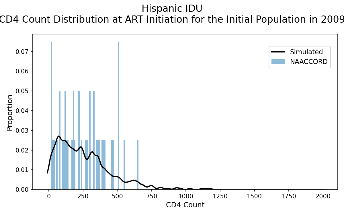
Figure 2m: Black MSM
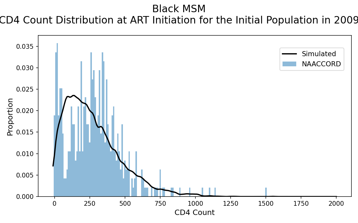
Figure 2n: White MSM
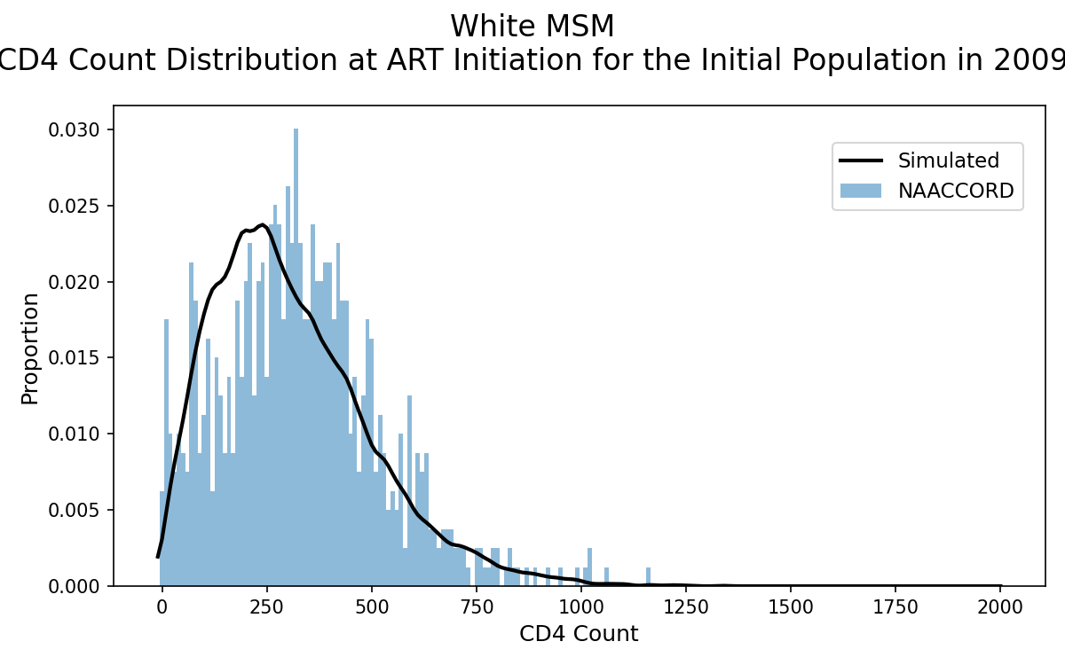
Figure 2o: Hispanic MSM
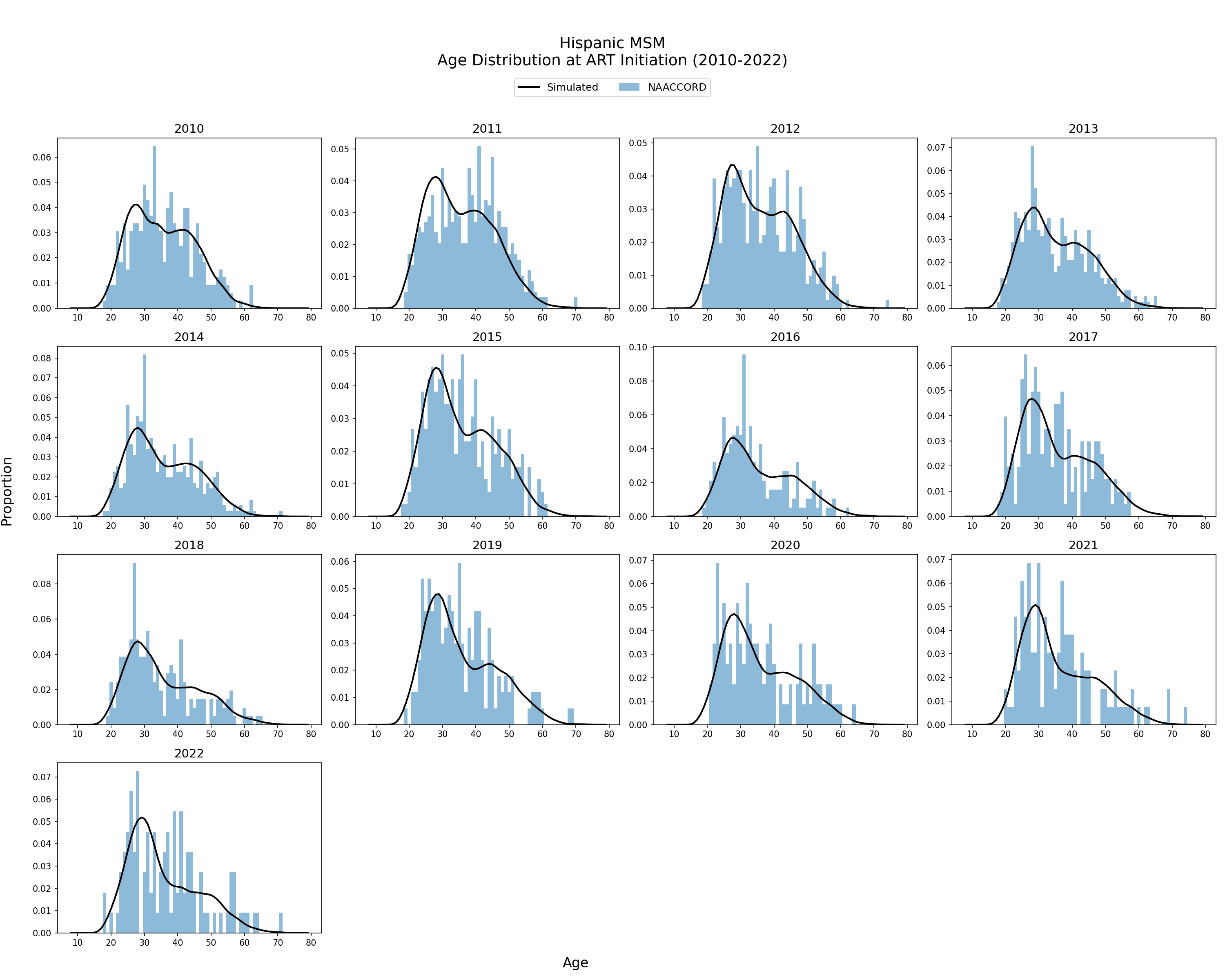
Population Initiating ART from 2010 - 2022
Age Distribution of ART Initiators
The age distribution of the simulated population initiating ART from 2010 - 2022 is shown. The black line represents the simulated age distribution against NA-ACCORD data (blue bars). Age at ART initiation is modeled by a two-component mixed normal distribution with parameters fit to a linear function of ART initiation year.
Figure 3a: HET Black Female
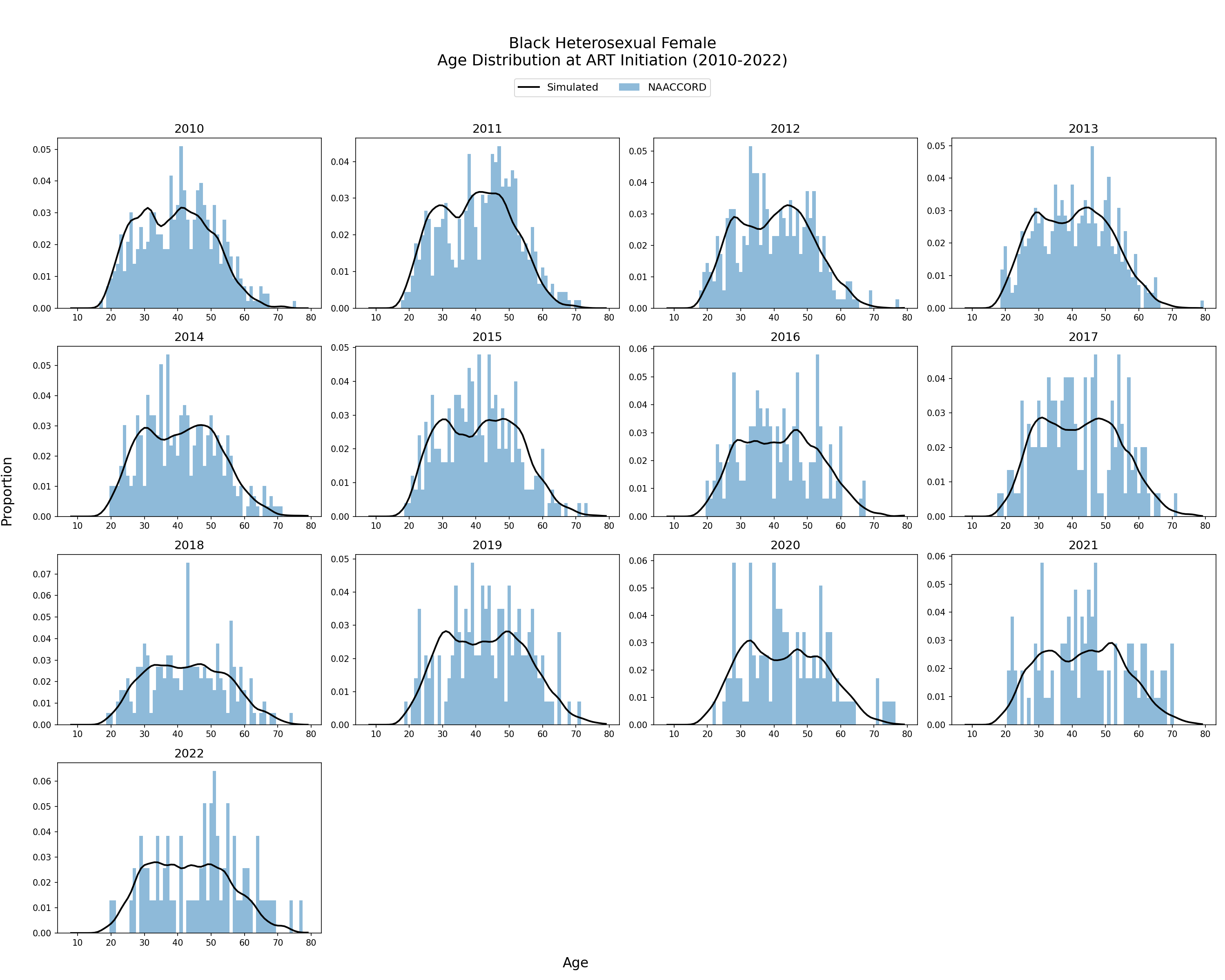
Figure 3b: HET White Female
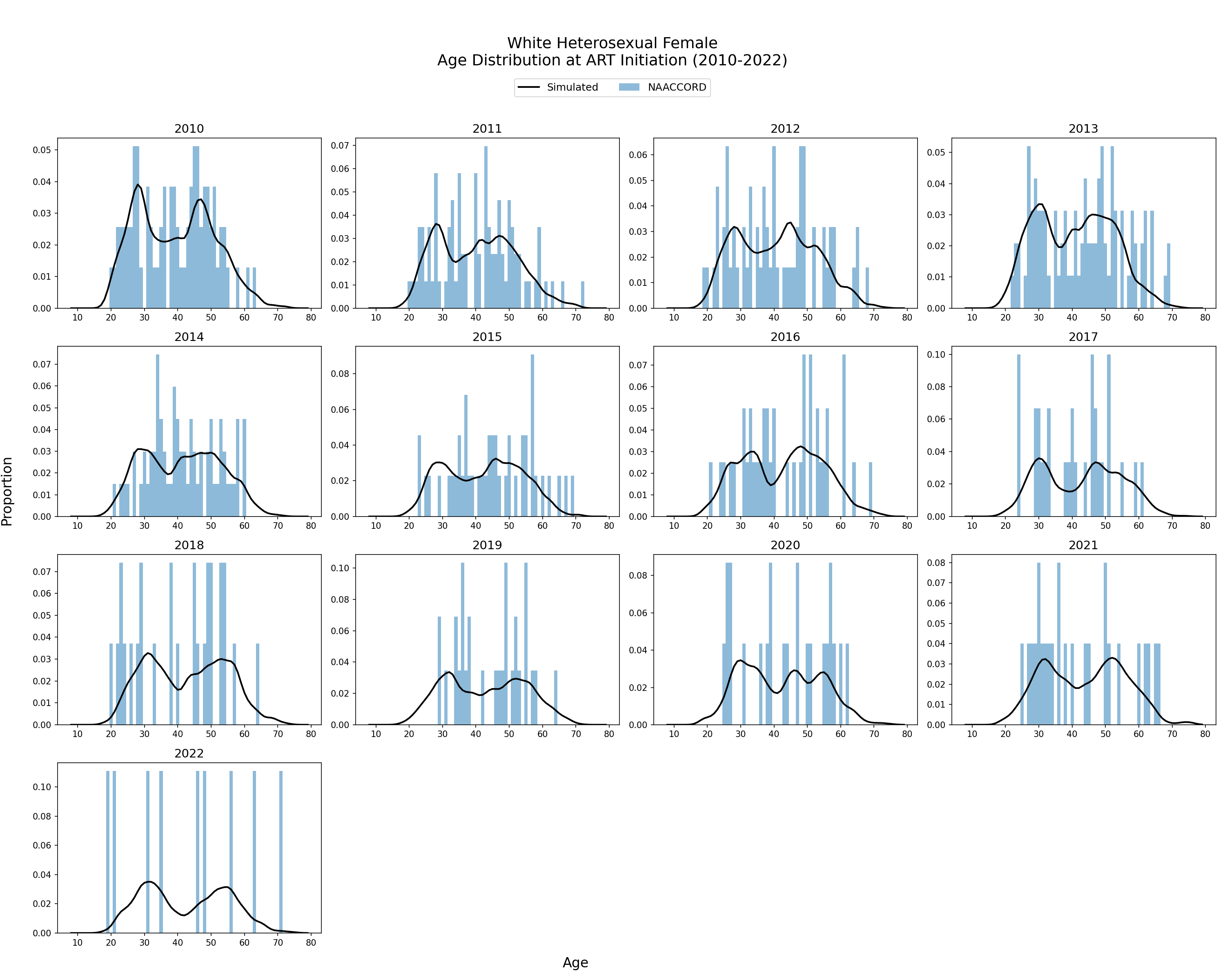
Figure 3c: HET Hispanic Female
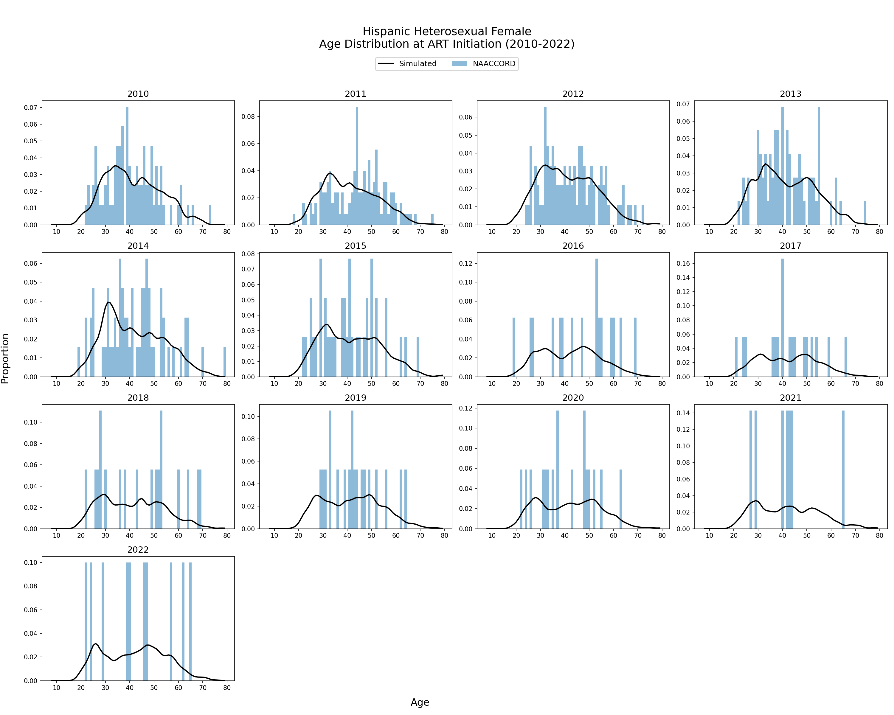
Figure 3d: HET Black Male
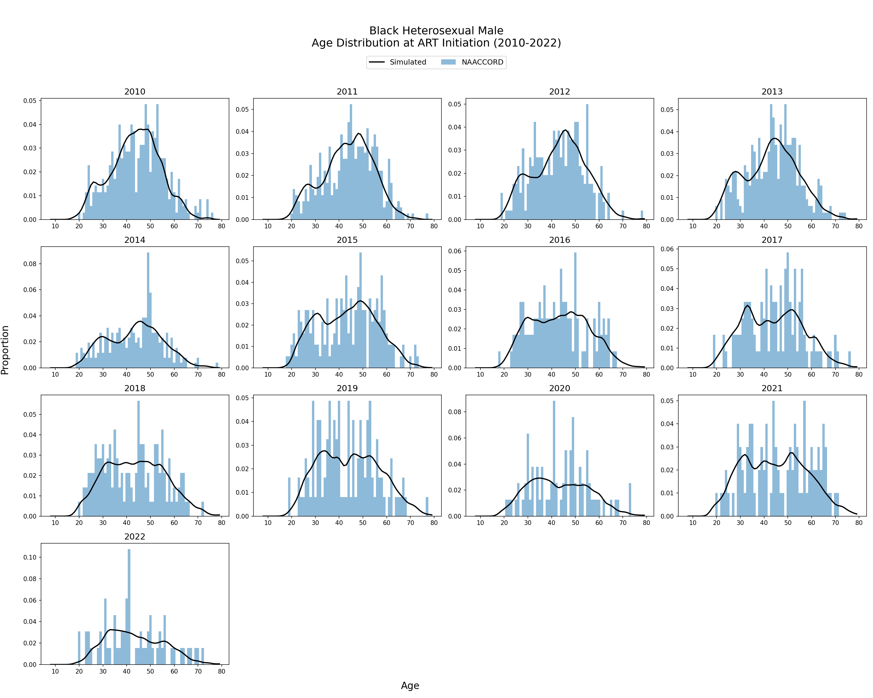
Figure 3e: HET White Male
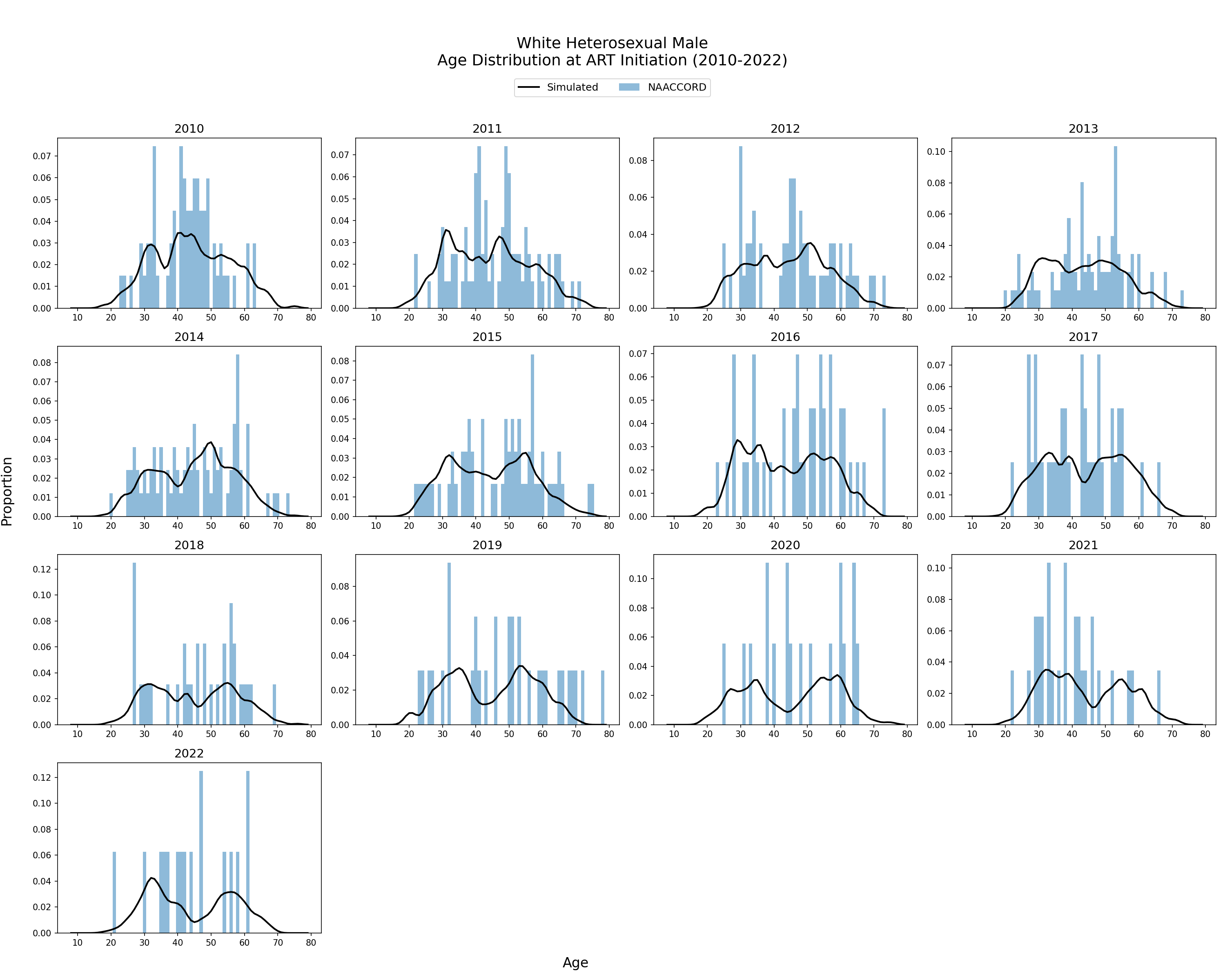
Figure 3f: HET Hispanic Male
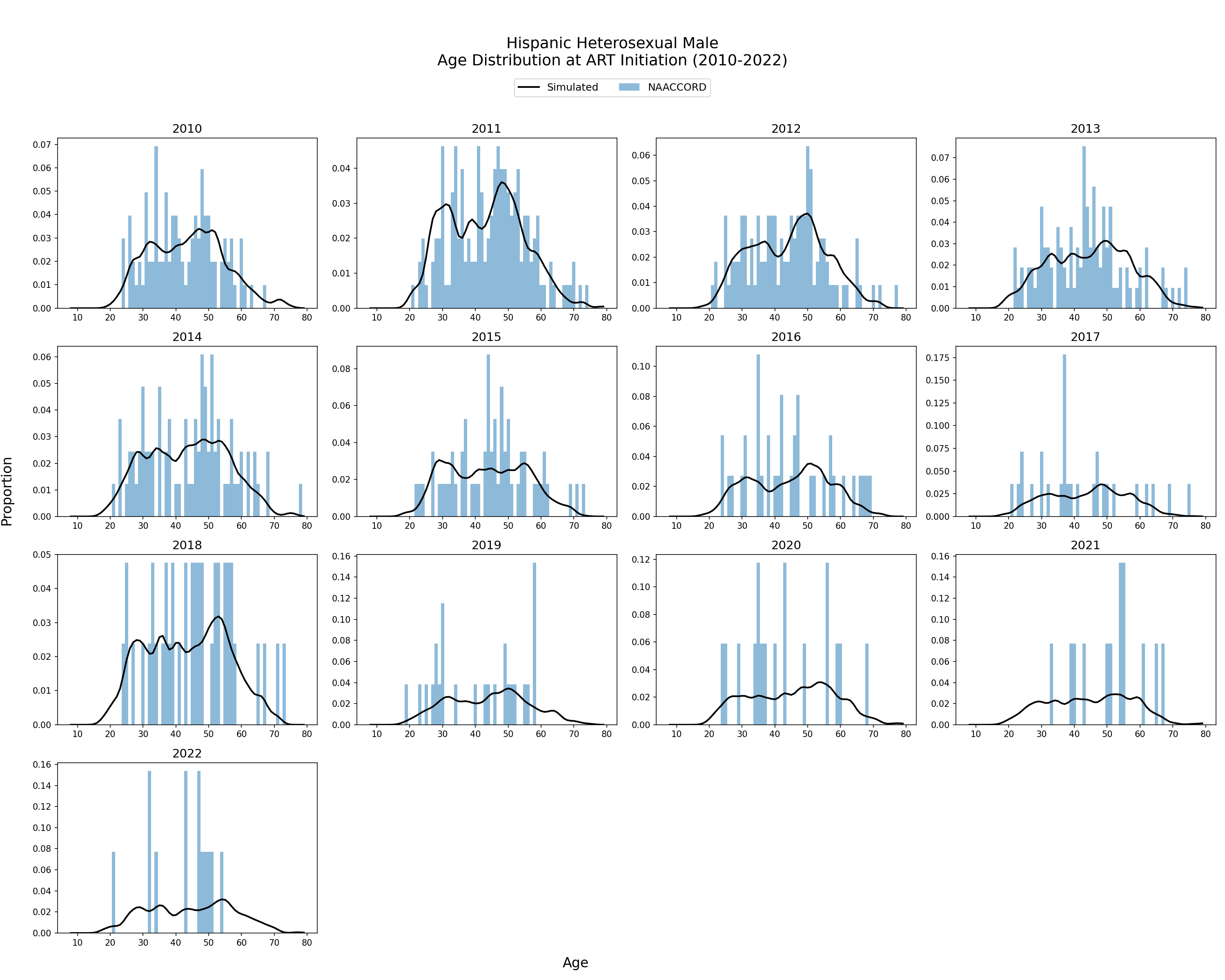
Figure 3g: IDU Black Female
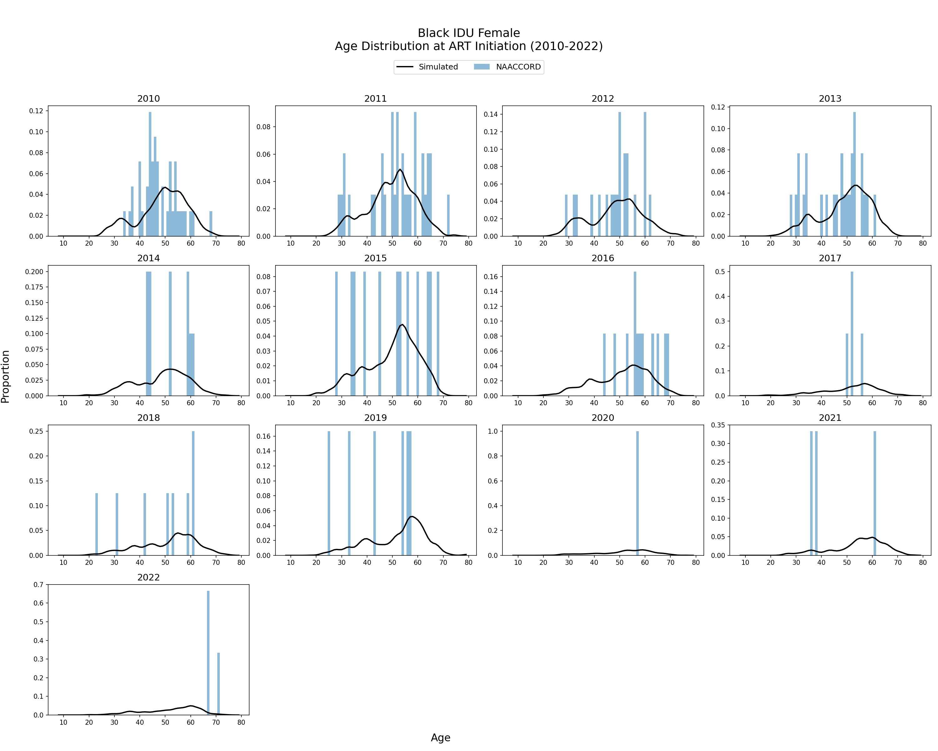
Figure 3h: IDU White Female
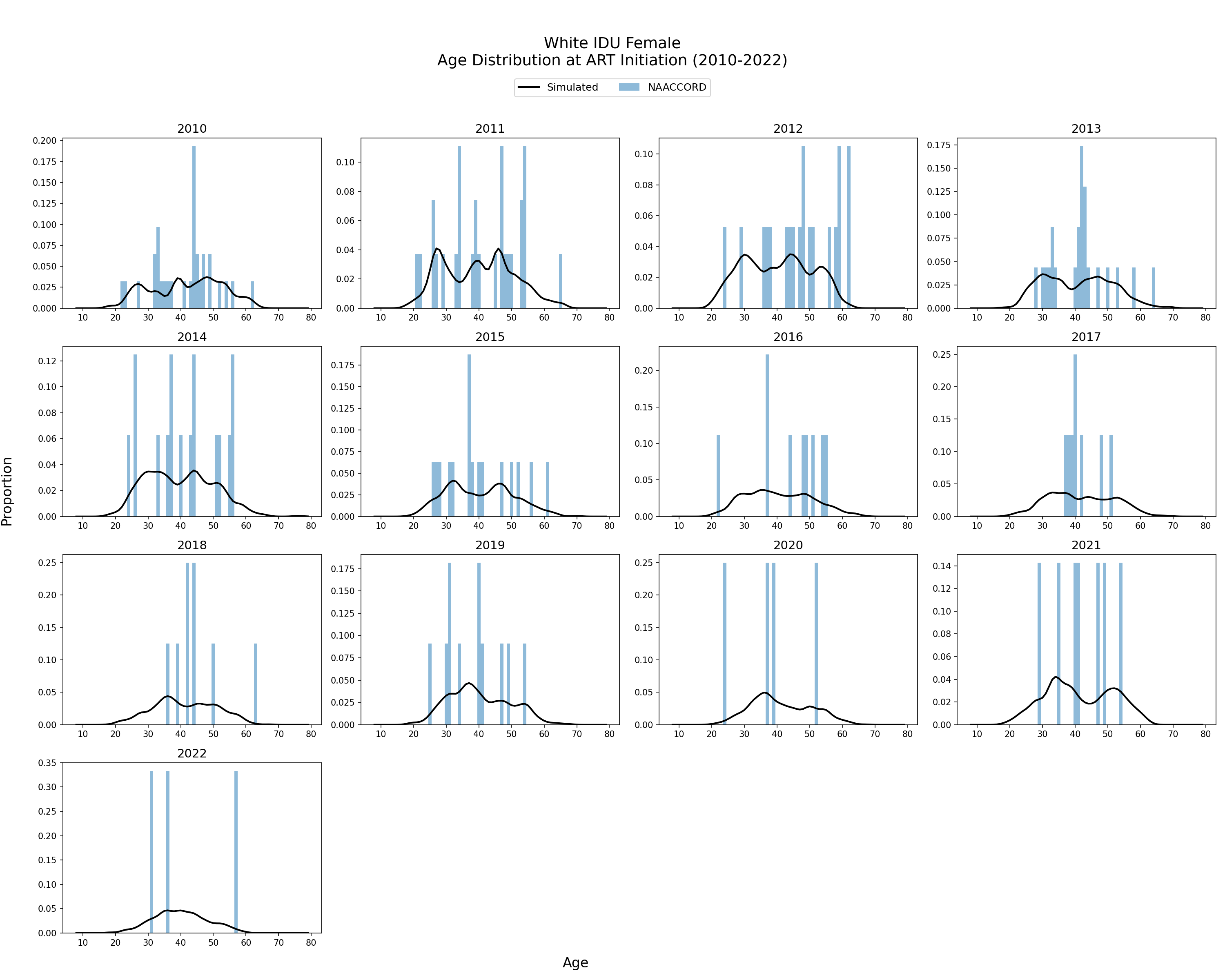
Figure 3i: IDU Hispanic Female
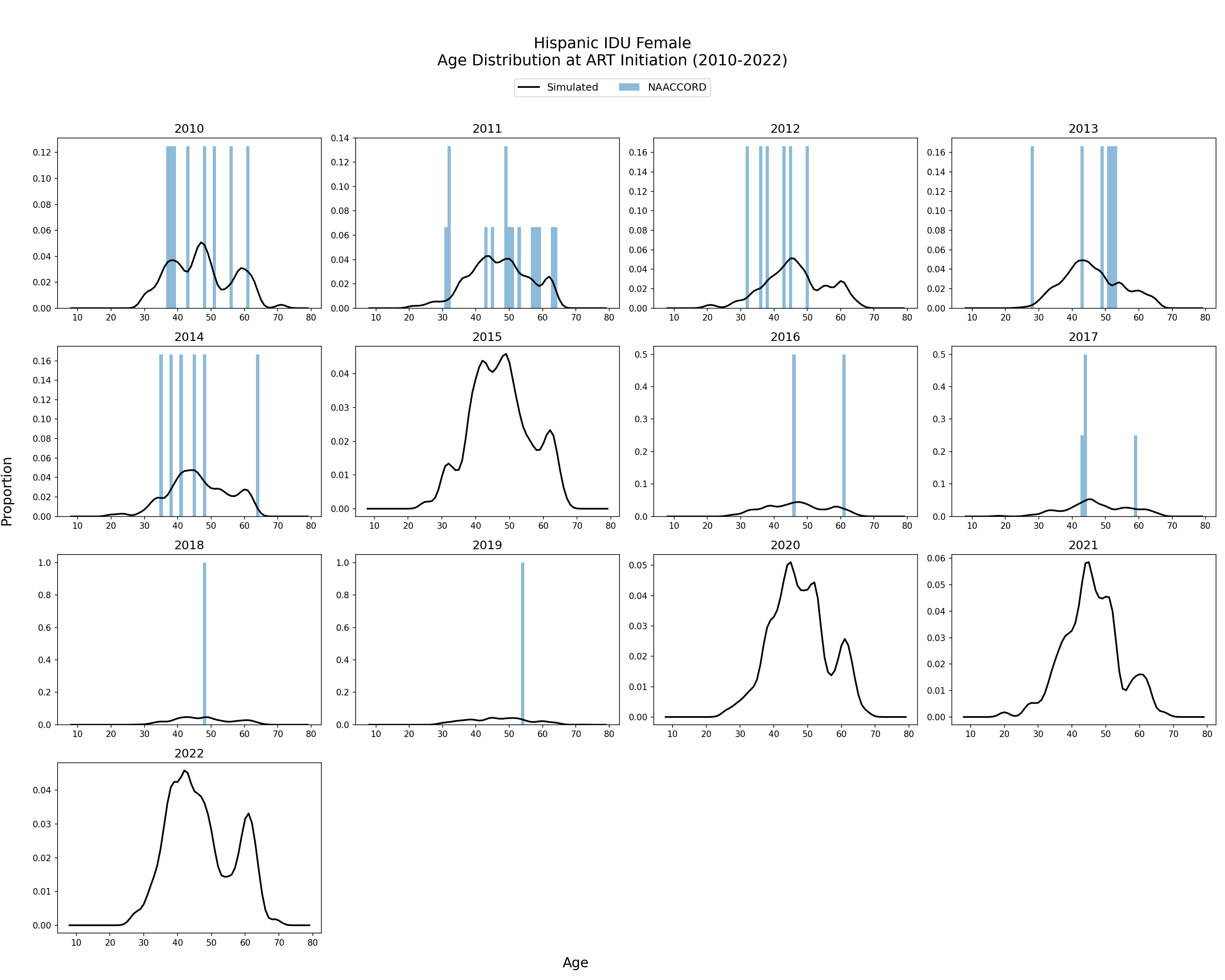
Figure 3j: IDU Black Male
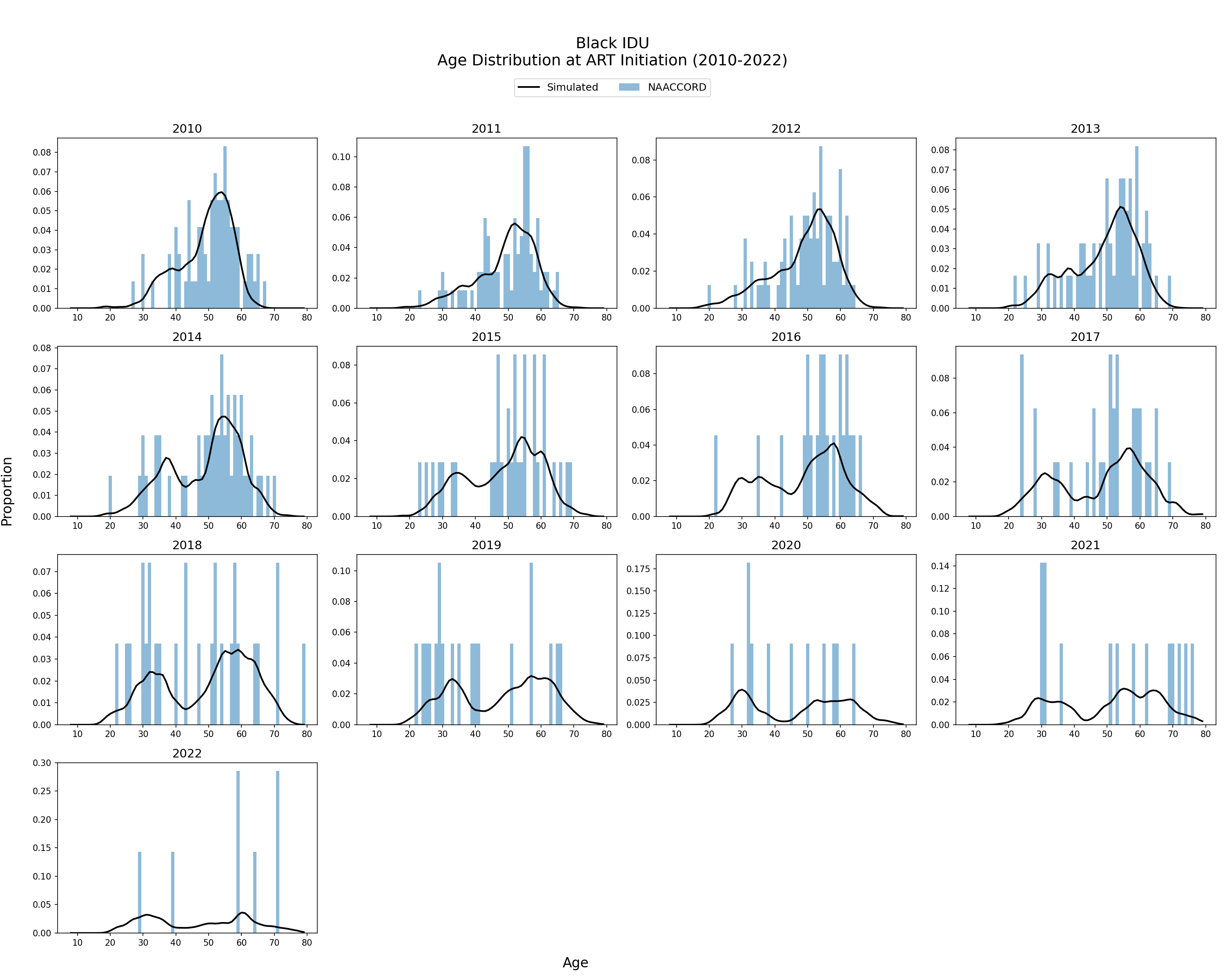
Figure 3k: IDU White Male
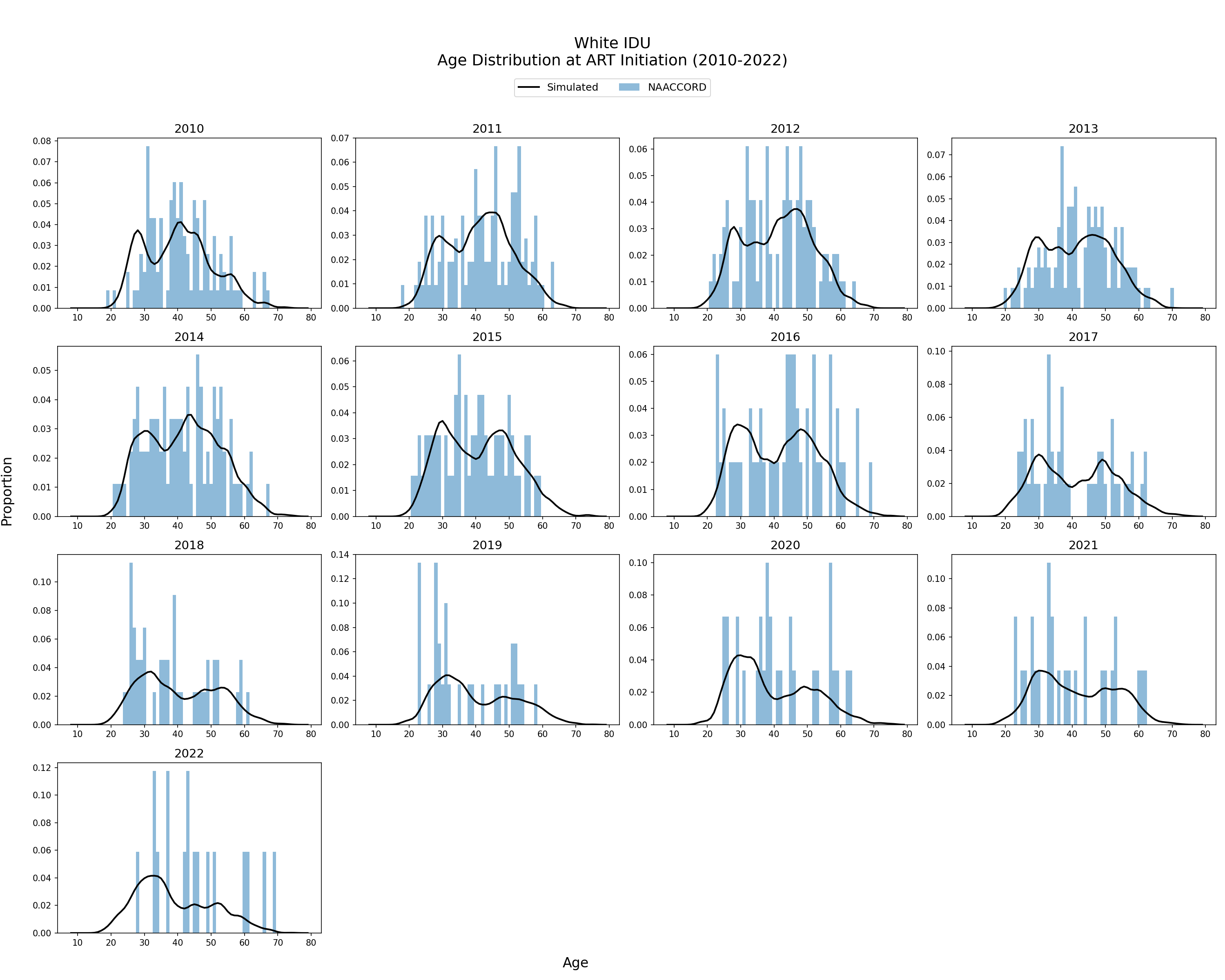
Figure 3l: IDU Hispanic Male
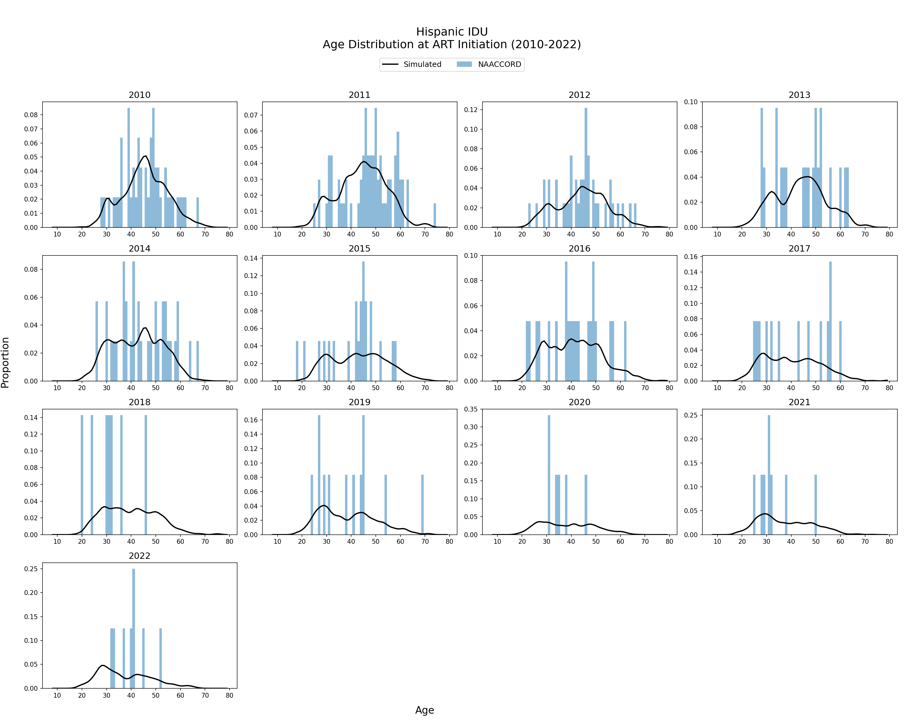
Figure 3m: Black MSM
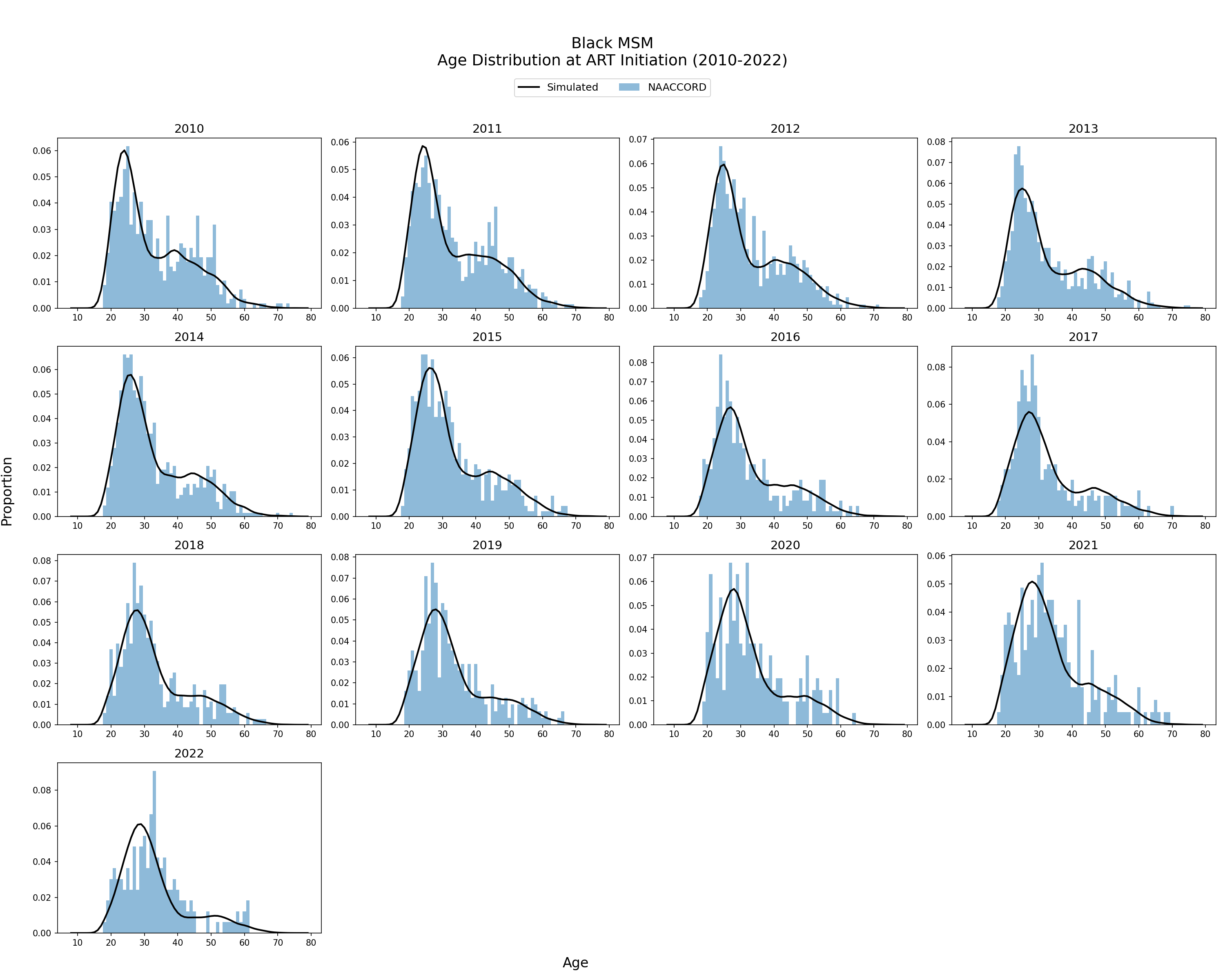
Figure 3n: White MSM
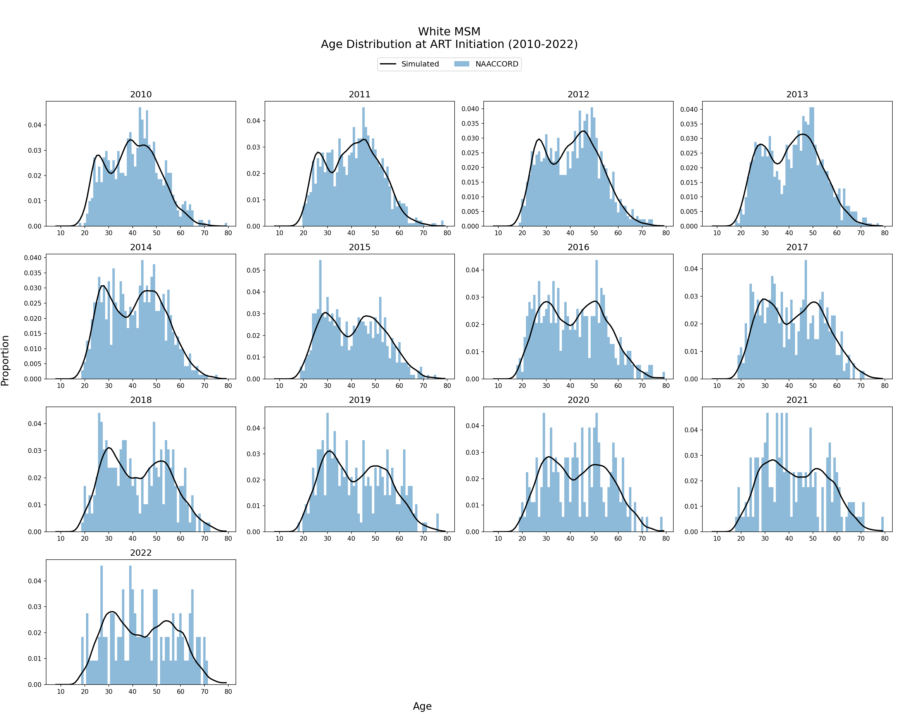
Figure 3o: Hispanic MSM
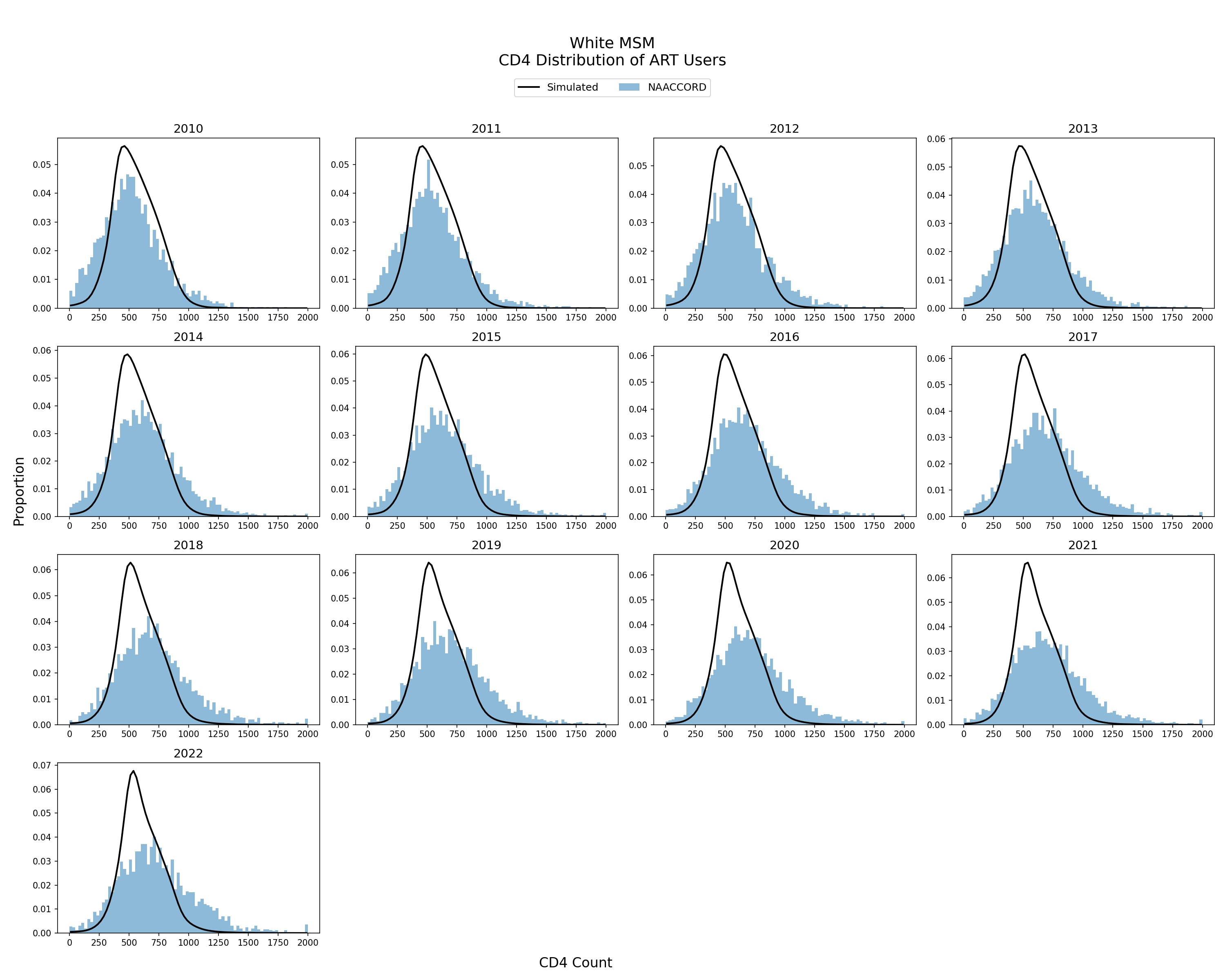
CD4 Distribution of ART Initiators
The CD4 count distribution of the simulated population initiating ART from 2010 - 2022 is shown. The black line represents the simulated CD4 count values against NA-ACCORD data (blue bars). CD4 count is drawn from a normal distribution with parameters fit to a linear function of ART initiation year.
Figure 4a: HET Black Female
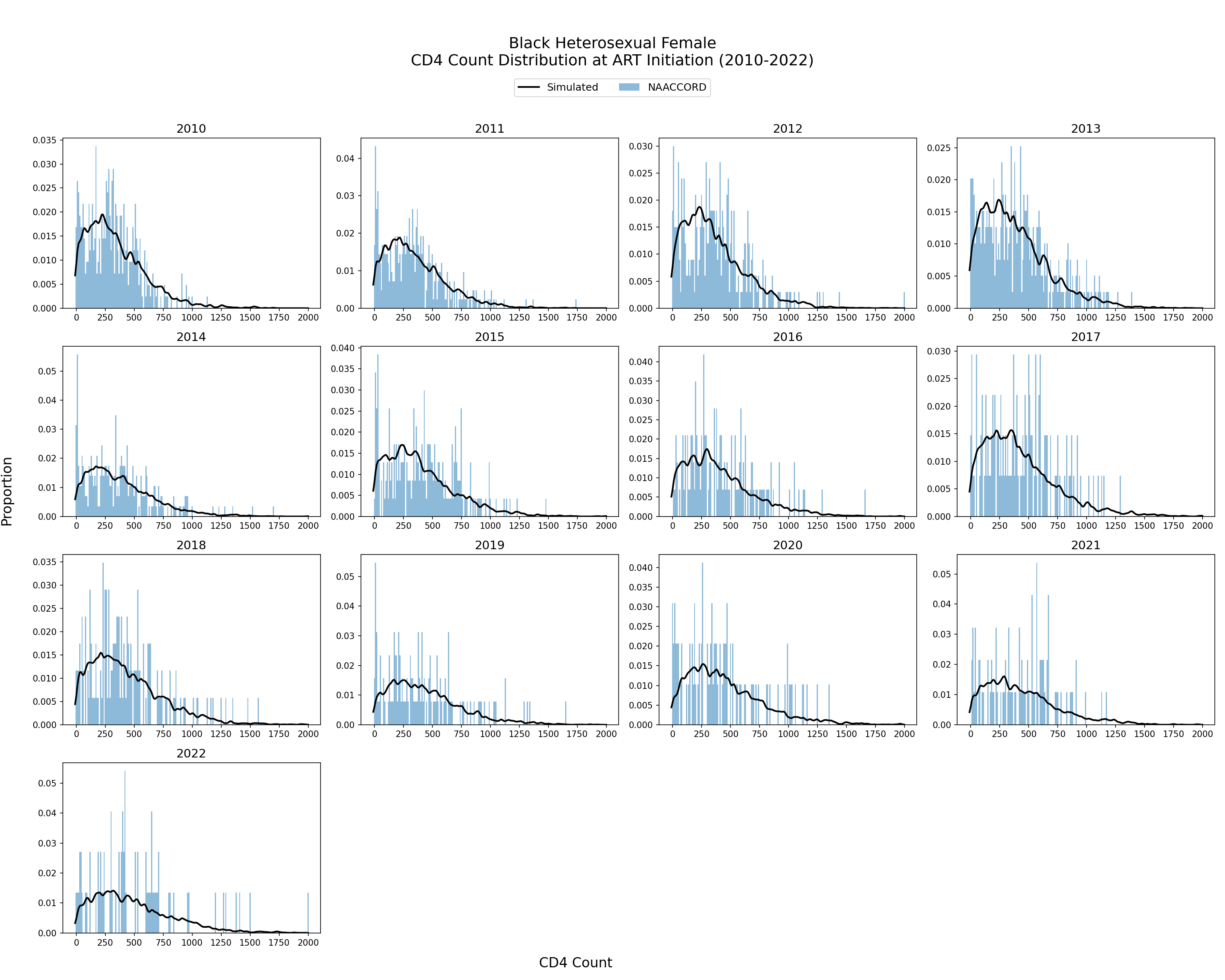
Figure 4b: HET White Female
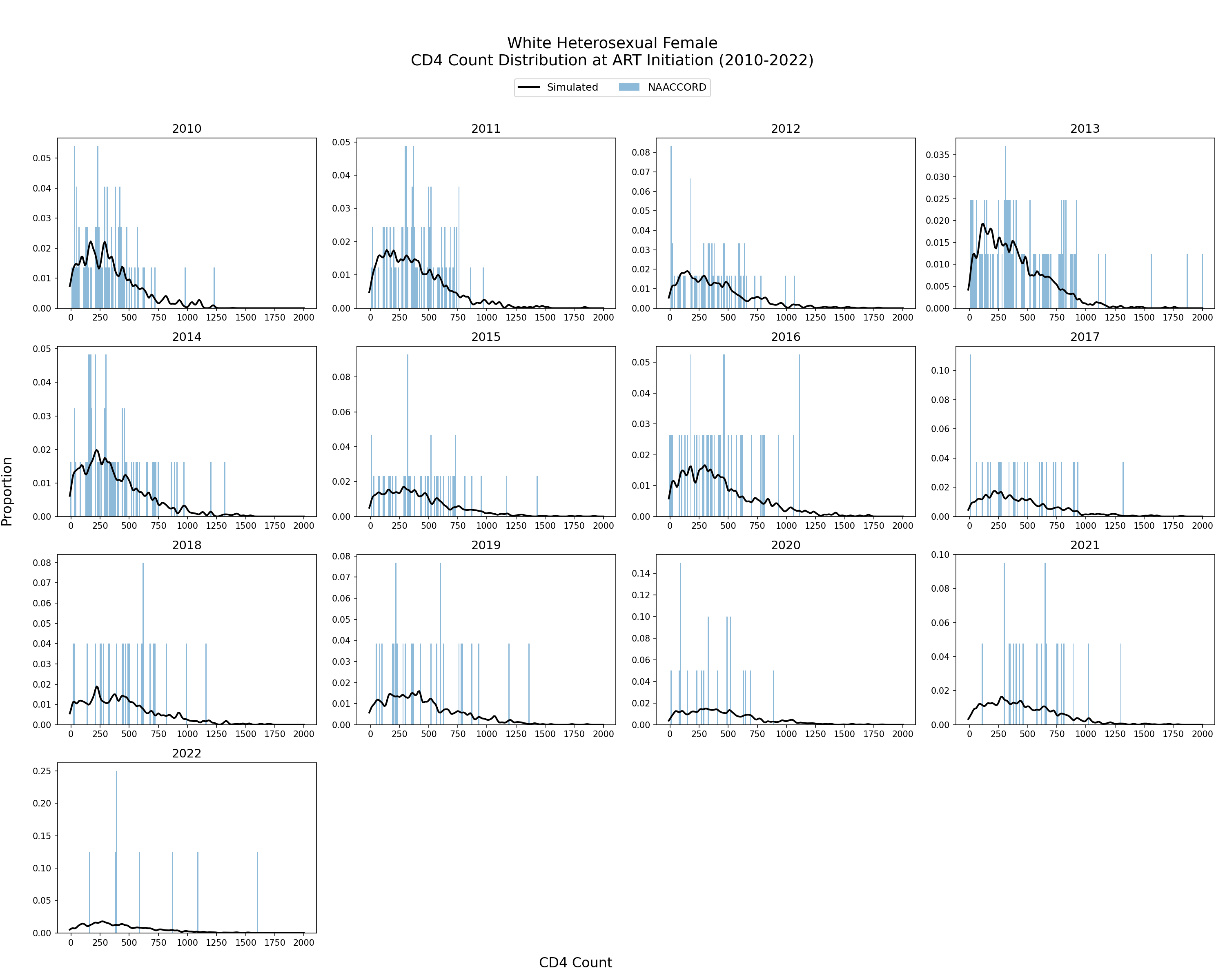
Figure 4c: HET Hispanic Female
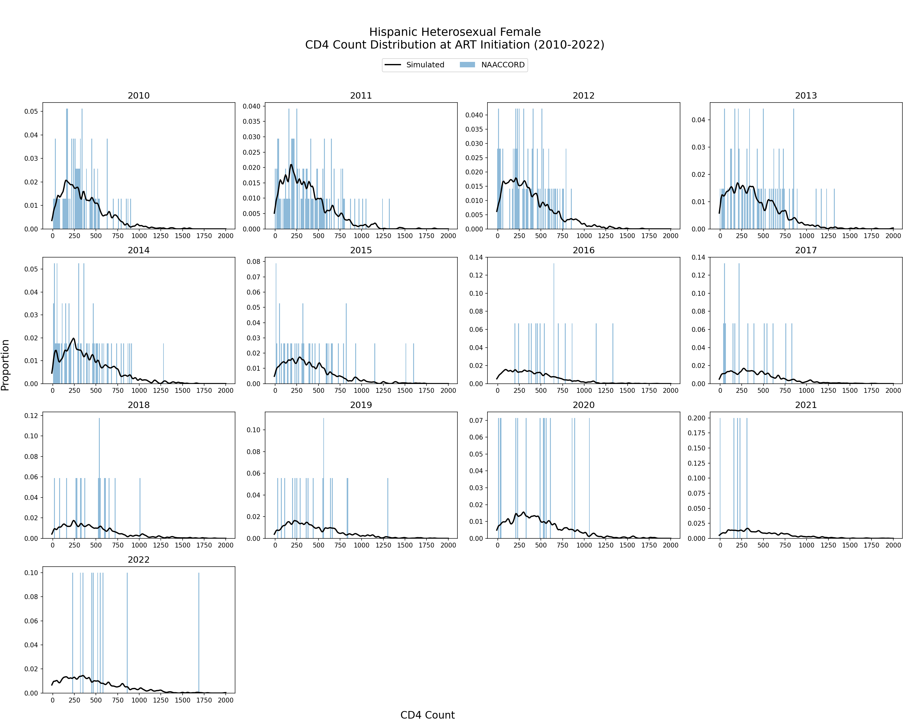
Figure 4d: HET Black Male
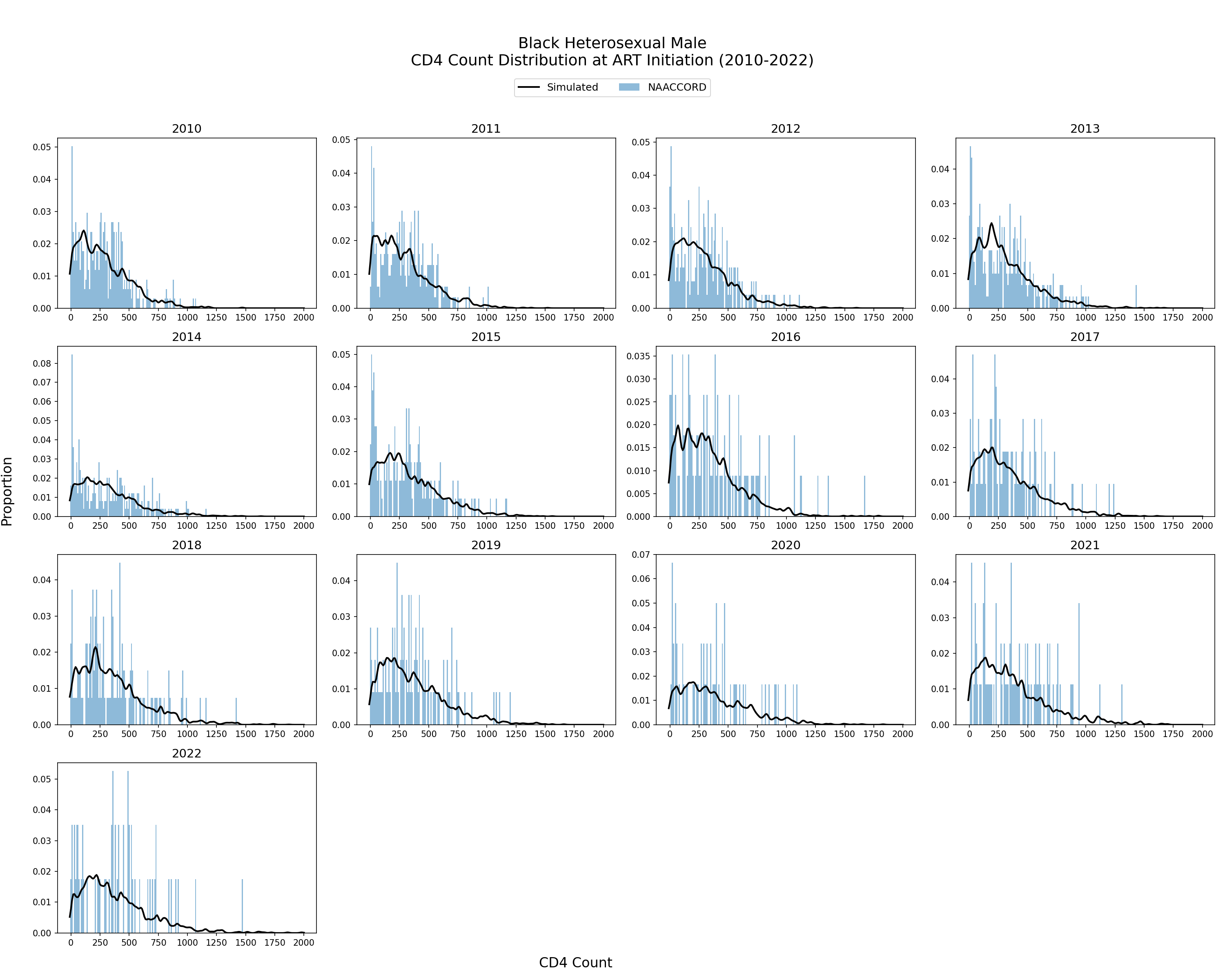
Figure 4e: HET White Male
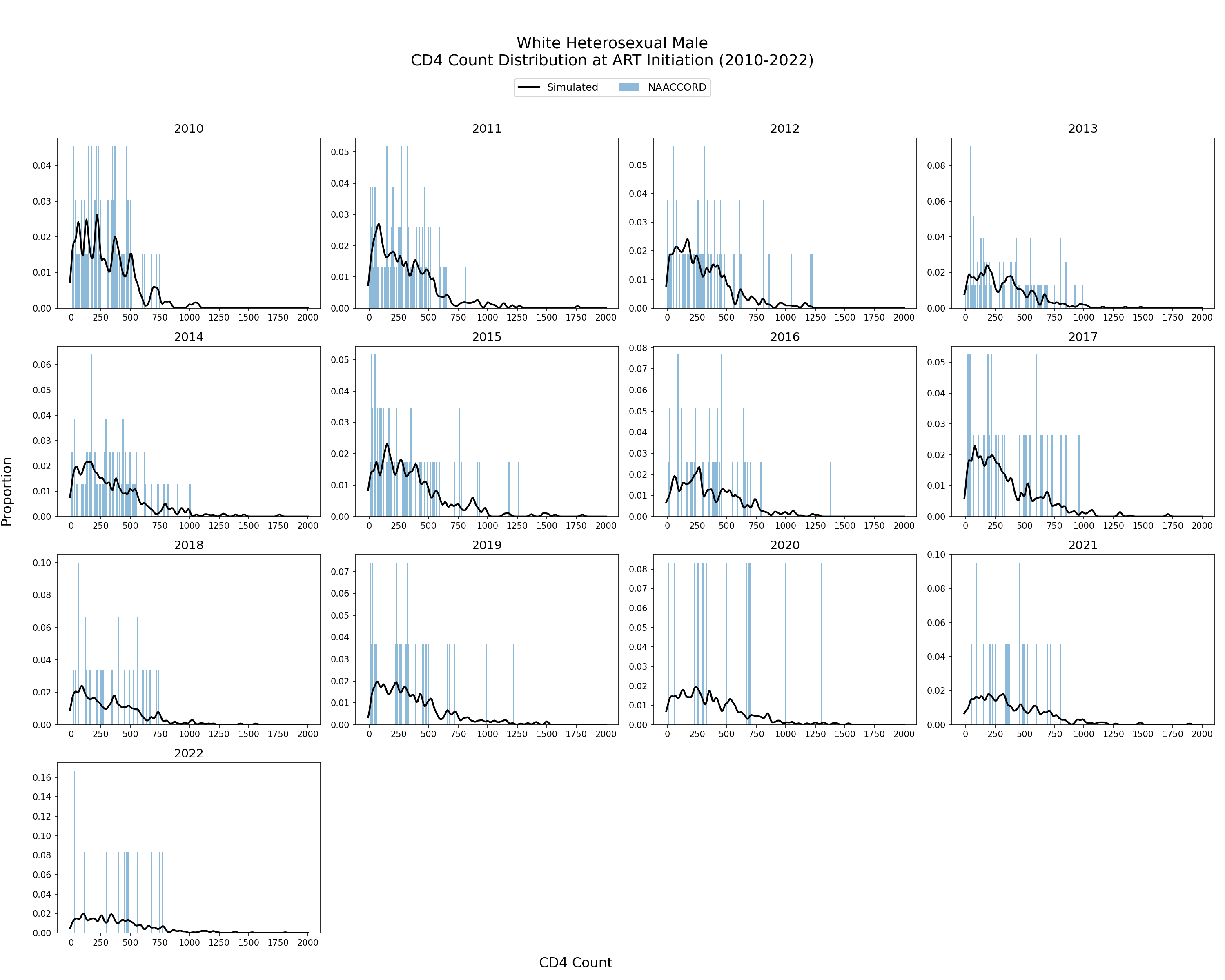
Figure 4f: HET Hispanic Male
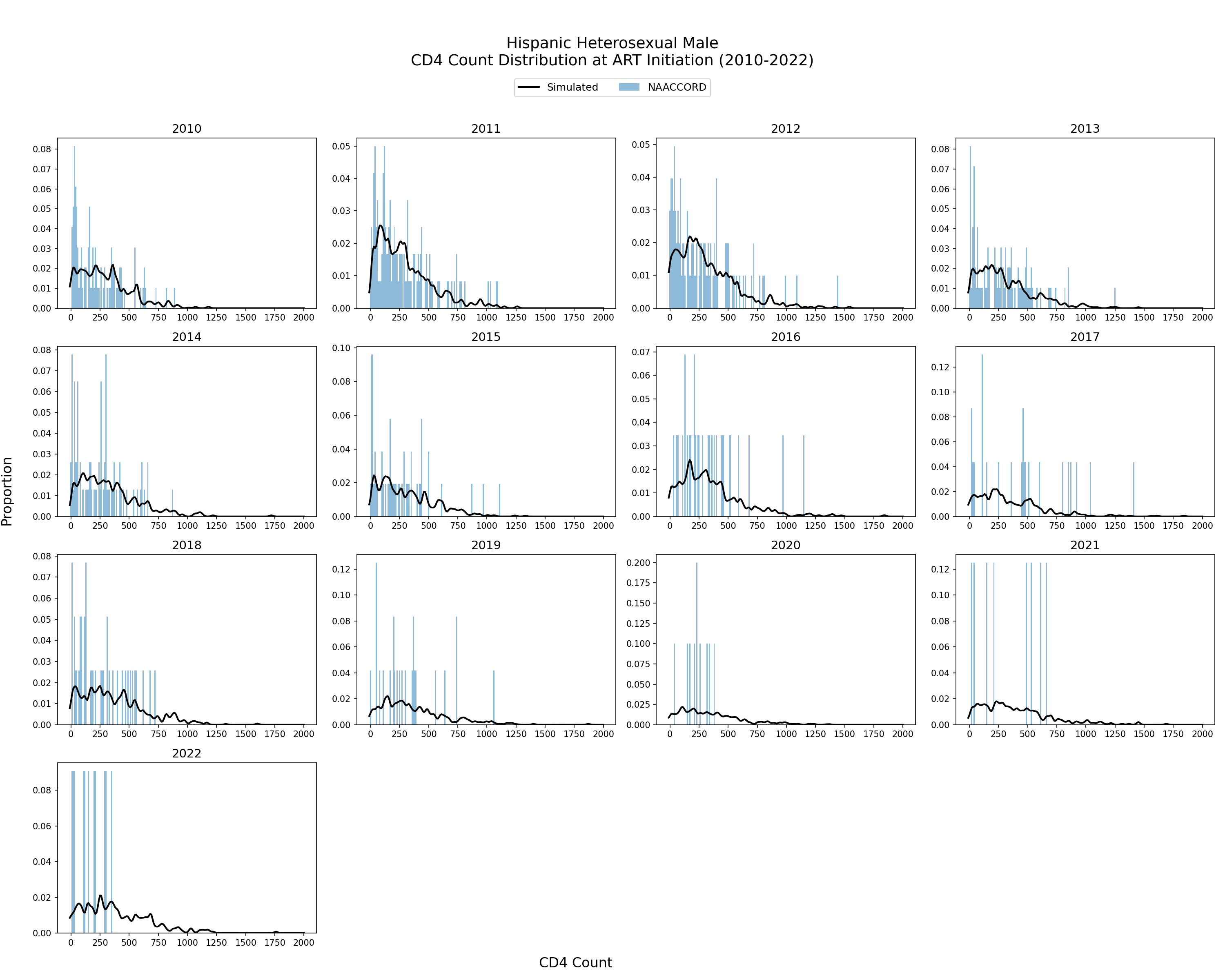
Figure 4g: IDU Black Female
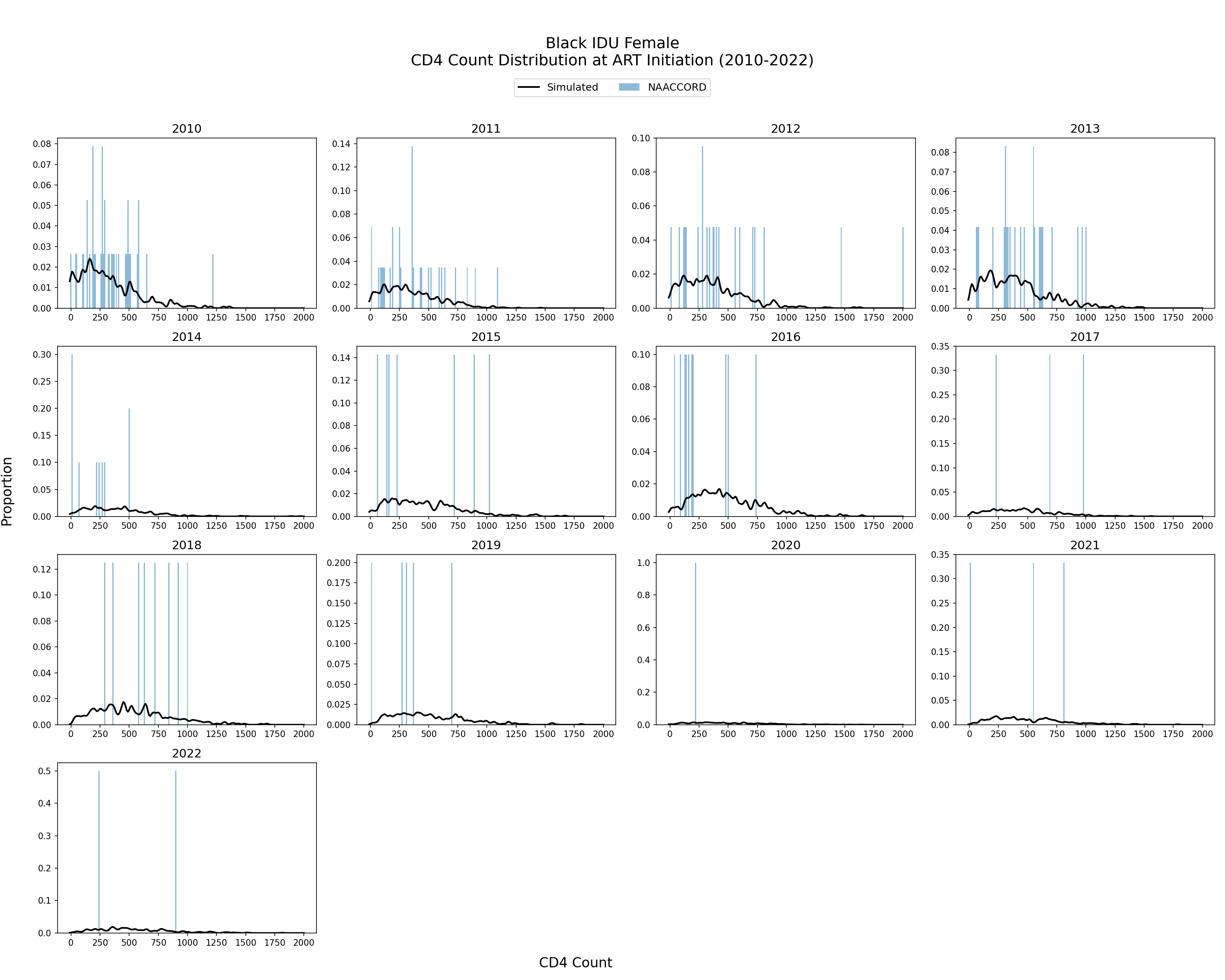
Figure 4h: IDU White Female
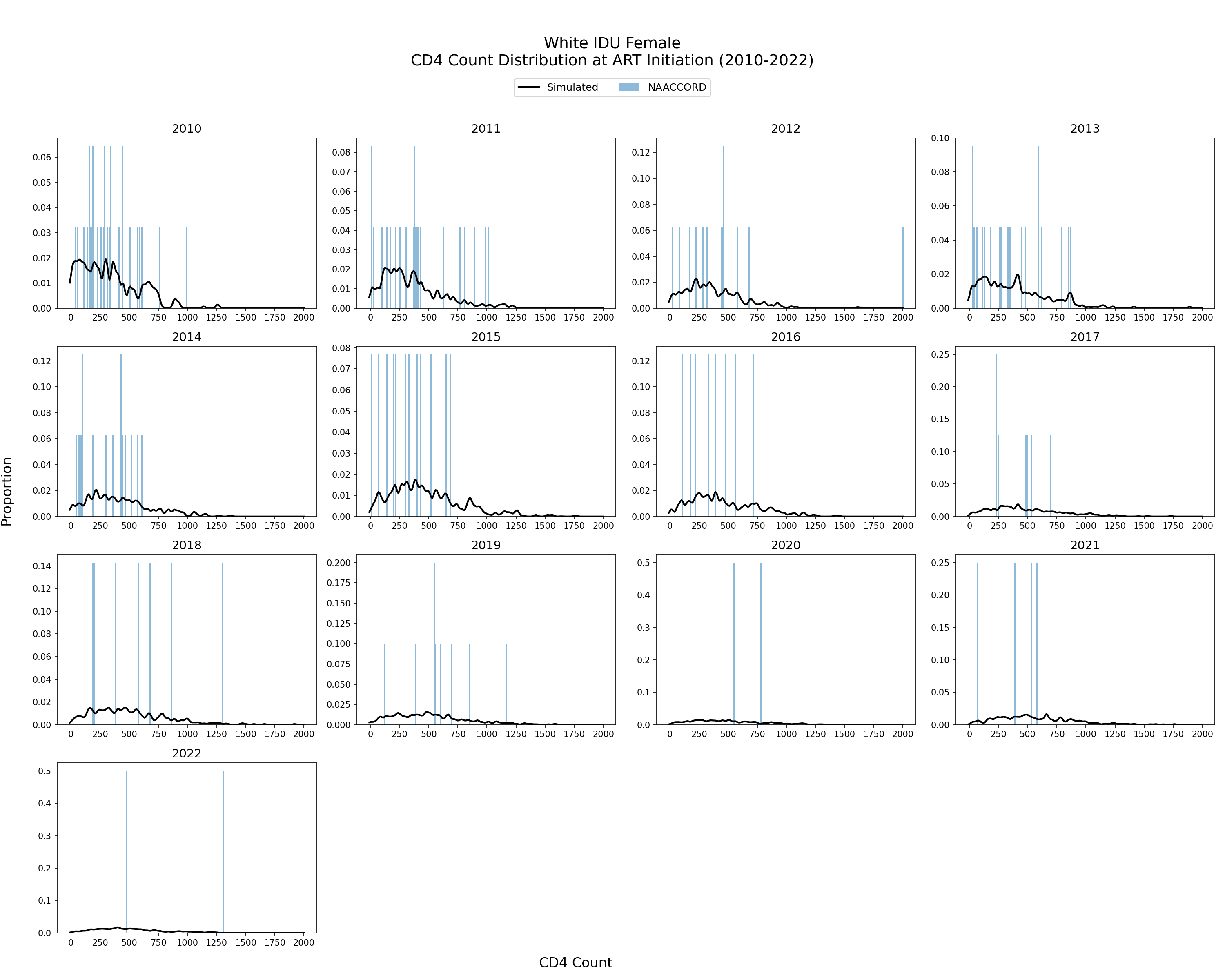
Figure 4i: IDU Hispanic Female
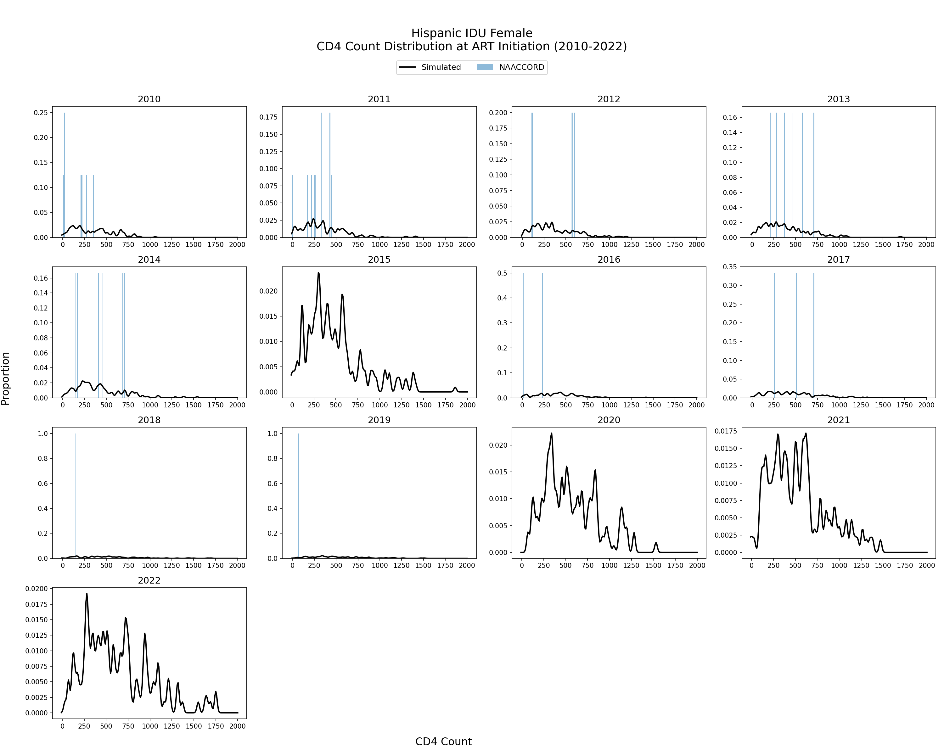
Figure 4j: IDU Black Male
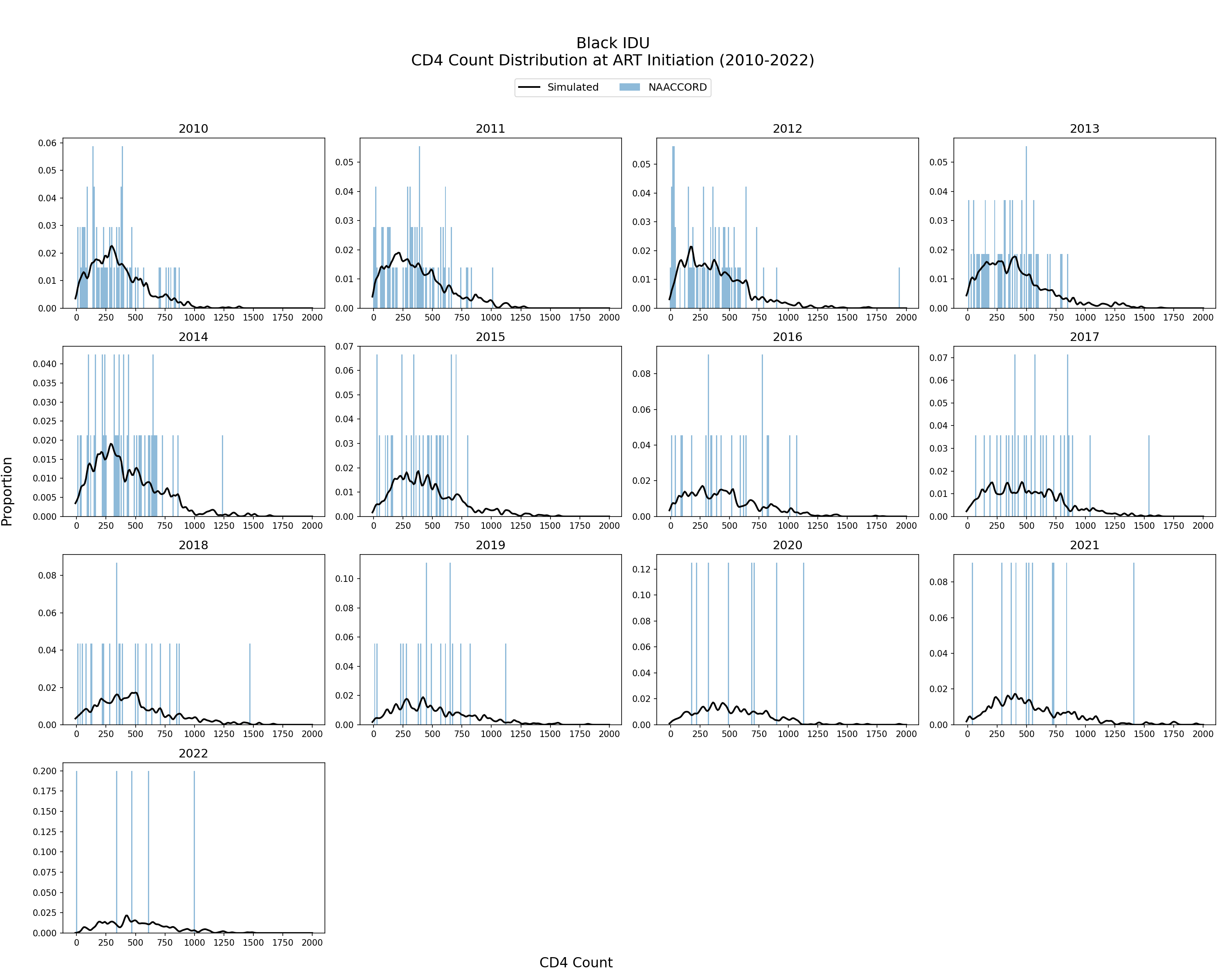
Figure 4k: IDU White Male
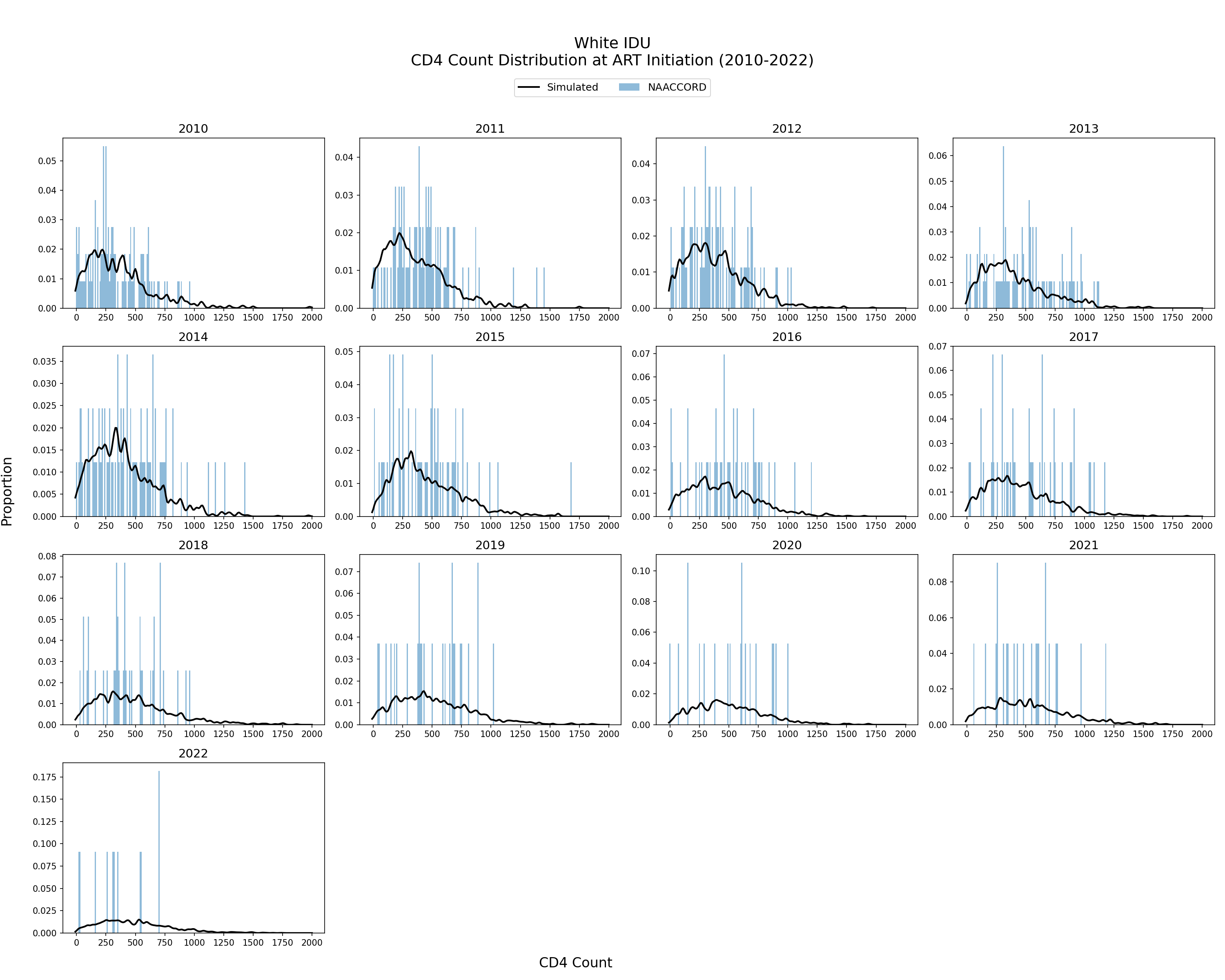
Figure 4l: IDU Hispanic Male
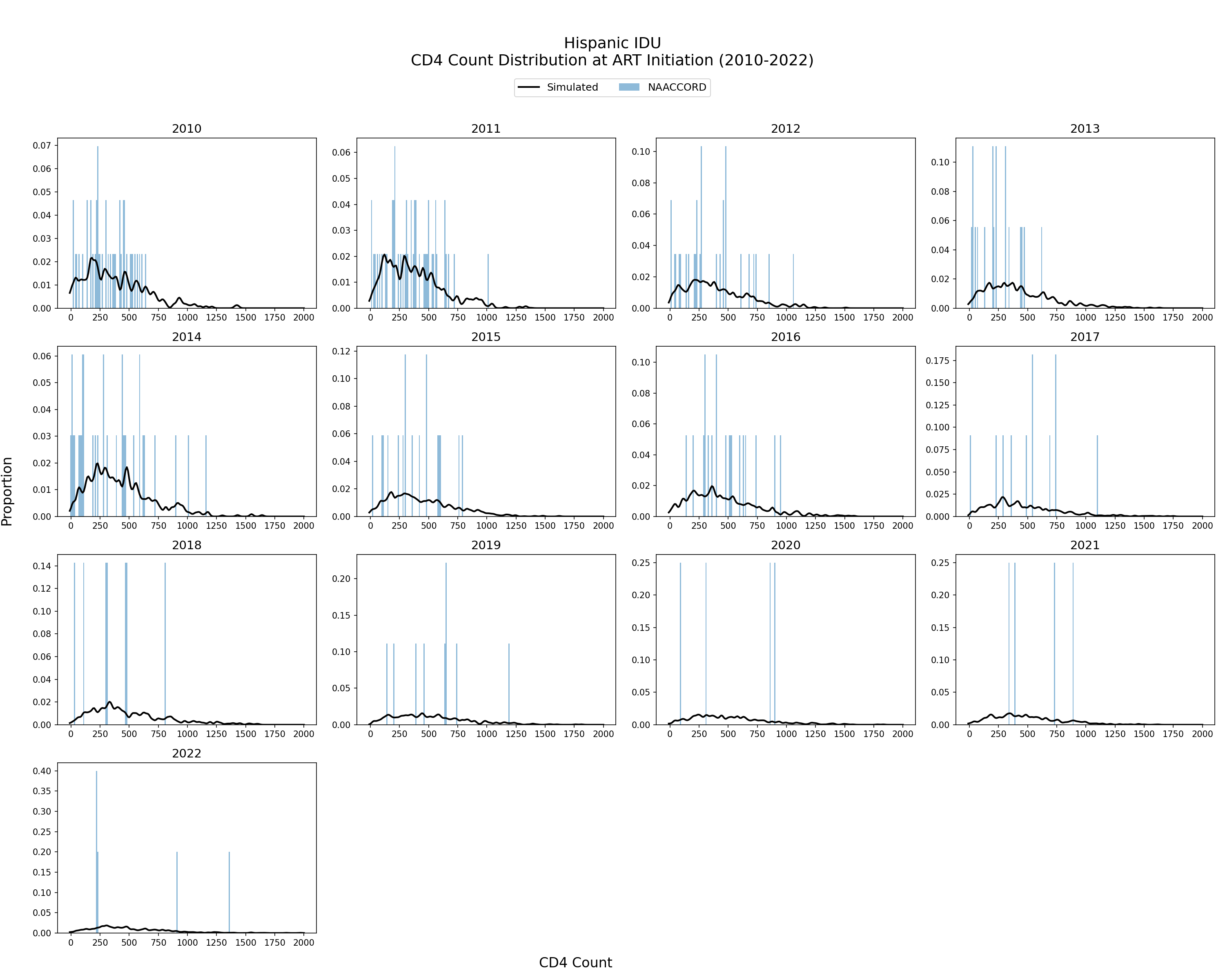
Figure 4m: Black MSM
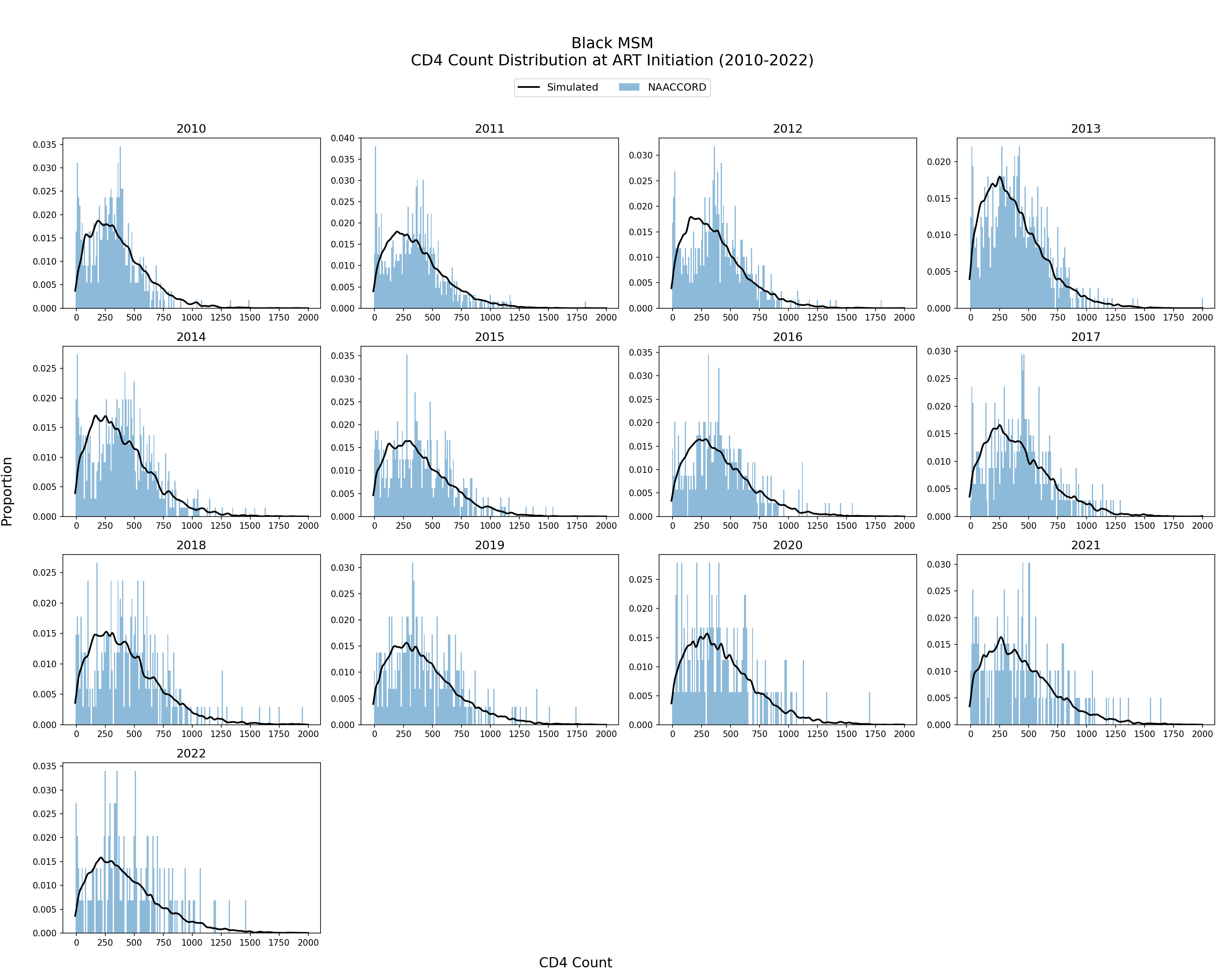
Figure 4n: White MSM
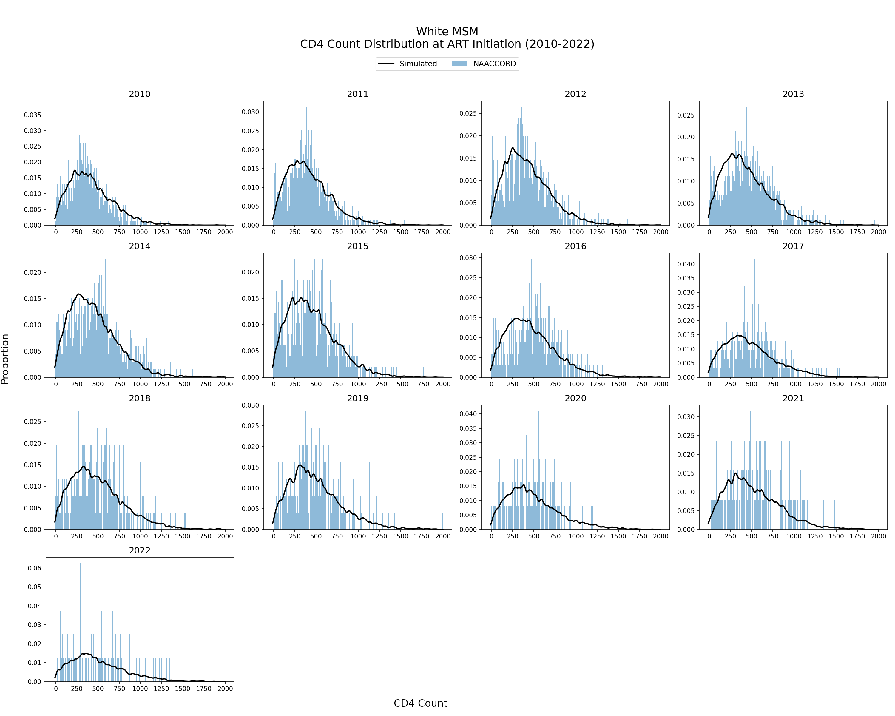
Figure 4o: Hispanic MSM
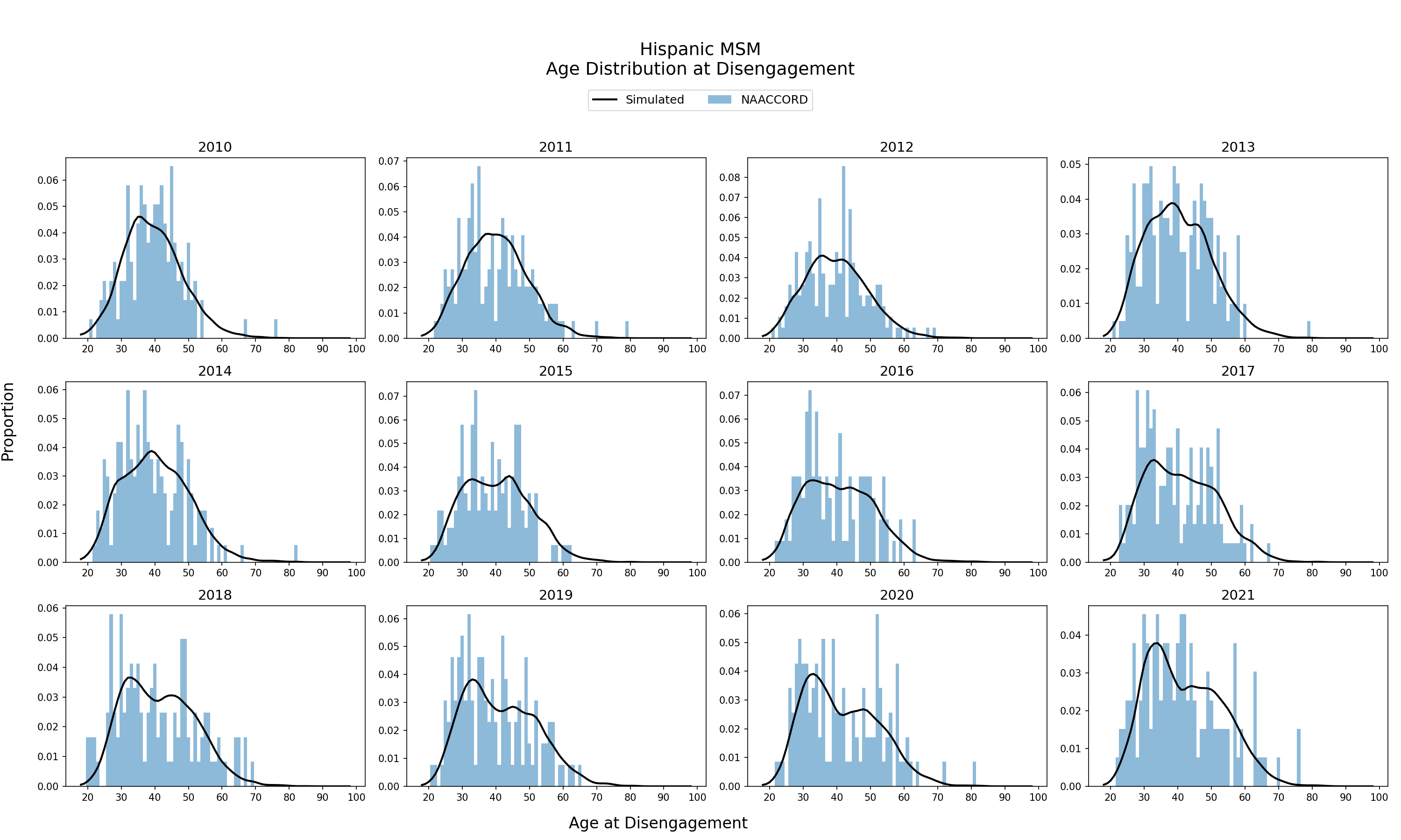
Population Disengaging from Care
Age Distribution of ART Users Disengaging from ART
The age distribution of the simulated population disengaging from ART from 2010 - 2021 is shown. The black line represents the simulated age distribution against NA-ACCORD data (blue bars). Age at disengagement from ART is an emergent property of the model.
Figure 5a: HET Black Female
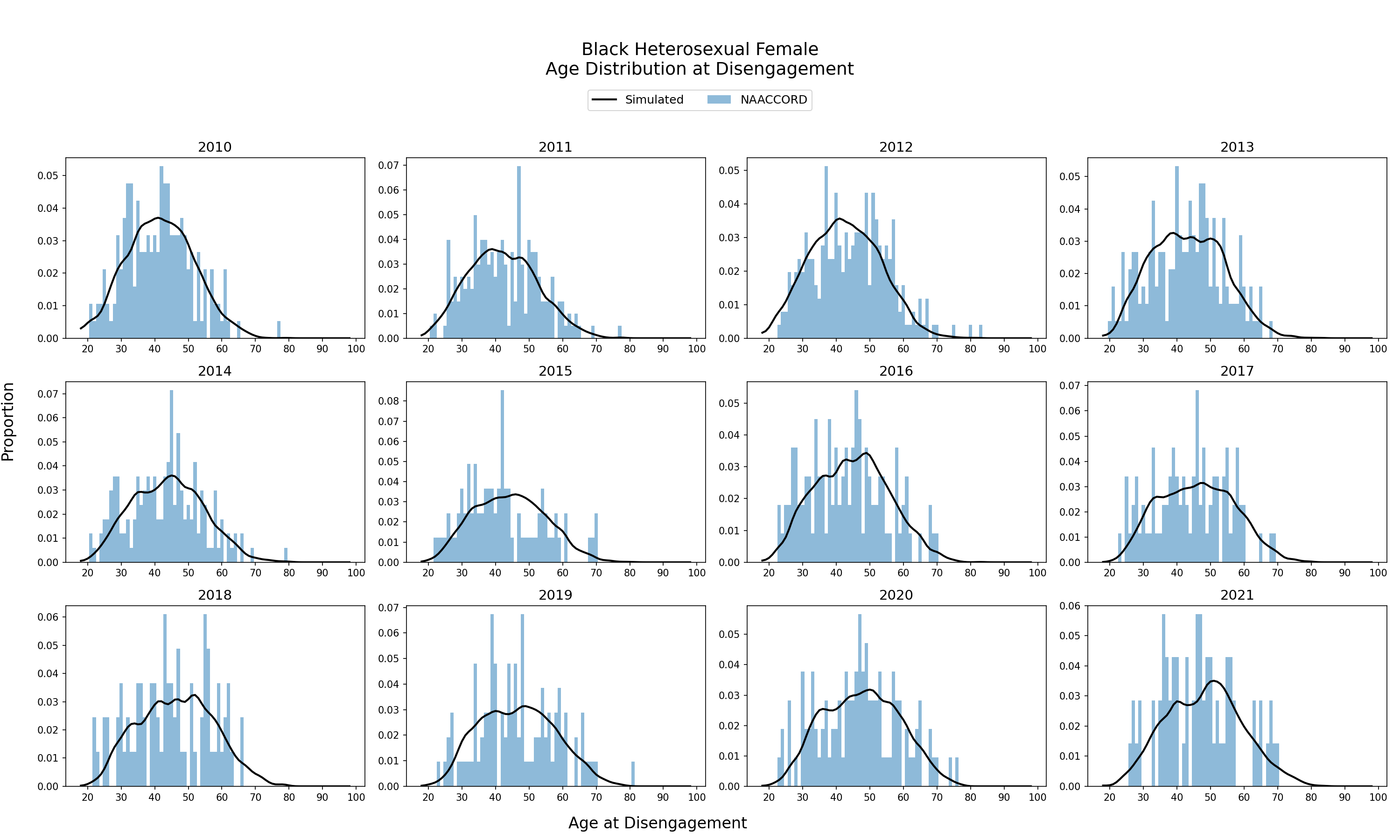
Figure 5b: HET White Female
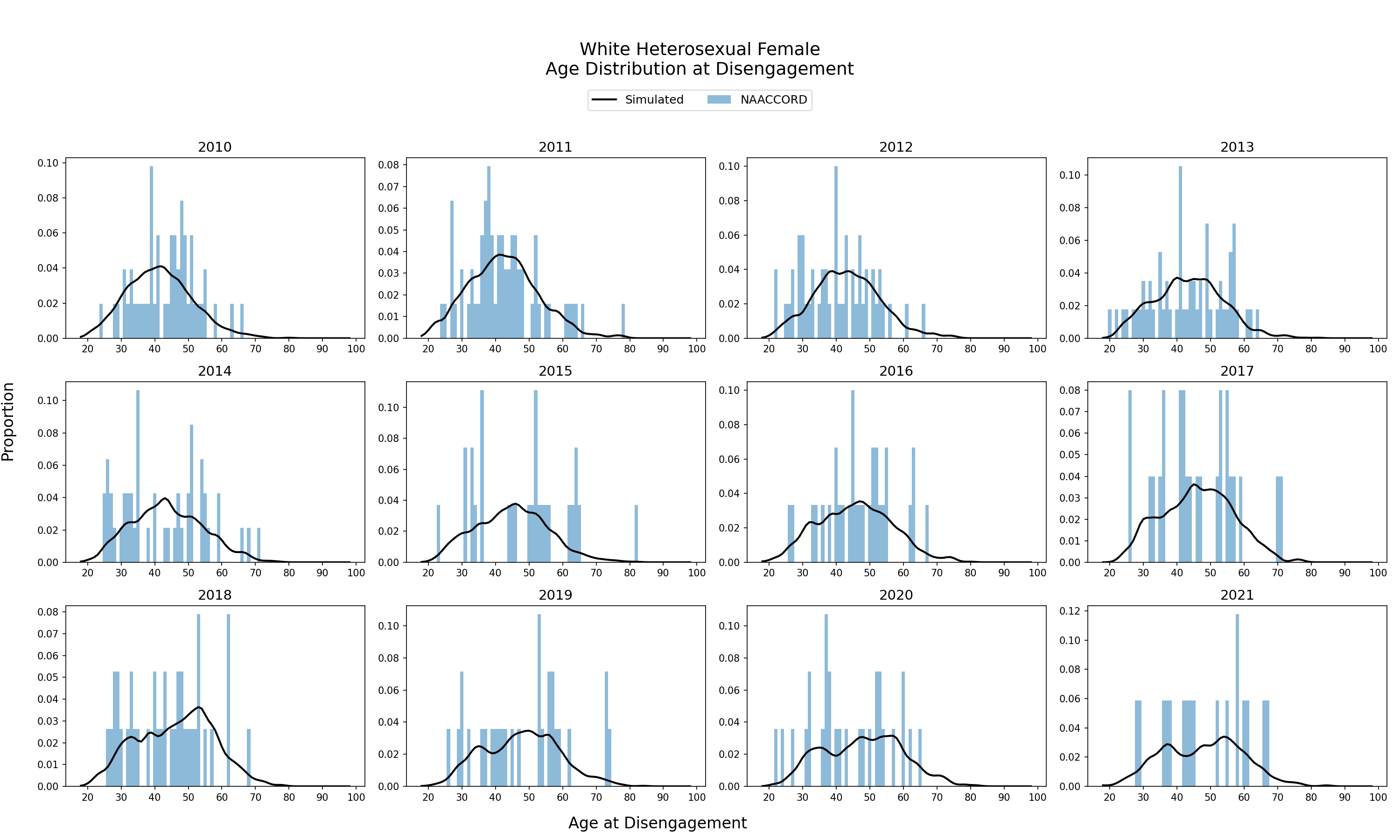
Figure 5c: HET Hispanic Female
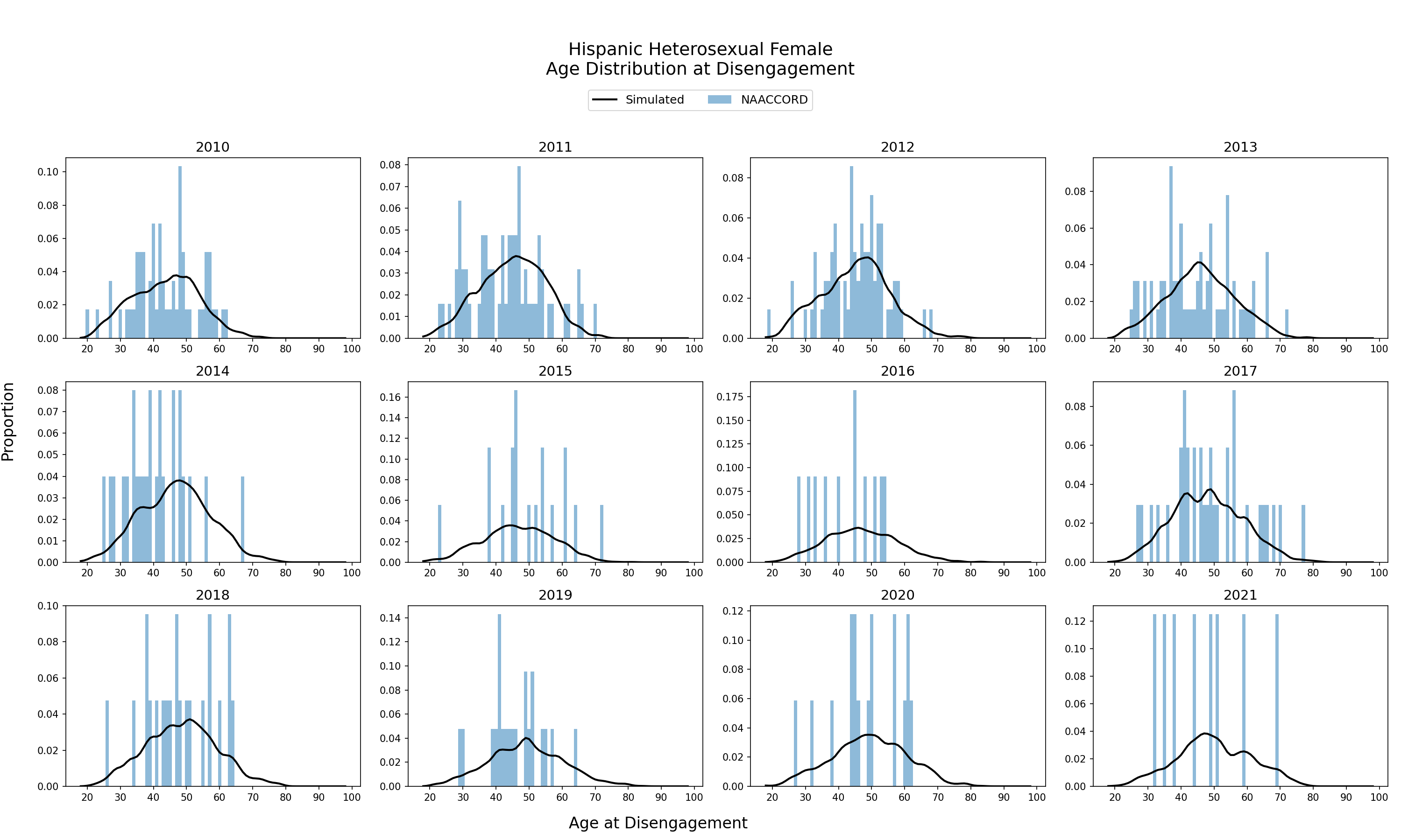
Figure 5d: HET Black Male
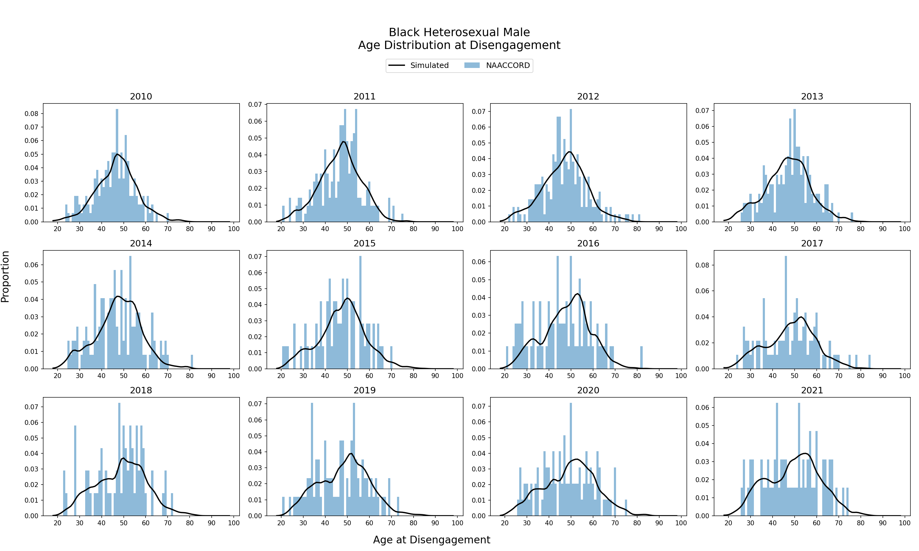
Figure 5e: HET White Male
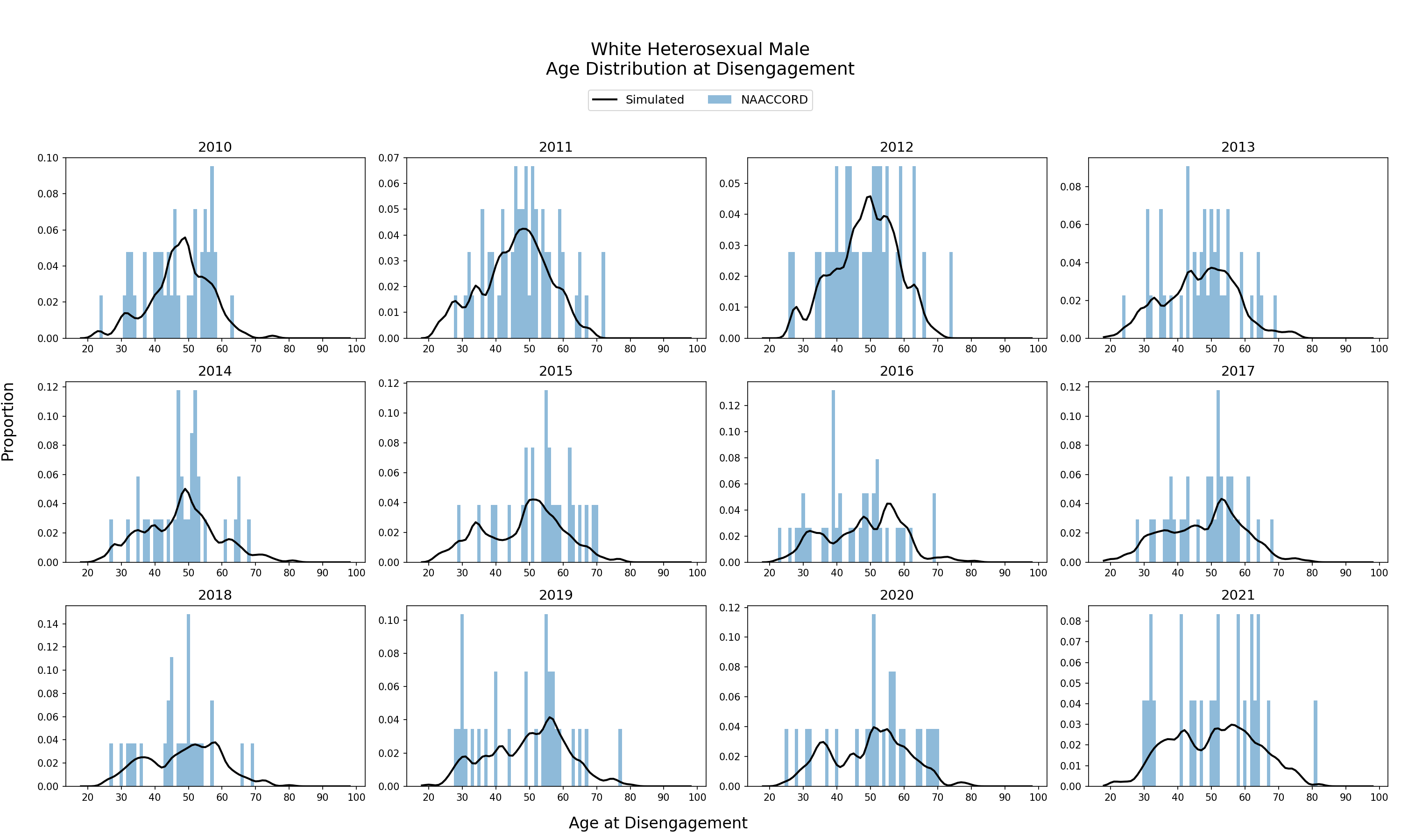
Figure 5f: HET Hispanic Male
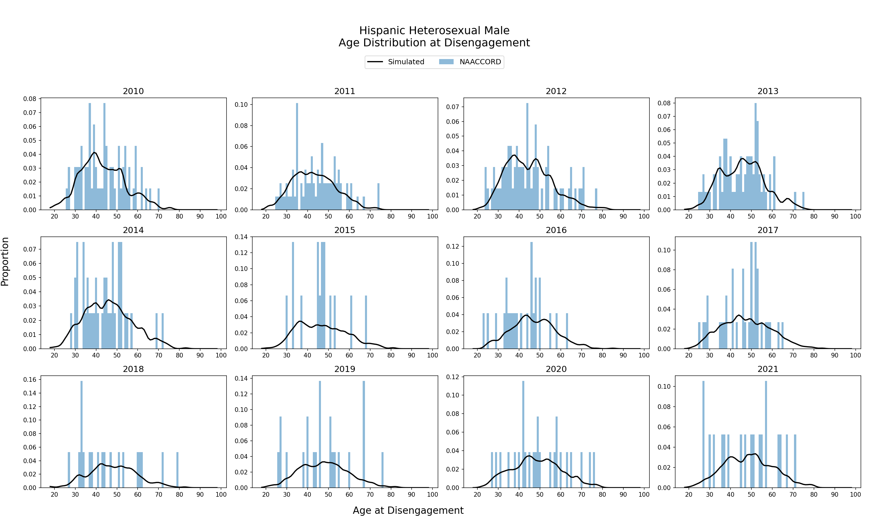
Figure 5g: IDU Black Female
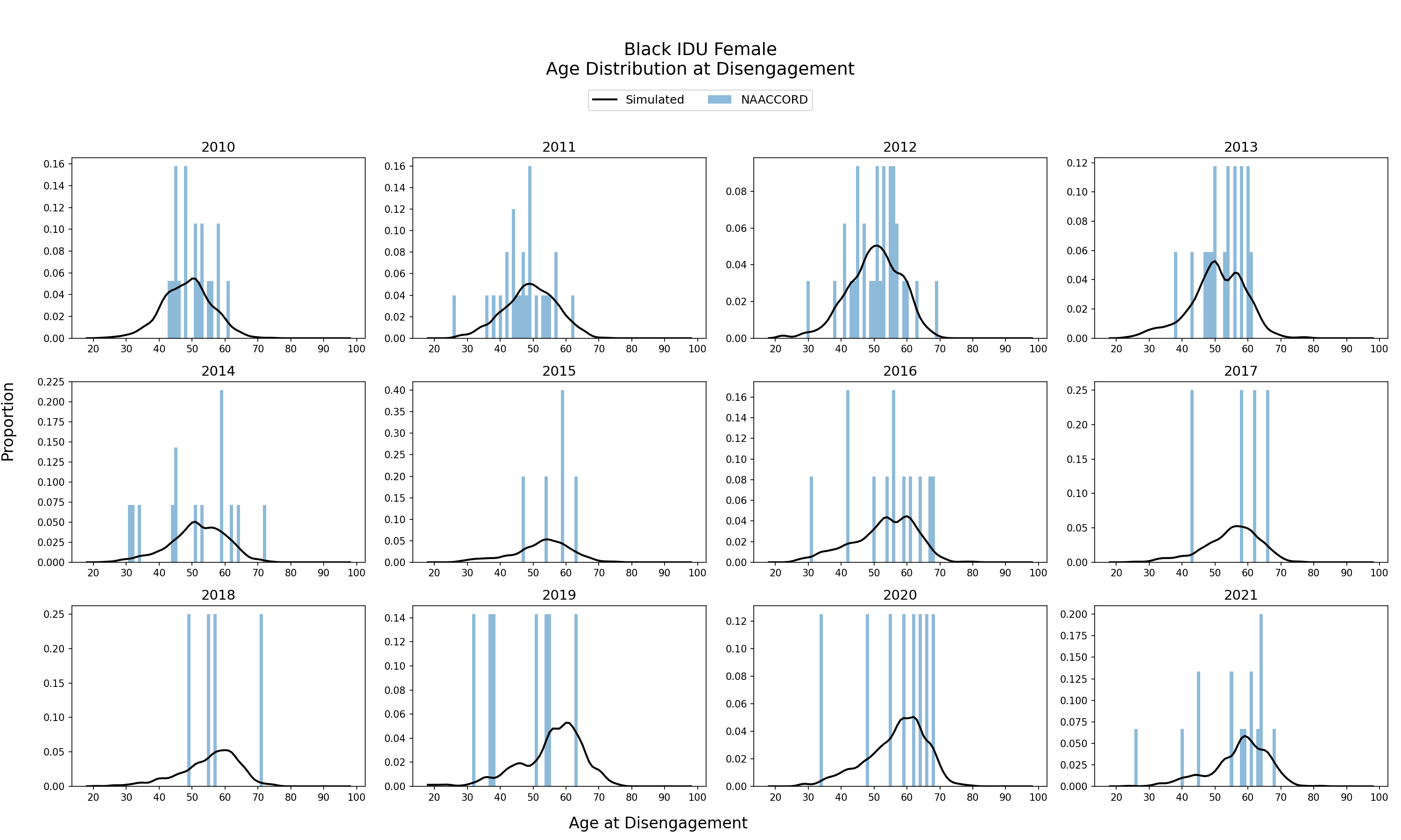
Figure 5h: IDU White Female
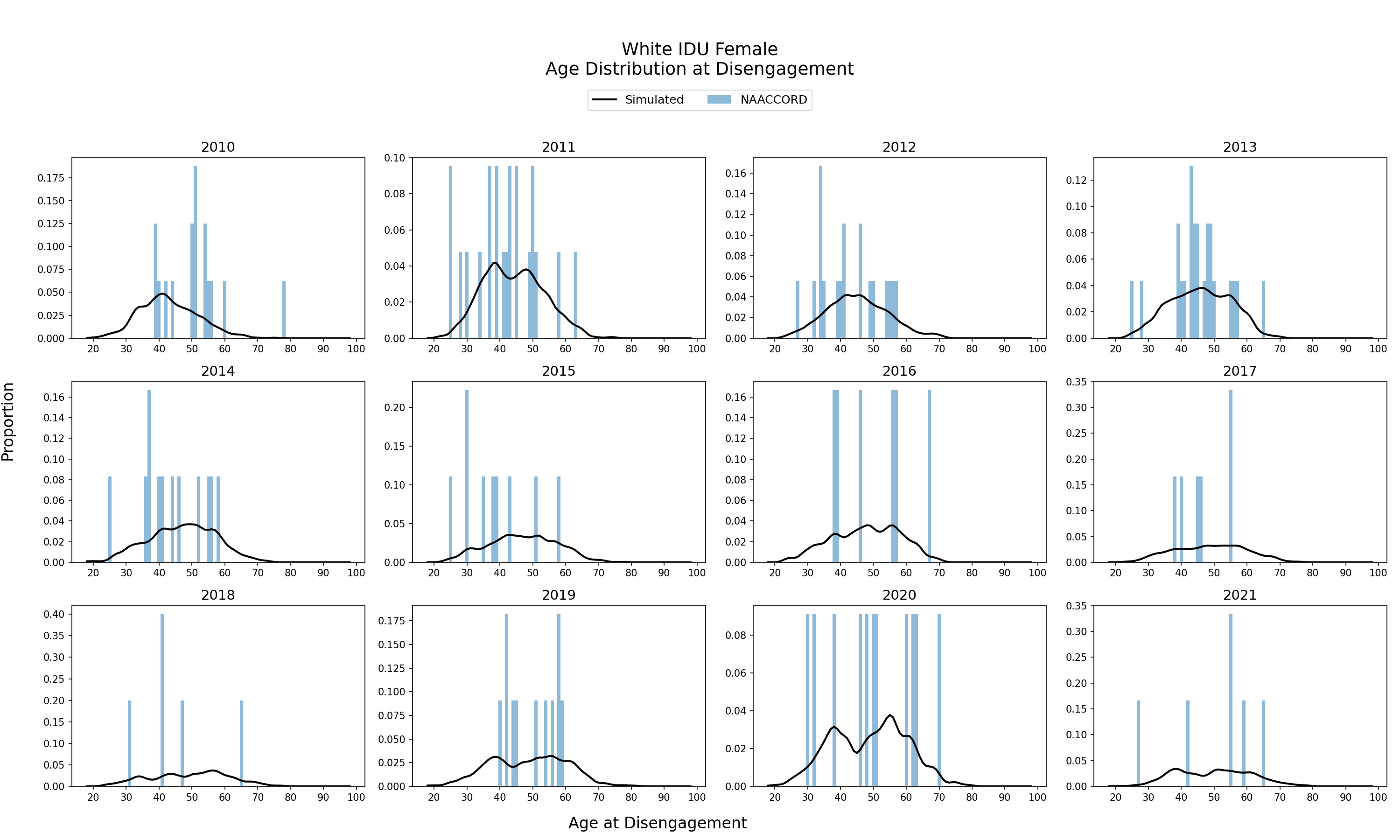
Figure 5i: IDU Hispanic Female
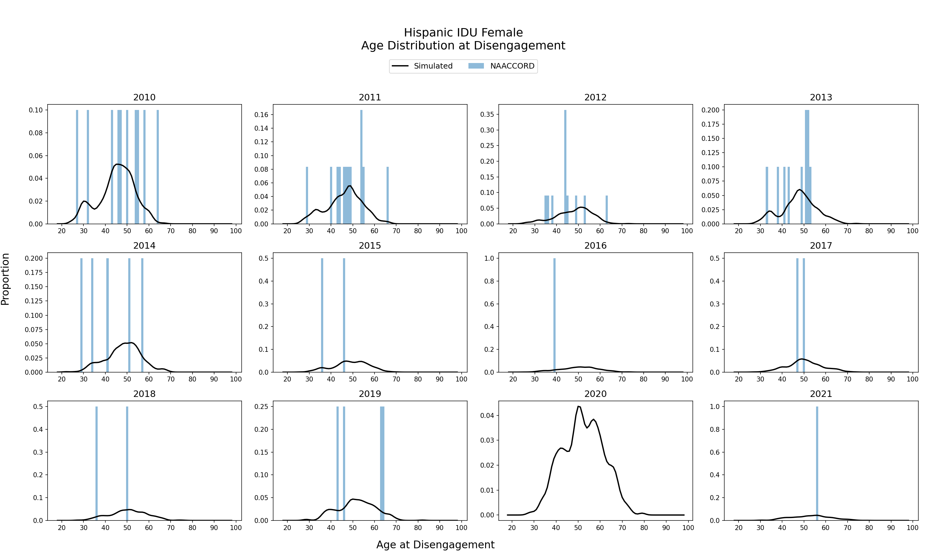
Figure 5j: IDU Black Male
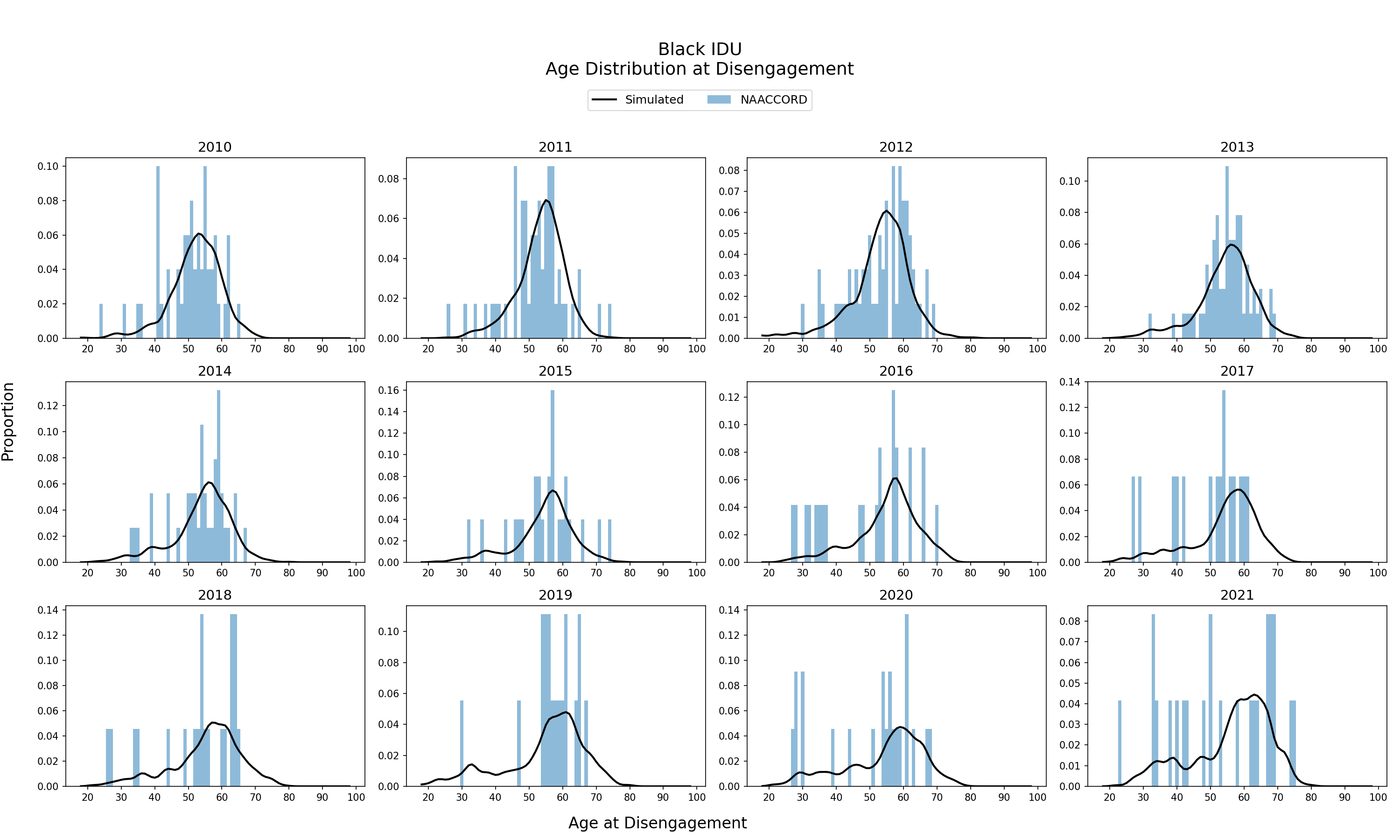
Figure 5k: IDU White Male
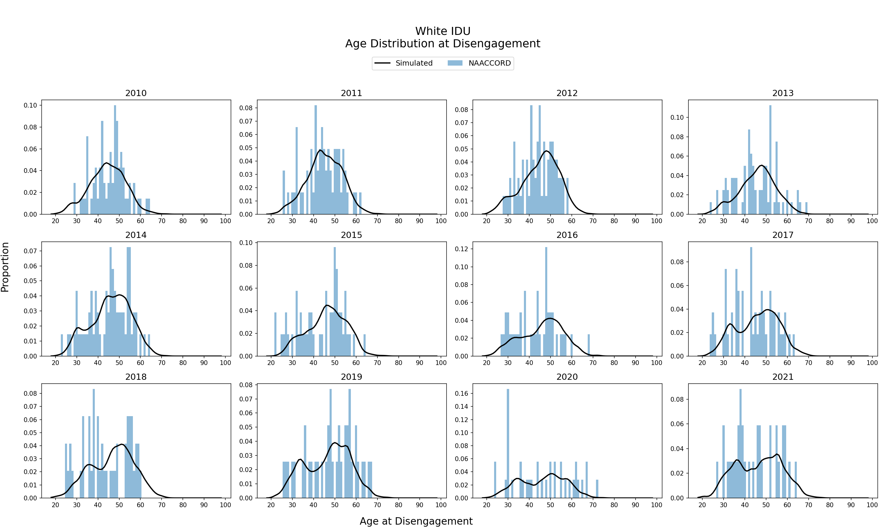
Figure 5l: IDU Hispanic Male
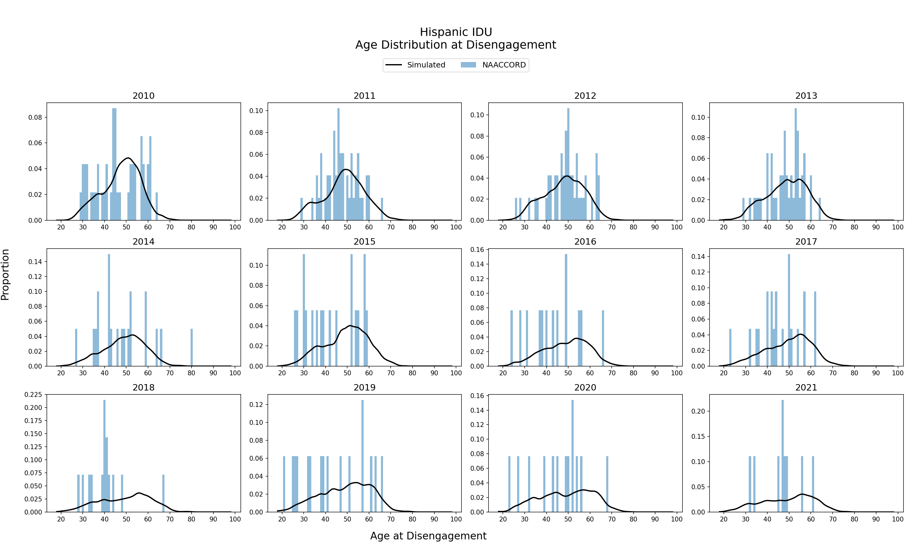
Figure 5m: Black MSM
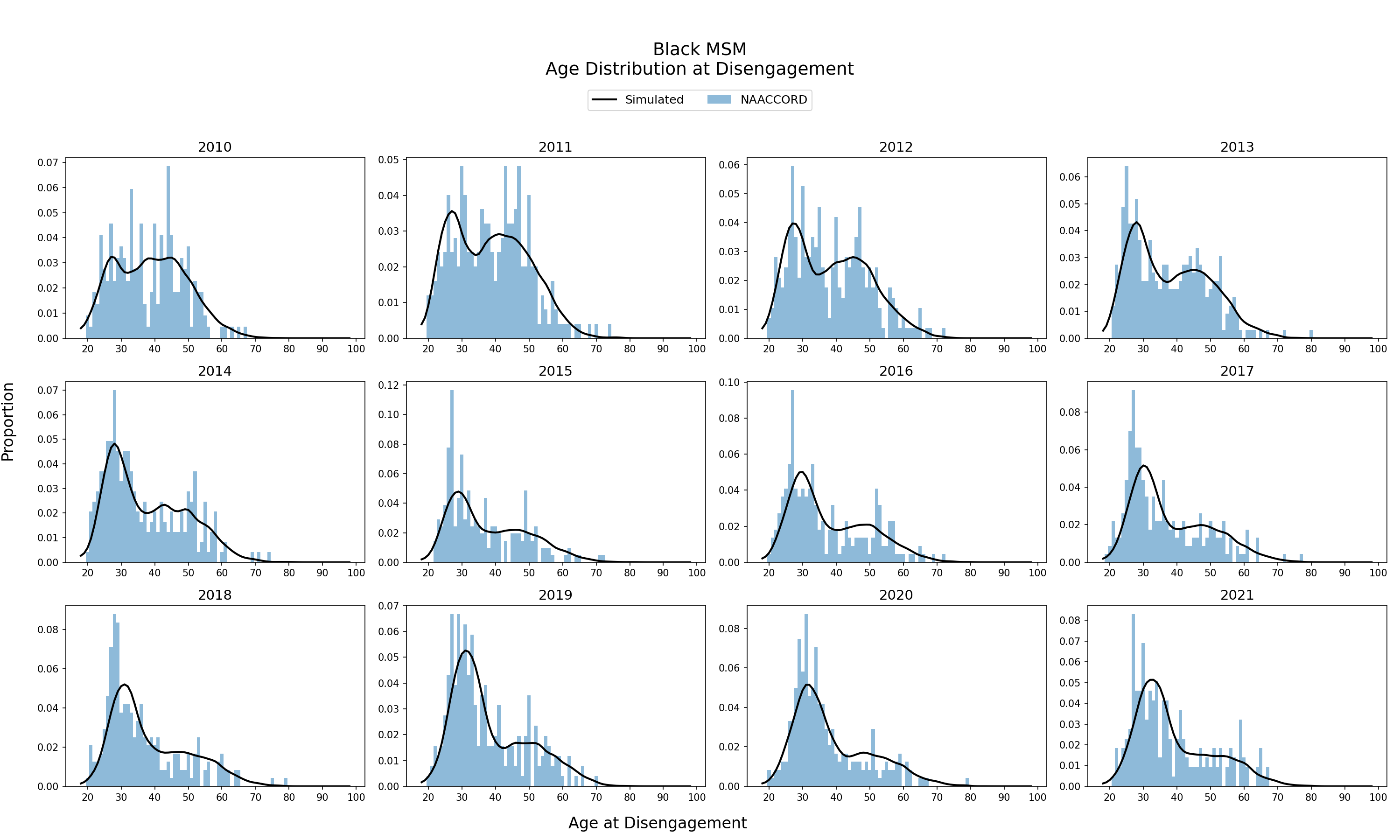
Figure 5n: White MSM
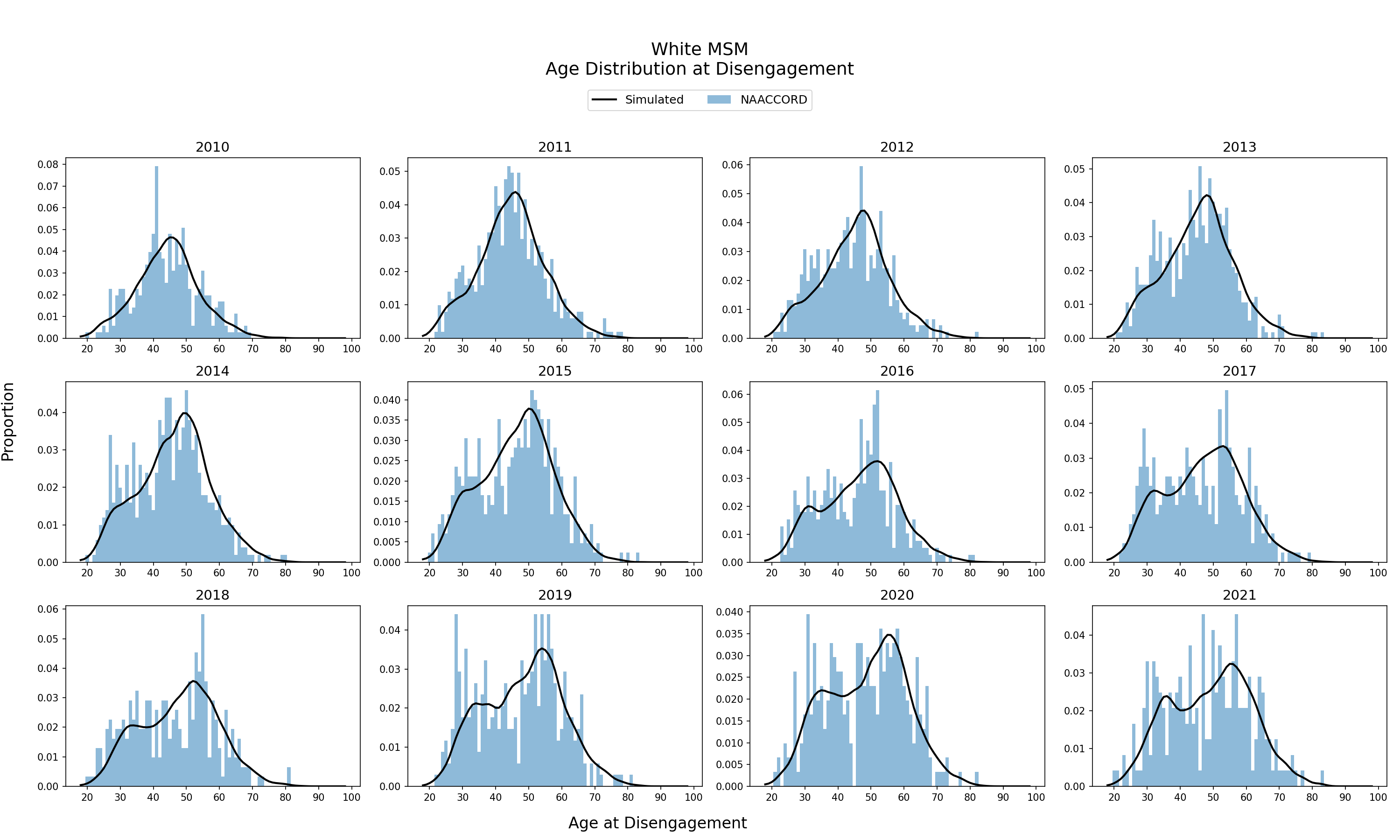
Figure 5o: Hispanic MSM
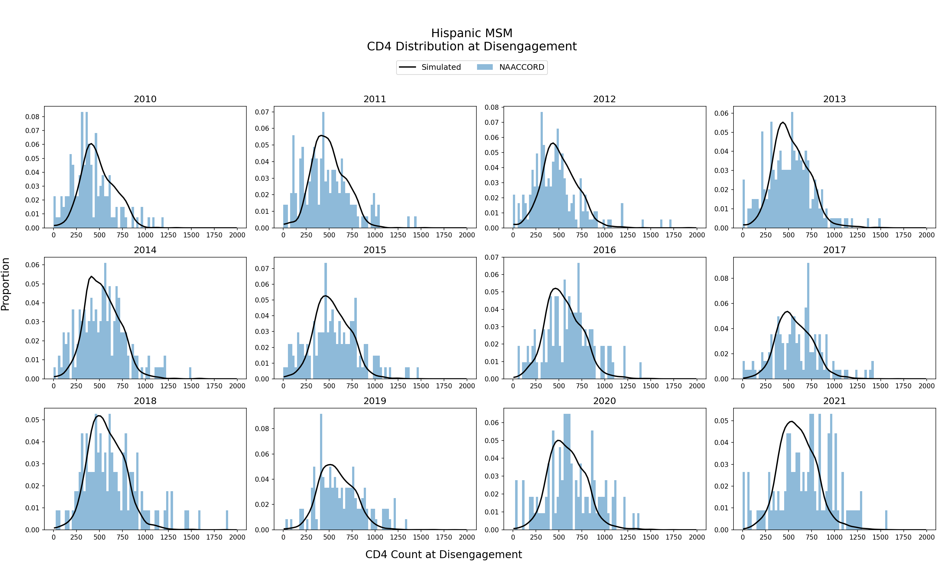
CD4 Count Distribution of ART Users Disengaging from ART
The cd4 distribution of the simulated population disengaging from ART from 2010 - 2021 is shown. The black line represents the simulated cd4 distribution against NA-ACCORD data (blue bars). cd4 at disengagement from ART is an emergent property of the model.
Figure 6a: HET Black Female
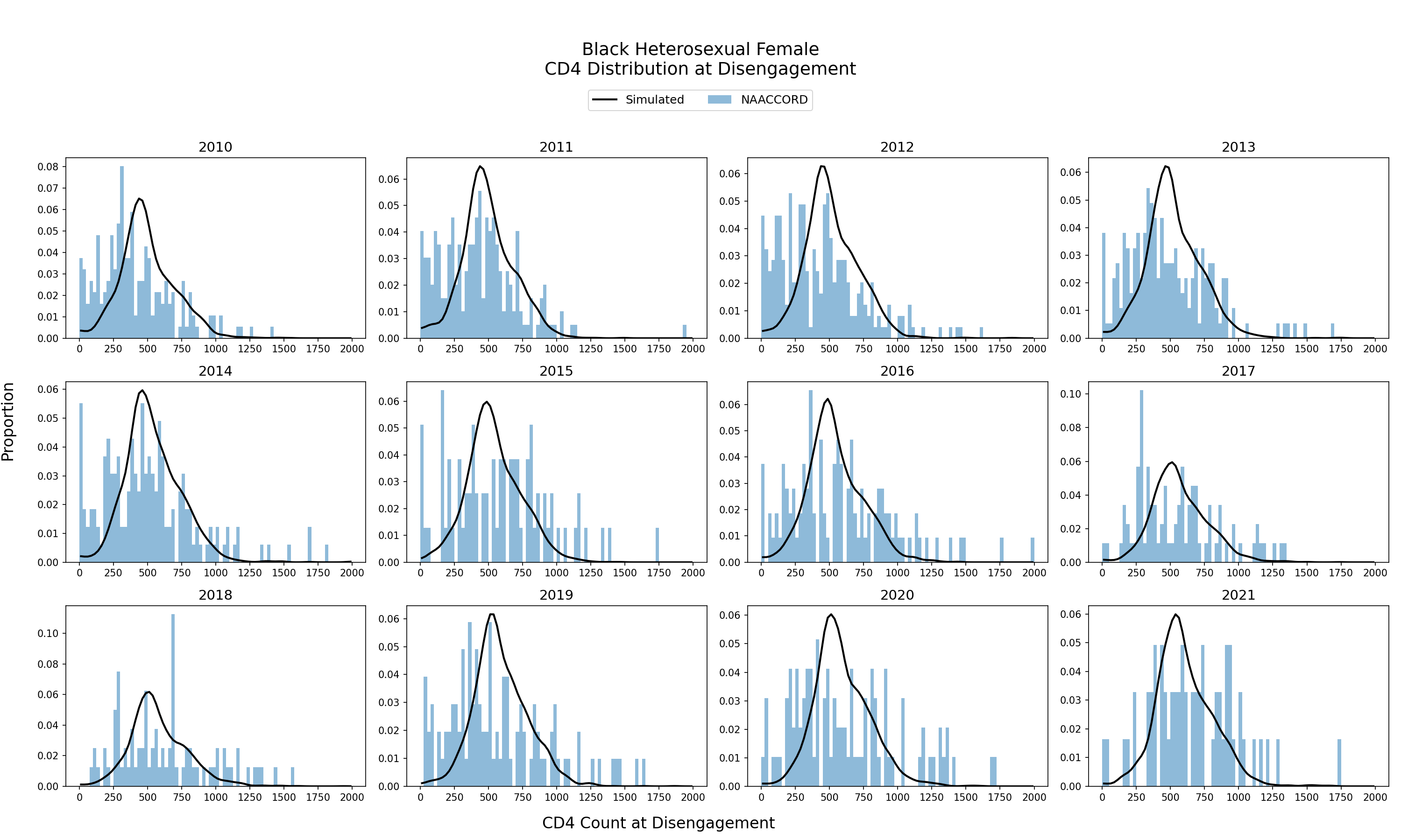
Figure 6b: HET White Female
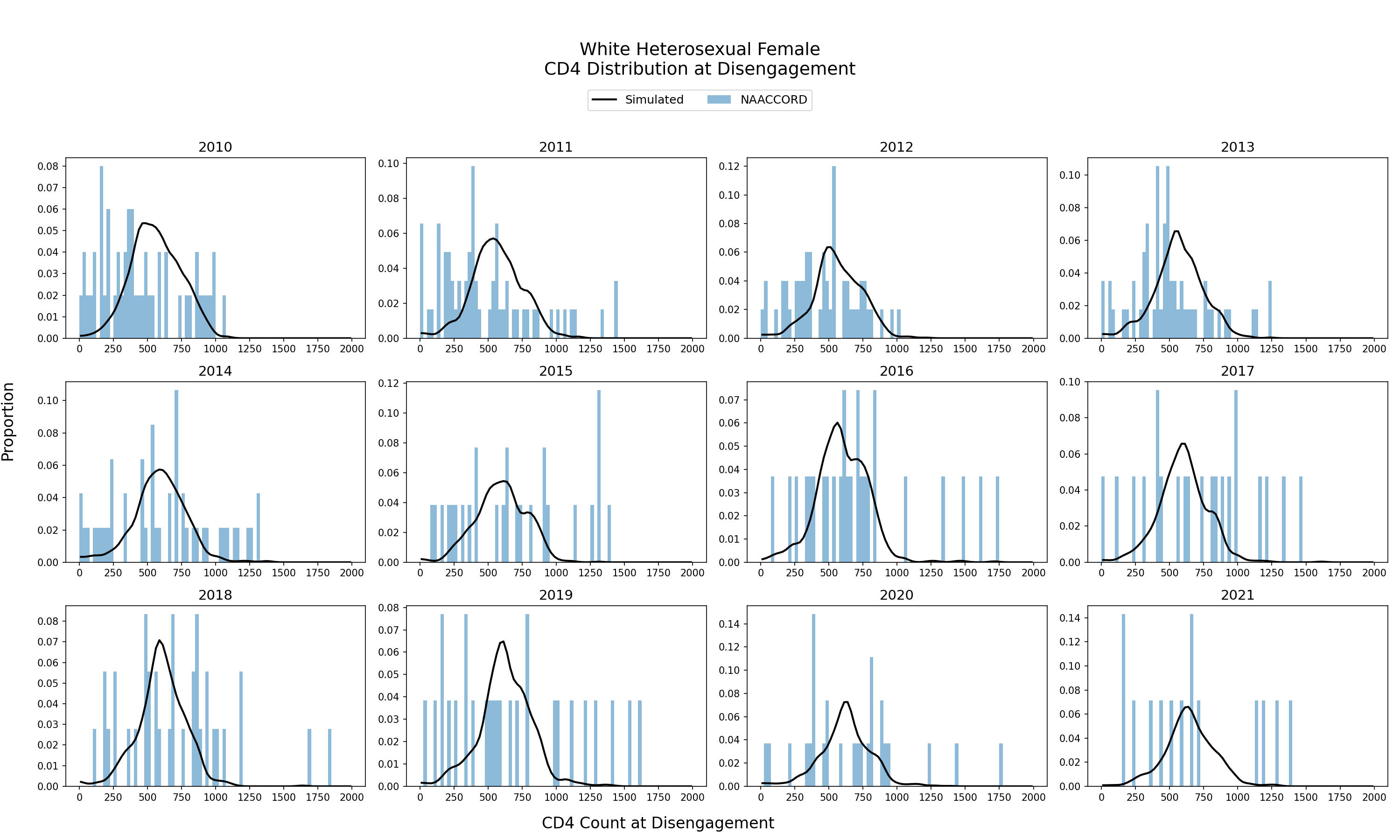
Figure 6c: HET Hispanic Female
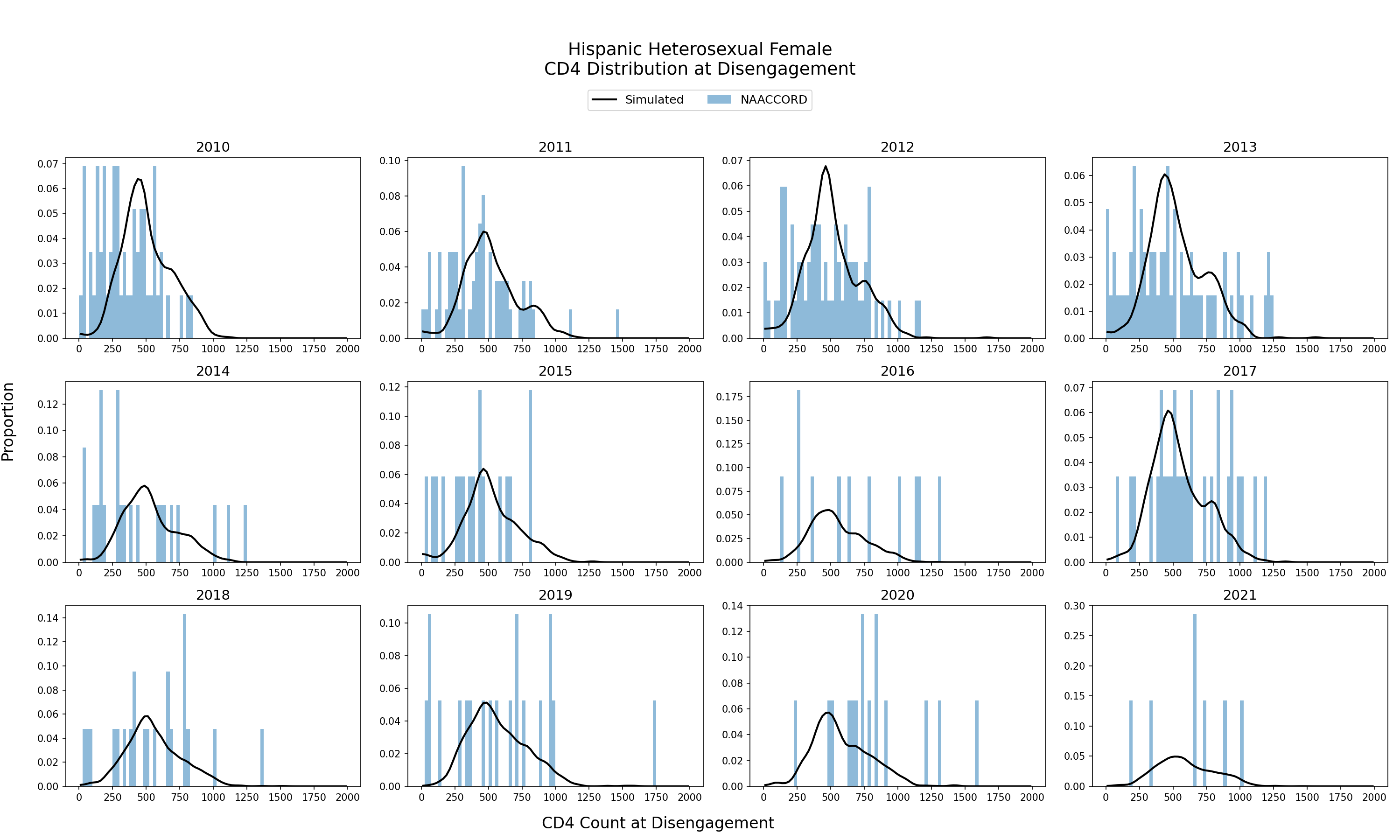
Figure 6d: HET Black Male
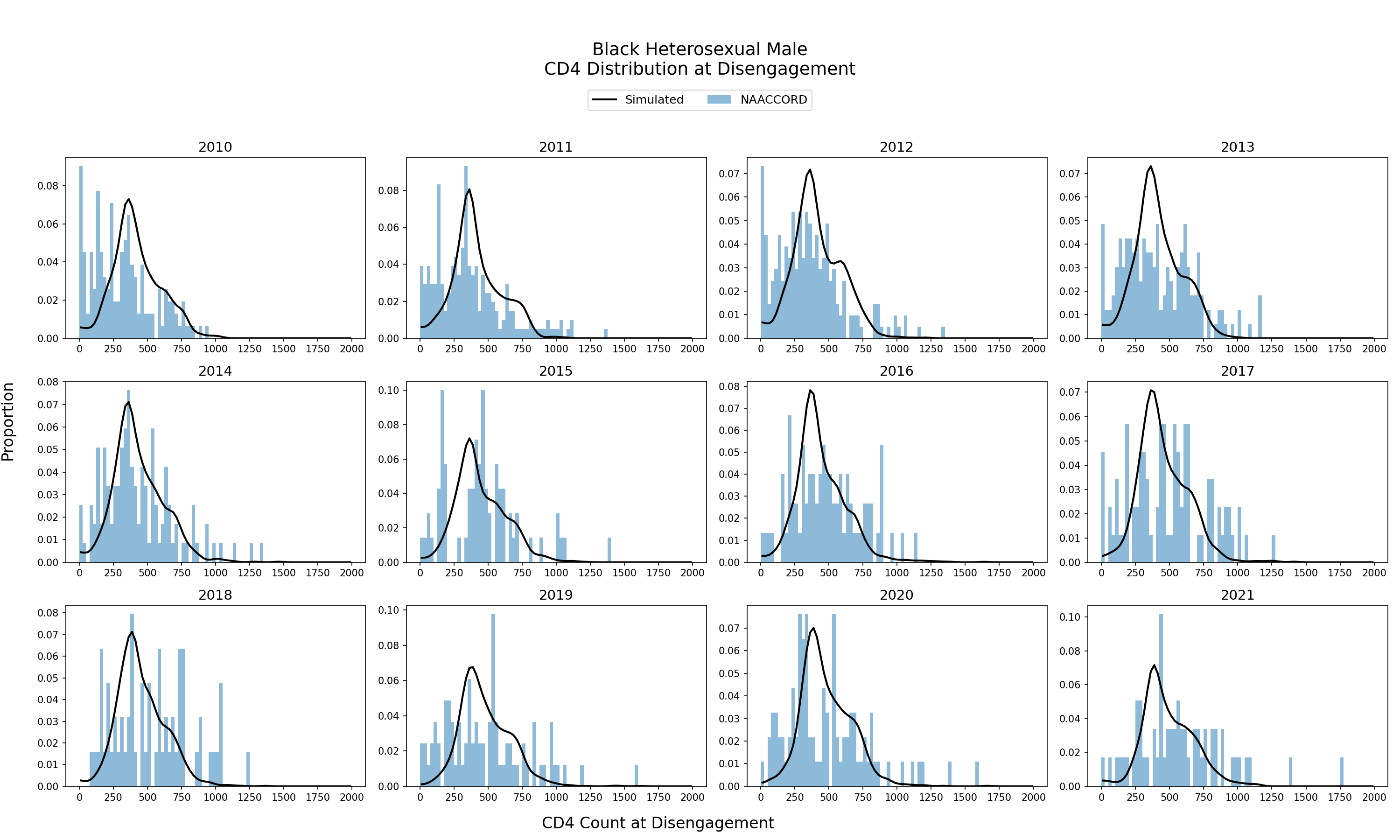
Figure 6e: HET White Male
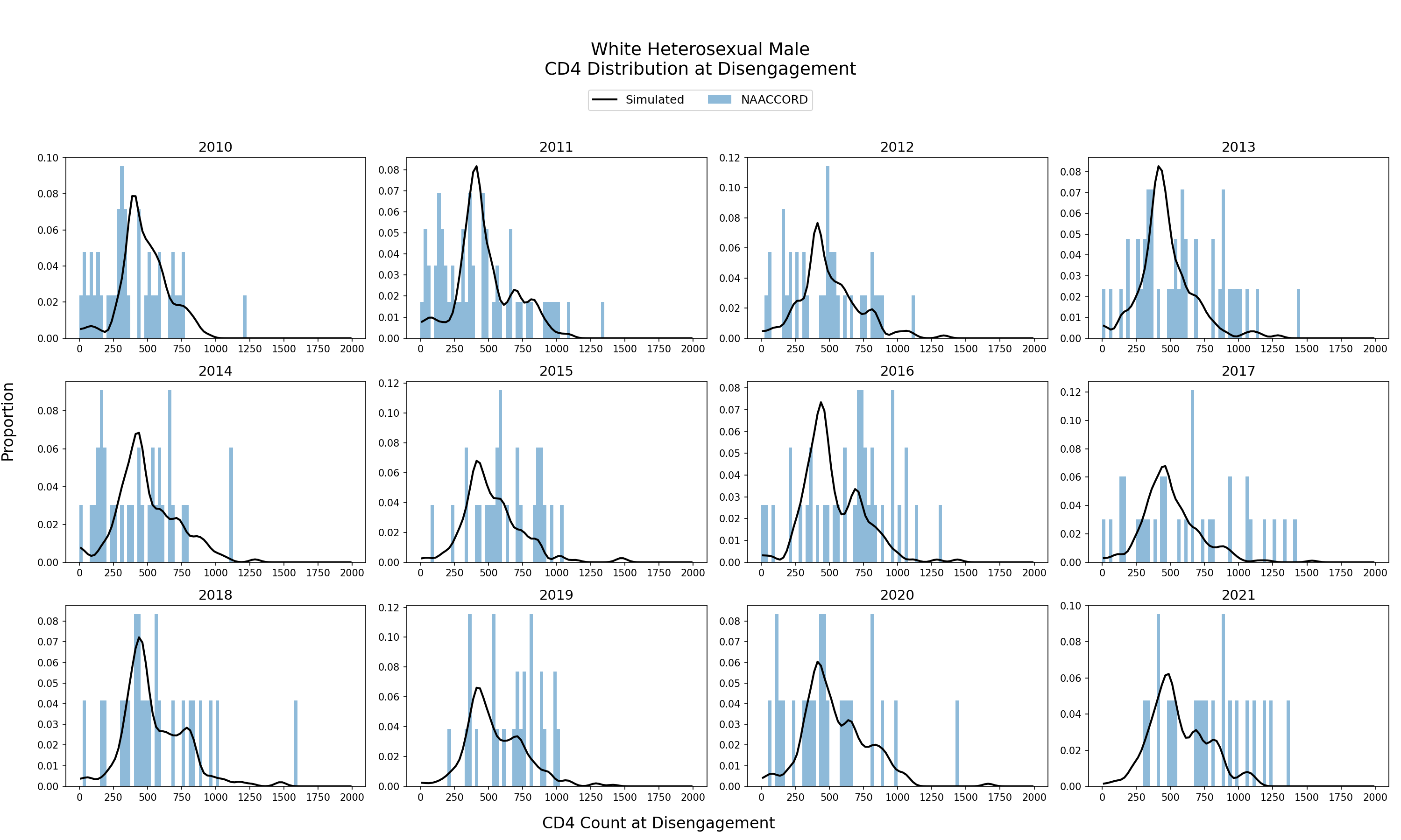
Figure 6f: HET Hispanic Male
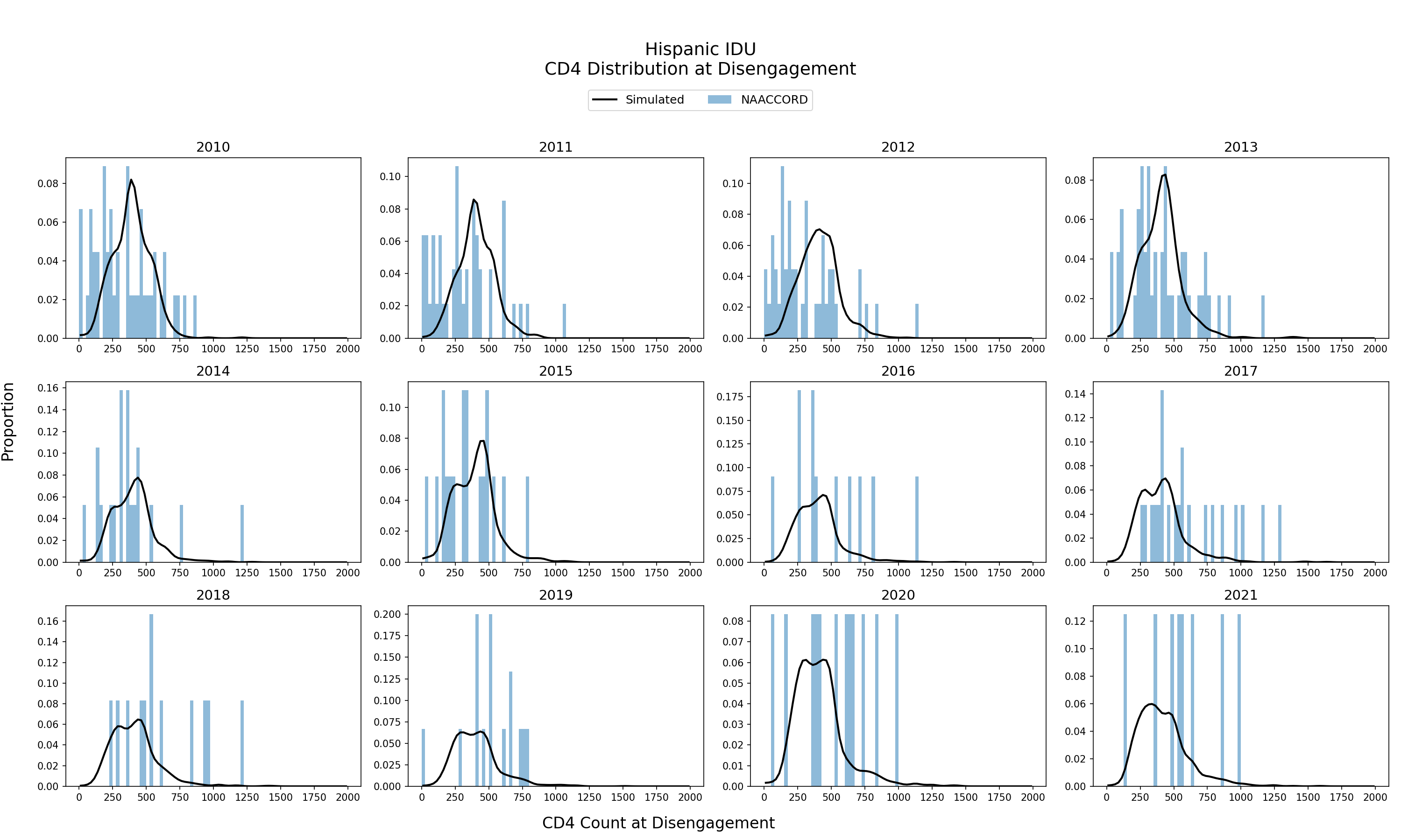
Figure 6g: IDU Black Female
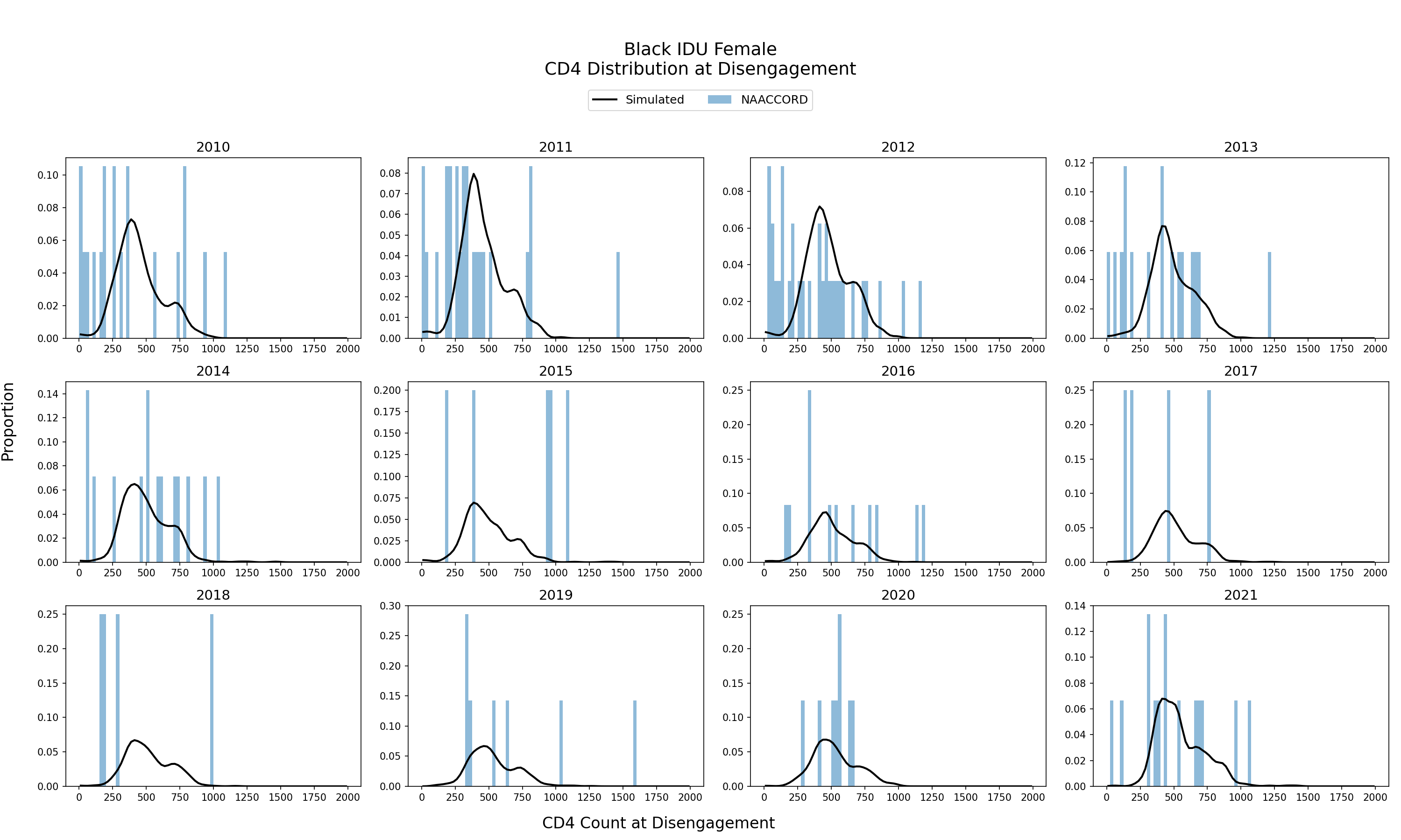
Figure 6h: IDU White Female
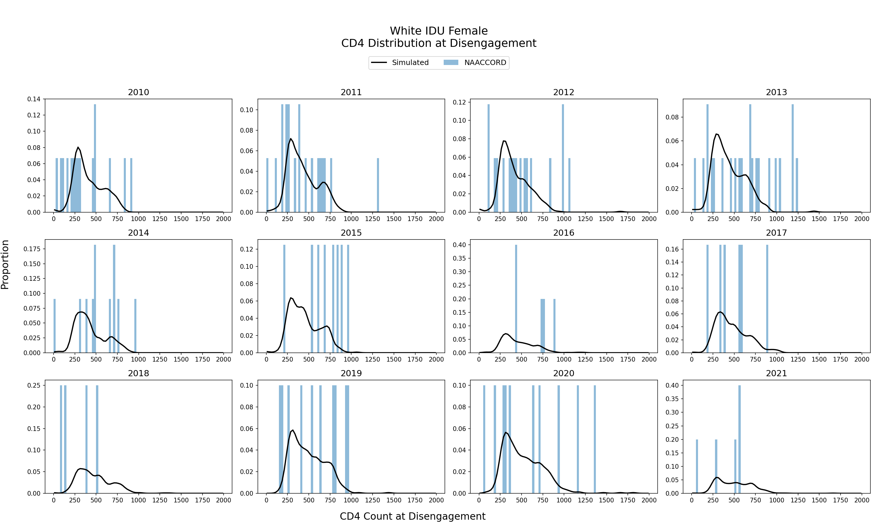
Figure 6i: IDU Hispanic Female
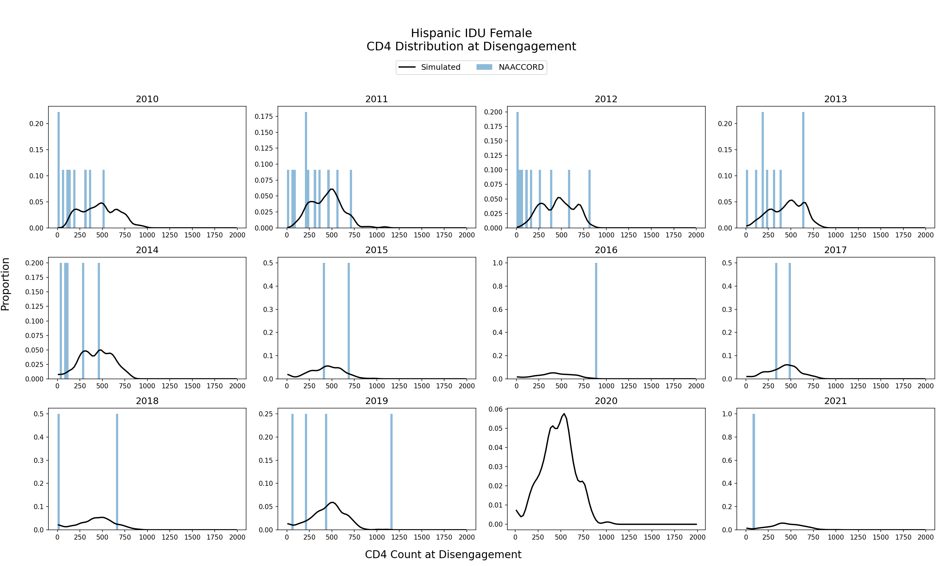
Figure 6j: IDU Black Male
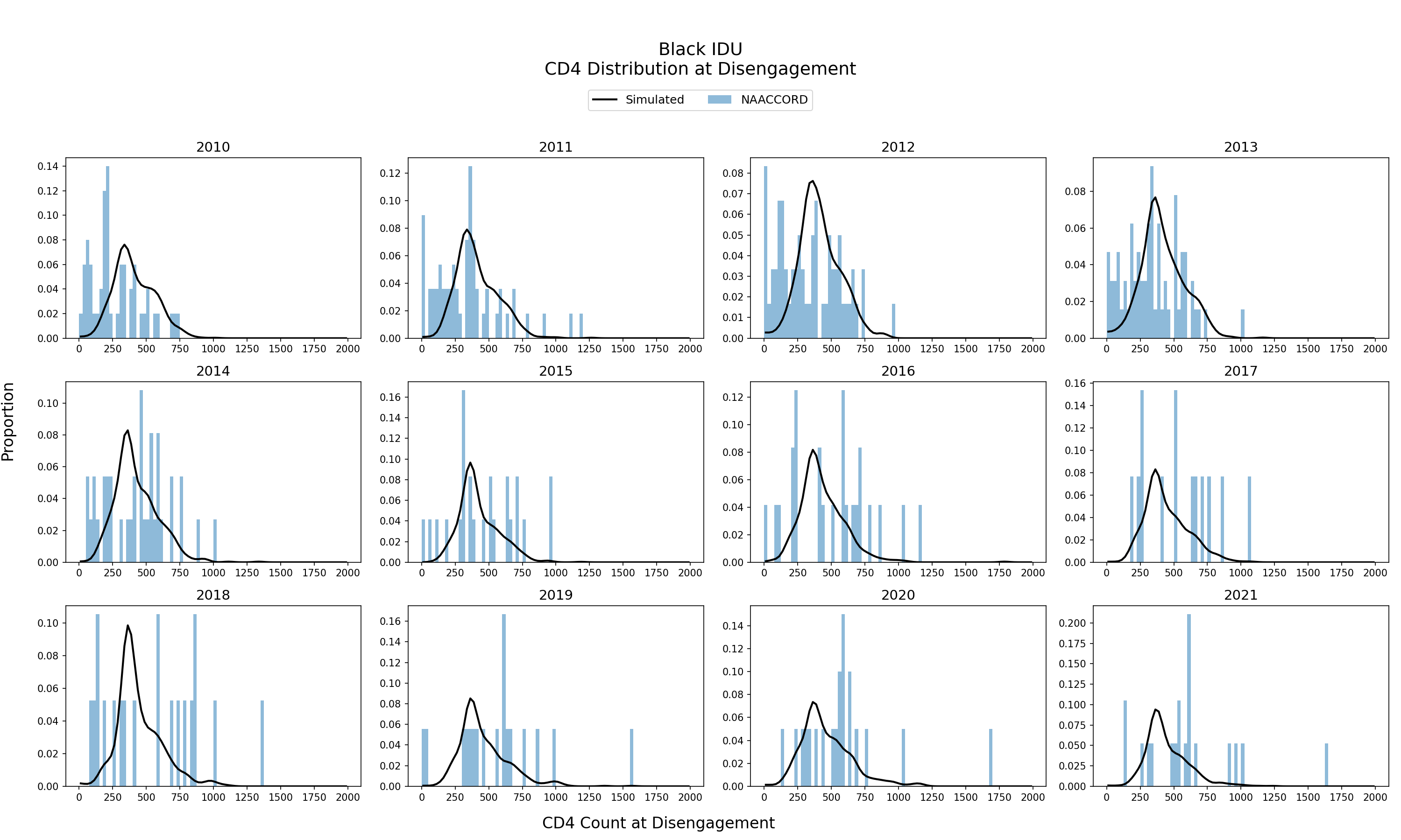
Figure 6k: IDU White Male
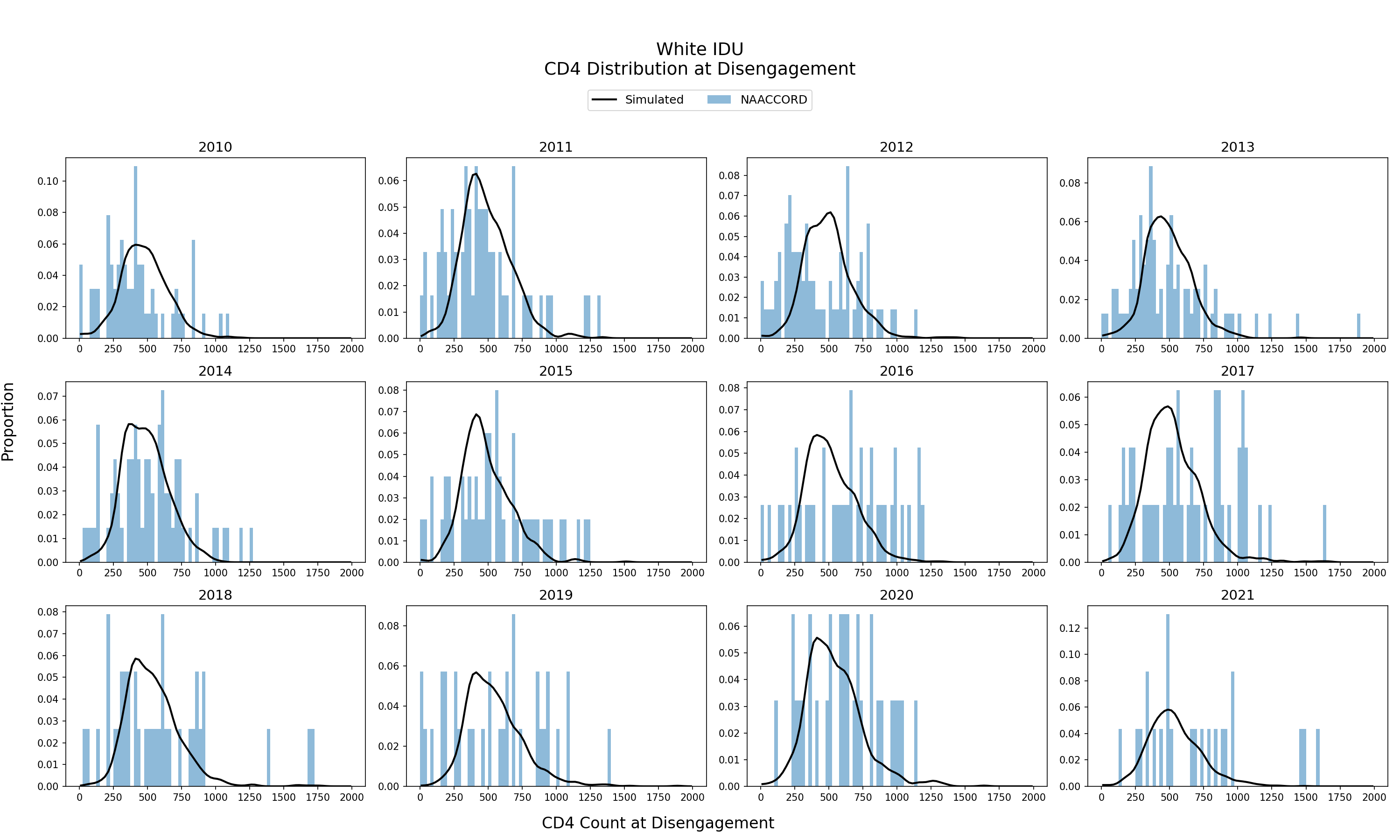
Figure 6l: IDU Hispanic Male
Figure 6m: Black MSM
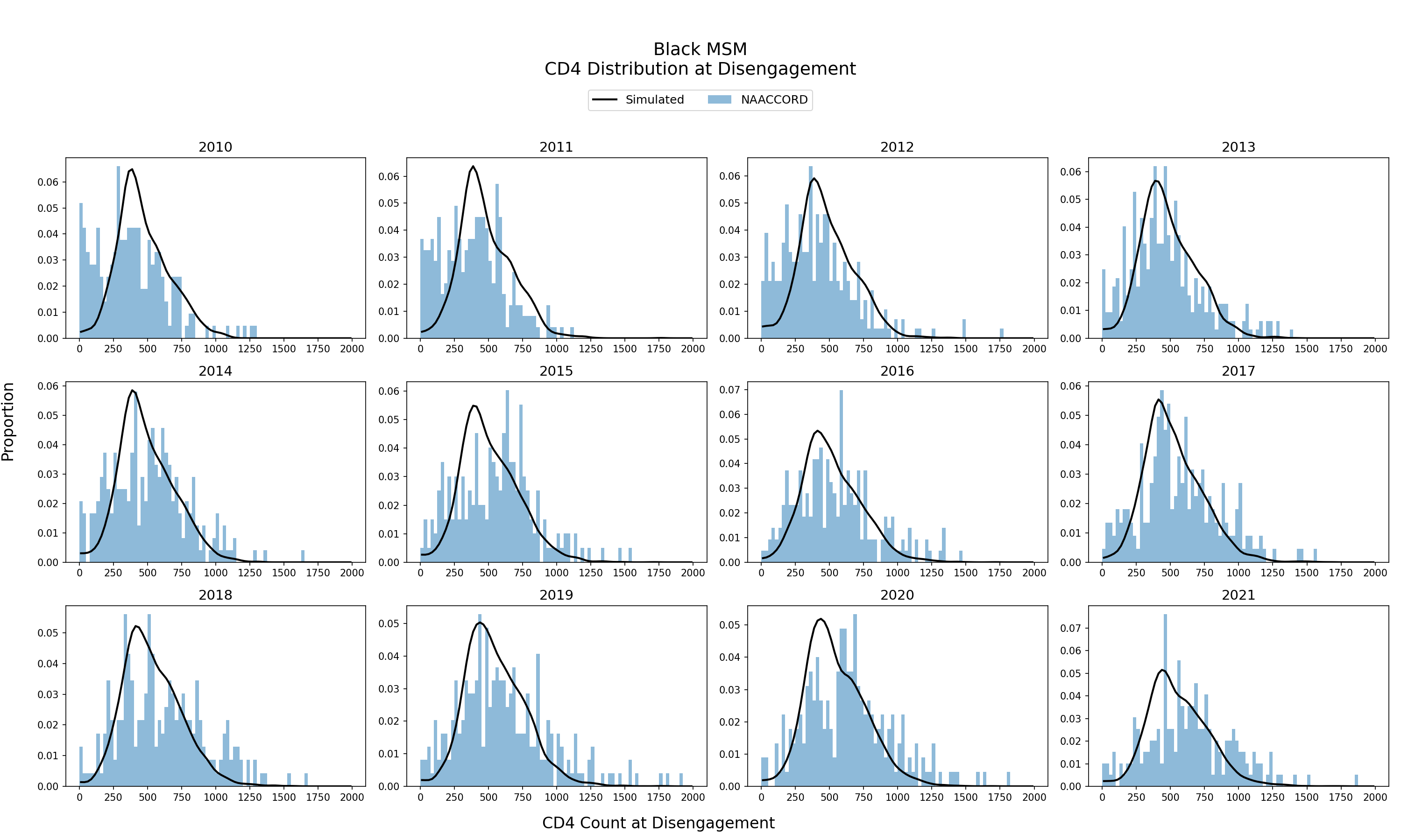
Figure 6n: White MSM
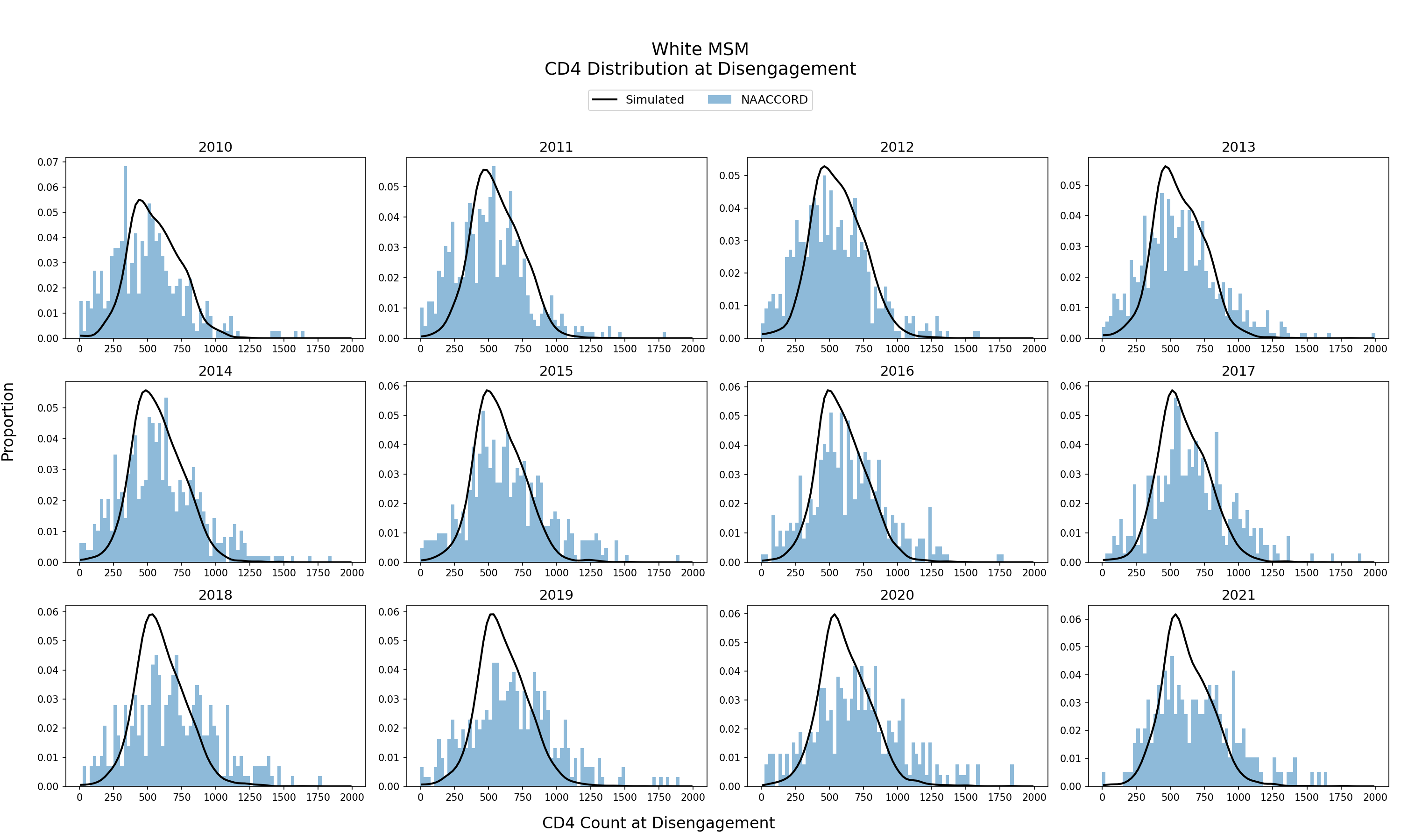
Figure 6o: Hispanic MSM
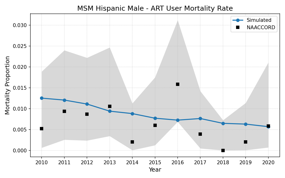
ART Users
Mortality Rate of ART Users
The mortality rate of the simulated population using ART from 2010 - 2020 is shown. The blue line represents the simulated mortality rate against NA-ACCORD data (black dots). Mortality rate is an emergent property of the model.
Figure 7a: HET Black Female
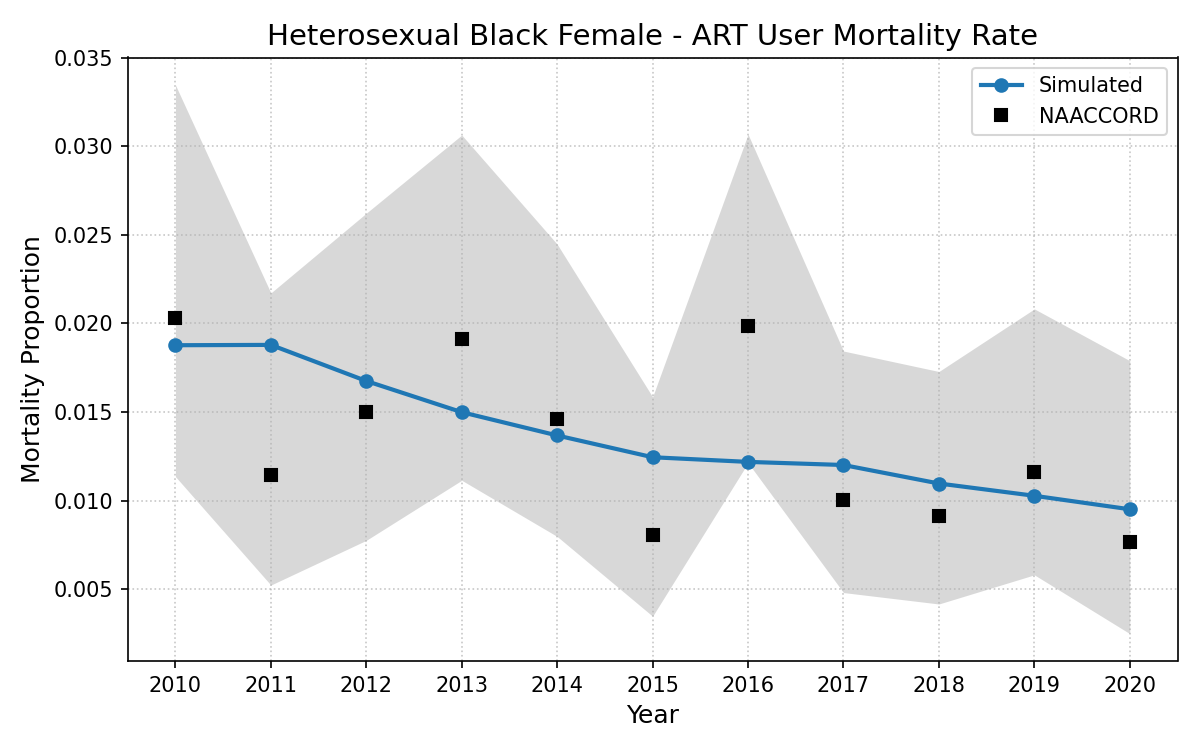
Figure 7b: HET White Female
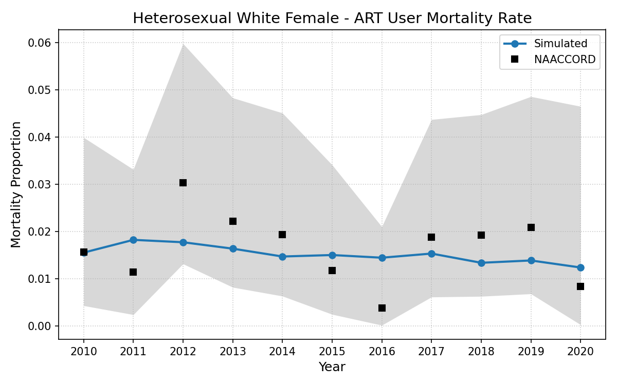
Figure 7c: HET Hispanic Female
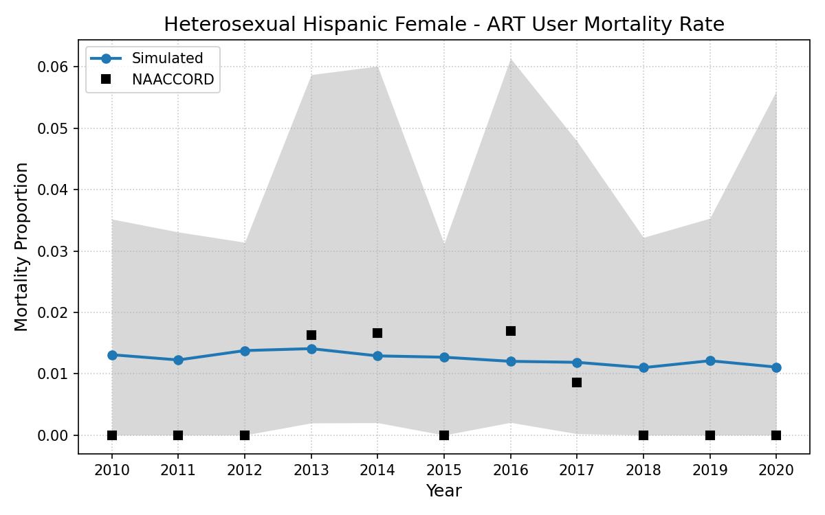
Figure 7d: HET Black Male
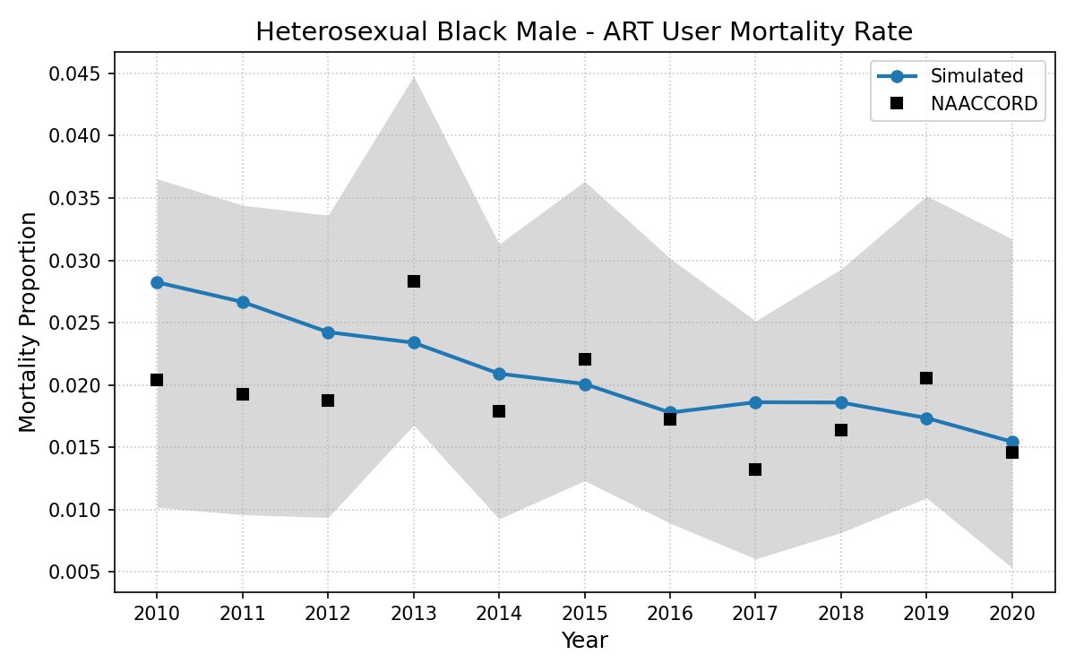
Figure 7e: HET White Male
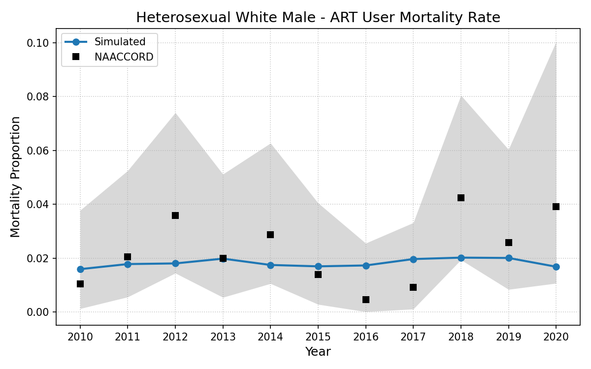
Figure 7f: HET Hispanic Male
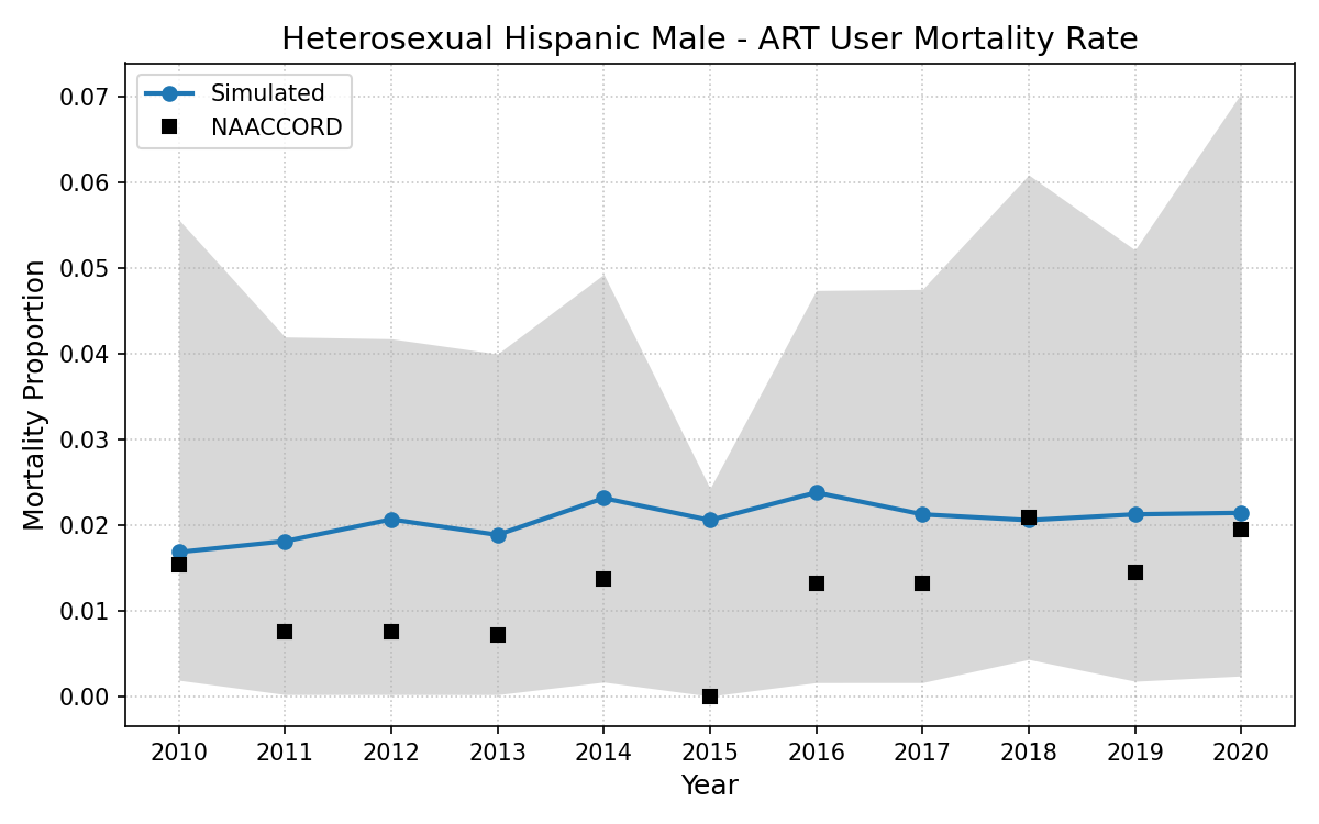
Figure 7g: IDU Black Female
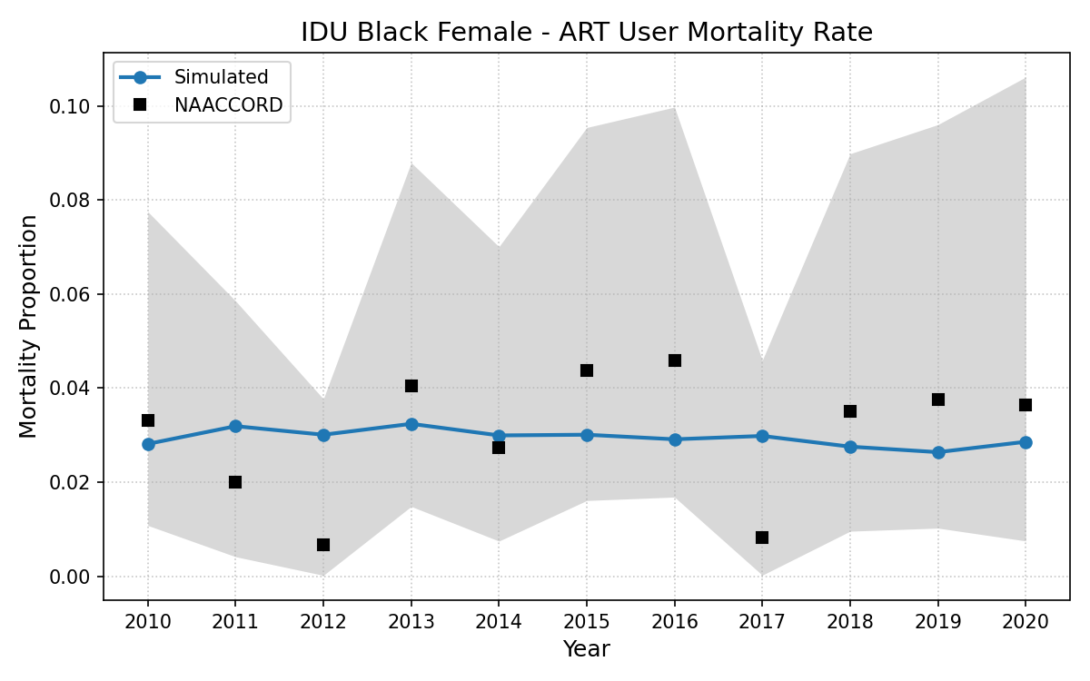
Figure 7h: IDU White Female
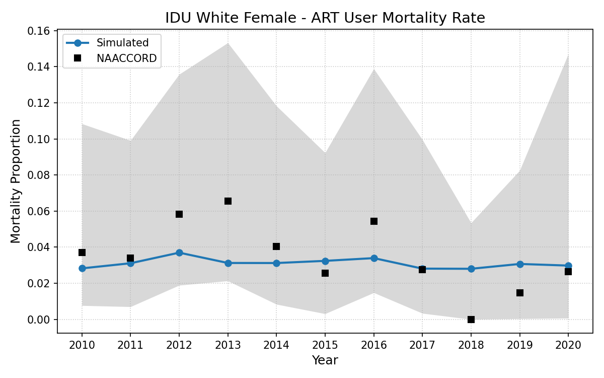
Figure 7i: IDU Hispanic Female
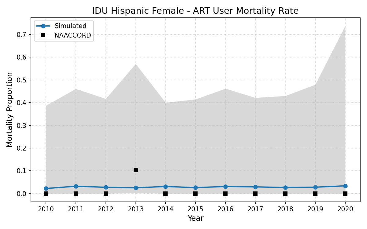
Figure 7j: IDU Black Male
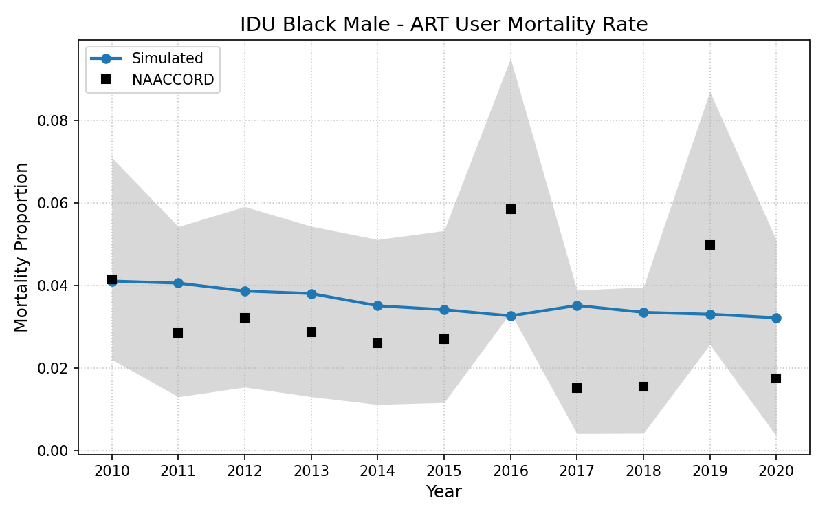
Figure 7k: IDU White Male
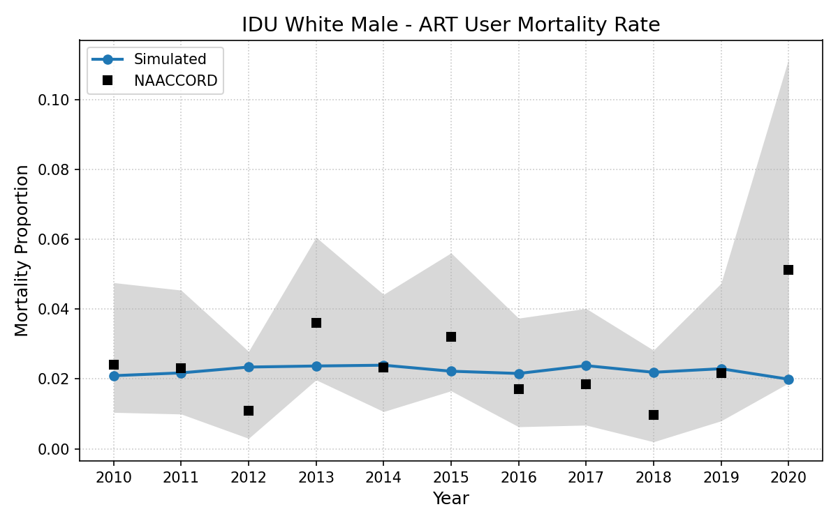
Figure 7l: IDU Hispanic Male
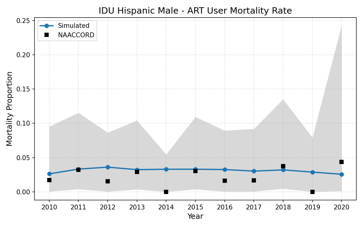
Figure 7m: Black MSM
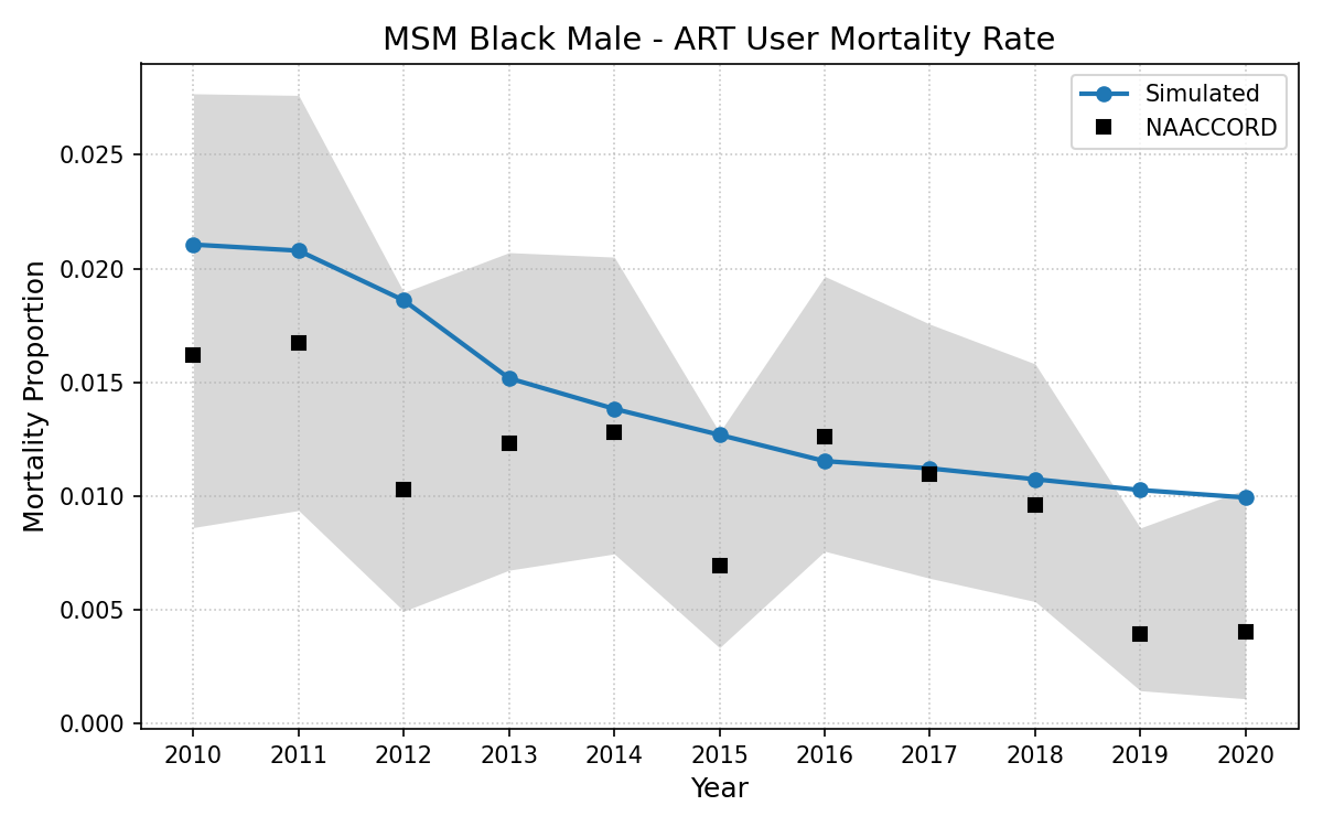
Figure 7n: White MSM
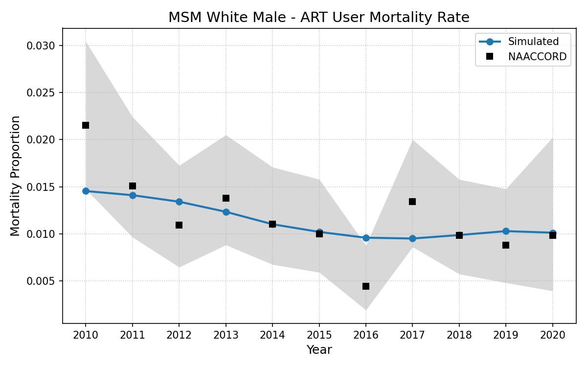
Figure 7o: Hispanic MSM
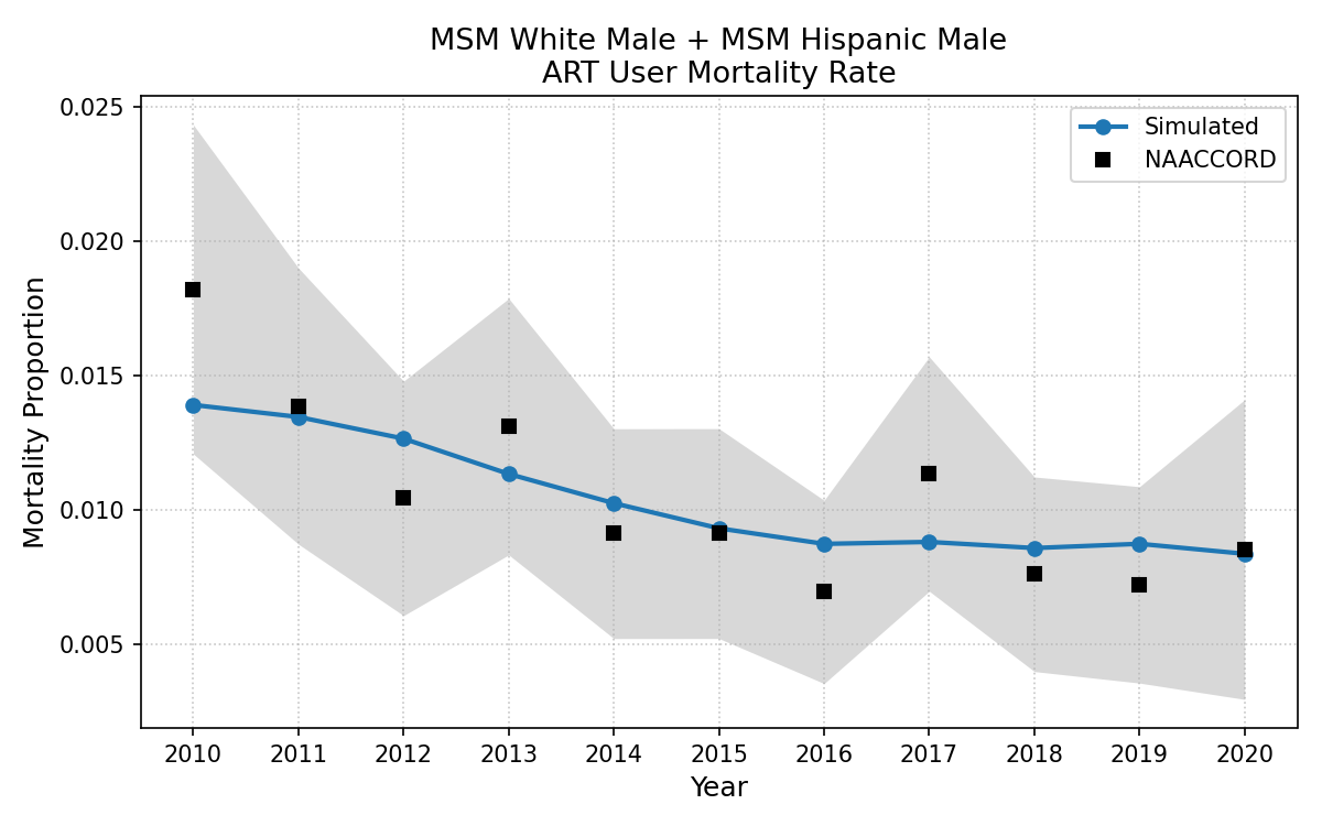
Collapsed Mortality Rates
Due to limitations in subgroup sample size, some groups were combined for final analysis. The collapsed group mortality rates are shown below:
Figure 8p: HET White Female + Het Hisp Female
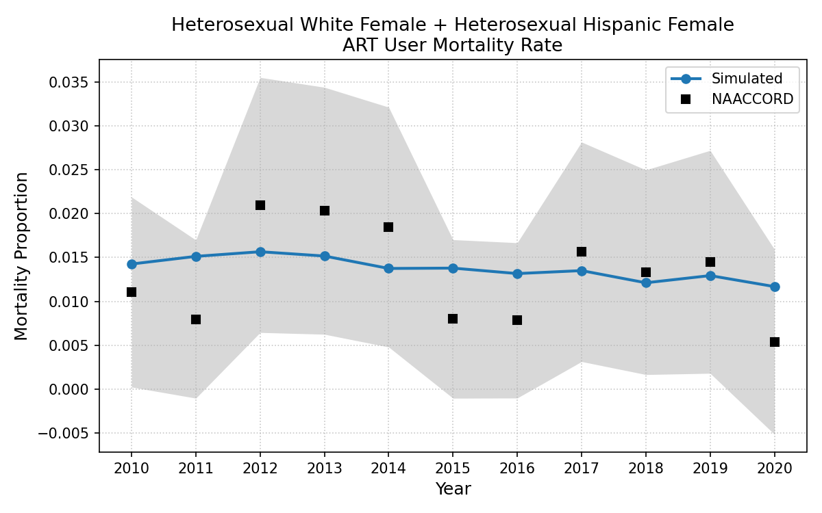
Figure 8q: HET White Male + HET Hisp Male
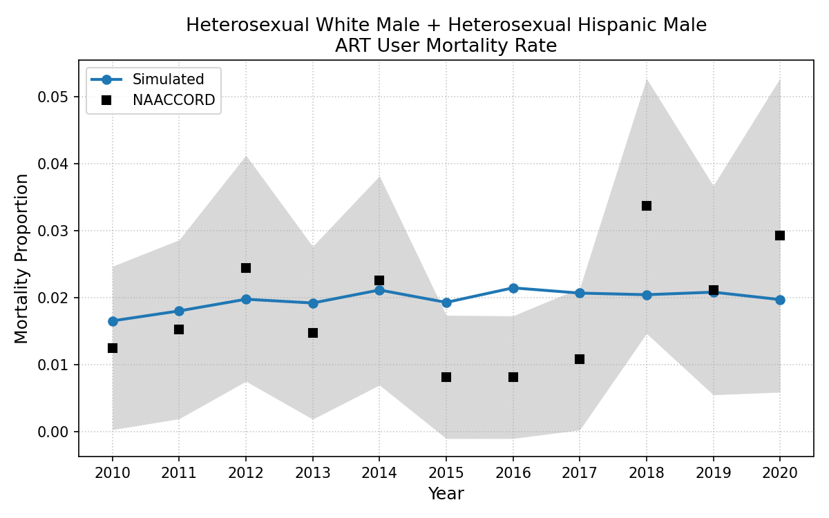
Figure 8r: IDU Female
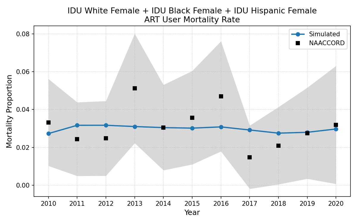
Figure 8s: IDU White Male + IDU Hisp Male
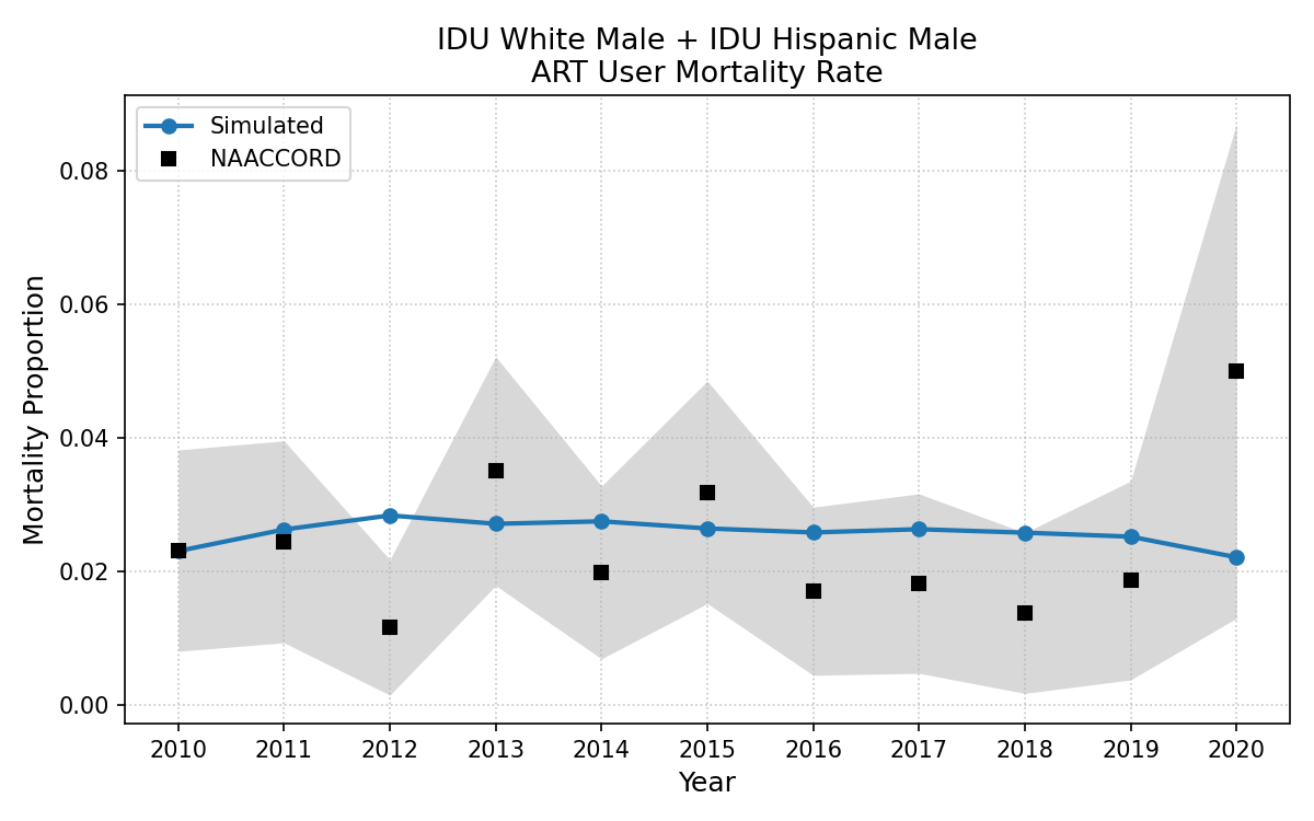
Figure 8t: White MSM + Hisp MSM
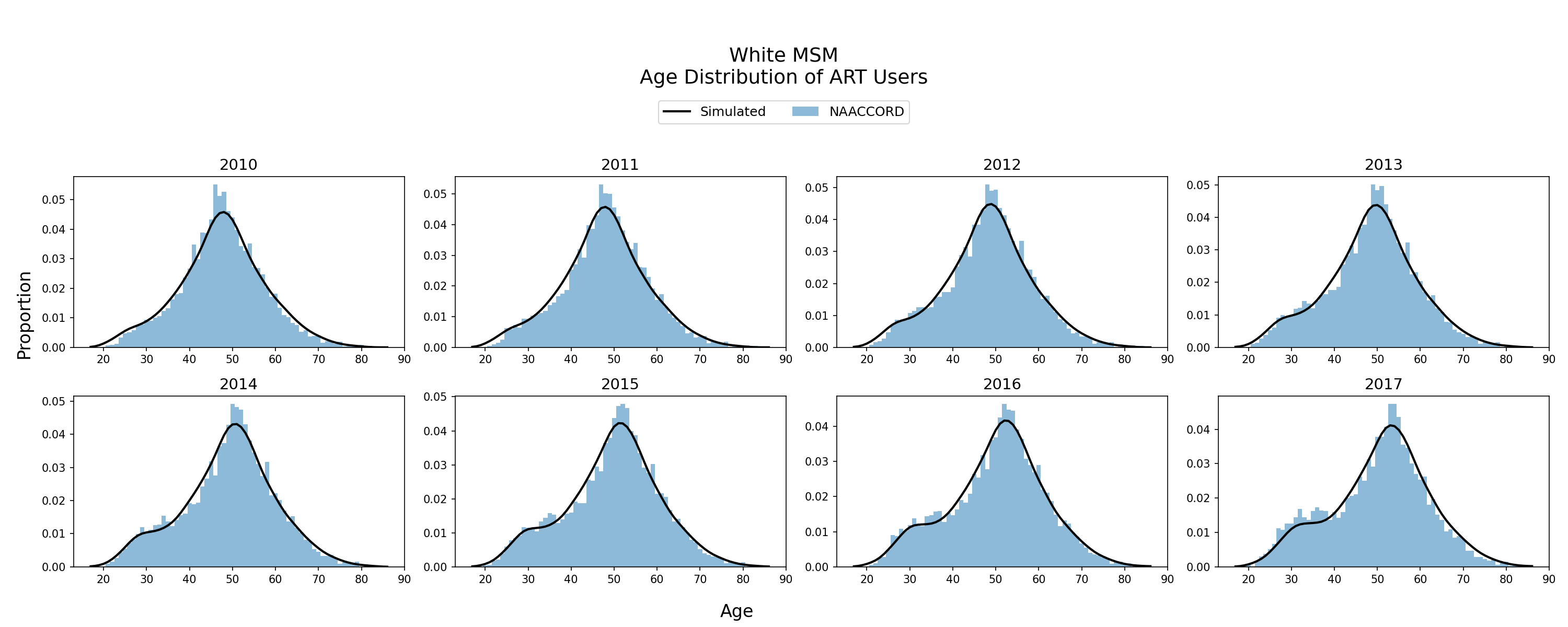
Age Distribution of ART Users
The age distribution of the simulated population using ART from 2010 - 2017 is shown. The black line represents the simulated age distribution against NA-ACCORD data (blue bars). Age distribution of ART users is an emergent property of the model.
Figure 9a: Black HET Female
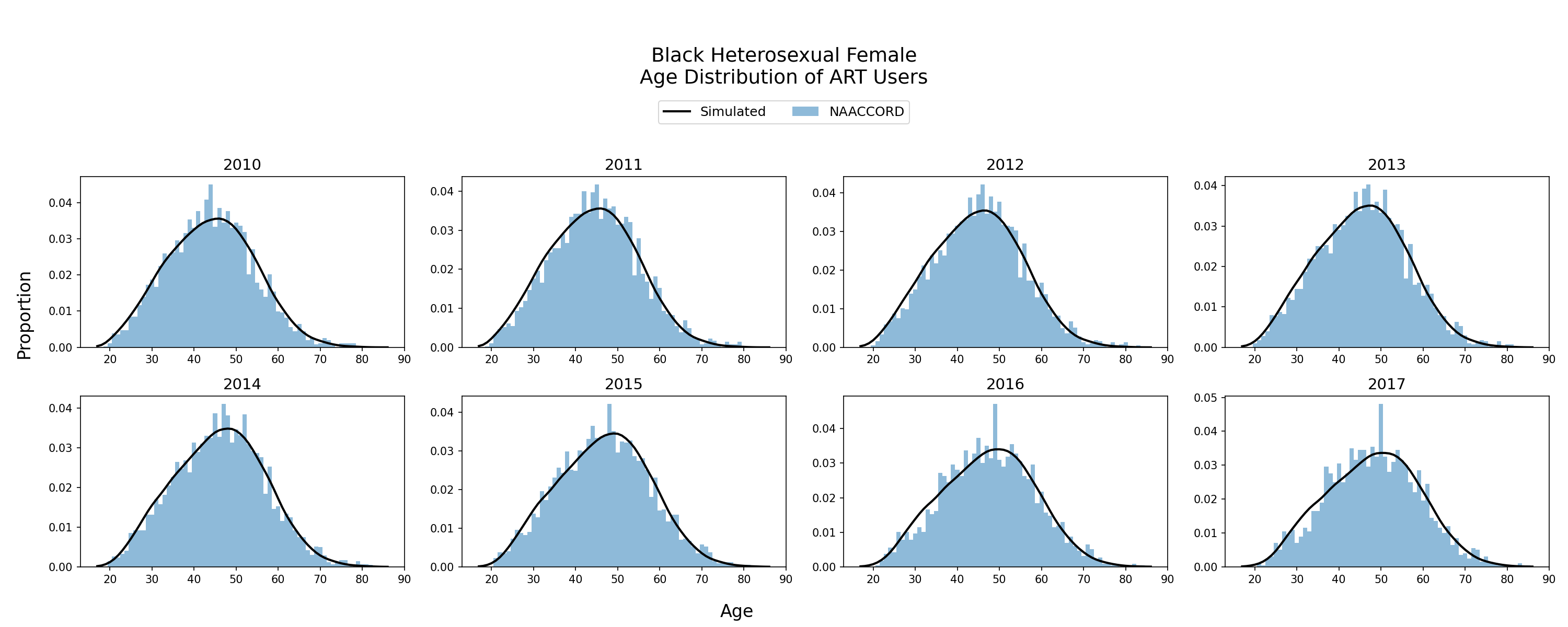
Figure 9b: Black HET Male
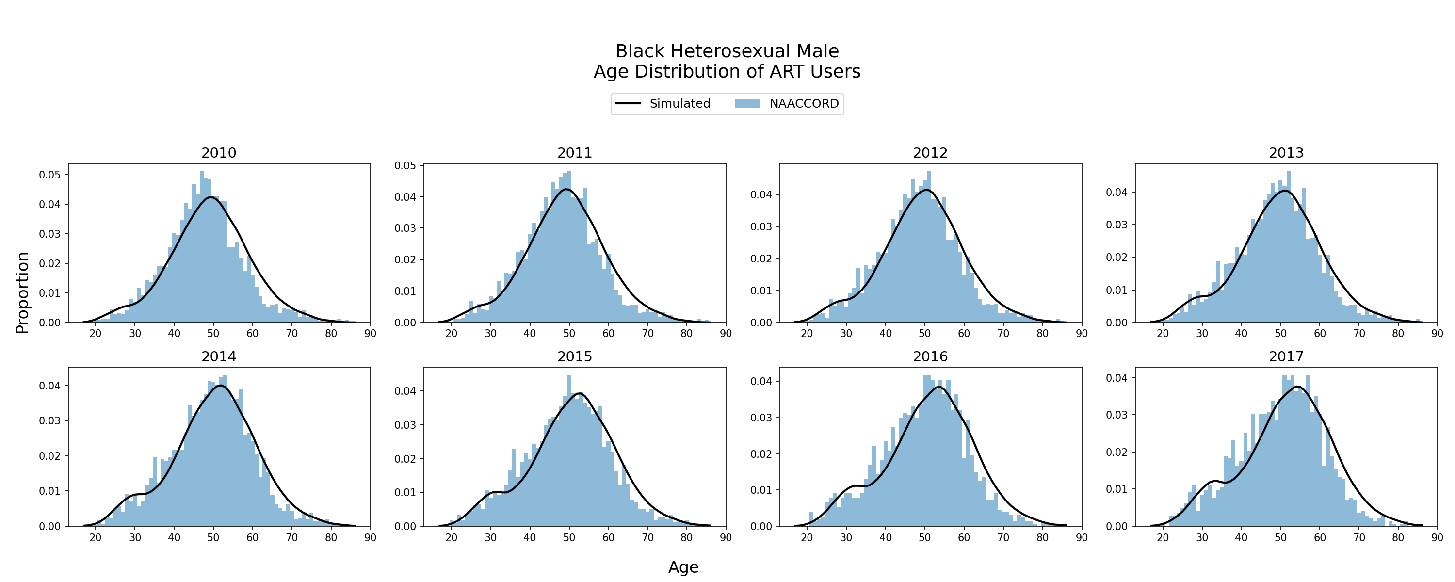
Figure 9c: Hispanic HET Female
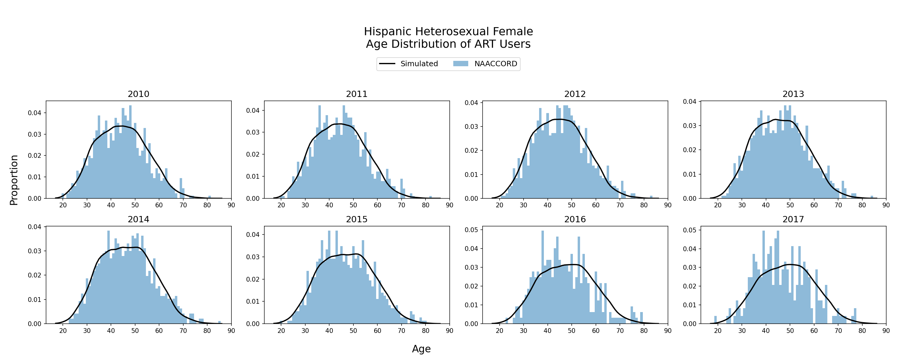
Figure 9d: Hispanic HET Male
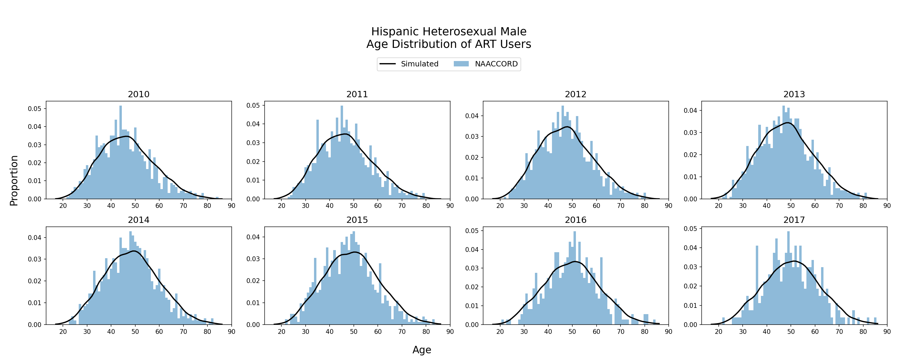
Figure 9e: White HET Female
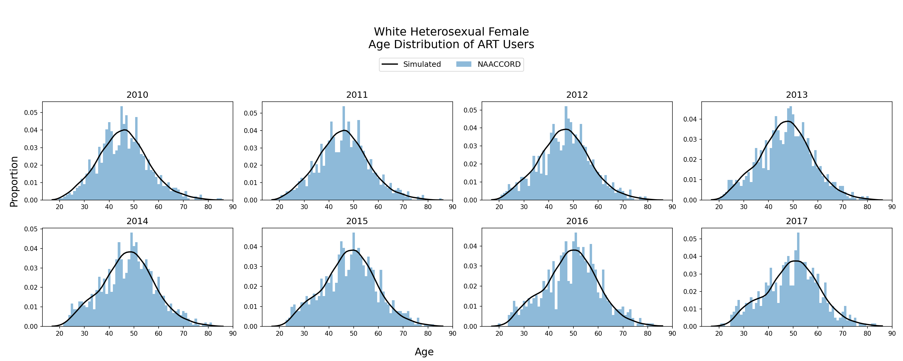
Figure 9f: White HET Male
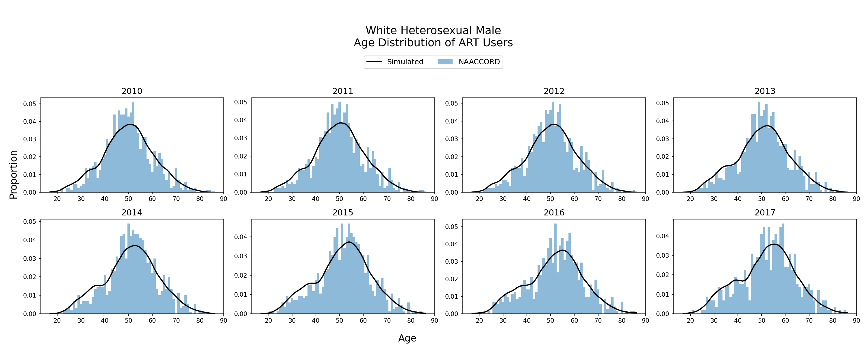
Figure 9g: Black IDU Female
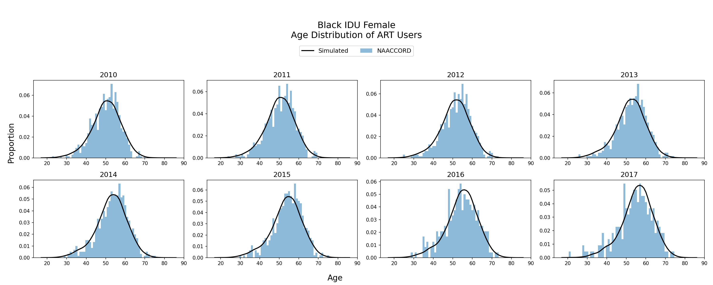
Figure 9h: Black IDU Male
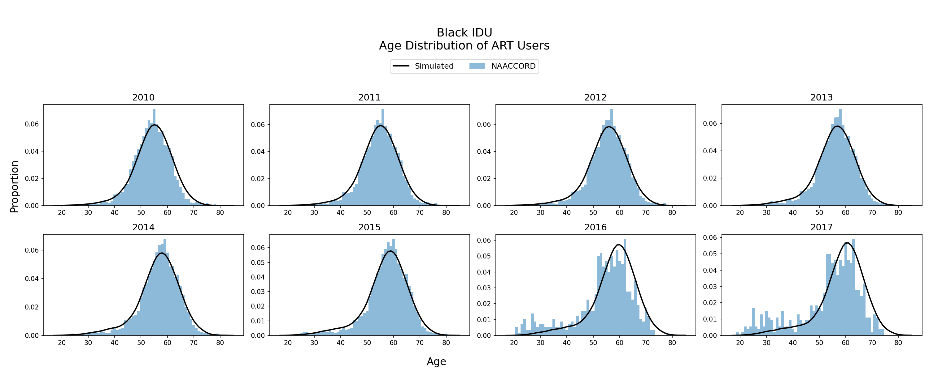
Figure 9i: Hispanic IDU Female
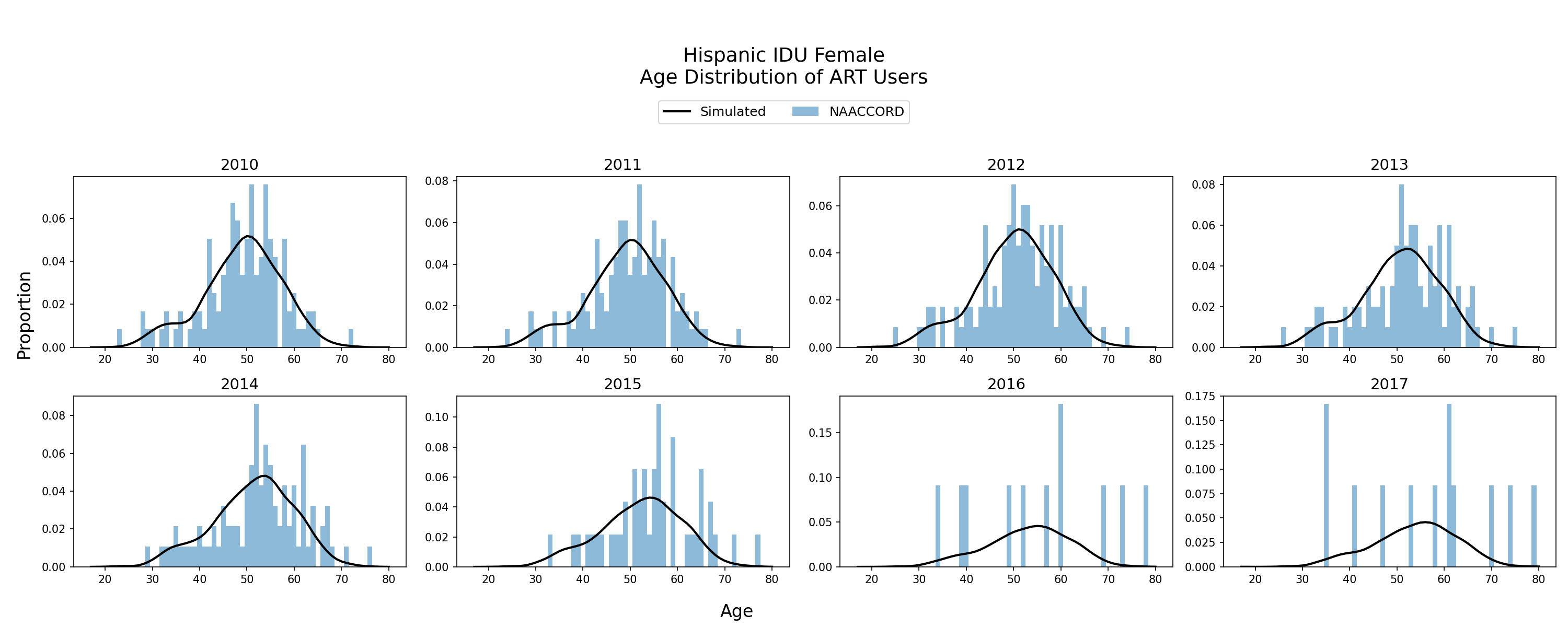
Figure 9j: Hispanic IDU Male
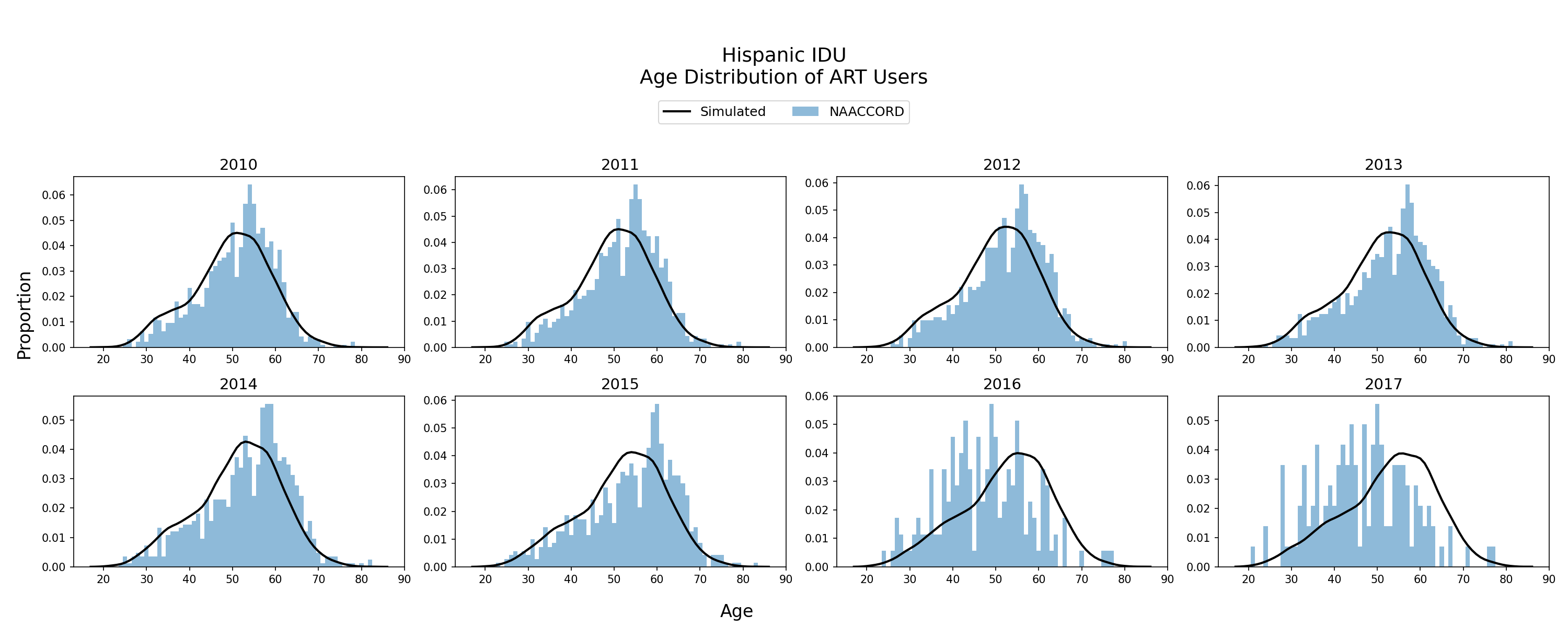
Figure 9k: White IDU Female
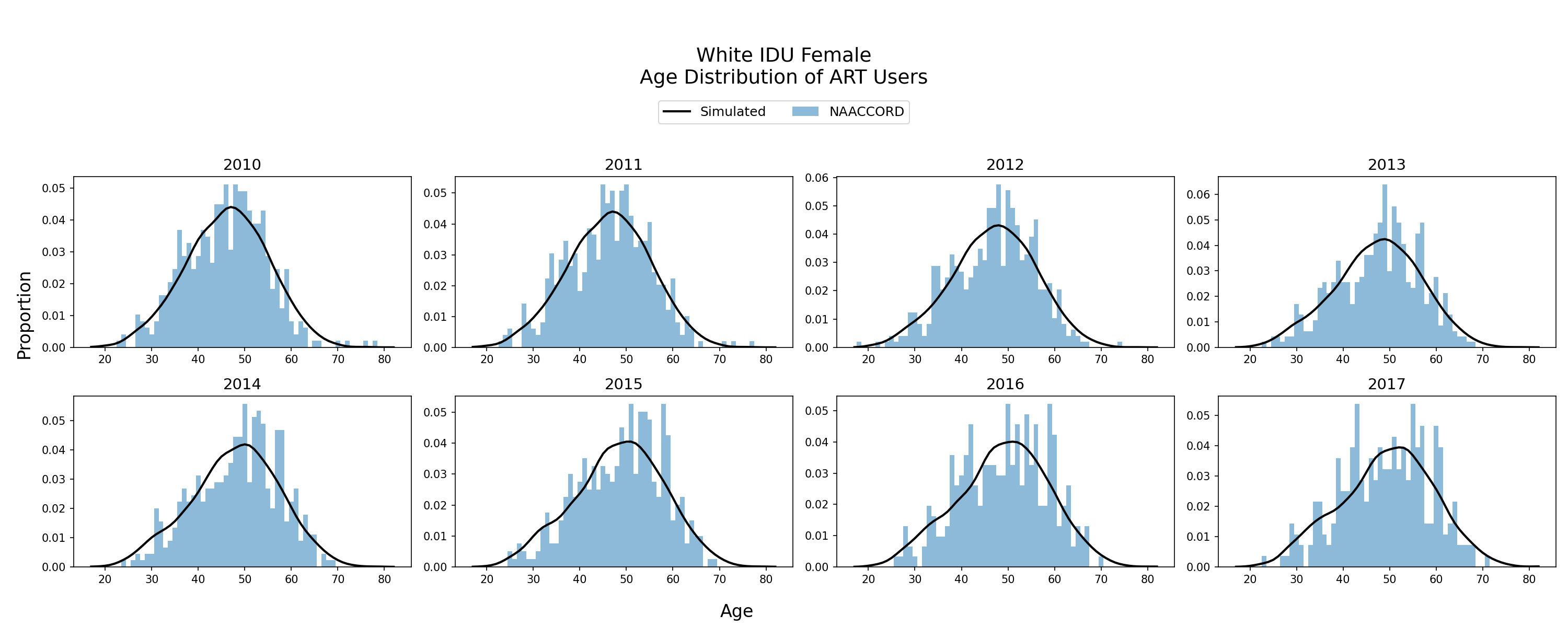
Figure 9l: White IDU Male
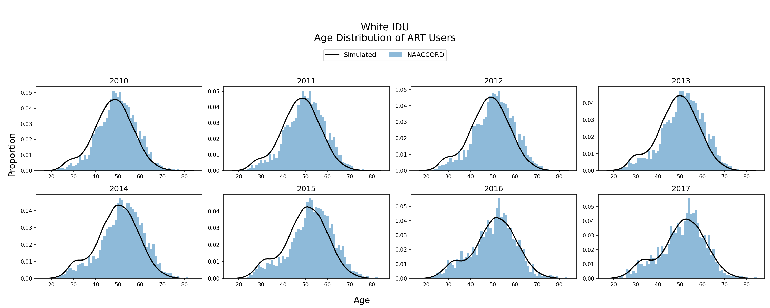
Figure 9m: Black MSM
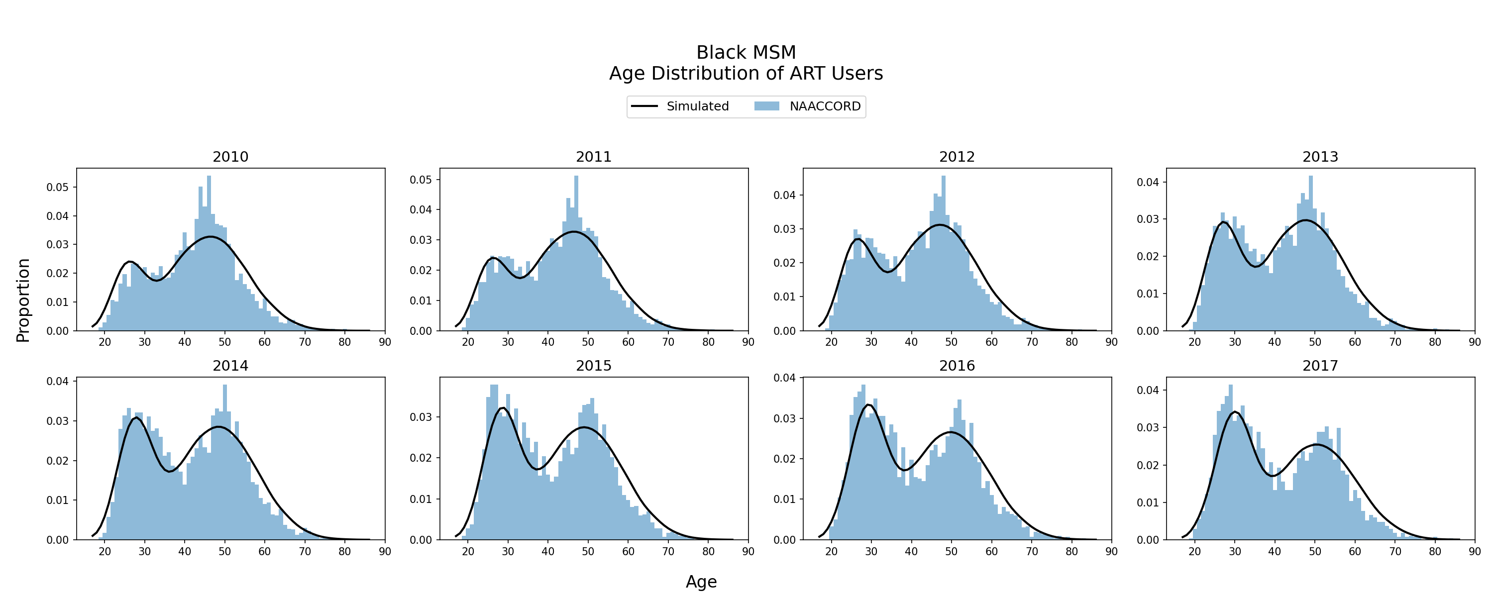
Figure 9n: Hispanic MSM
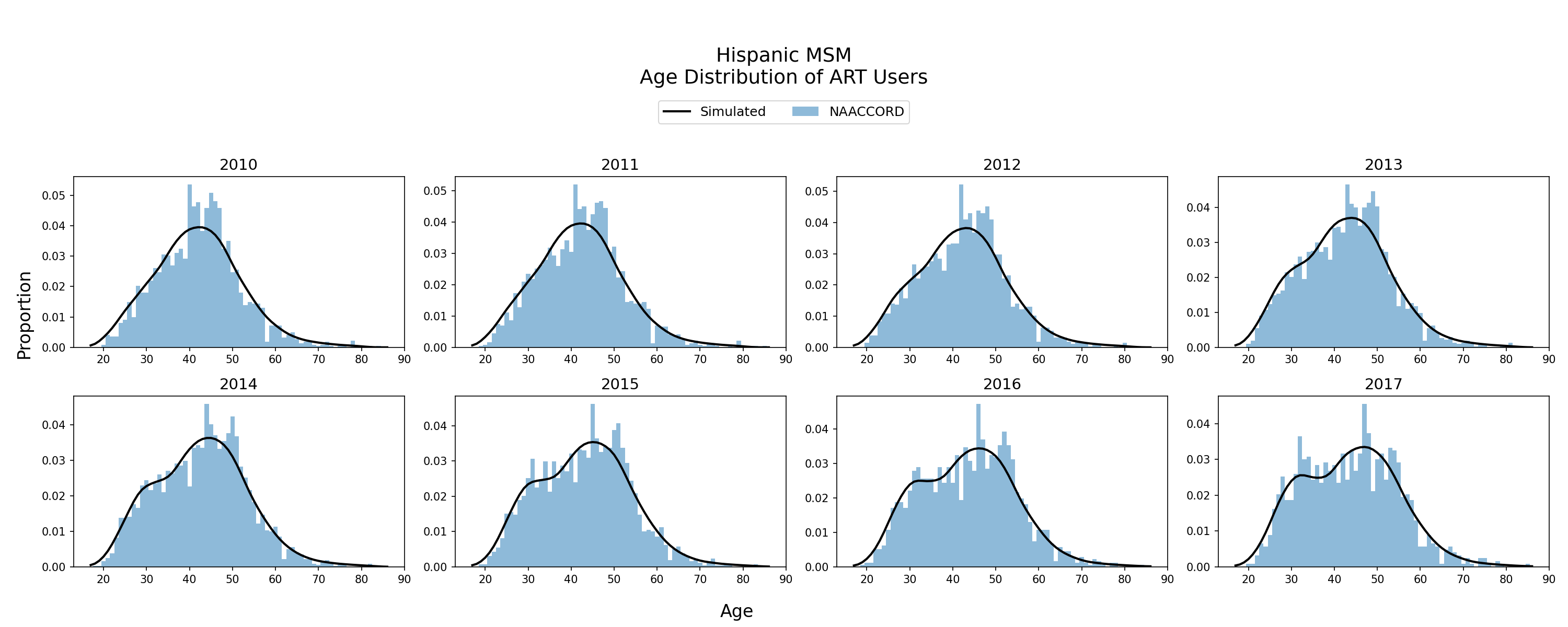
Figure 9o: White MSM
CD4 Count Distribution of ART Users
The cd4 count distribution of the simulated population using ART from 2010 - 2017 is shown. The black line represents the simulated cd4 count distribution against NA-ACCORD data (blue bars). CD4 count distribution of ART users is an emergent property of the model.
Figure 10a: Black HET Female
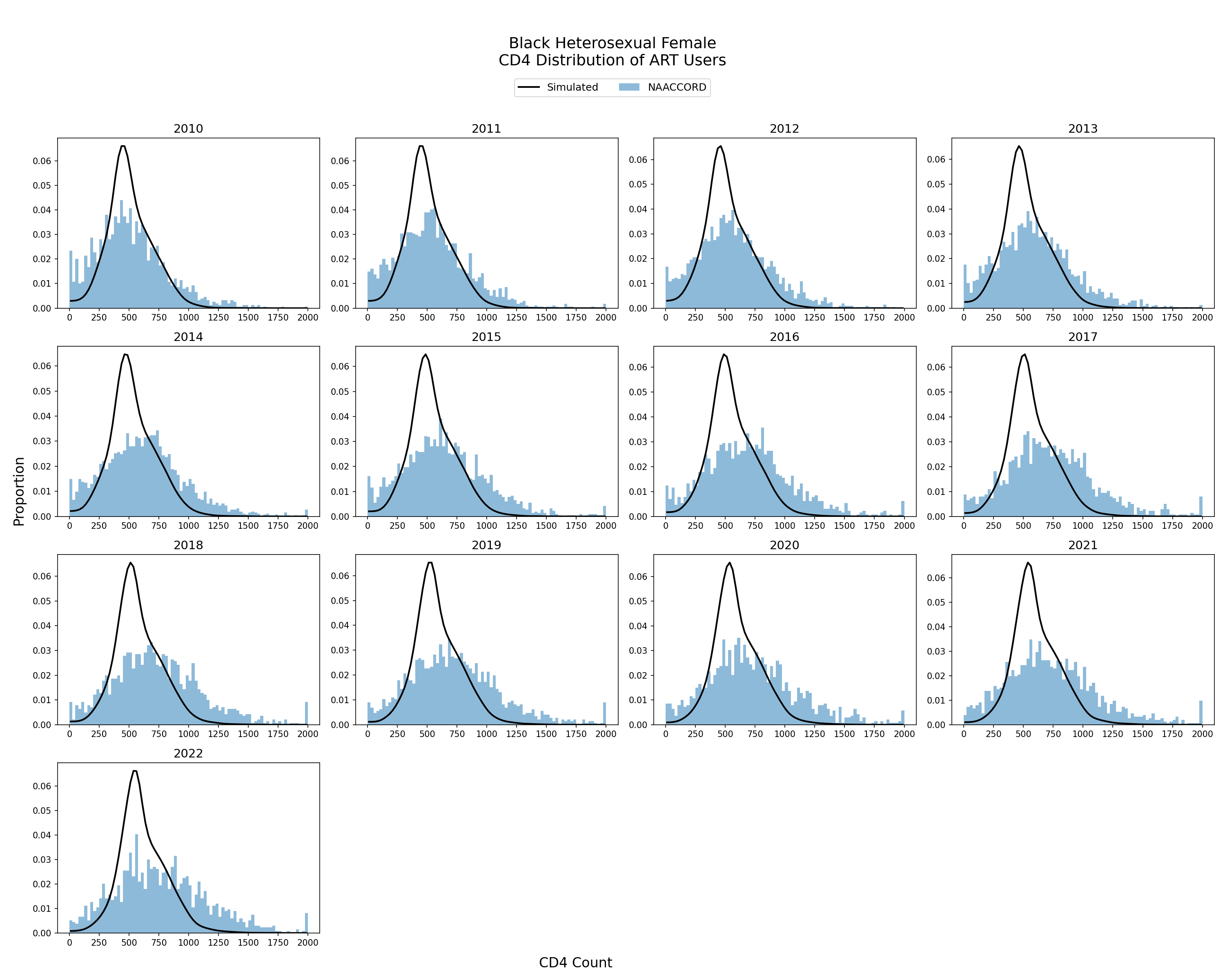
Figure 10b: Black HET Male
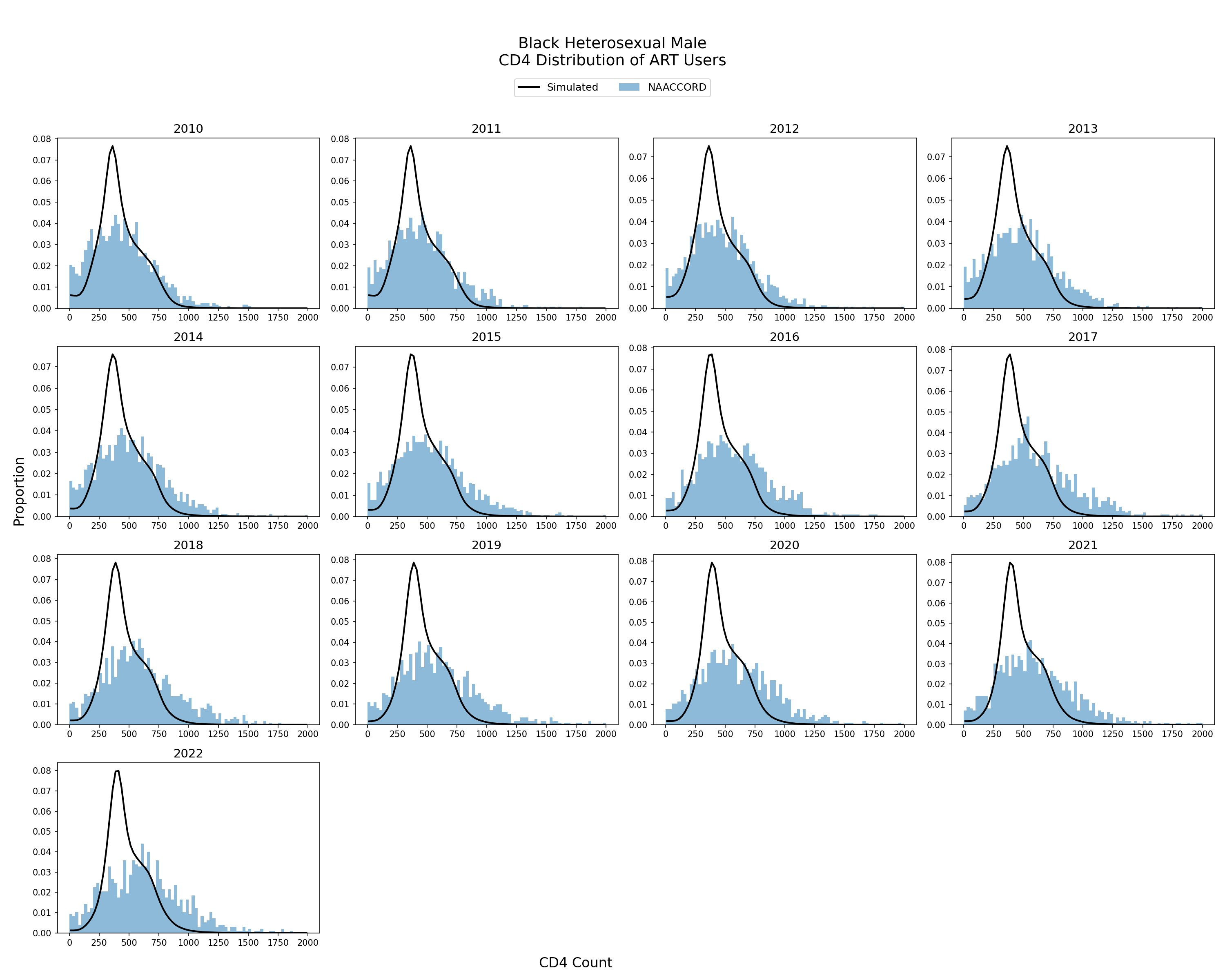
Figure 10c: Hispanic HET Female
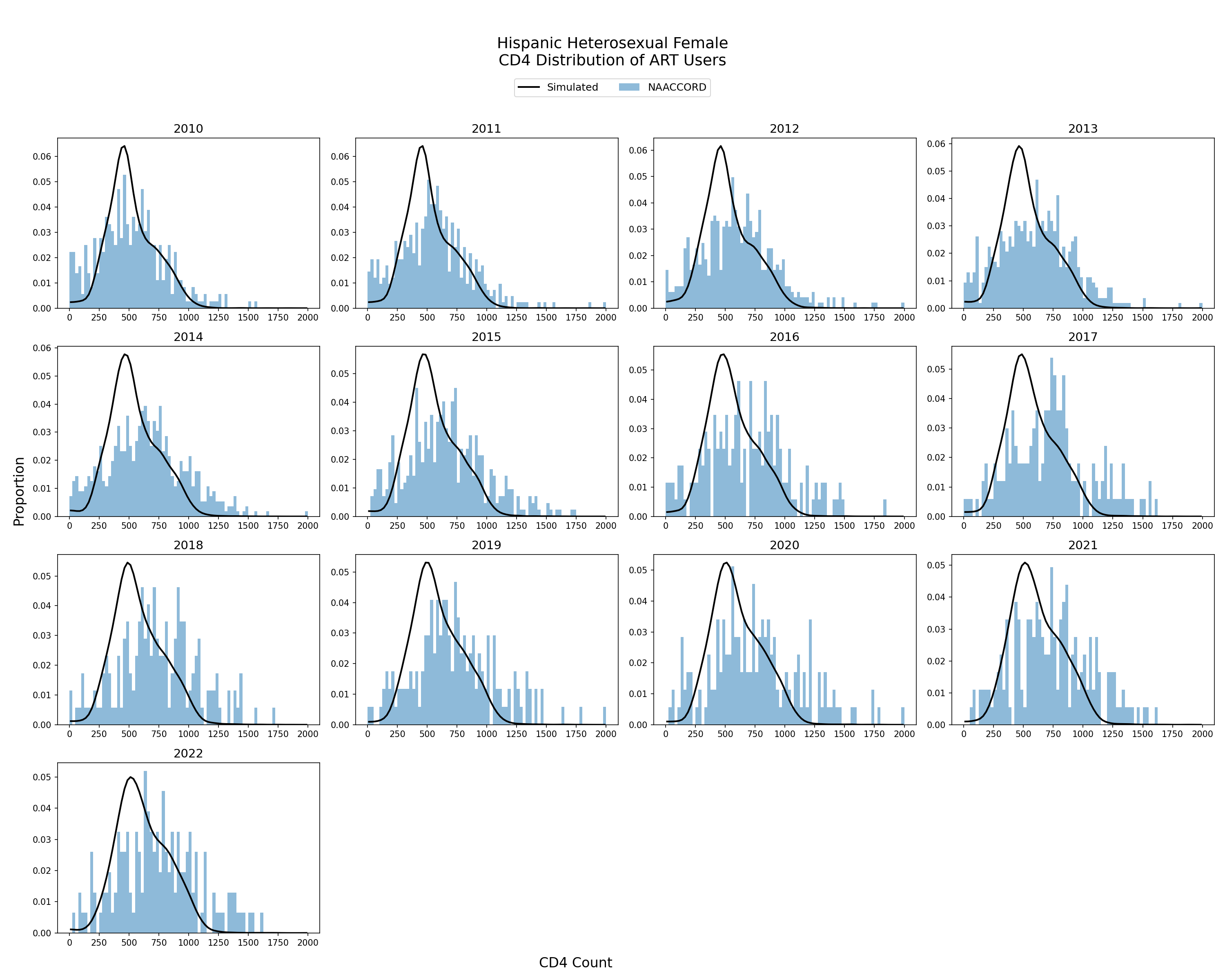
Figure 10d: Hispanic HET Male
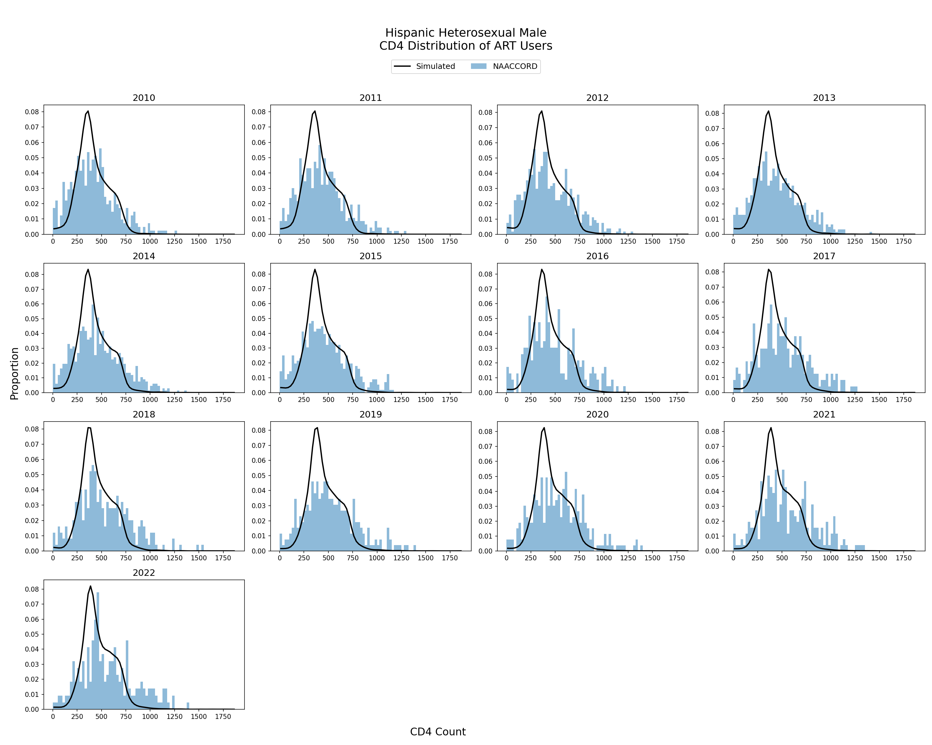
Figure 10e: White HET Female
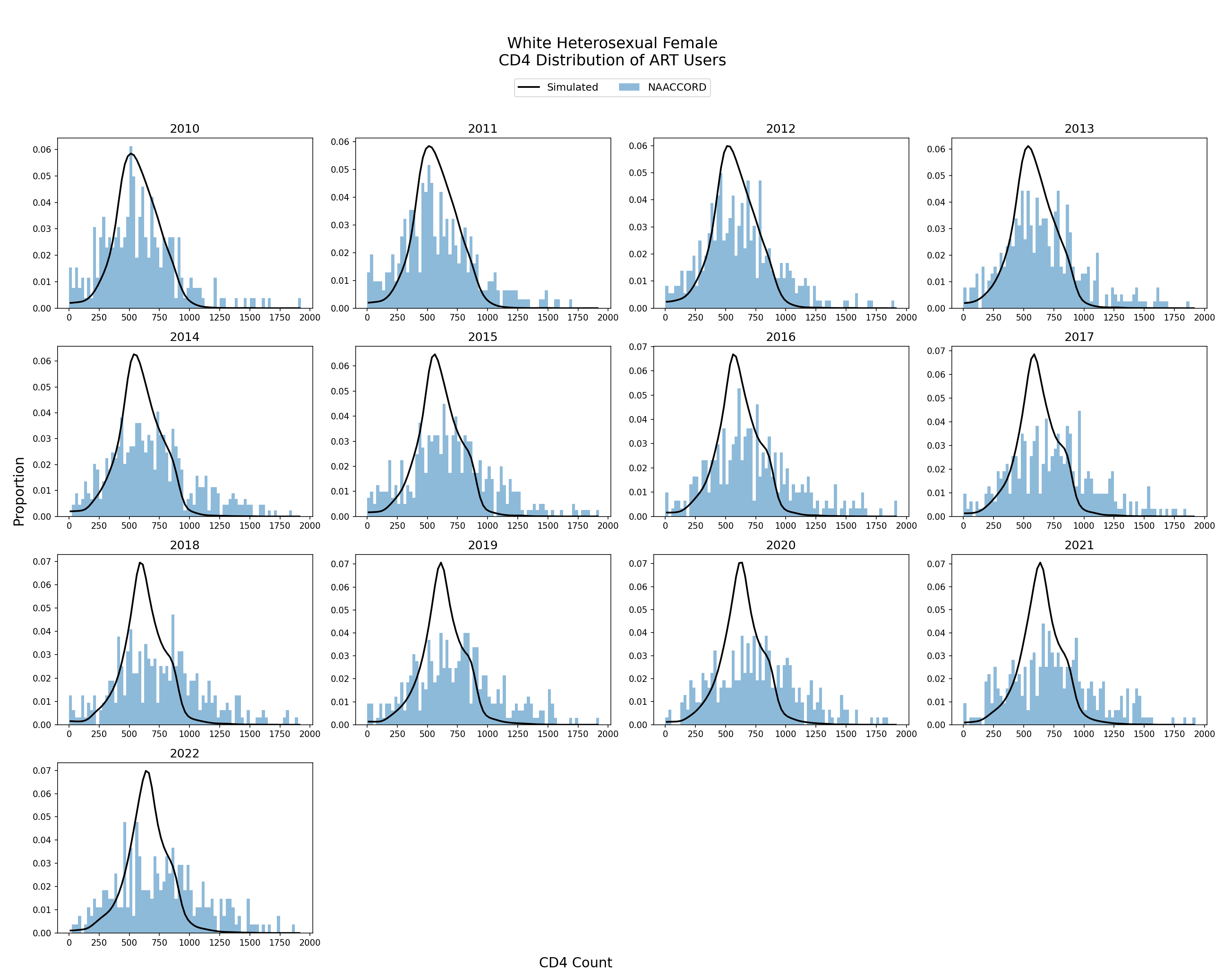
Figure 10f: White HET Male
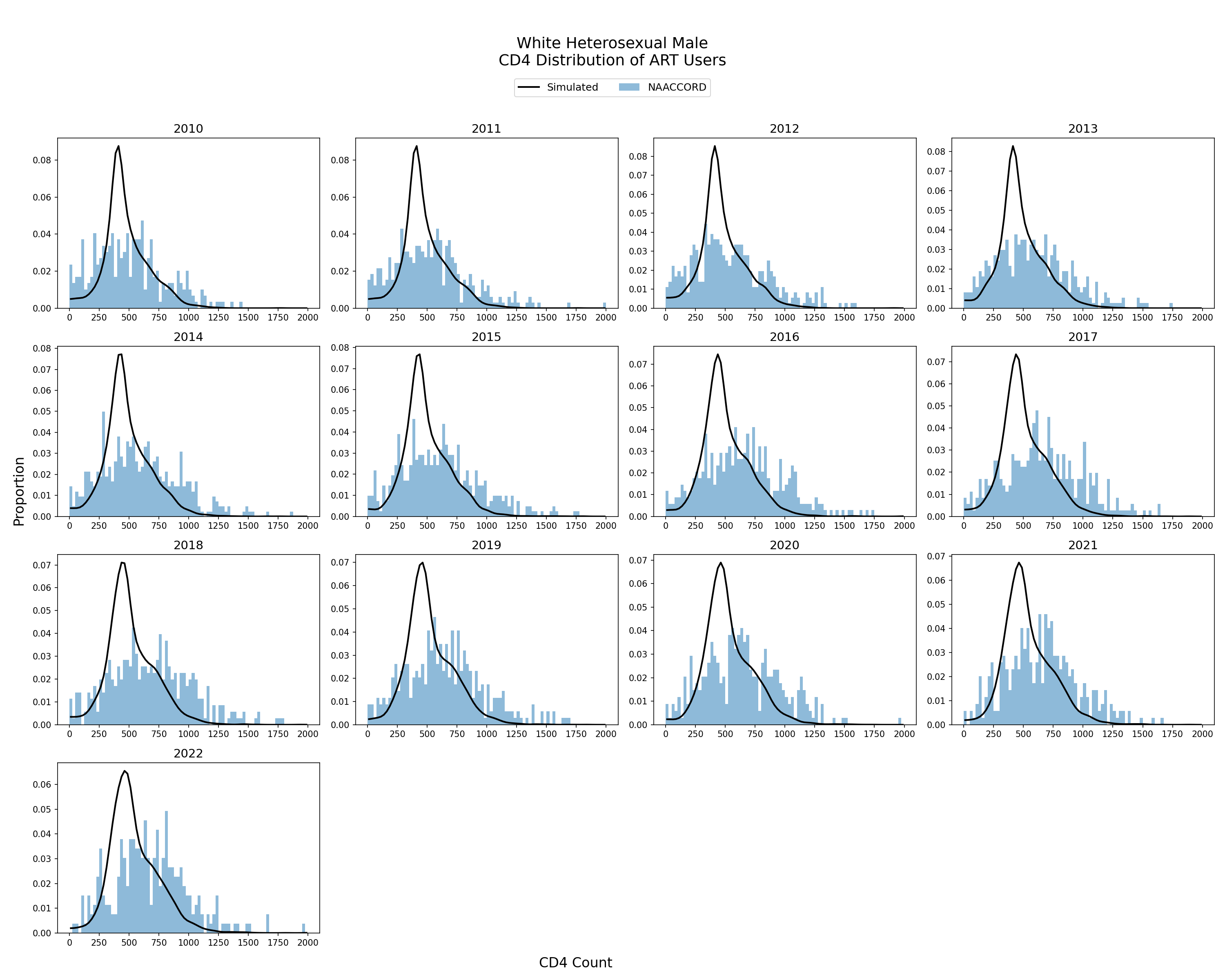
Figure 10g: Black IDU Female
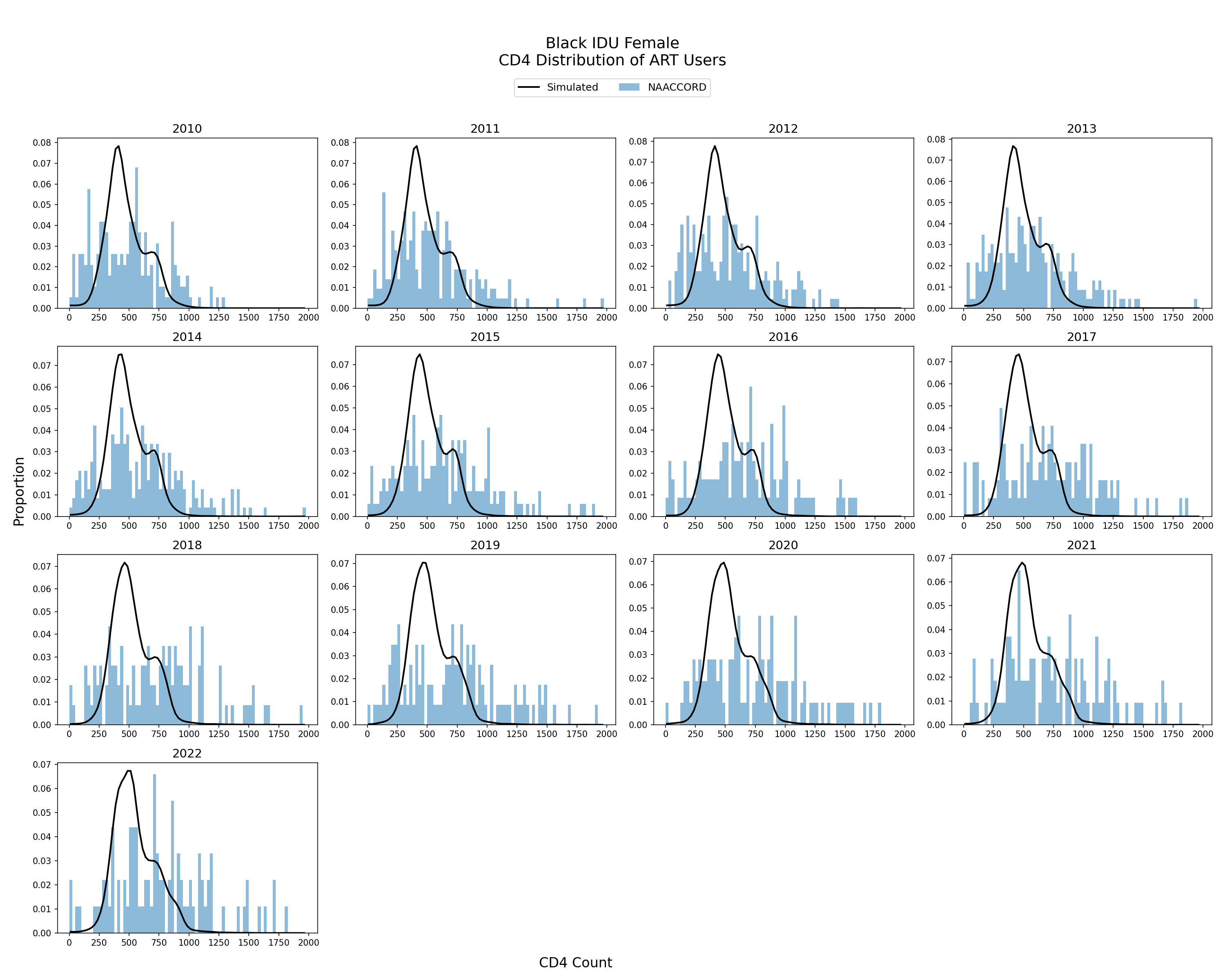
Figure 10h: Black IDU Male
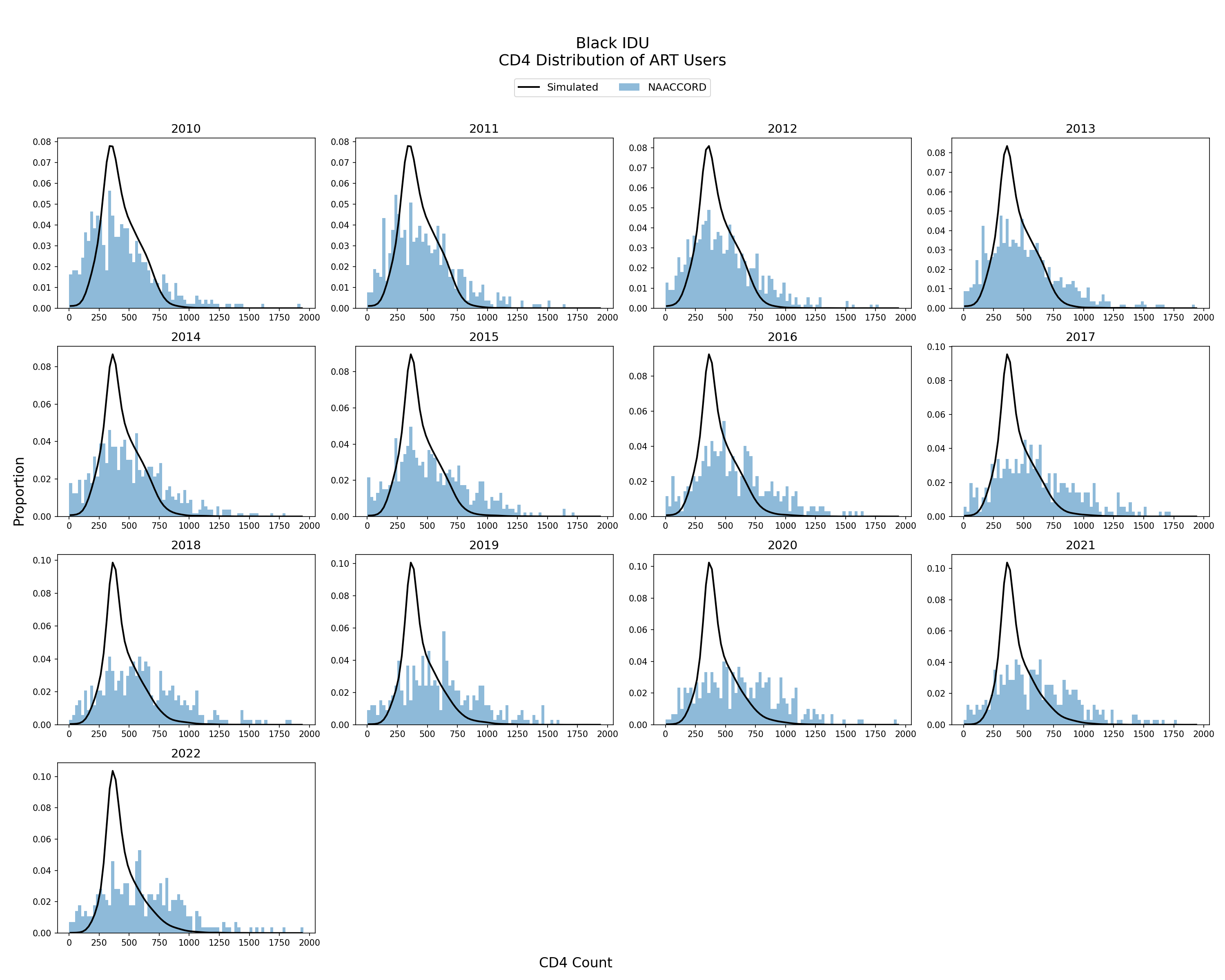
Figure 10i: Hispanic IDU Female
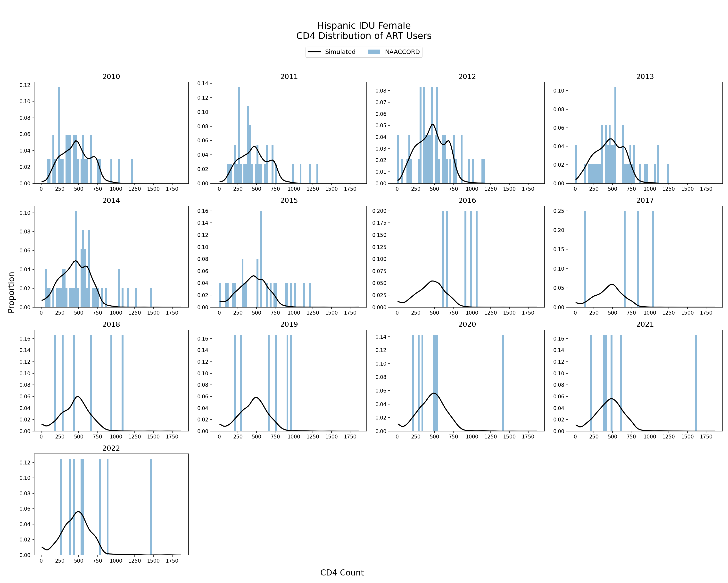
Figure 10j: Hispanic IDU Male
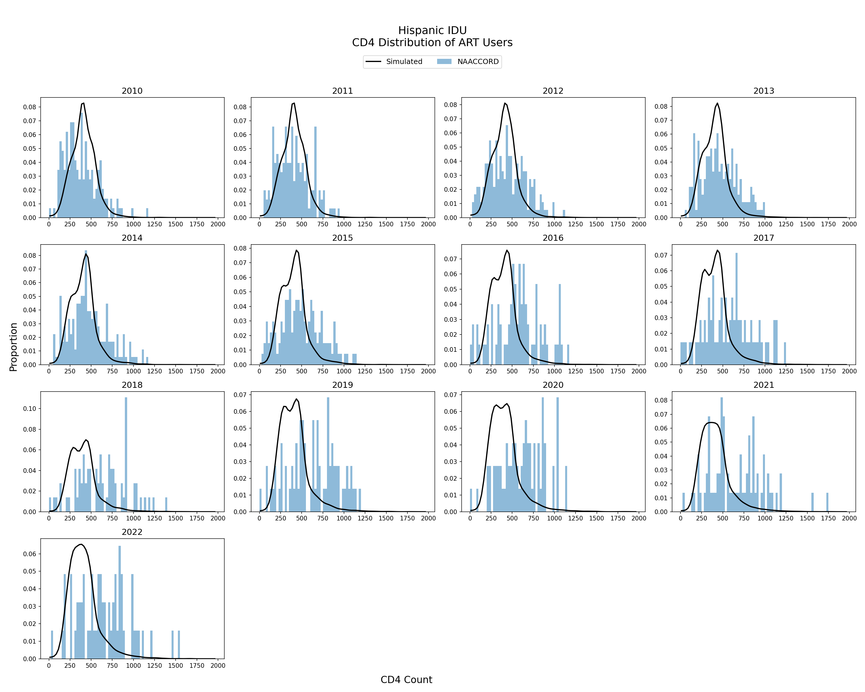
Figure 10k: White IDU Female
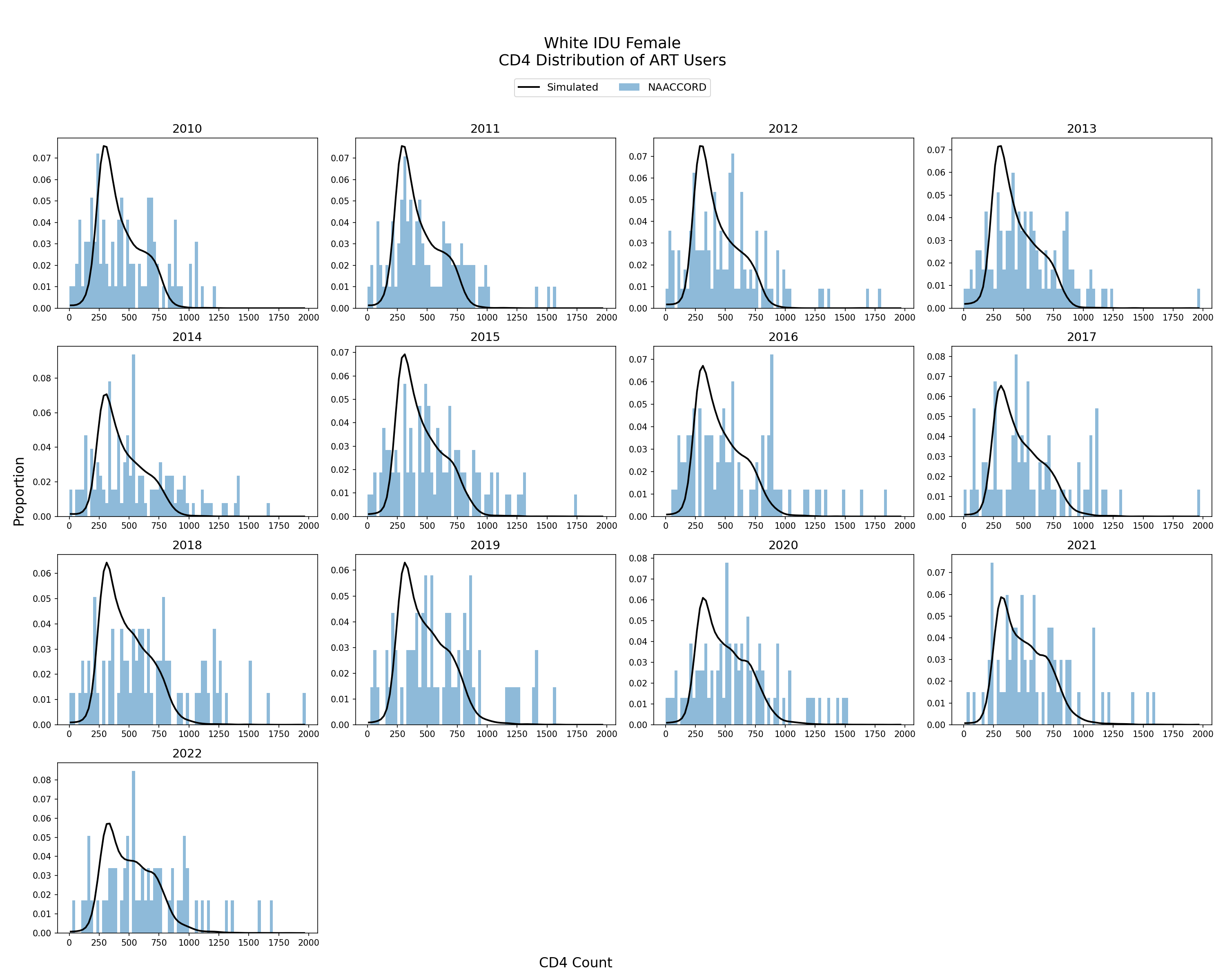
Figure 10l: White IDU Male
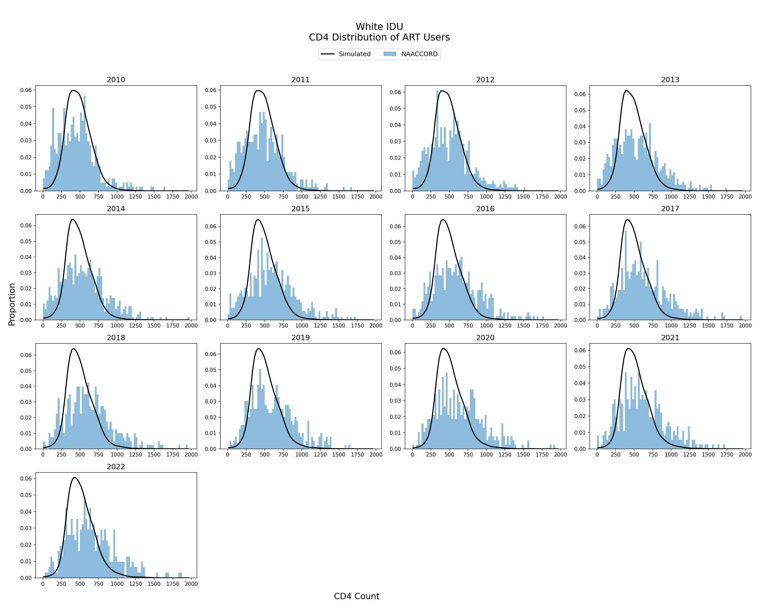
Figure 10m: Black MSM
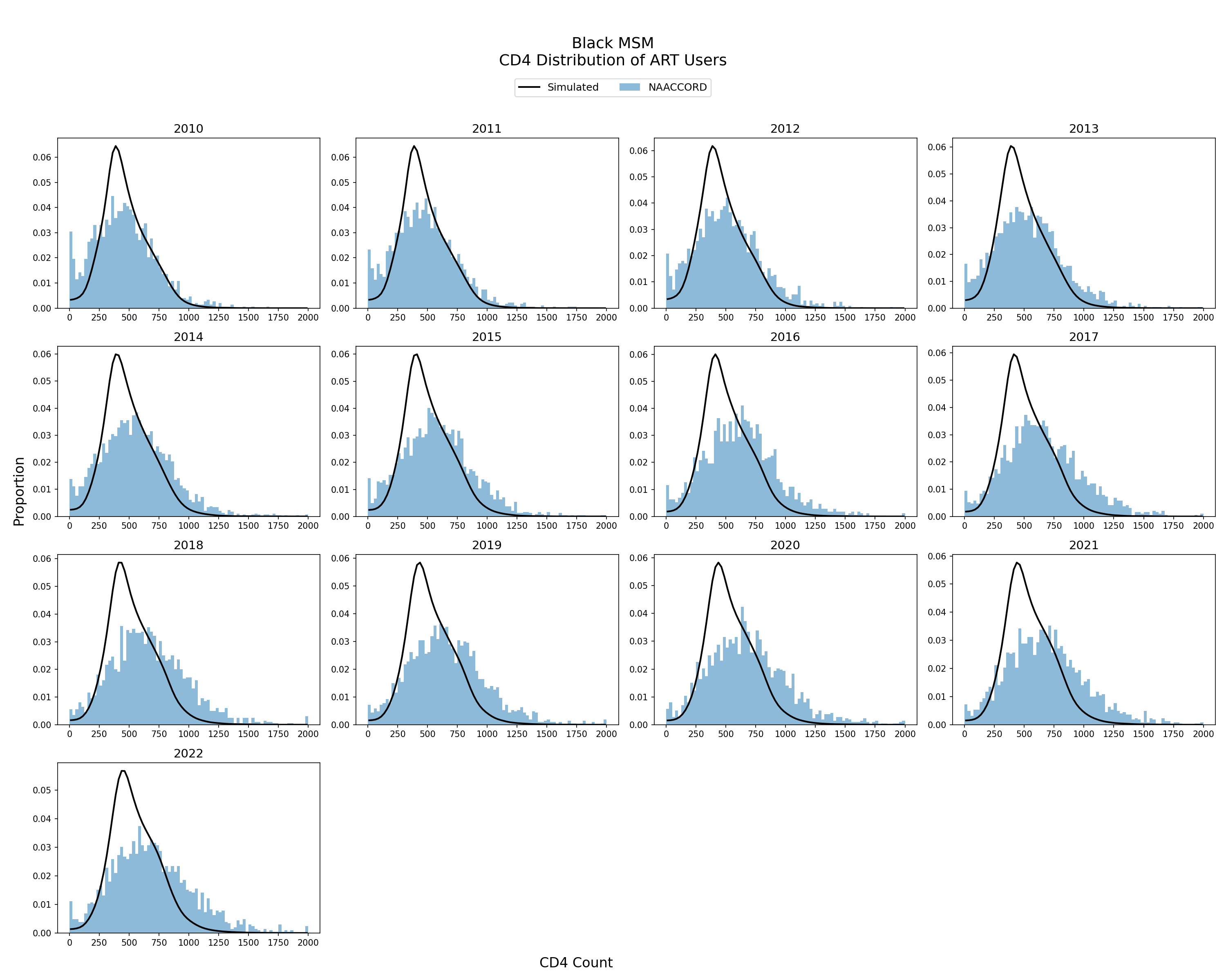
Figure 10n: Hispanic MSM
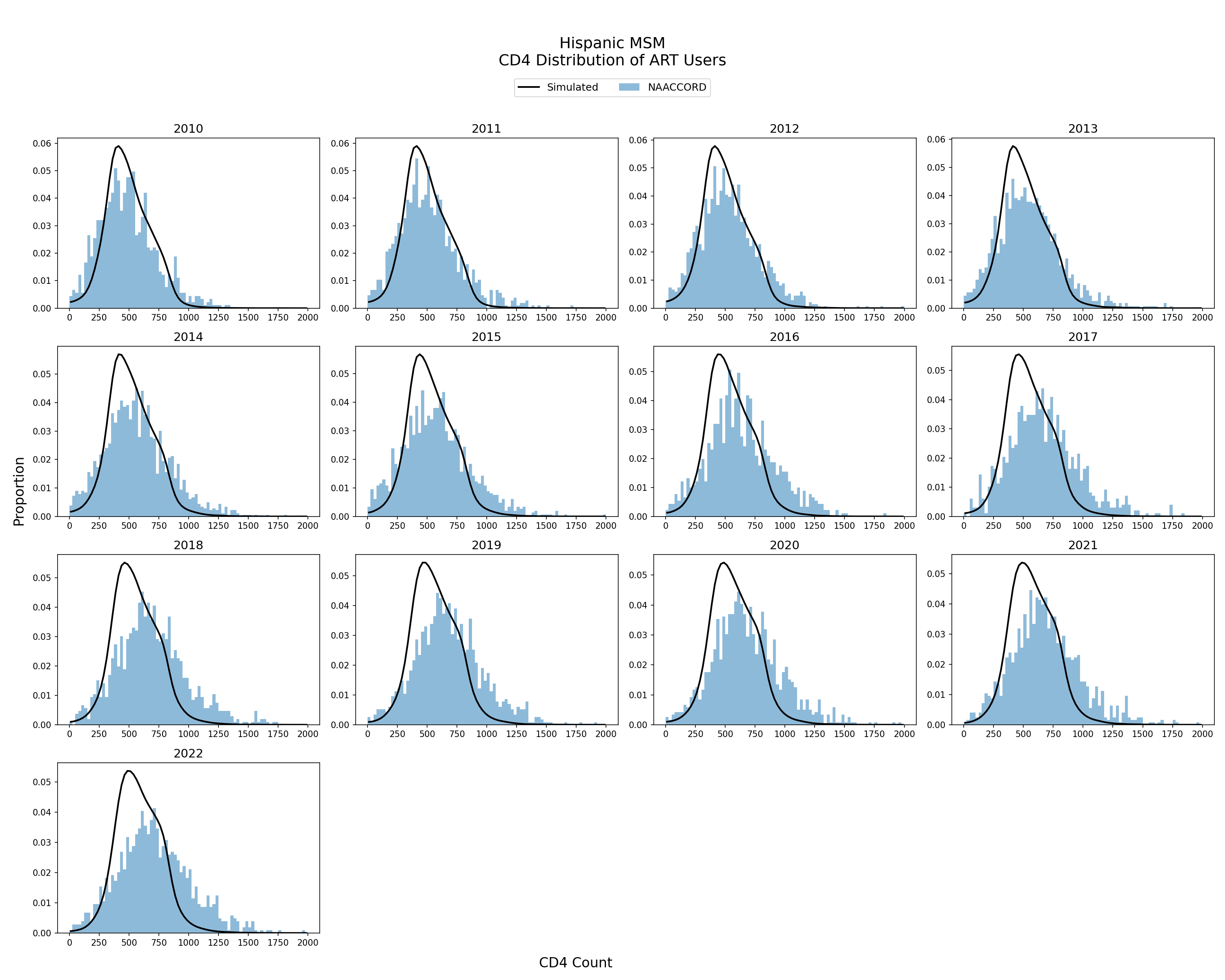
Figure 10o: White MSM
Population Reengaging from Care
Reengagement with HIV Care
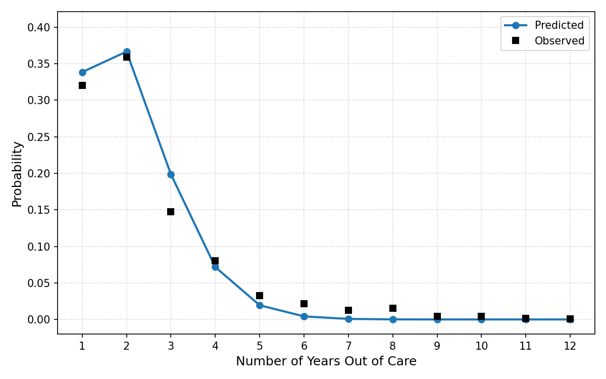
The number of years spent out of care following disengagement for the simulated population is modeling by a normalized Poisson distribution. The probability of spending a certain number of years out of care was fit such that the probability of staying disengaged for more than 12 years was zero. The resulting fit is shown below with the blue line representing the probability of being assigned a number of years out of care and the black dots represented the observed NAACCORD data.
Figure 11: Number of Years Spent Out of Care
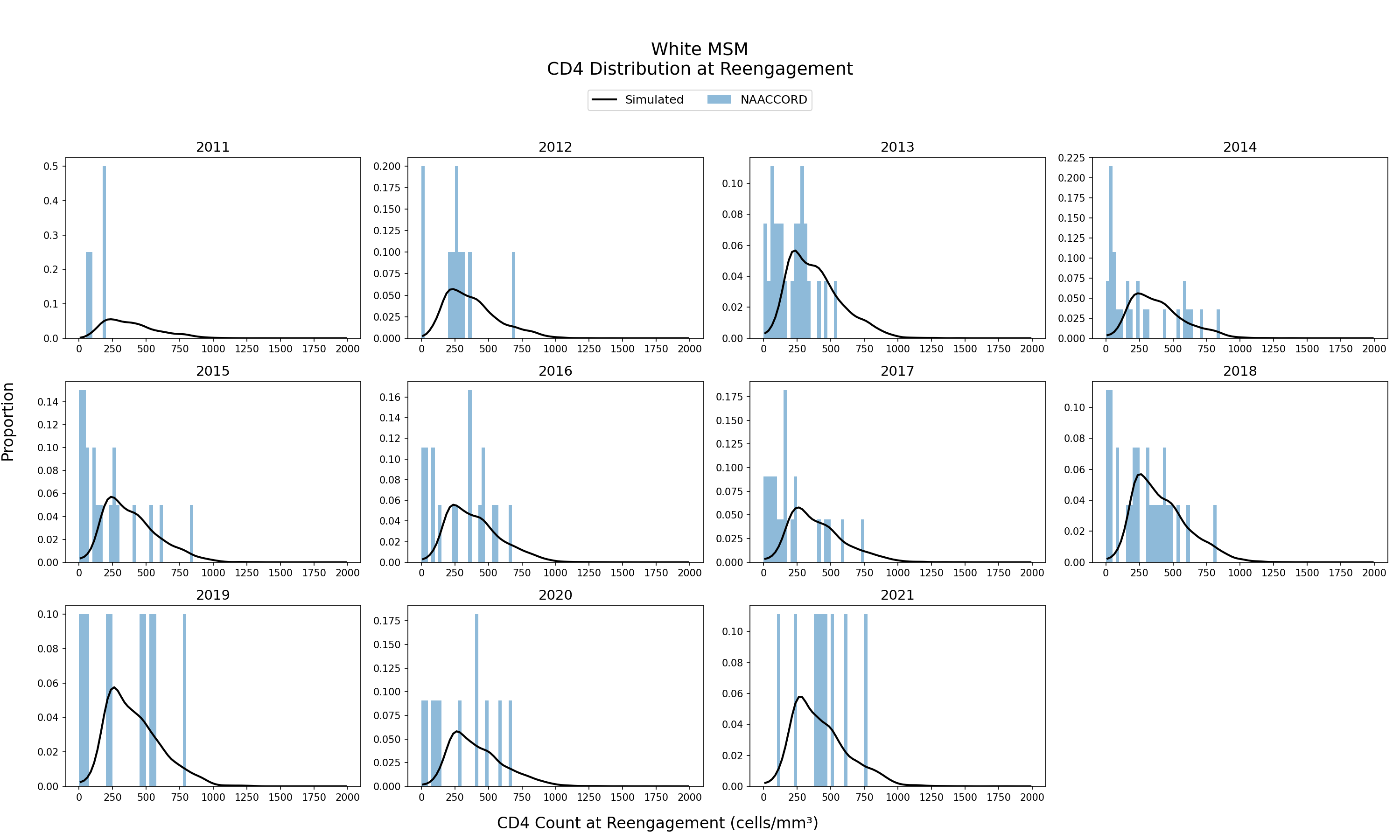
CD4 at Reengagement
The distribution of CD4 count at reengagement of the simulated population using ART from 2011 - 2021 is shown. The black line represents the simulated CD4 count distribution against NA-ACCORD data (blue bars). CD4 Count distribution of ART users is an emergent property of the model.
Figure 12a: Black HET Female
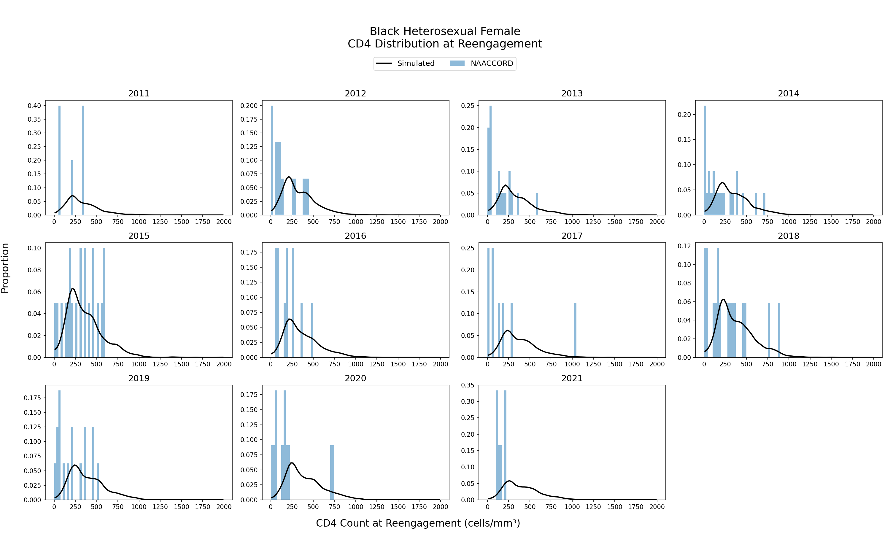
Figure 12b: Black HET Male
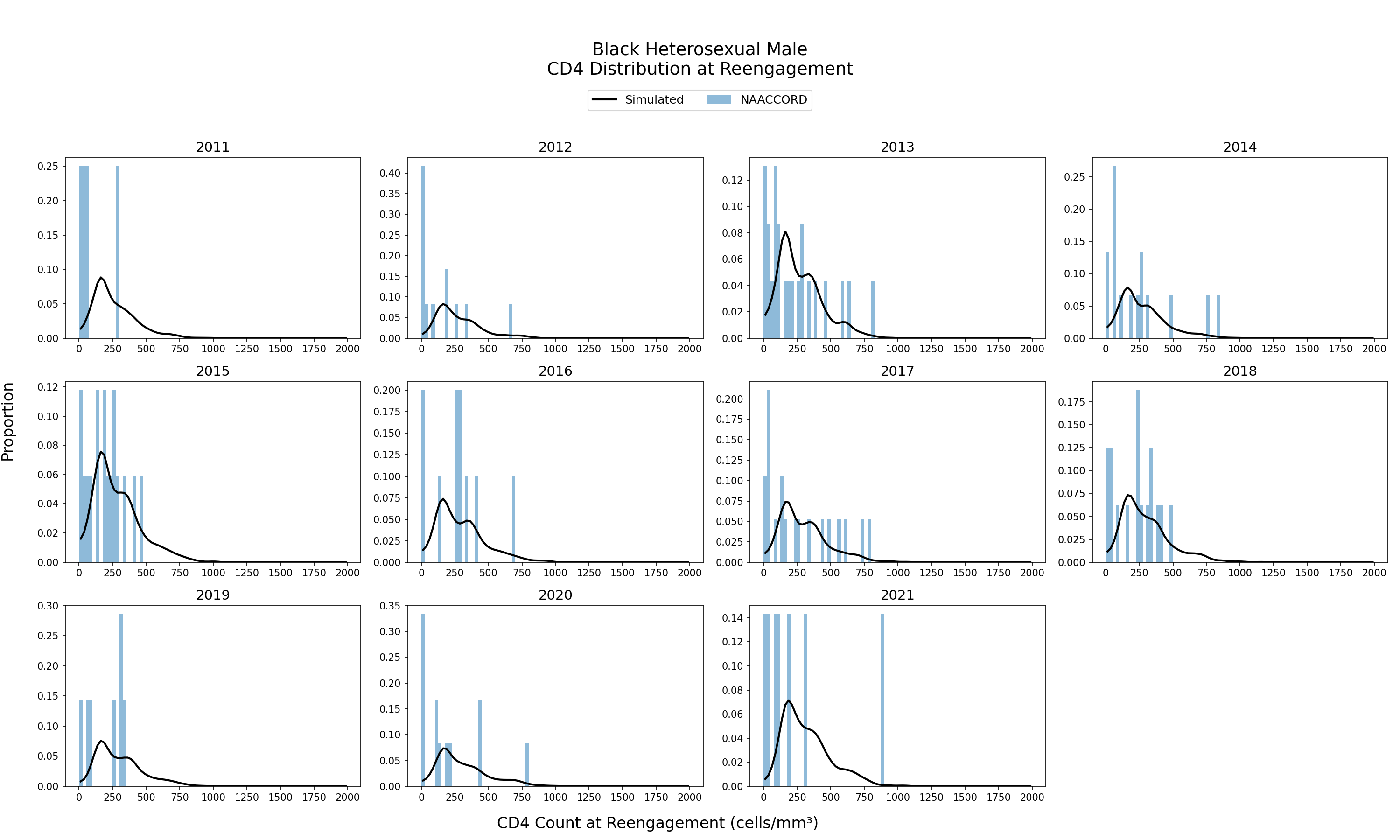
Figure 12c: Hispanic HET Female
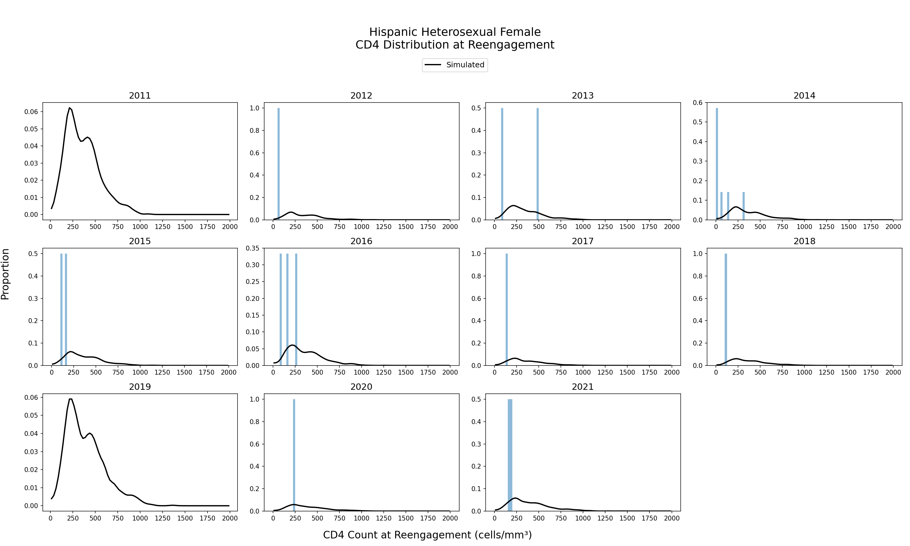
Figure 12d: Hispanic HET Male
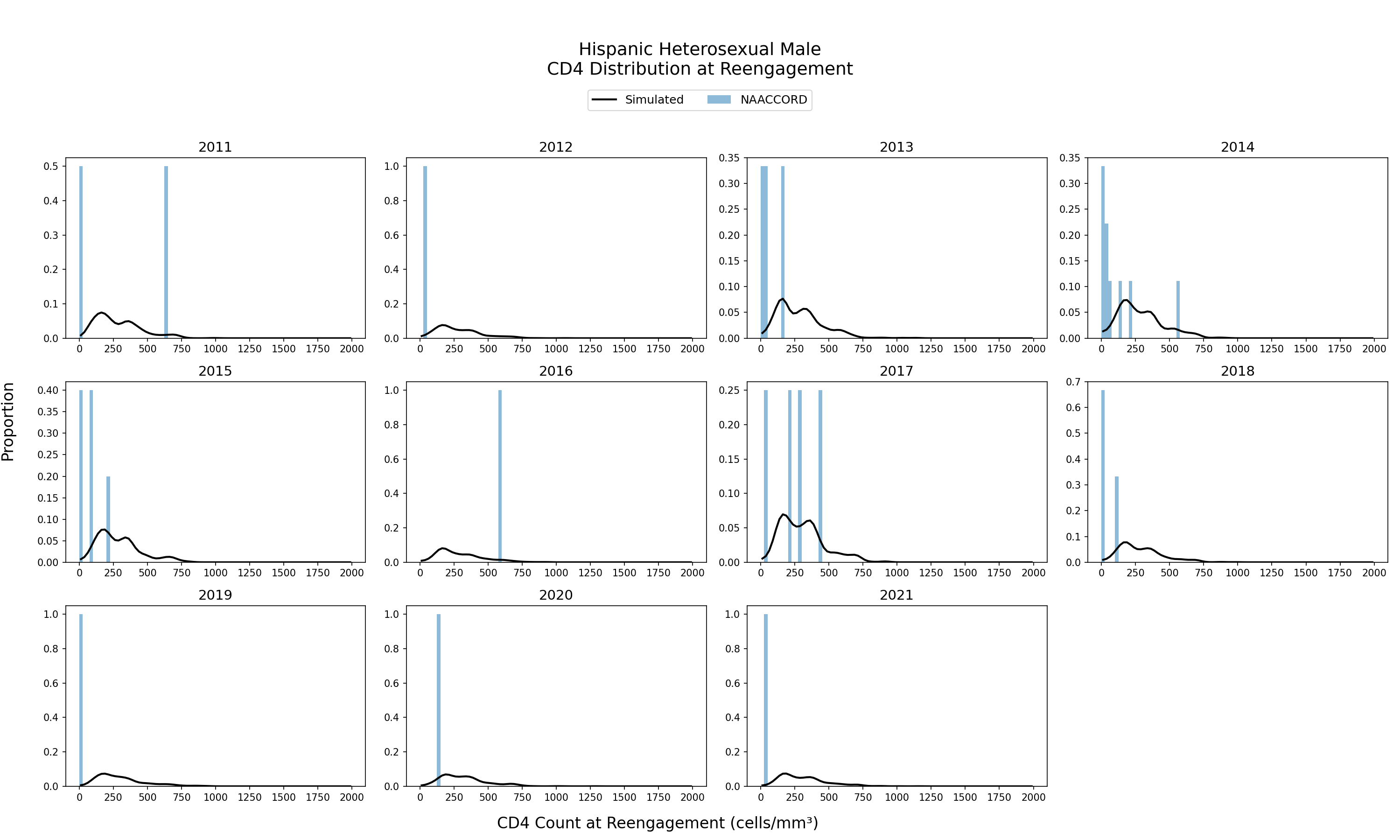
Figure 12e: White HET Female
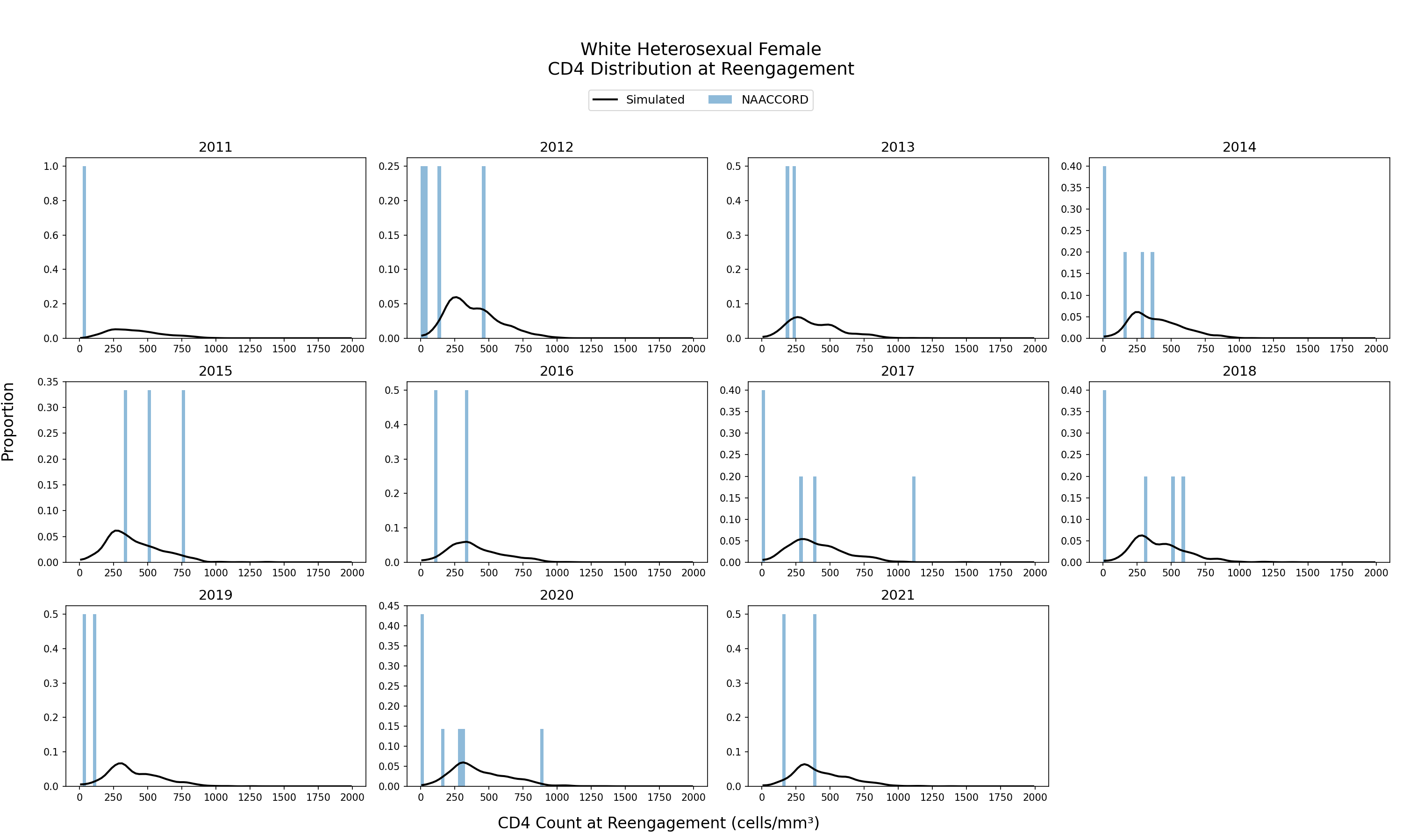
Figure 12f: White HET Male
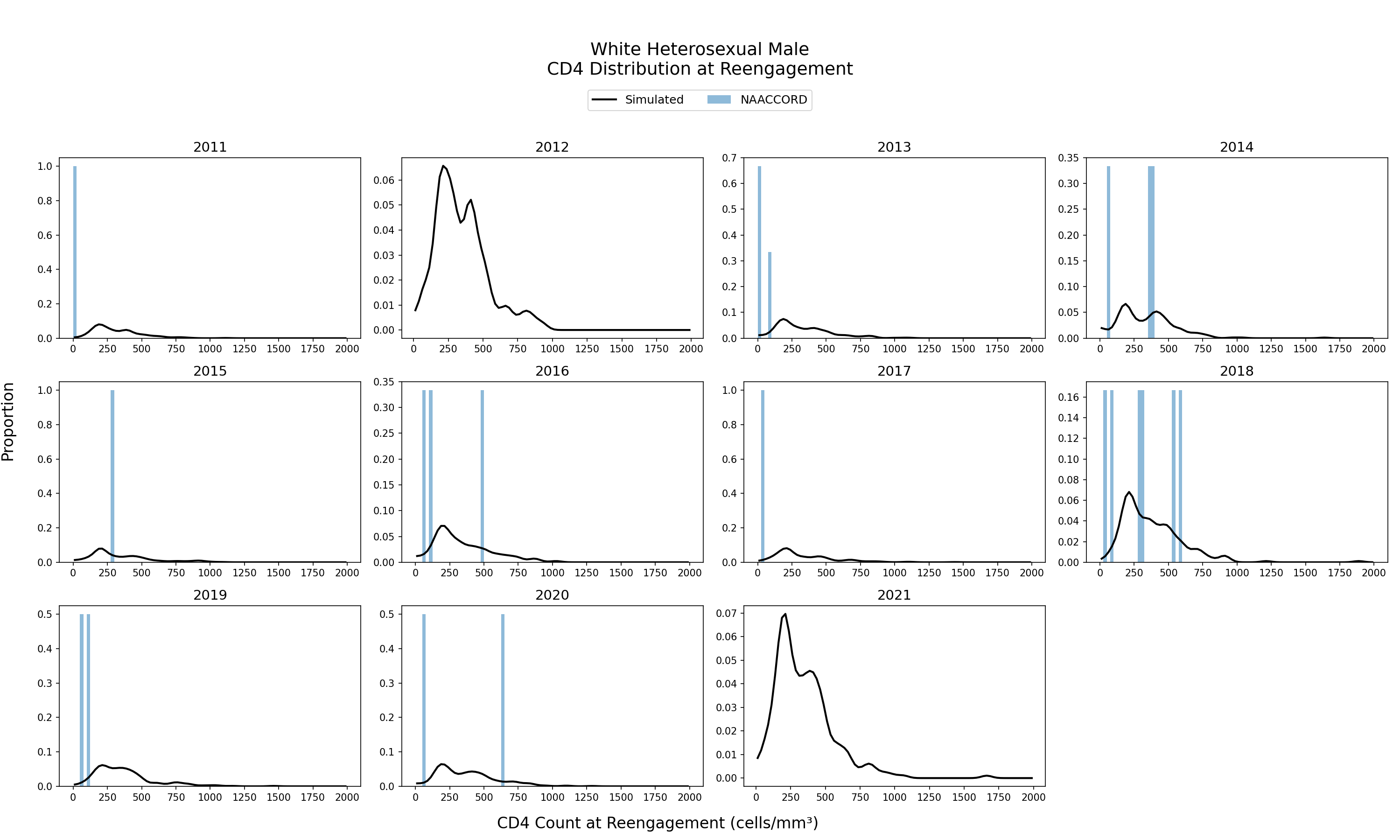
Figure 12g: Black IDU Female
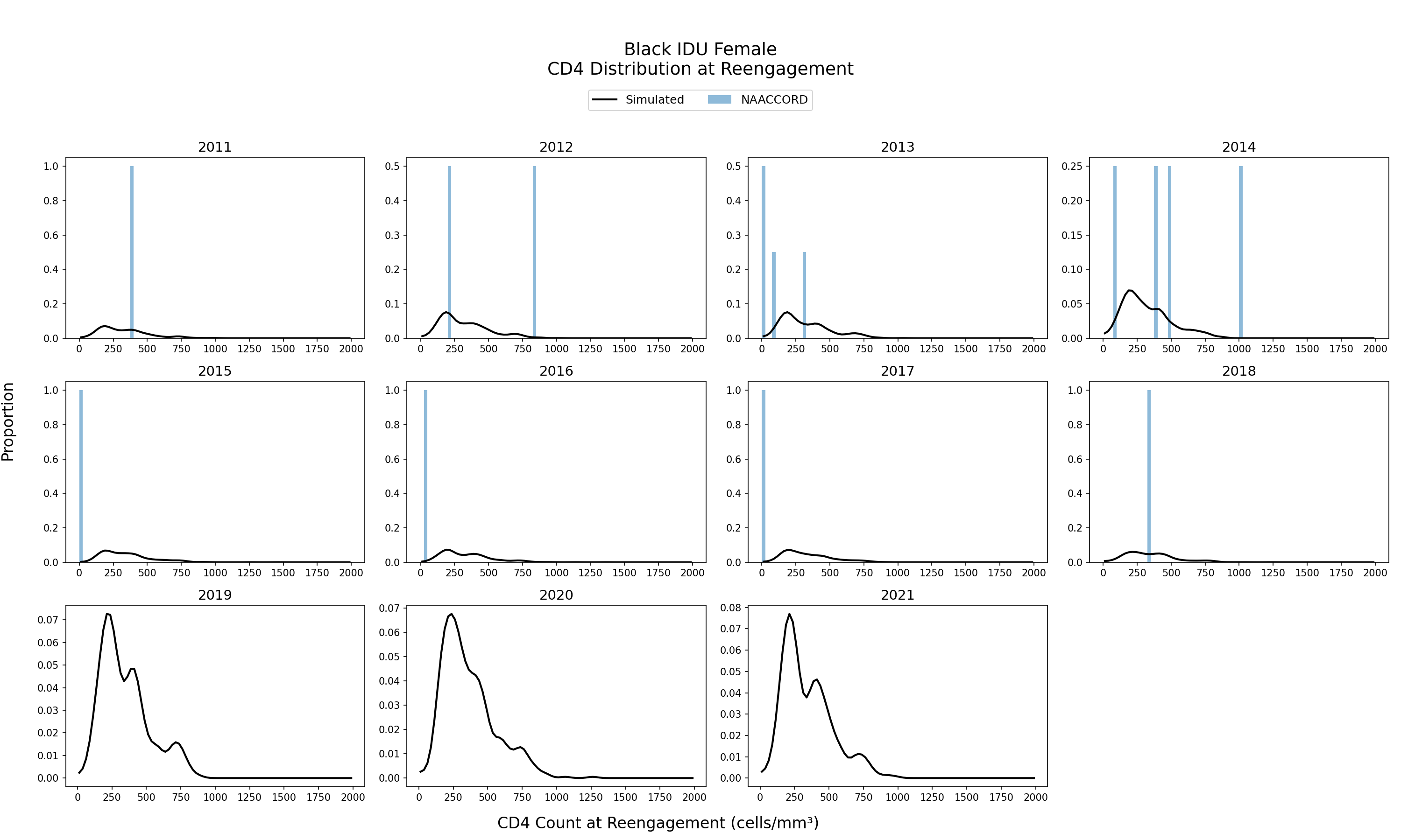
Figure 12h: Black IDU Male
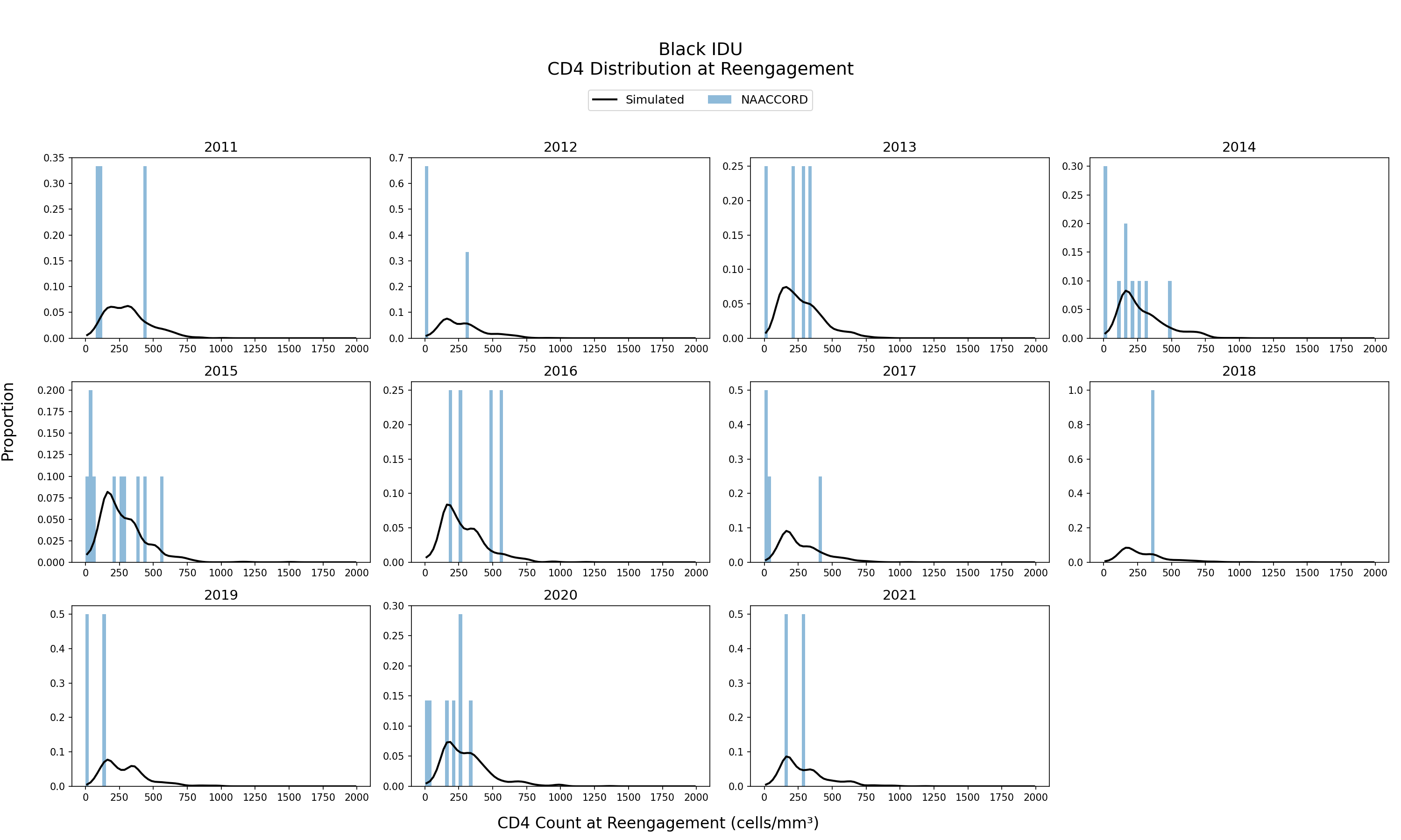
Figure 12i: Hispanic IDU Female
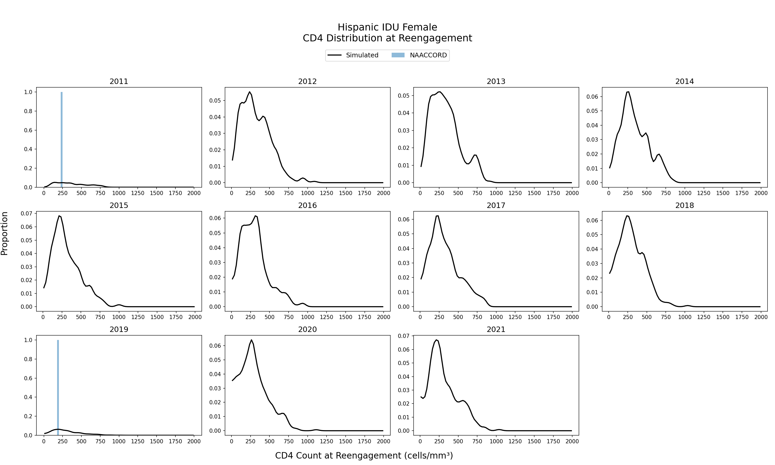
Figure 12j: Hispanic IDU Male
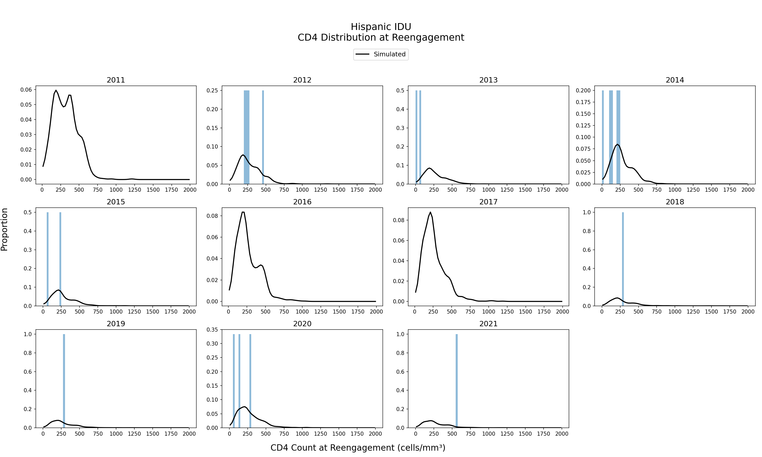
Figure 12k: White IDU Female
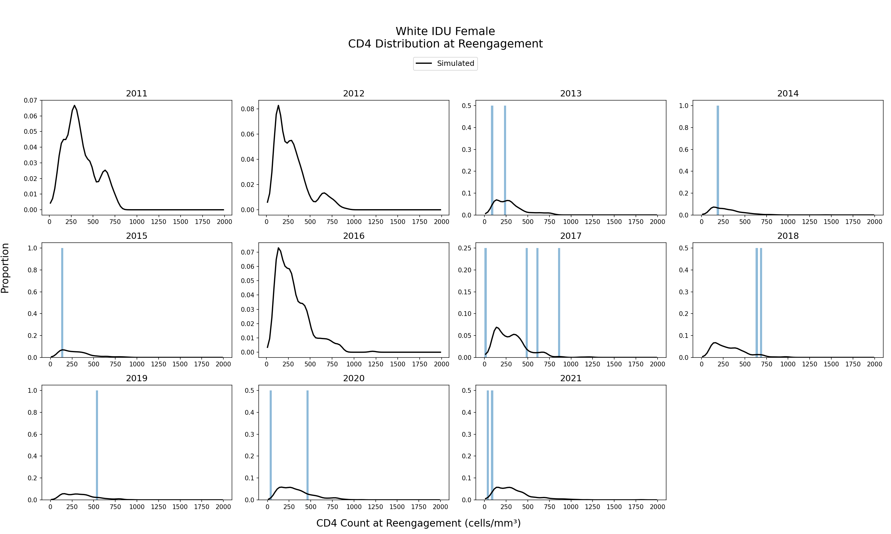
Figure 12l: White IDU Male
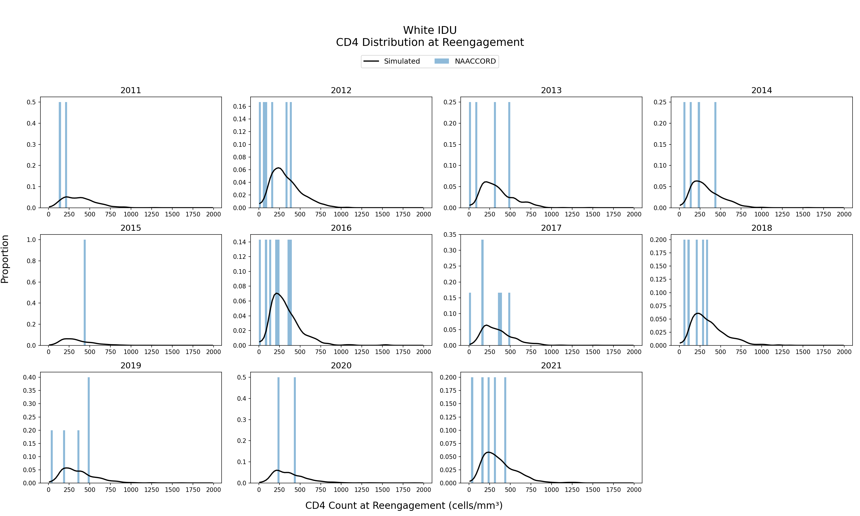
Figure 12m: Black MSM
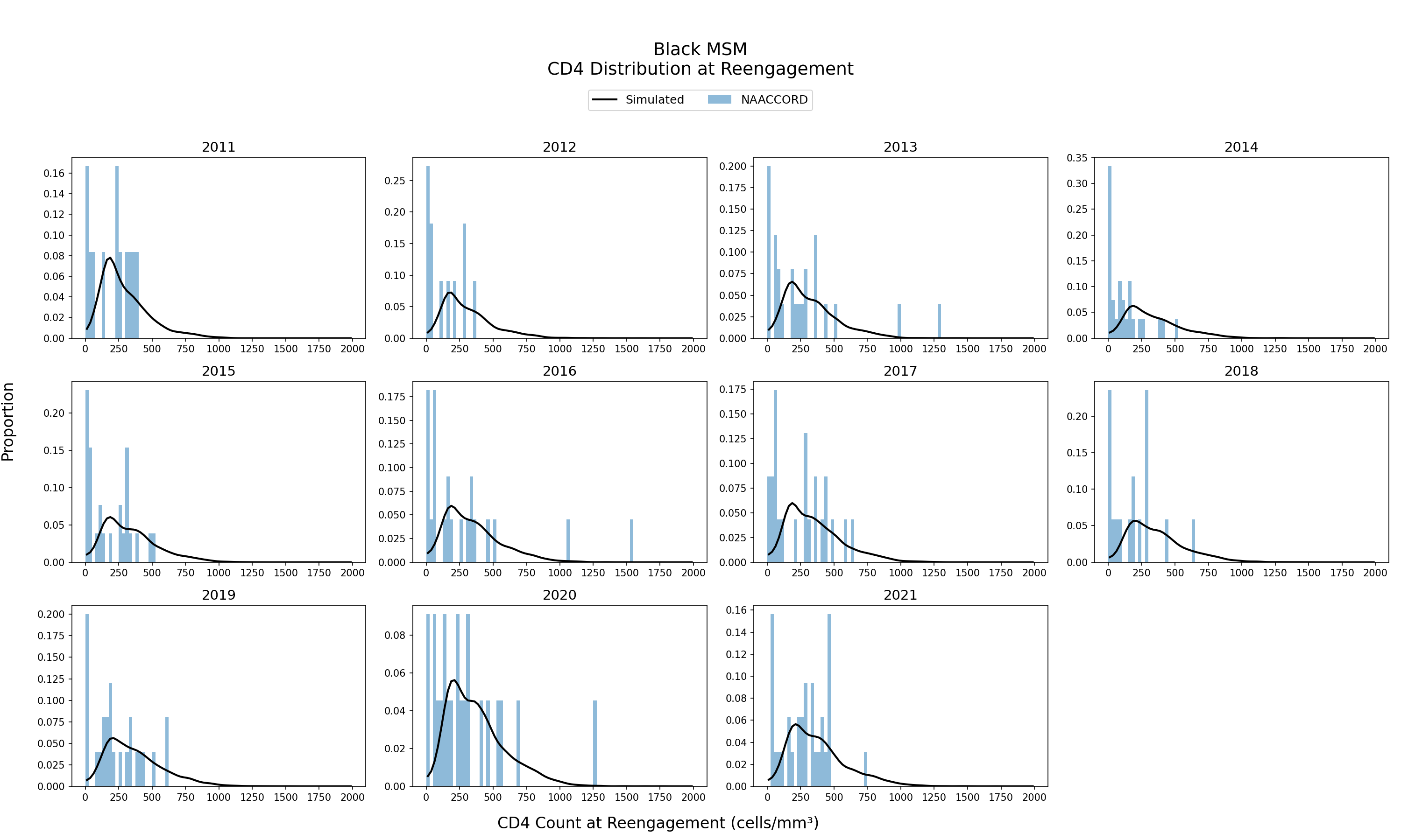
Figure 12n: Hispanic MSM
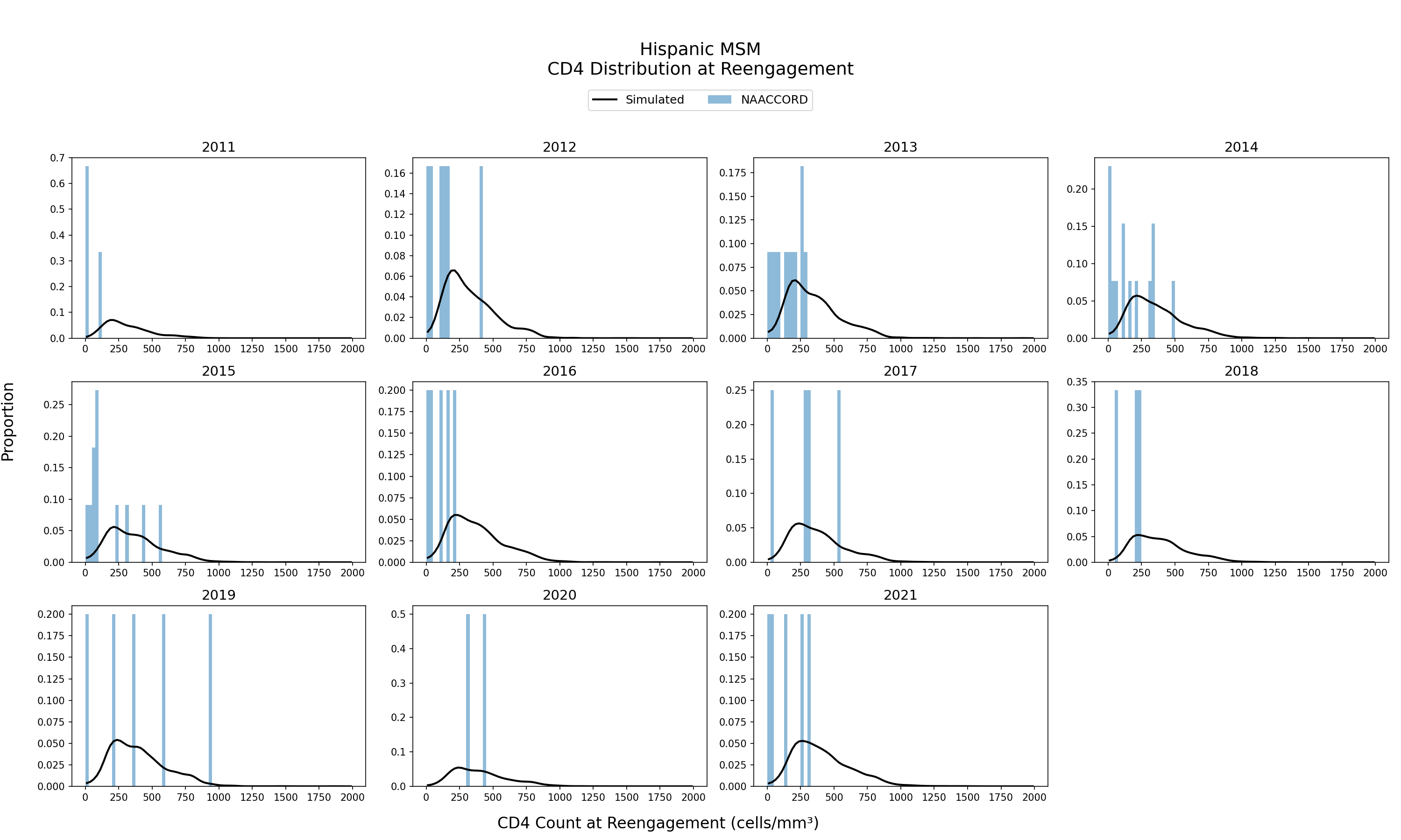
Figure 12o: White MSM
Comorbidities
The PEARL model allows for subgroups specific projection of future comorbidity burden. To ensure that our model aligns with real-world data, we compare the comorbidity incidence, prevalence, and prevalence at initiation of ART users across all modeled comorbidities.
Incidence
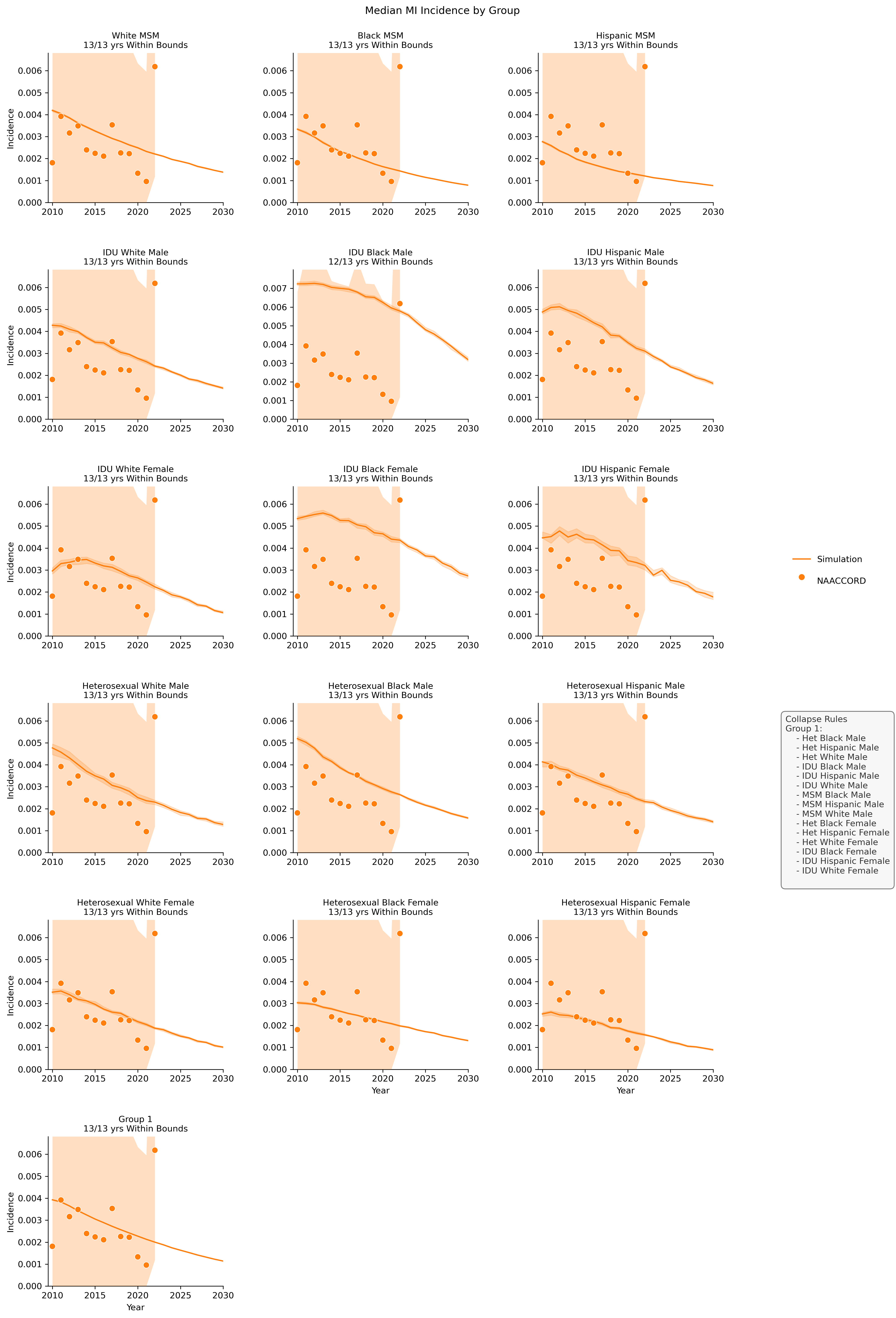
Below we present the incidence comparison of ART users between simulated comorbidities from the PEARL model and comorbity data from the NAACCORD. For each comorbidity plot, we show all subgroups and their alignment with acceptable deviation defined by the maximum of 95% confidence interval and 0.05 absolute value. The fit is defined as the number of years that fall within acceptable deviation and is listed below the subgroup title for each plot. Subgroups that have more than 25% of years outside deviation are shaded red. Due to sample size constraints, some groups are combined in the PEARL model. In these cases, the individual subgroup plots are presented in addition to the combined subgroup plots. The rules for collapsing are shown in the legend to the right.
Figure 13a: Anxiety
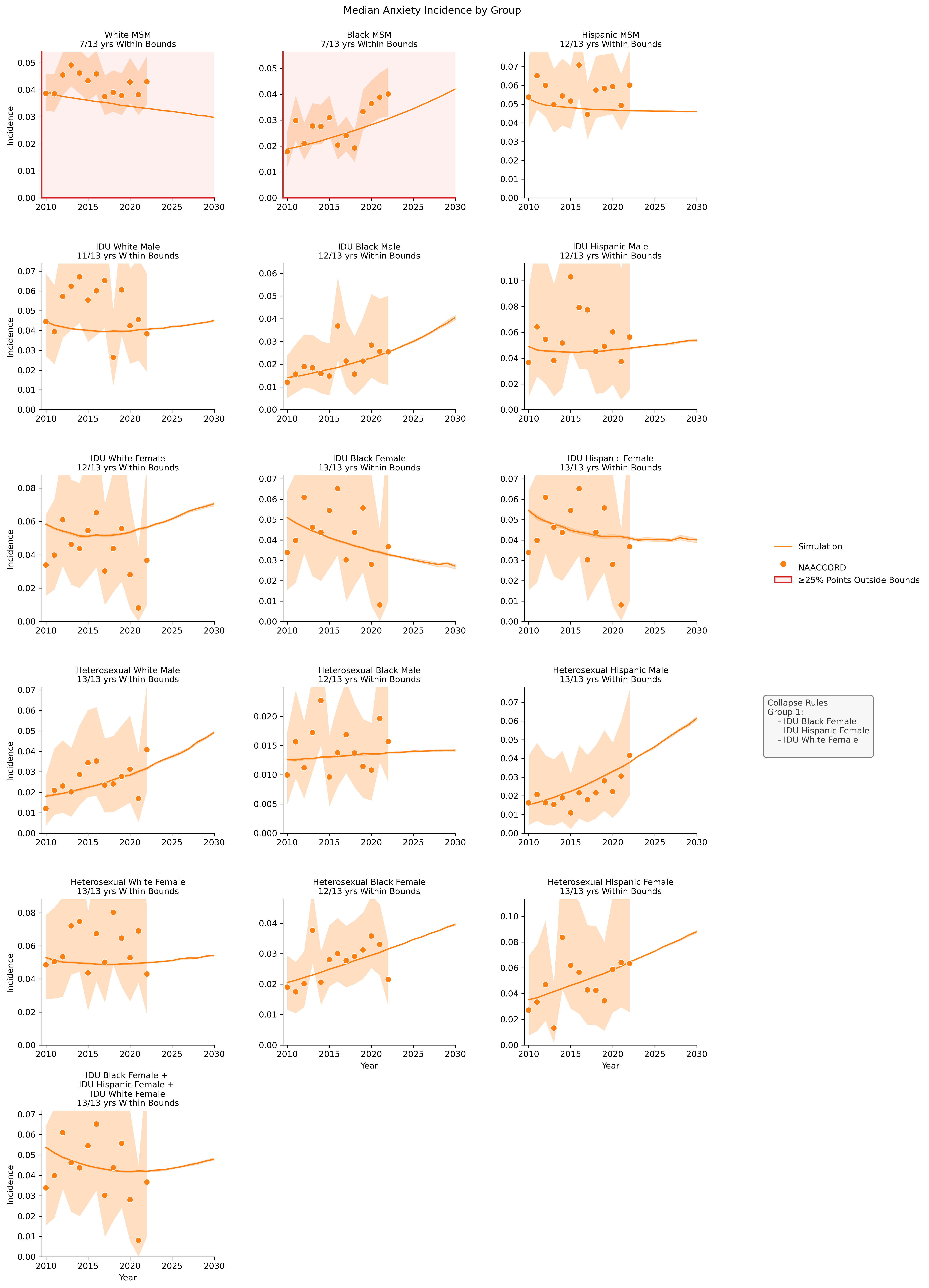
Figure 13b: Chronic Kidney Disease
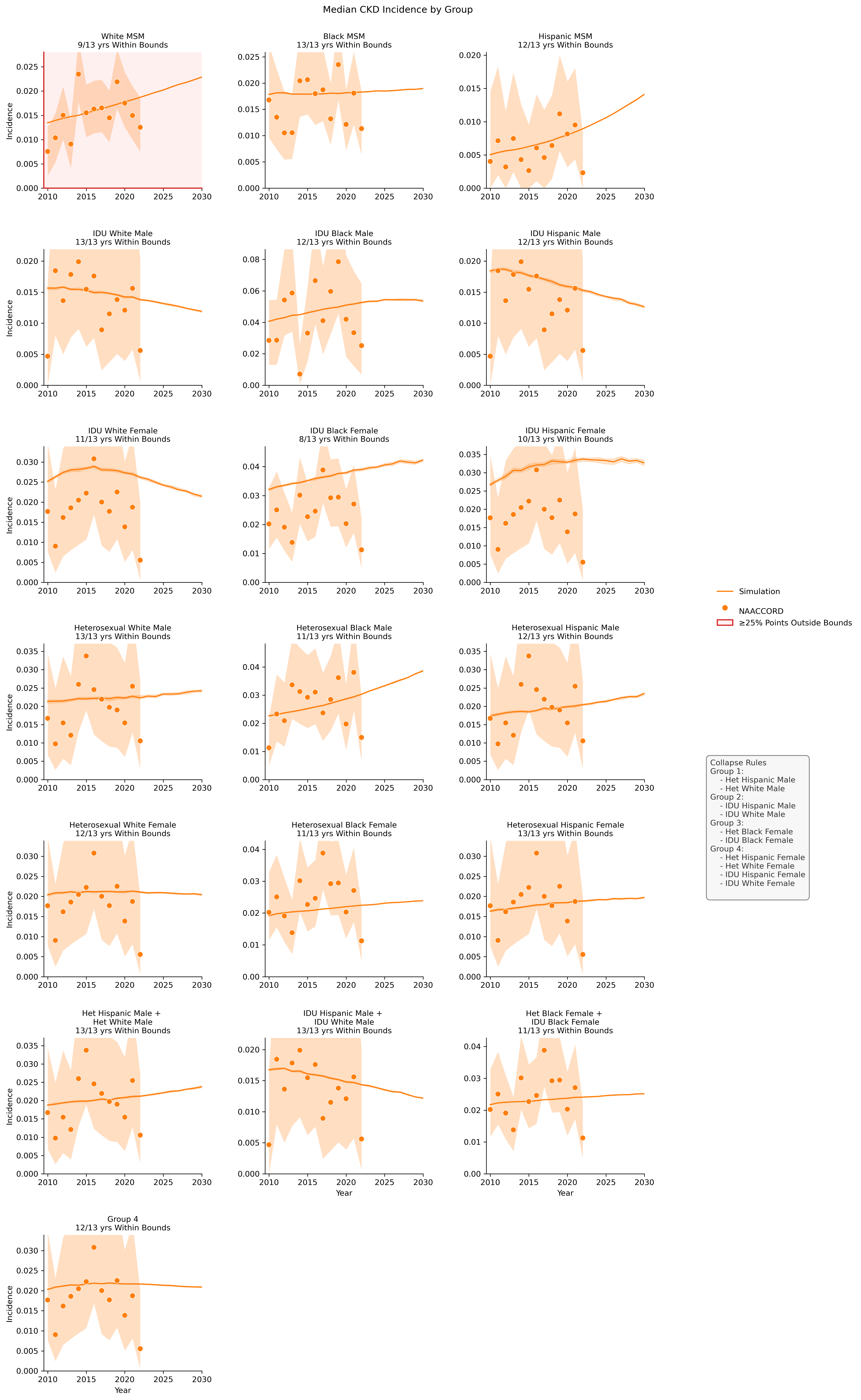
Figure 13c: Diabetes
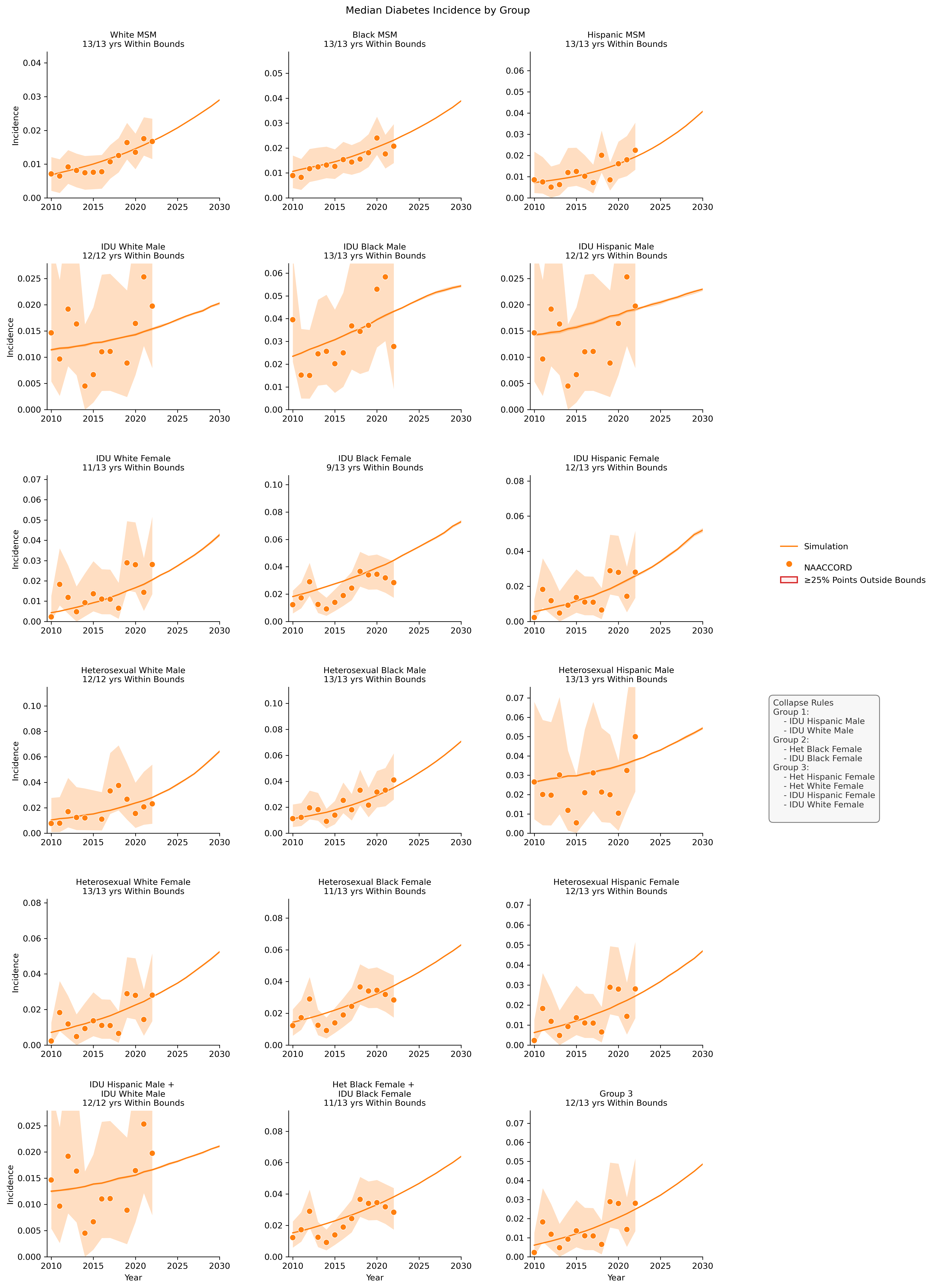
Figure 13d: Depression
Figure 13e: ESLD
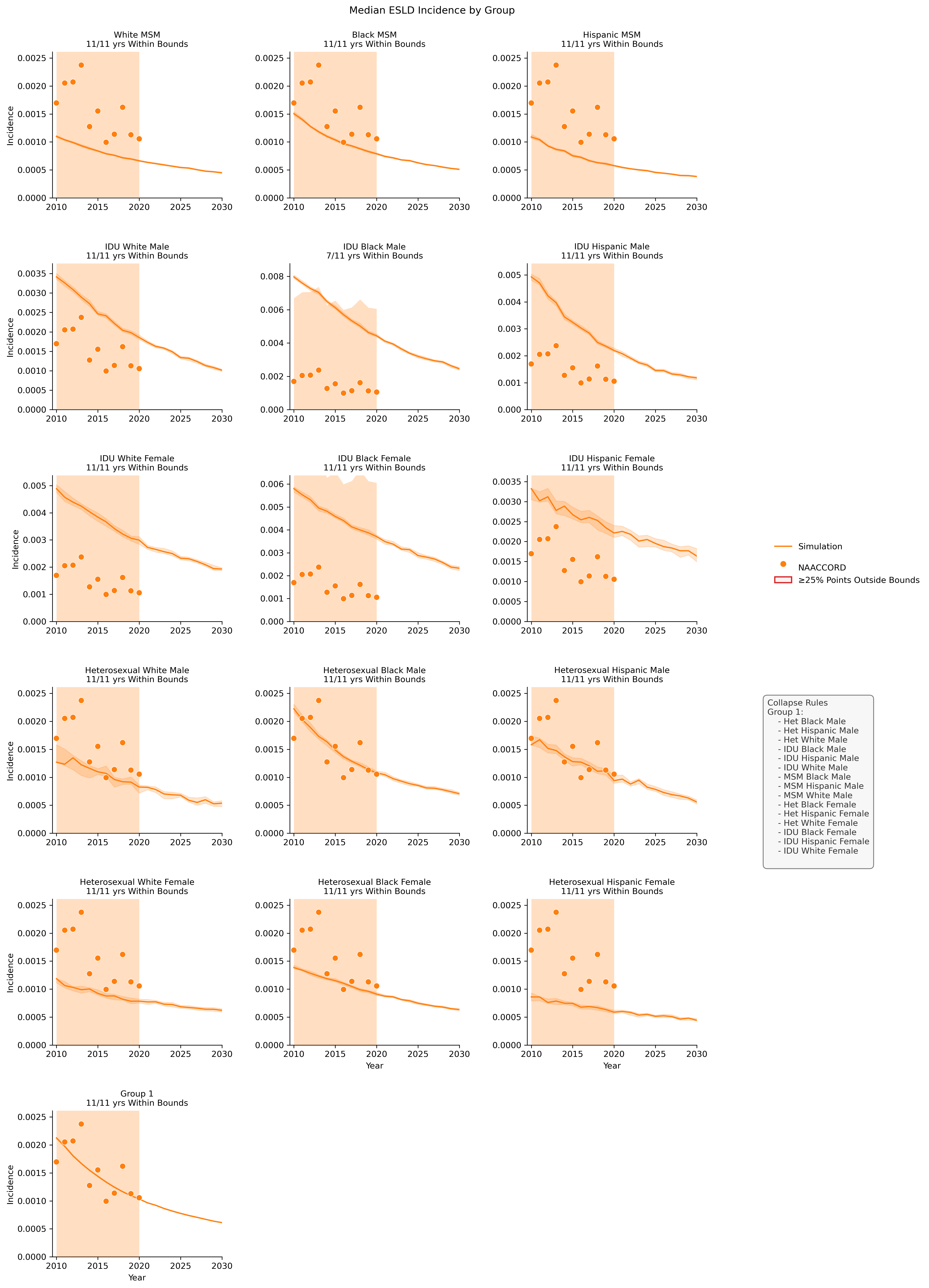
Figure 13f: Hypertension
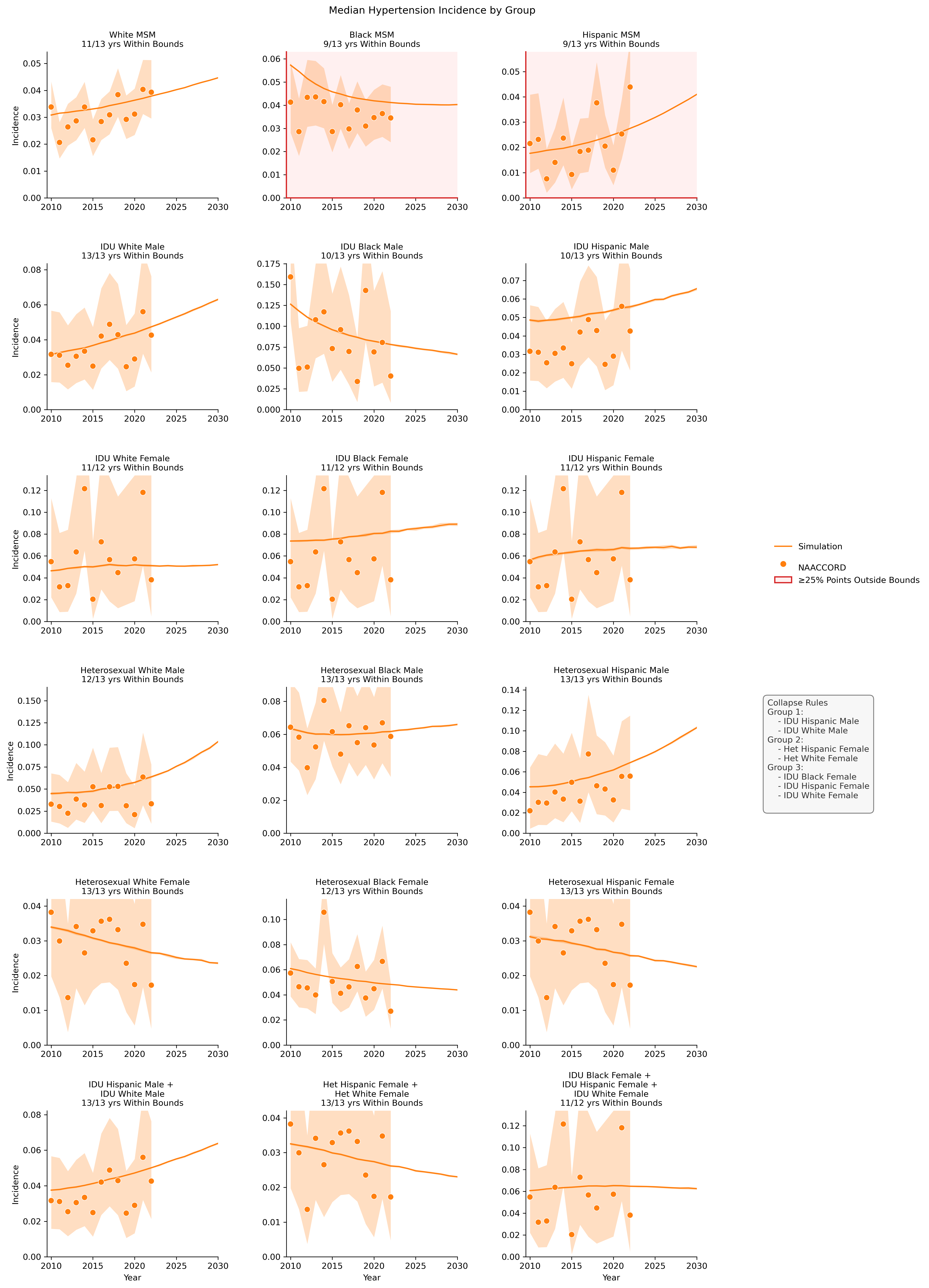
Figure 13g: Hypolipidemia
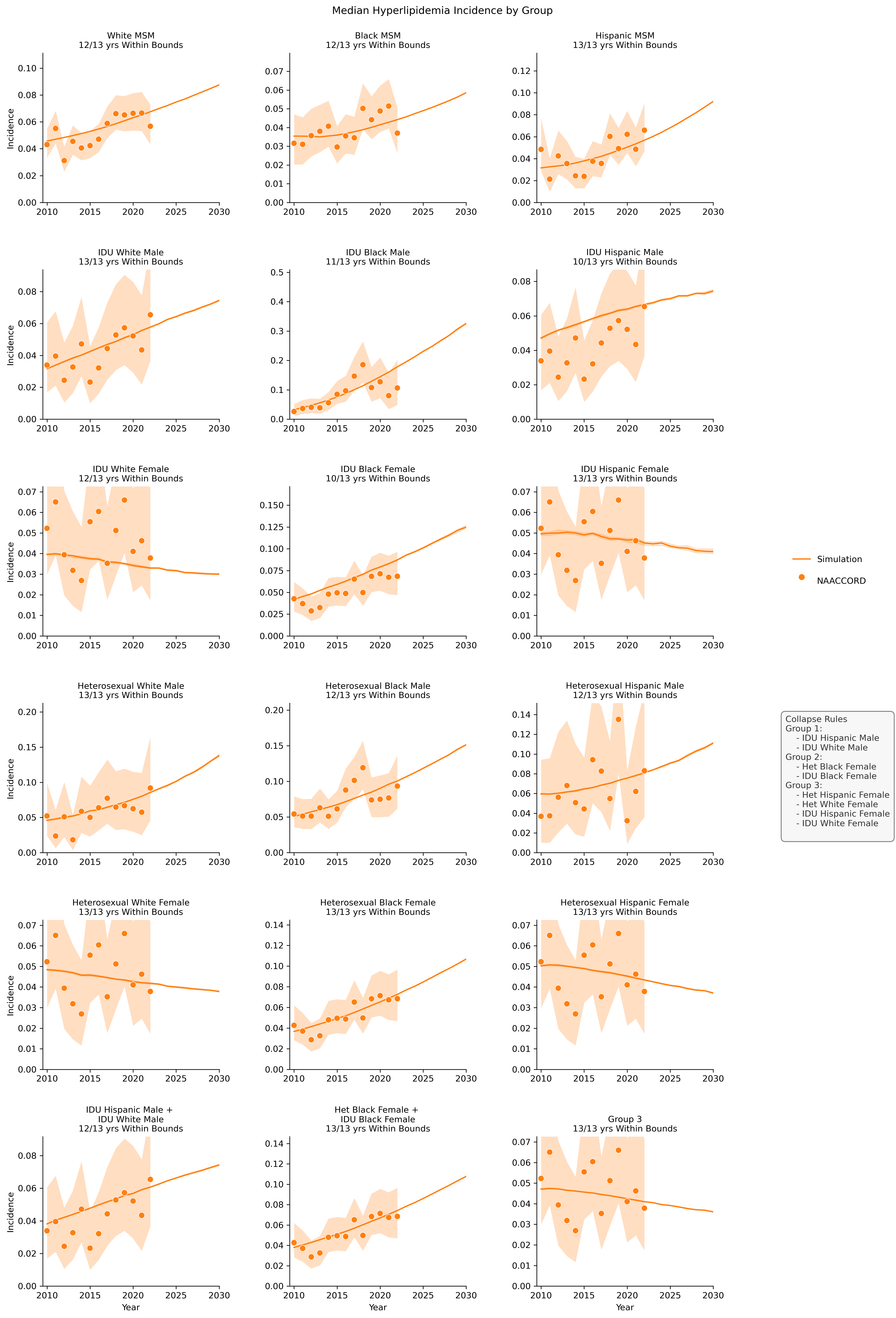
Figure 13h: Cancer
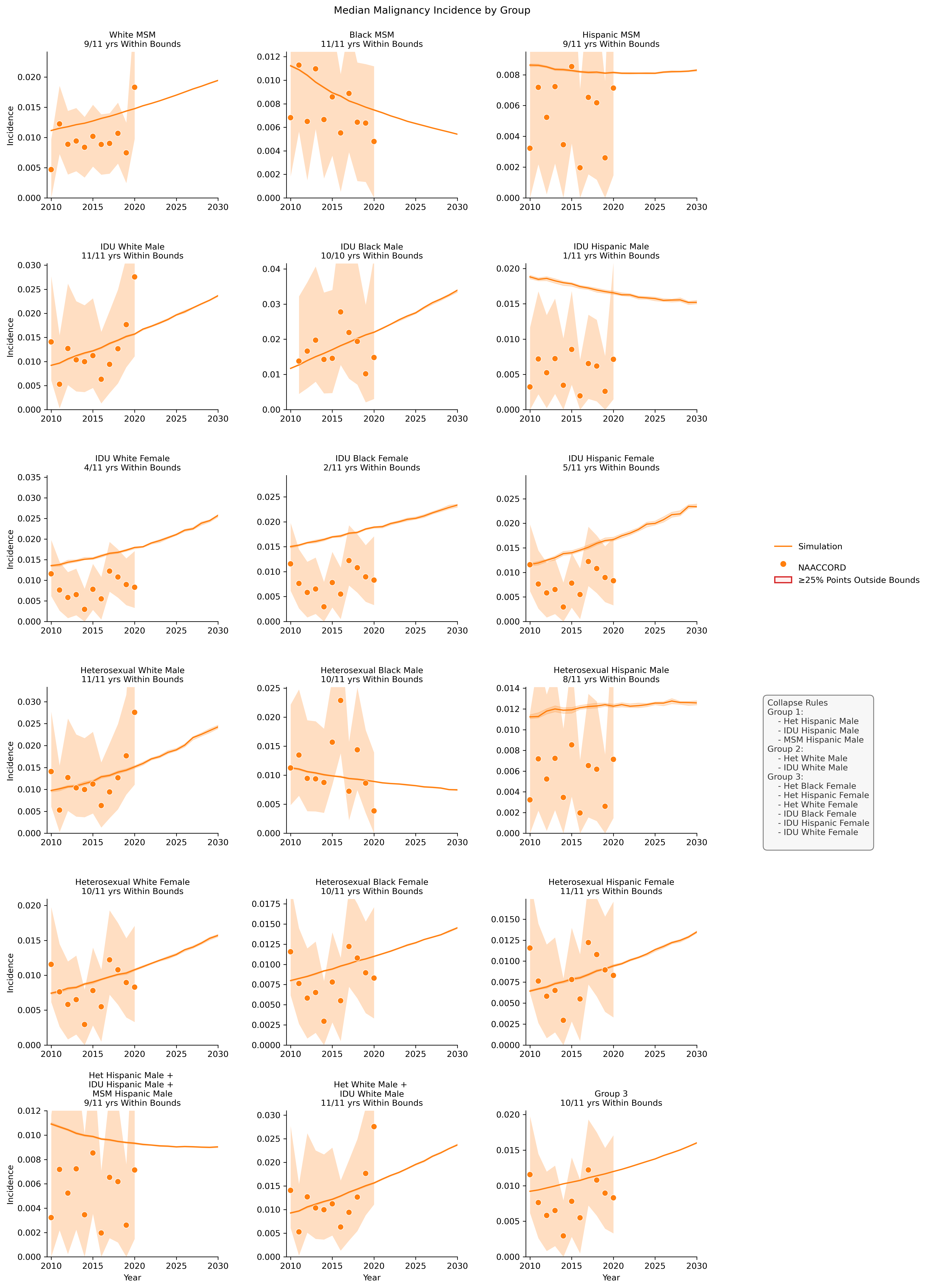
Figure 13i: MI
Prevalence
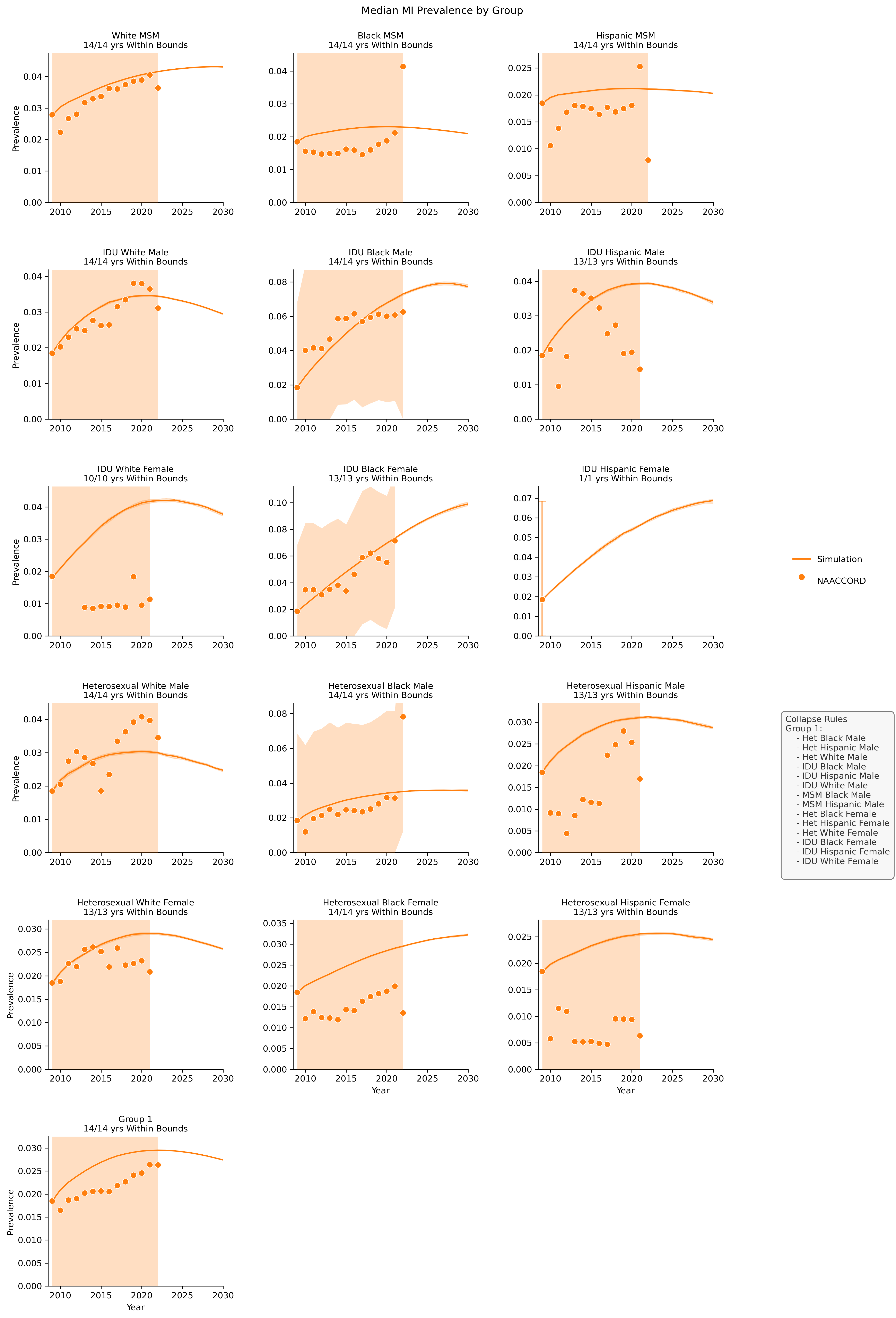
Below we present the prevalence comparison of ART users between simulated comorbidities from the PEARL model and comorbity data from the NAACCORD. For each comorbidity plot, we show all subgroups and their alignment with acceptable deviation defined by the maximum of 95% confidence interval and 0.05 absolute value. The fit is defined as the number of years that fall within acceptable deviation and is listed below the subgroup title for each plot. Subgroups that have more than 25% of years outside deviation are shaded red. Due to sample size constraints, some groups are combined in the PEARL model. In these cases, the individual subgroup plots are presented in addition to the combined subgroup plots. The rules for collapsing are shown in the legend to the right.
Figure 14a: Anxiety
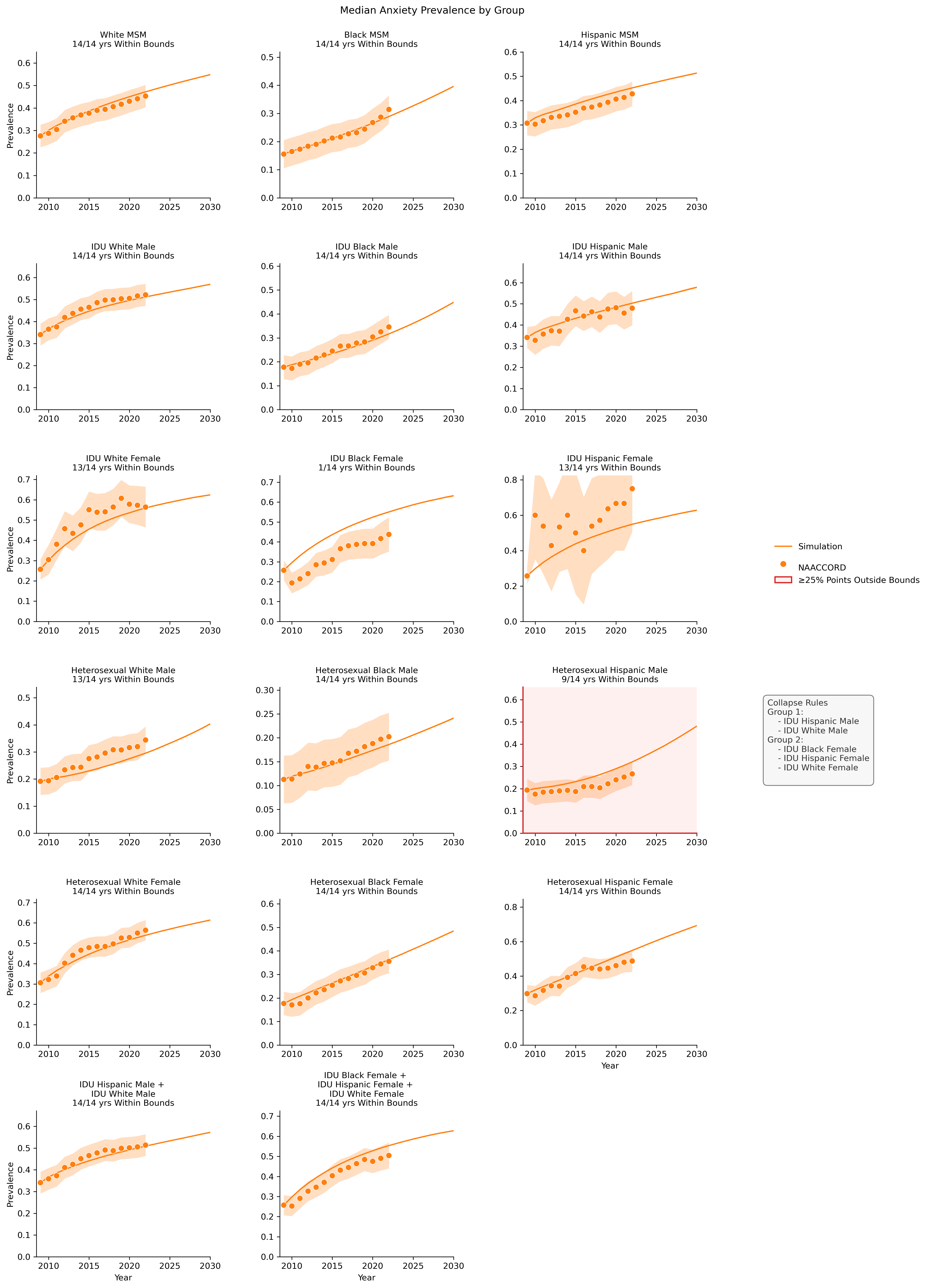
Figure 14b: Chronic Kidney Disease
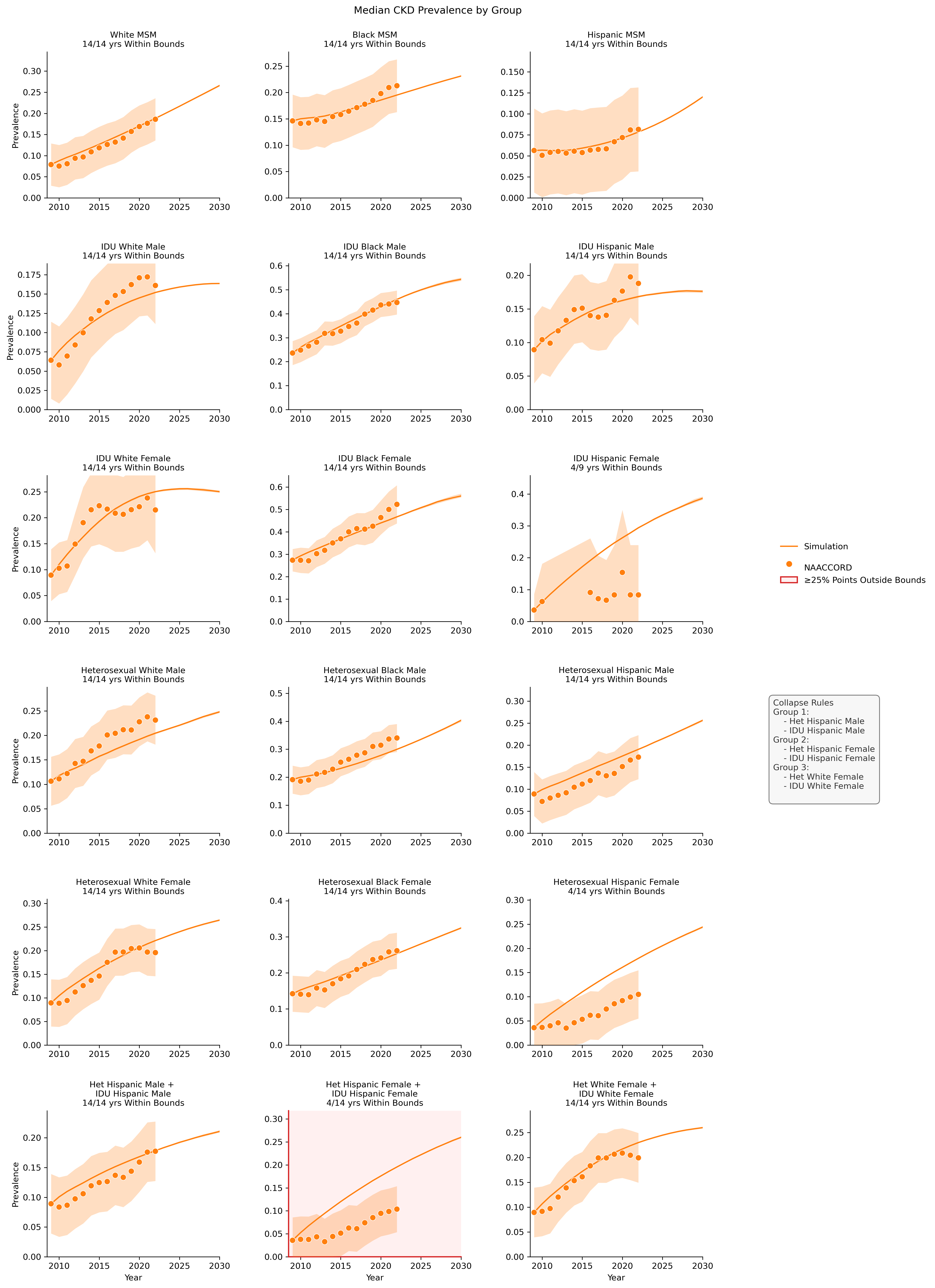
Figure 14c: Diabetes
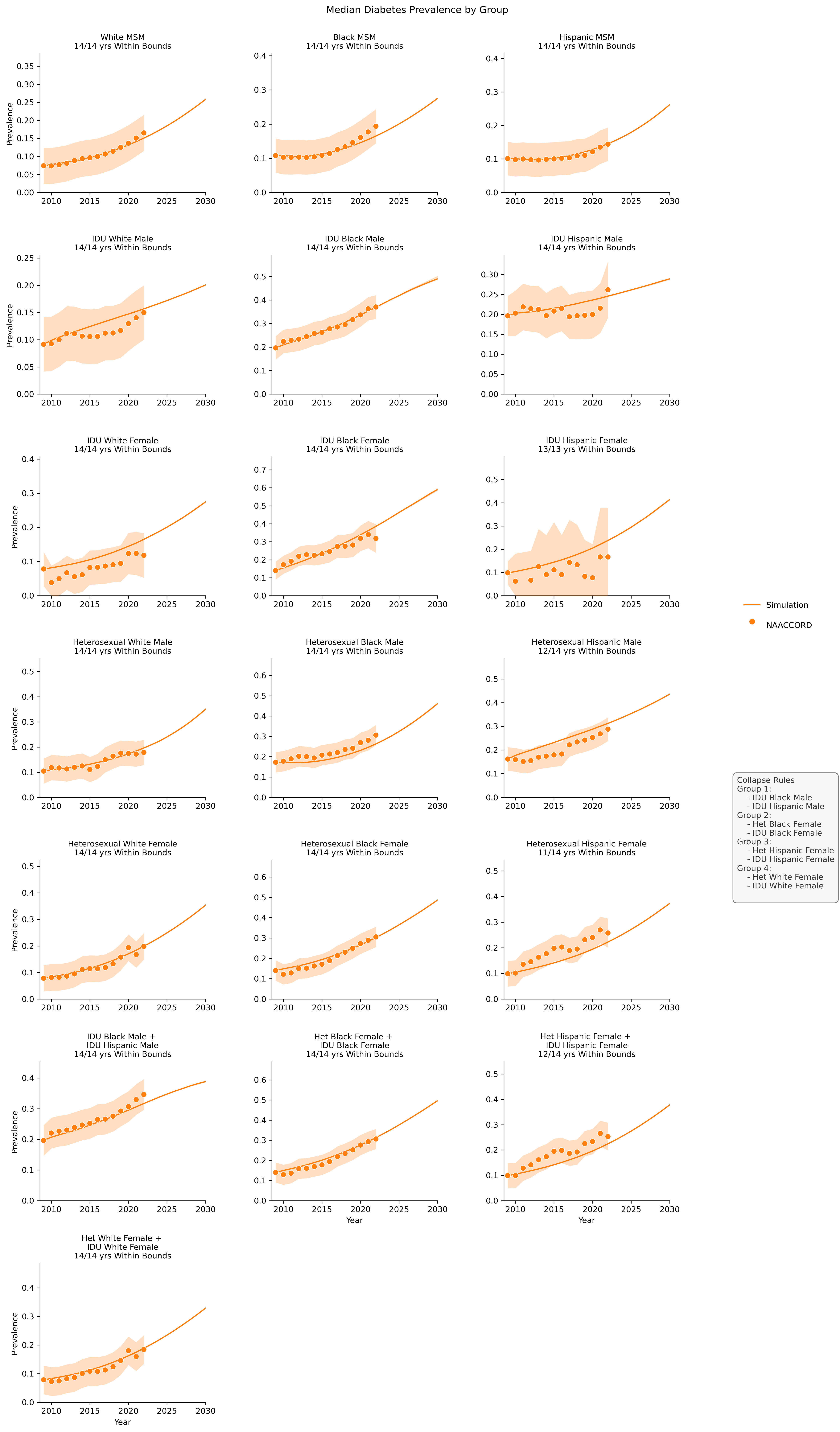
Figure 14d: Depression
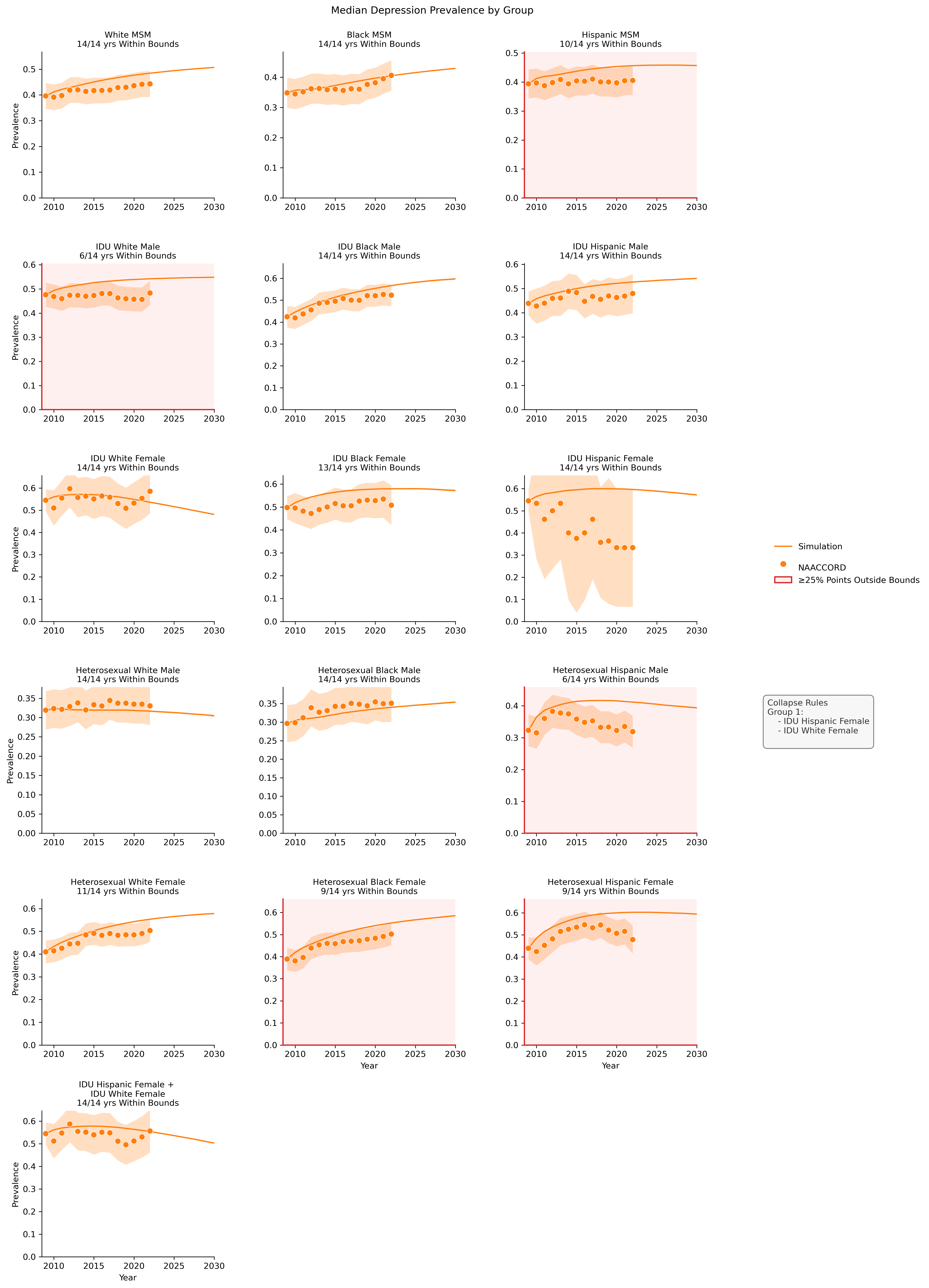
Figure 14e: ESLD
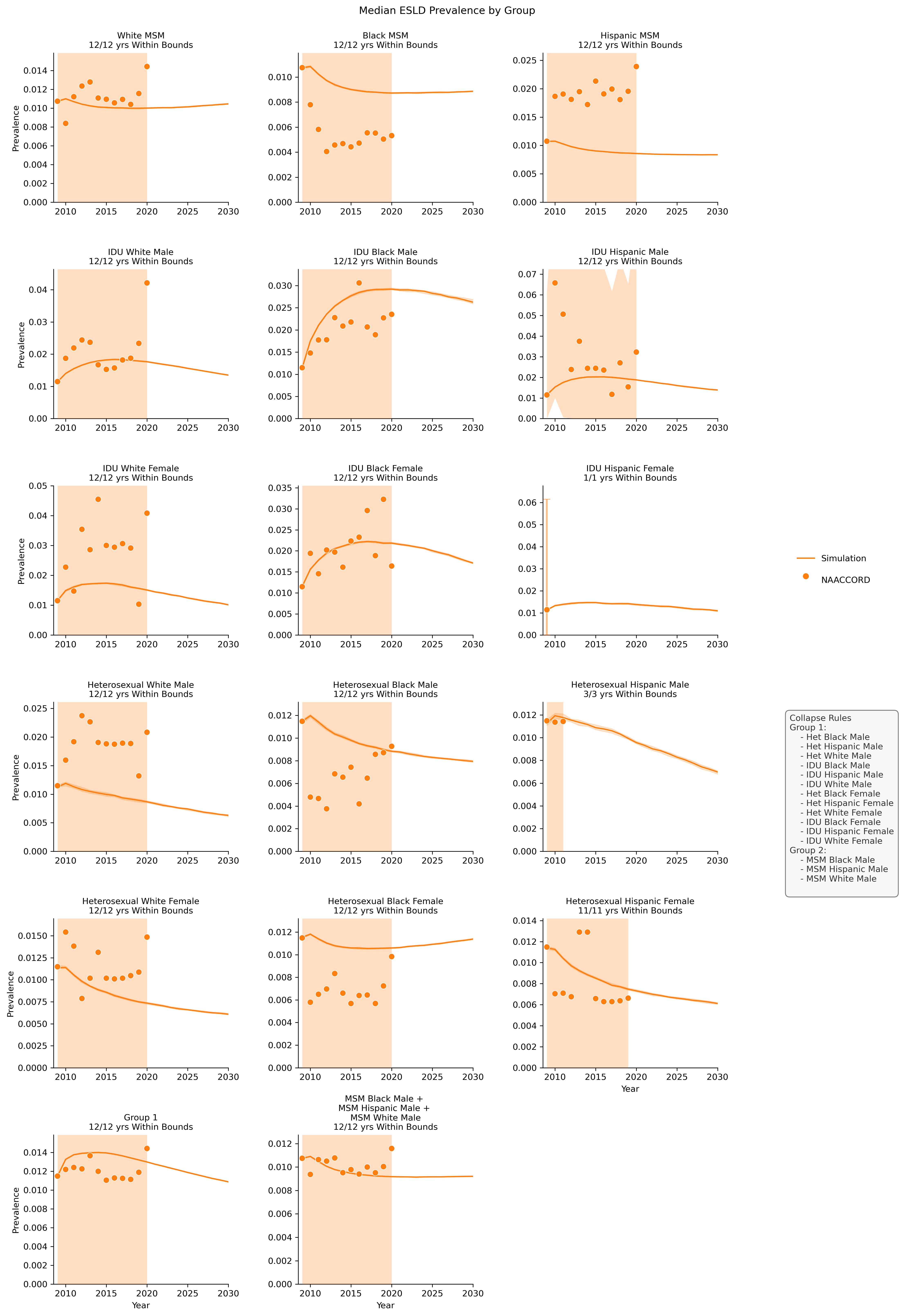
Figure 14f: Hypertension

Figure 14g: Hypolipidemia
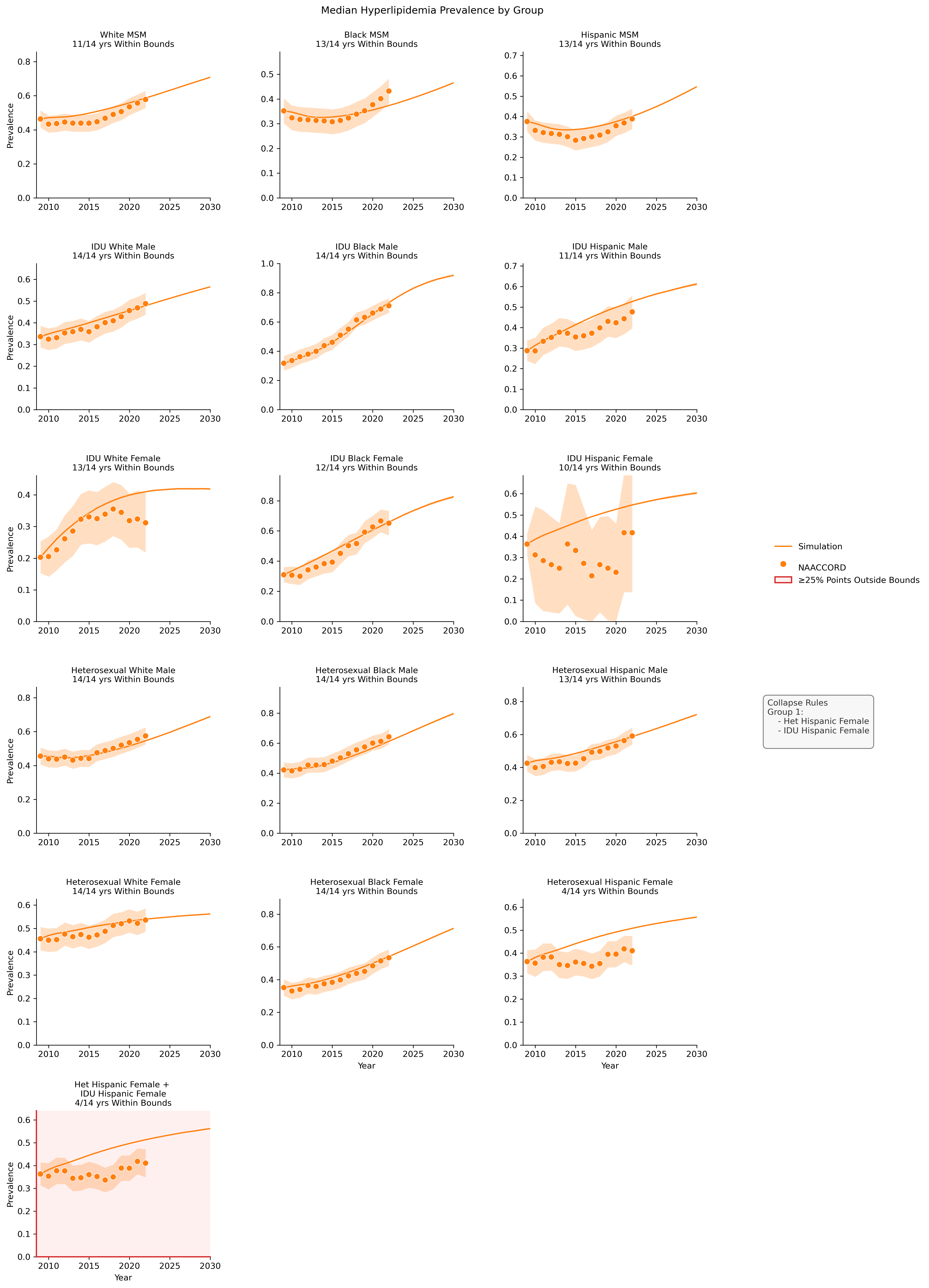
Figure 14h: Cancer
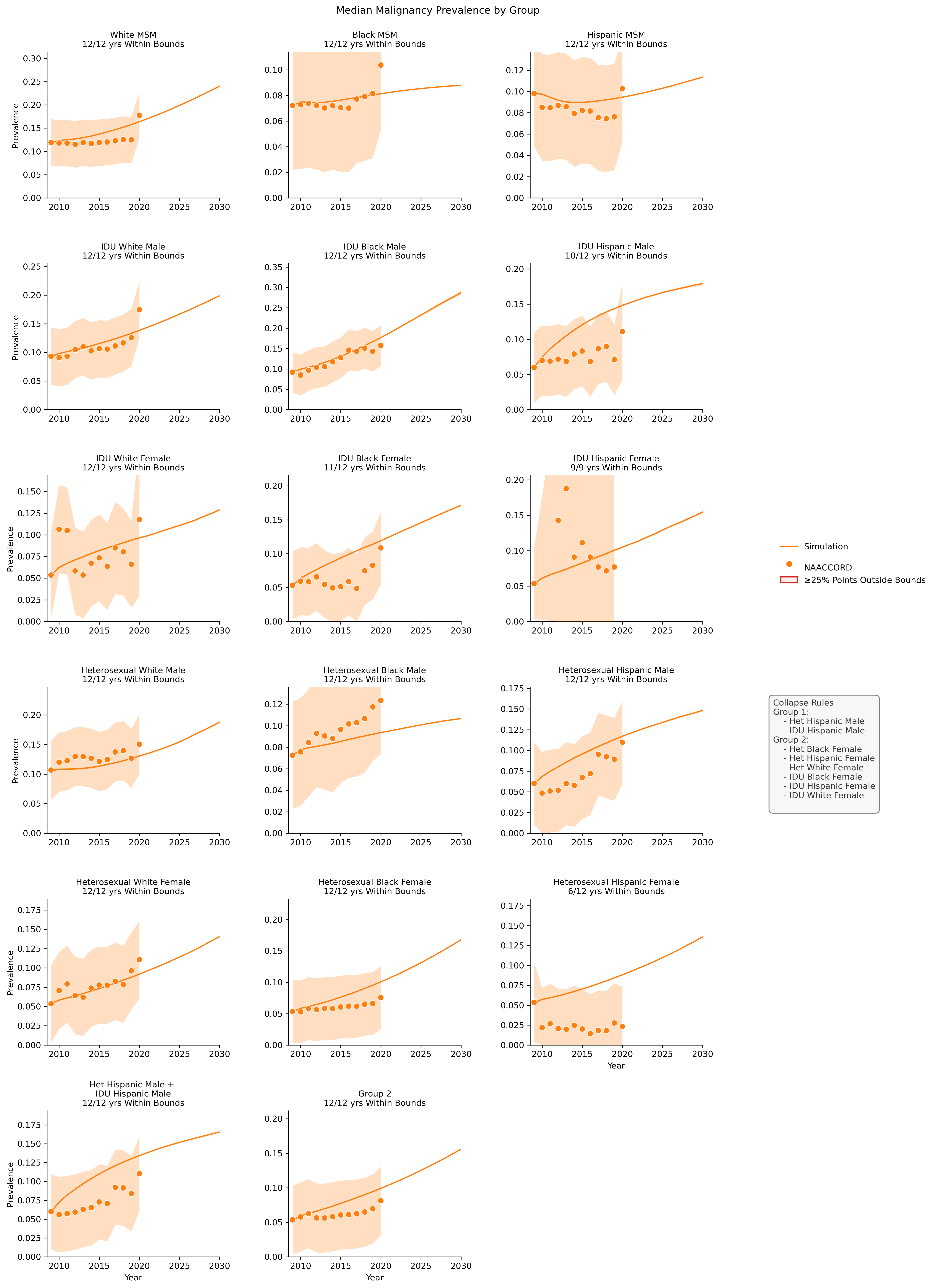
Figure 14i: MI
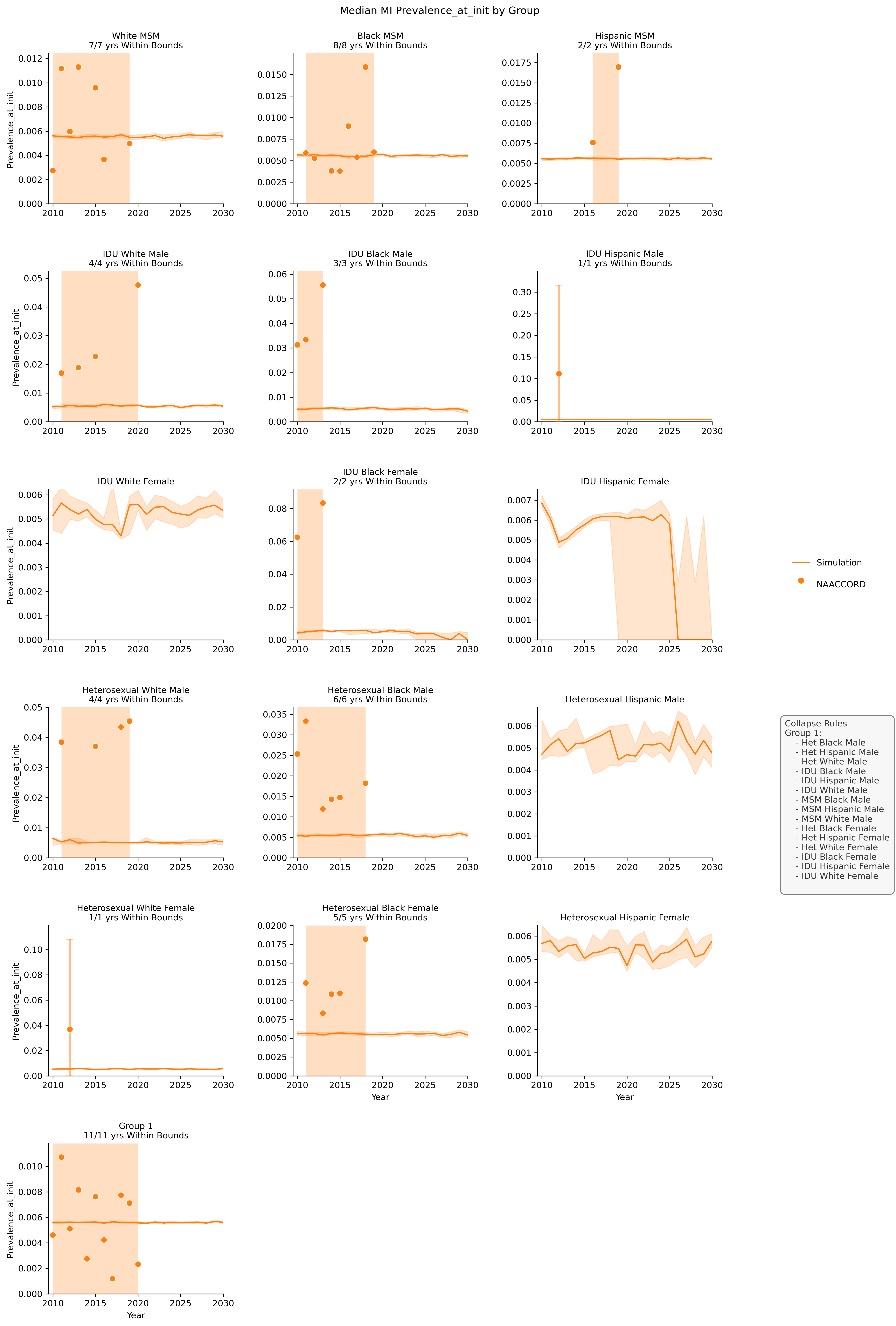
Prevalence at ART Initiation
Below we present the prevalence comparison of ART users at initiation between simulated comorbidities from the PEARL model and comorbity data from the NAACCORD. For each comorbidity plot, we show all subgroups and their alignment with acceptable deviation defined by the maximum of 95% confidence interval and 0.05 absolute value. The fit is defined as the number of years that fall within acceptable deviation and is listed below the subgroup title for each plot. Subgroups that have more than 25% of years outside deviation are shaded red. Due to sample size constraints, some groups are combined in the PEARL model. In these cases, the individual subgroup plots are presented in addition to the combined subgroup plots. The rules for collapsing are shown in the legend to the right.
Figure 15a: Anxiety
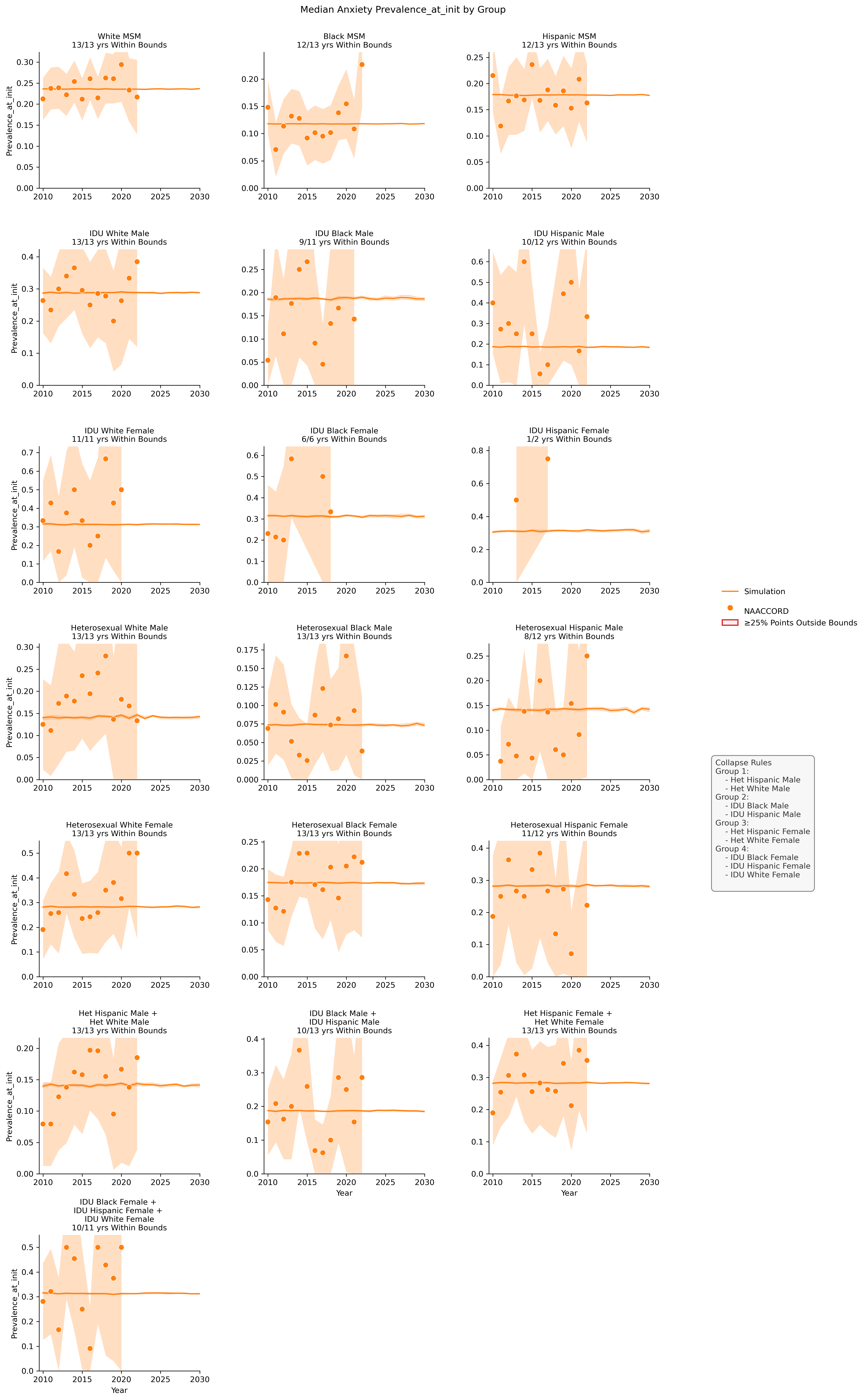
Figure 15b: Chronic Kidney Disease
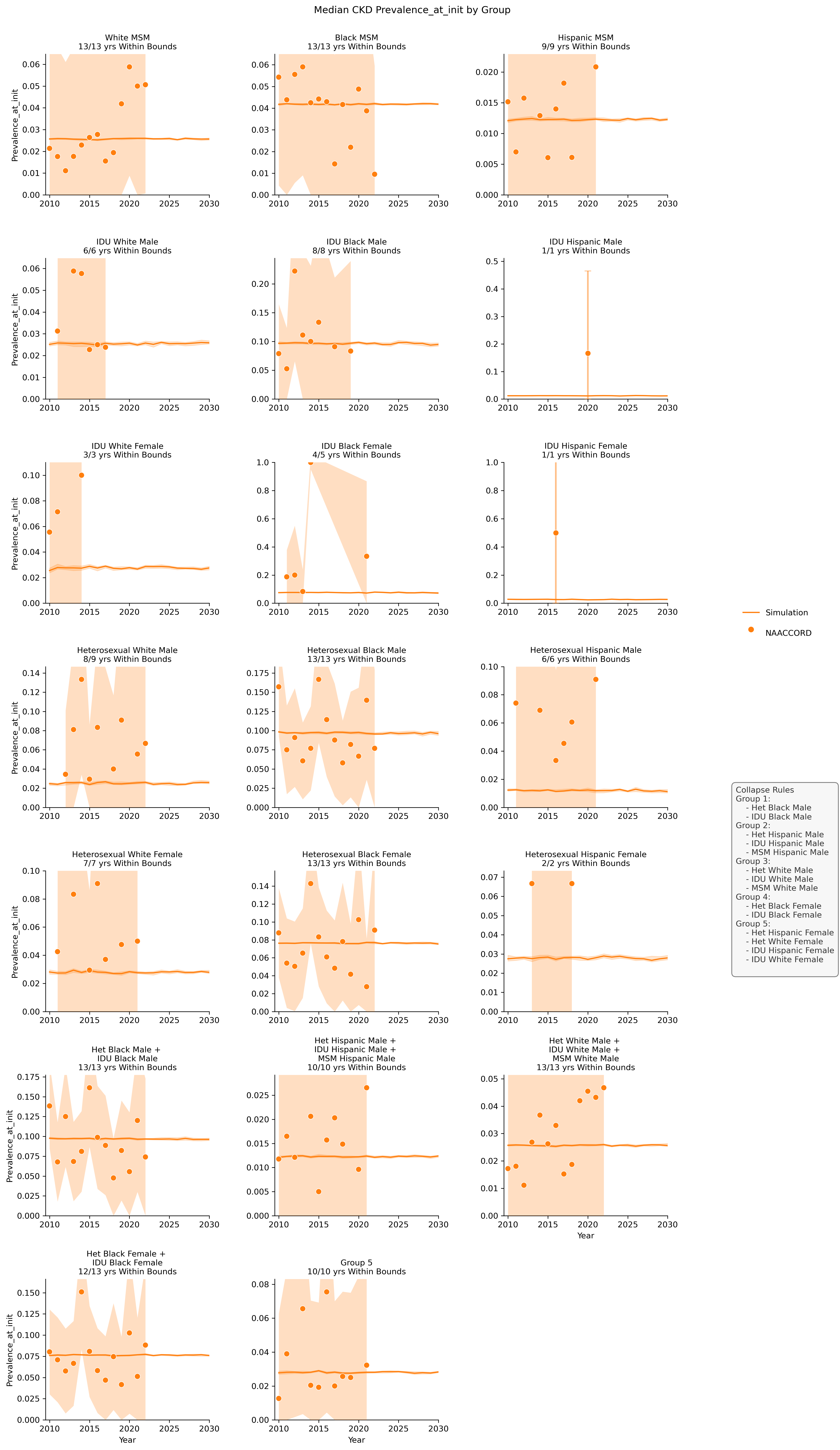
Figure 15c: Diabetes
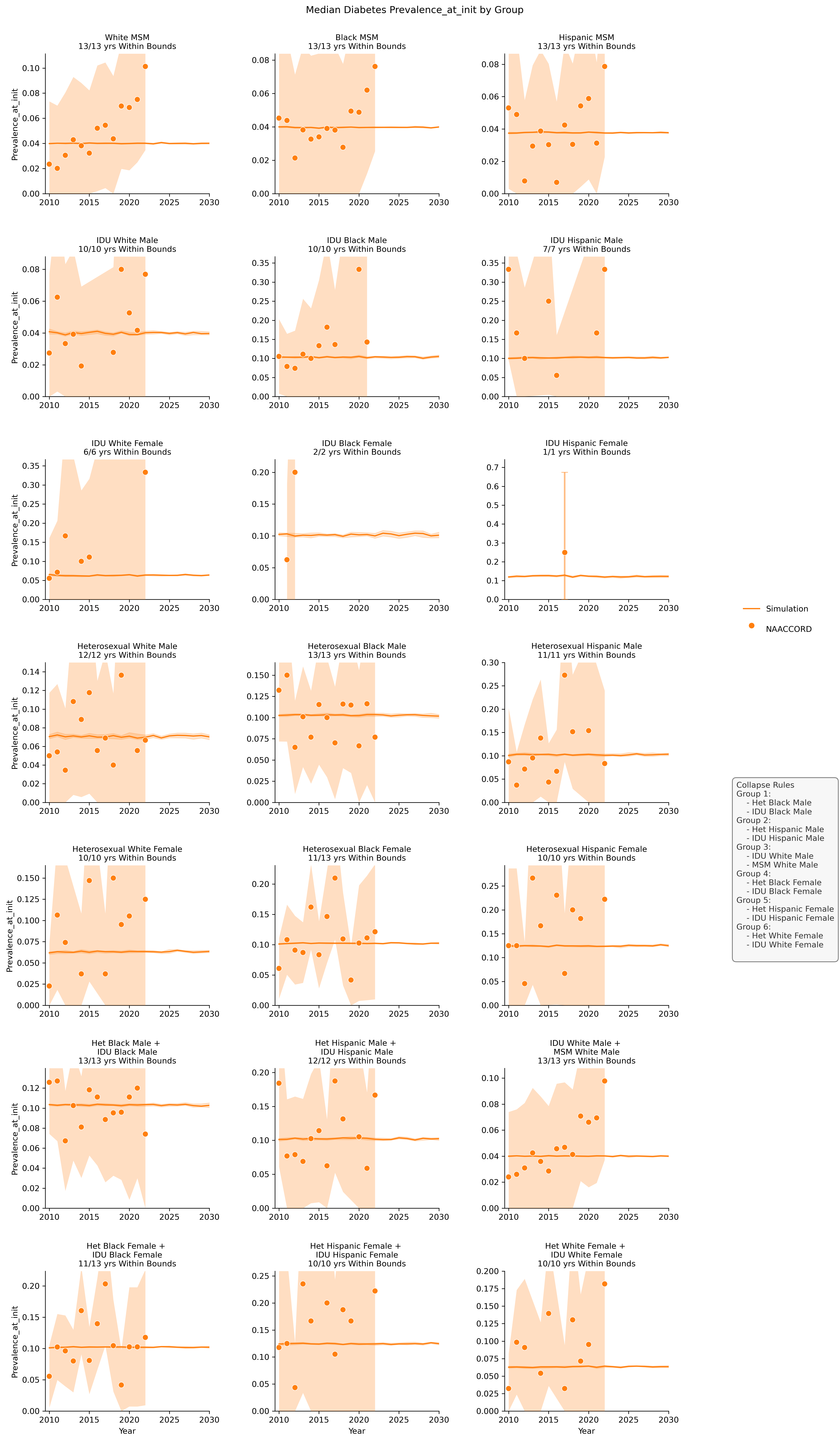
Figure 15d: Depression
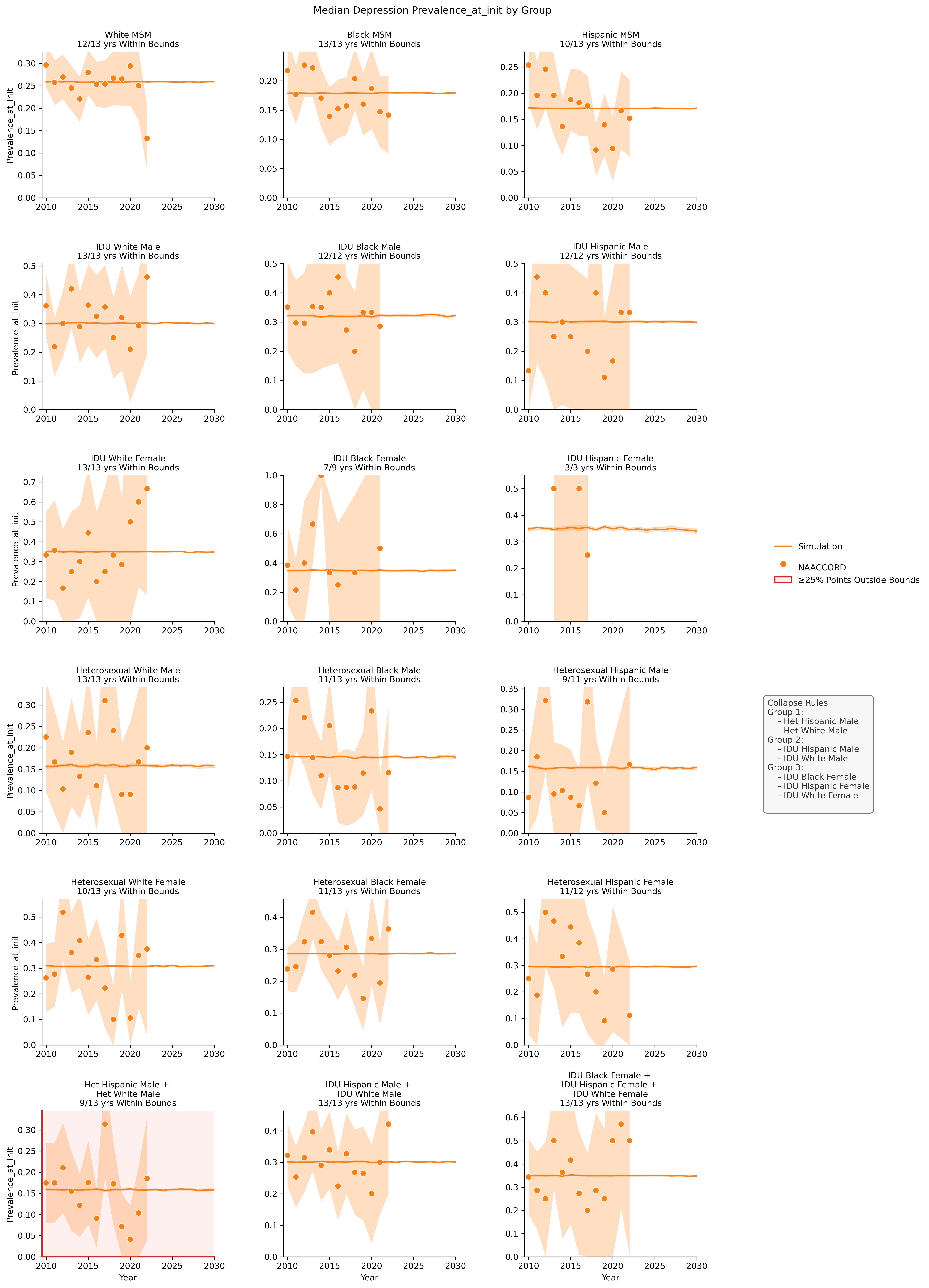
Figure 15e: ESLD
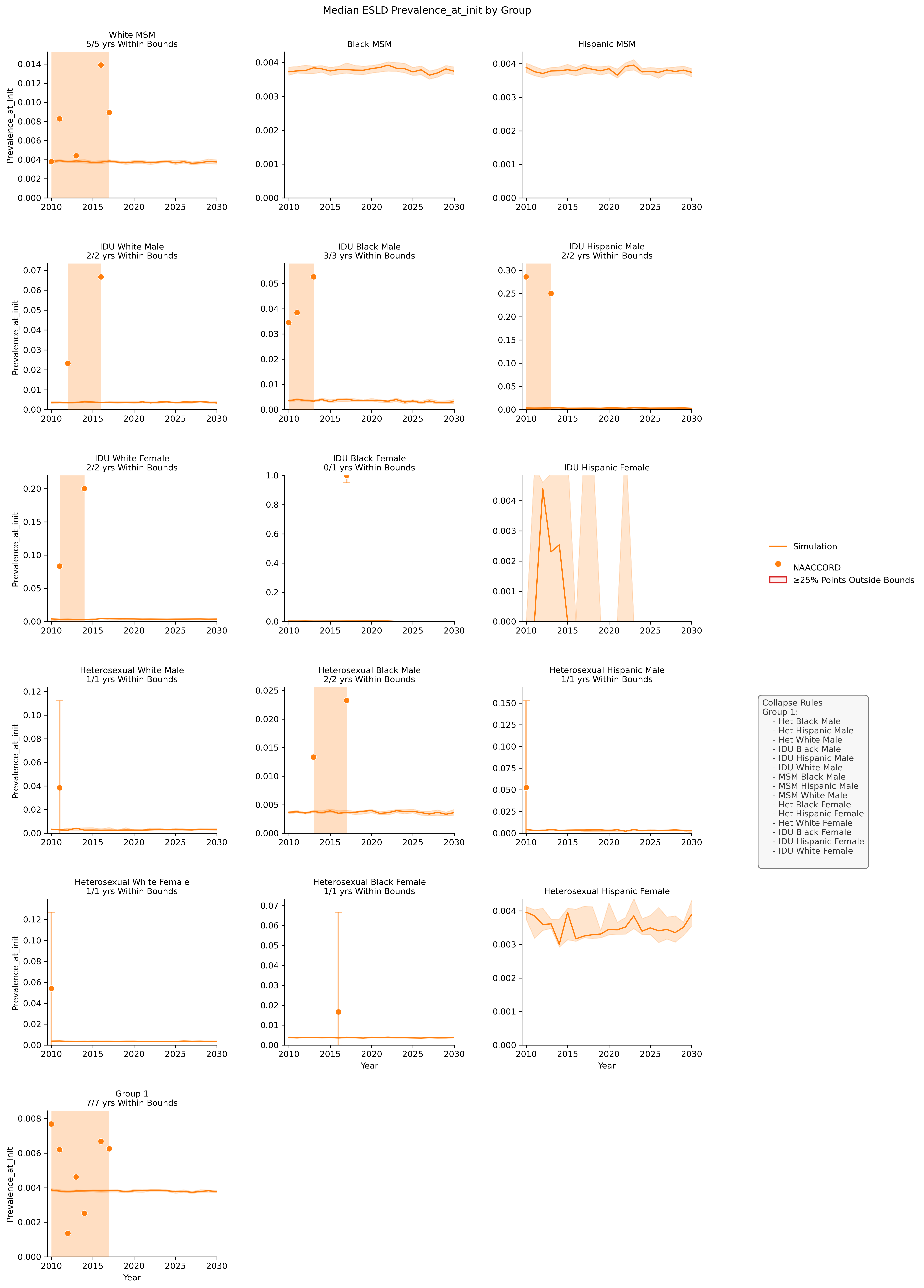
Figure 15f: Hypertension
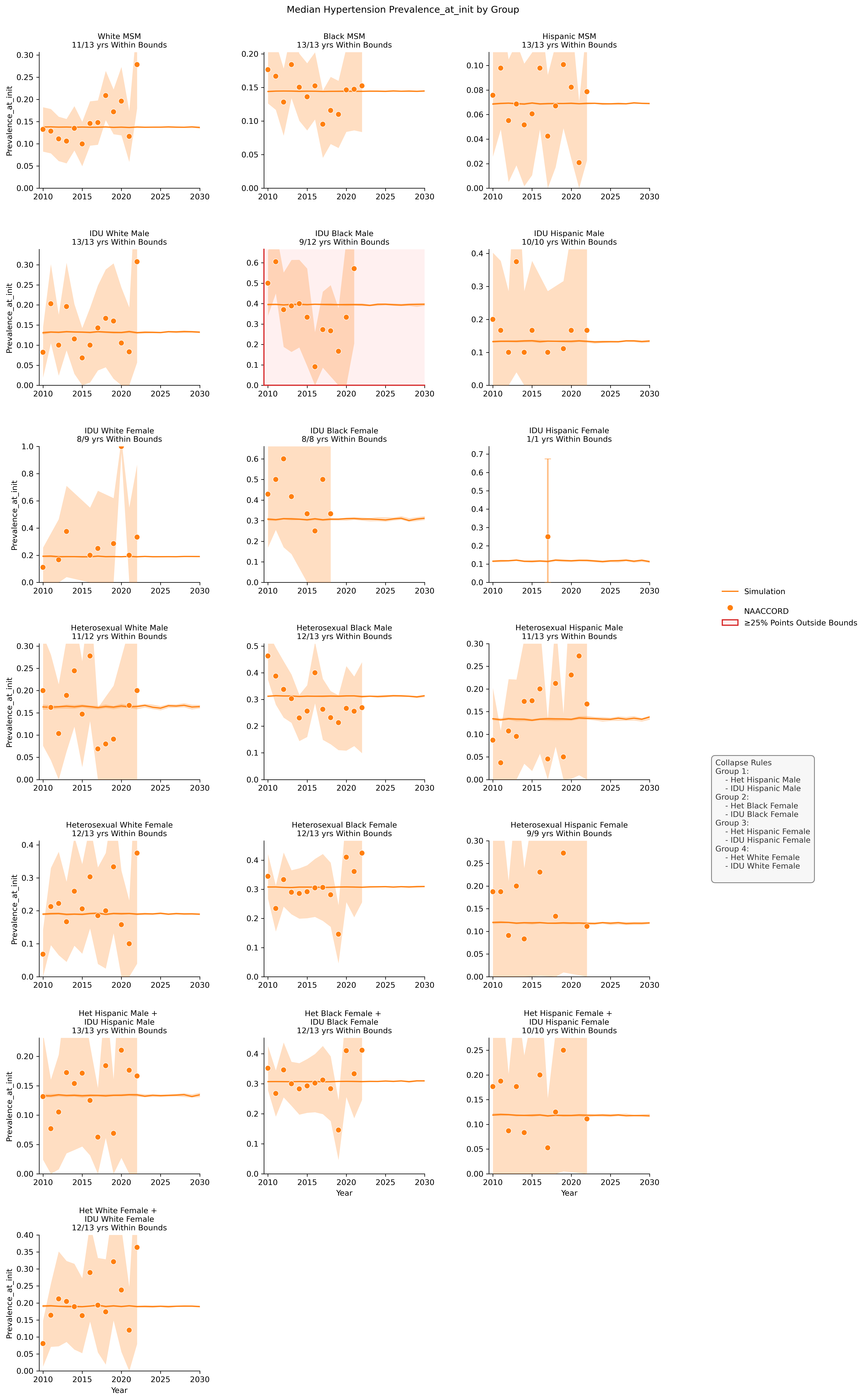
Figure 15g: Hypolipidemia
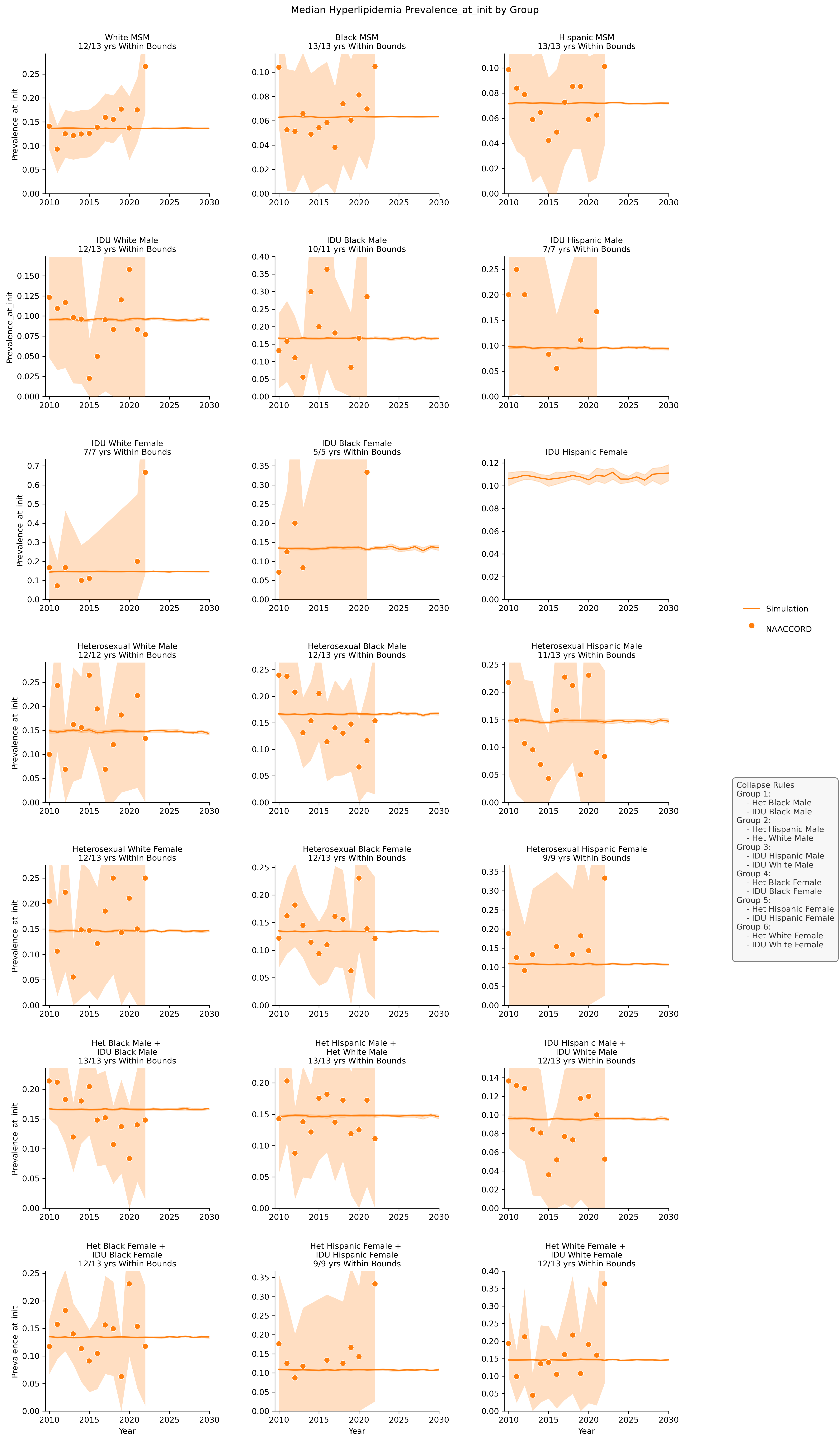
Figure 15h: Cancer
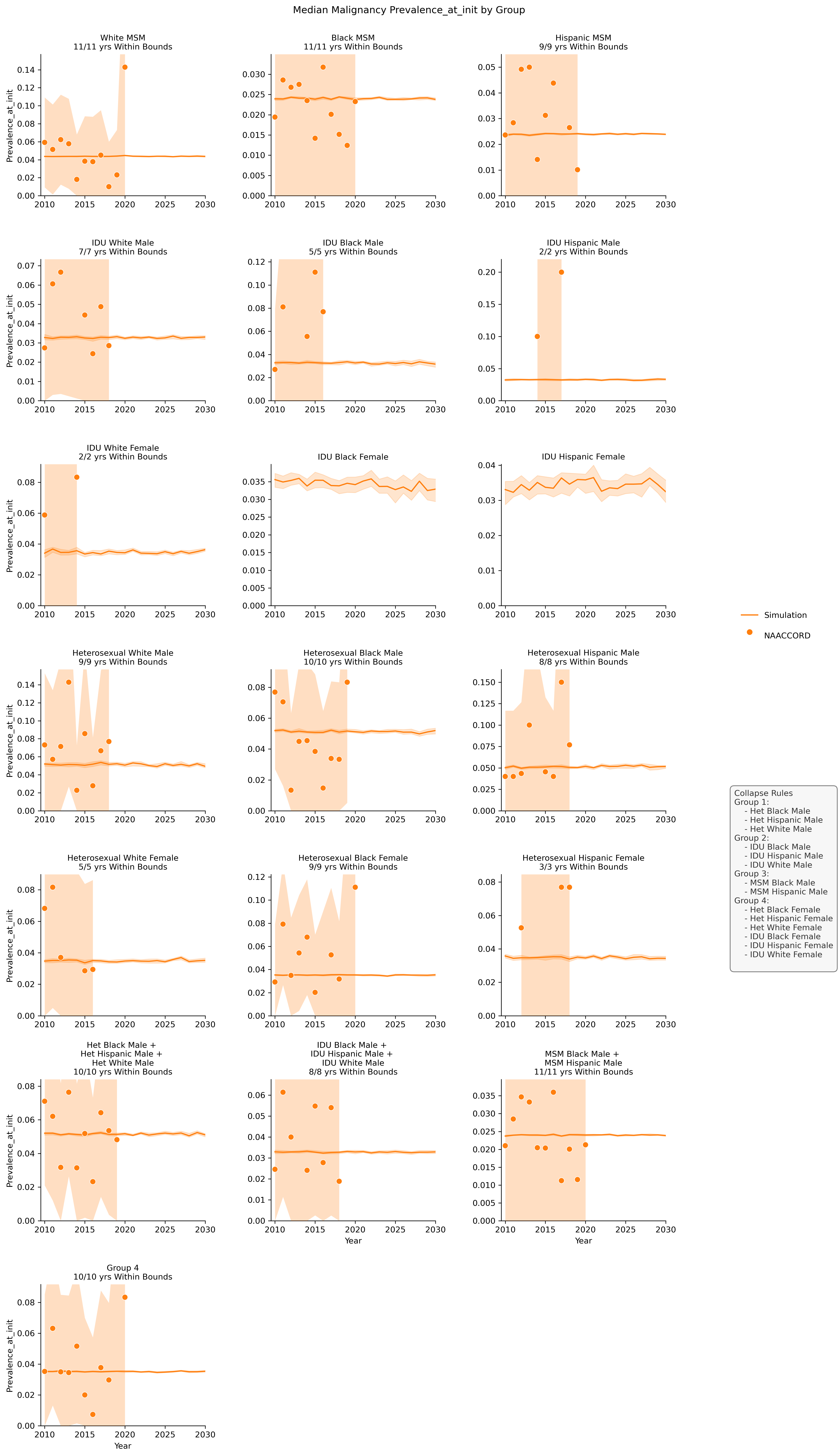
Figure 15i: MI